Design: Vasvi Mukerjee
Project Type: Student Project
School: Shillington School of Graphic Design
Course: Graphic Design
Location: New York, USA
Packaging Contents: Spice
Packaging Substrate / Materials: Paper
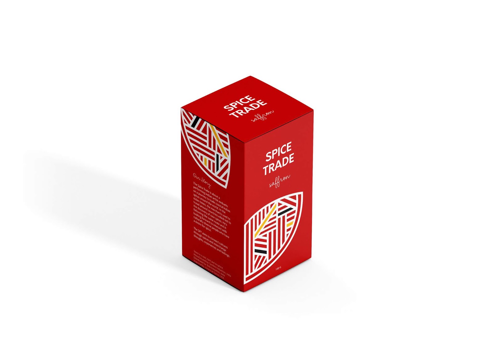
Spice Trade is about a performing Indian artist who embarks on a journey to trade Indian spices around the world. In the olden times, merchants used to travel around countries which led to the discovery of new spices. He’s following the same route and is looking forward to interact with culturally diverse people who have a desire for spice. Spice Trade aims to connect cultures through spices and interchange thoughts, experiences and feelings.
I did a lot of research on cultural Indian elements while also studying about the derivation of spices. Since most of the spices are either derived from herbs or flowers or leaves; which led to the final design of the packaging. I chose bold lines to create a strong identity for the brand as it’s a launch brand.
The three colors were chose and interchangeably used on all three different flavors of the spice packaging.
I also named the brand following the concept of trade of spices in the olden times. I kept the logo extremely simple as I wanted the graphics to be more empowering. I used a simple Sans serif font to balance out the playful and bold graphics.

What’s Unique?
The idea and concept behind the packaging is very traditional but the design is extremely modern. The design is a mix of organic + geometric inspiration. Since the flavors of the selected spices are extremely strong, the graphics and colors are also strong and bold.