Design: All Creative Agency
Project Type: Produced, Commercial Work
Client: Gritz Brewery
Location: Brescia, Italy
Packaging Contents: Beer
Packaging Substrate / Materials: Glass bottle and label
Printing process : Offset printing
Three characters, three faces of the Gritz family represented with a modern and ironic style that tell a story.
A beautiful story, indeed, with grandmother Graziella who leaves her inheritance to Claudio on condition that he uses it to open the brewery he dreamed of so much. The All Creative Teamimmediately became passionate about the story and we took the work very seriously.
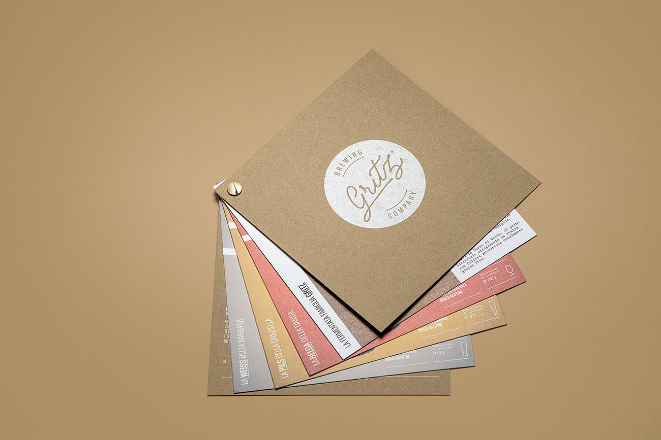
The restyling of the Gritz logo was the first step in building the visual identity of the brand: the handwritten signature was translated into a script font, enriched with the payoff Brewing co. (company, ndr.) to which the circled R was then added after registering the trademark in the patent office.
This nice and familiar naming of the products communicates, by extension, the love and affection that the brewer dedicates to the creation of his products..
Zia Alessandra, passionate wine taster 🥂, expresses her passion while also appreciating the structure and character of the Belgian beer from Gritz. The tulip glass, typical of the wine world, takes the shape of the glass used for this type of beer. The deliberately pronounced lines of the nose characterize the character and invite the user to discover the aromatic scents of the product.
Mamma Barbara, fulcrum for the management and administration 🏦 of the brewery and tireless worker. But that doesn’t mean she can’t appreciate the pleasure of a glass of Weiss! The illustration sees her busy typing on the computer and, almost sur-prised, wondering how it is possible that her beloved beer is already finished. A glass of Weiss is never enough!
Nonna Graziella 👵🏻, as already mentioned, is the person who partly allowed the creation of the brewery. The illustration is full of conceptual elements: the tickets that come out of the bag represent financial support and the hops placed on the hand symbolize the gift, evoking the typical gesture of a grandmother to give sweets or candies to her grandchildren.
The next gluten-free craft beer, for which Claudio is studying the recipe, will be dedicated to his wife Camilla. 👩🏻
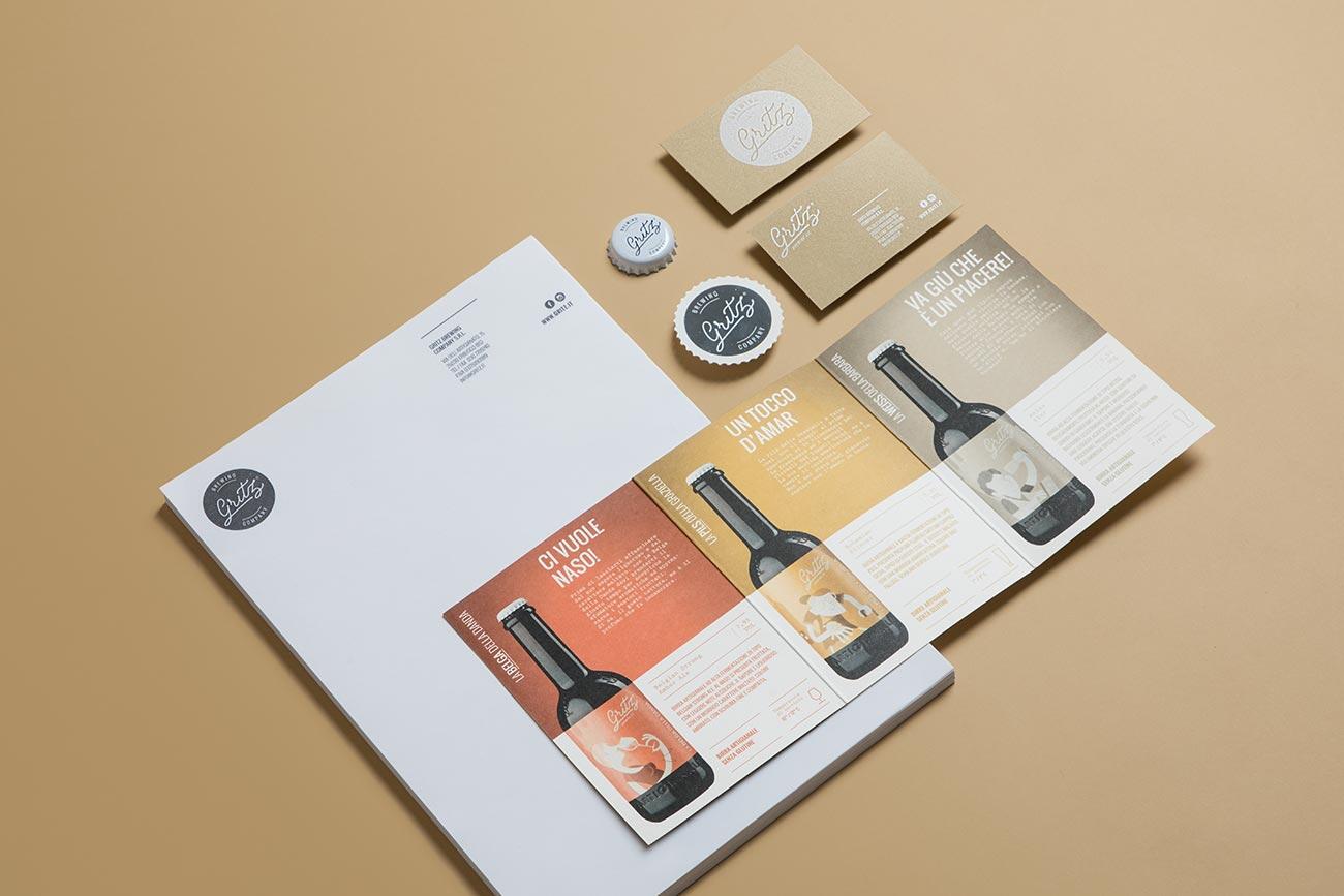
Such special products certainly could not have ordinary packaging. The ideas in All Creative are never lacking so we designed an original container, made of fine natural cardboard, die-cutted and equipped with a horizontal belt to keep the bottles firmly inside.
A fun, careful project with attention to every detail, with visual communication consistent with the product and the sector, which impressed customers and provided excellent re-demption for sales and orders.
The tasty beer of the Gritz family only needed one last gem to be perfect: a lively website. For the digital image we decided to make the bottles, with their illustrations, the protagonists of navigation. Presented through 360-degree animations, the beers were the subject of a studio photoshoot. Thanks to the use of the continuous shooting technique, it was possible to map every angle of the bottles and then rework them through the use of CSS3 code.
The website combines colors and images that recall the original style of the brand’s visual identity, not failing to accurately report all the data relating to the bottles, from the serving temperature to the recommended pairings.
Each beer has its own information card, with a style reminiscent of a classic paper label, which appears scrolling.
Particular importance was placed on mobile browsing. Thanks to the use of a code developed internally by All Creative, in fact, navigation flows smoothly… just like a frozen Gritz.
Gritz eCommerce has been included in the Top 10 Food & Drink Website Designs by Design Brush