Design: Happycentro
Marketing Director at Gromart: Emanuela Rovere
Project Manager: Federico Padovani
Art Direction: Federico Galvani & Federico Padovani
Graphic Design: Anna Rodighiero
Illustration: The Amazing Stefania Stefi Cossu
Animation: Erik Righetti
3D artist: Alessio Danubio
Many thanks to: Guido Martinetti & Federico Grom
Special thanks to: Nicky Neerscholten, Emanuela Rovere, Laura Sandrone, Arianna Verdecchia, Martina Muggiri
Project Type: Produced, Commercial Work
Client: GROM – Il Gelato Come Una Volta (Gromart – Unilever)
Location: Italy
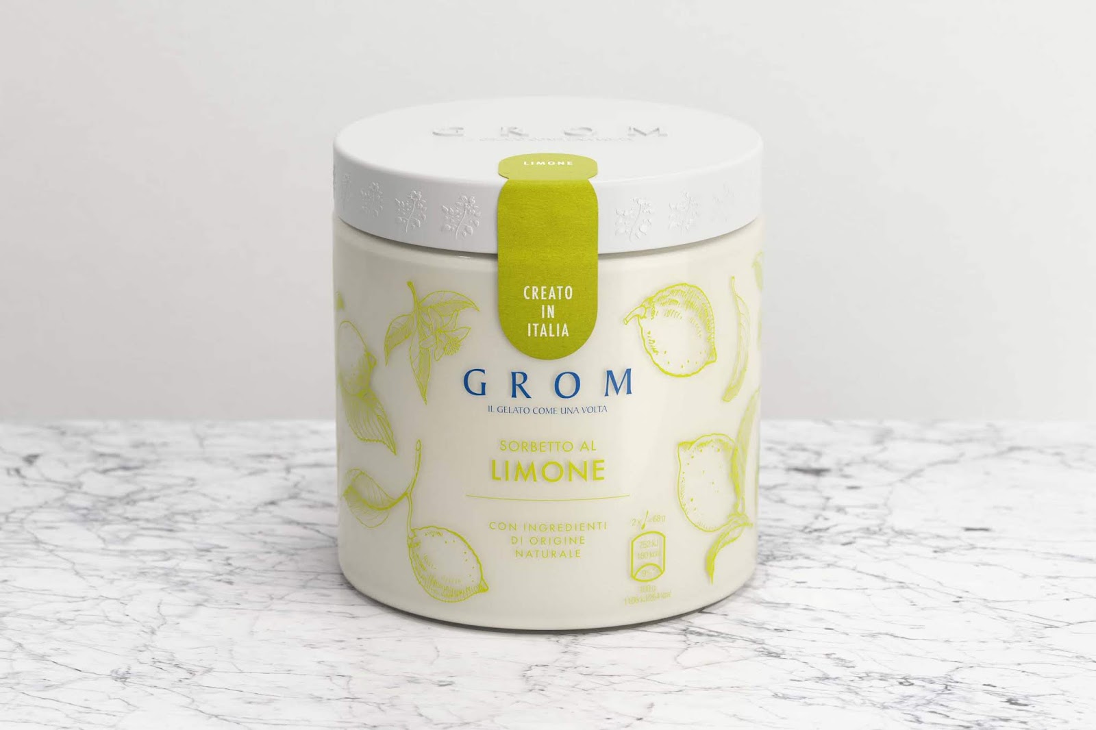
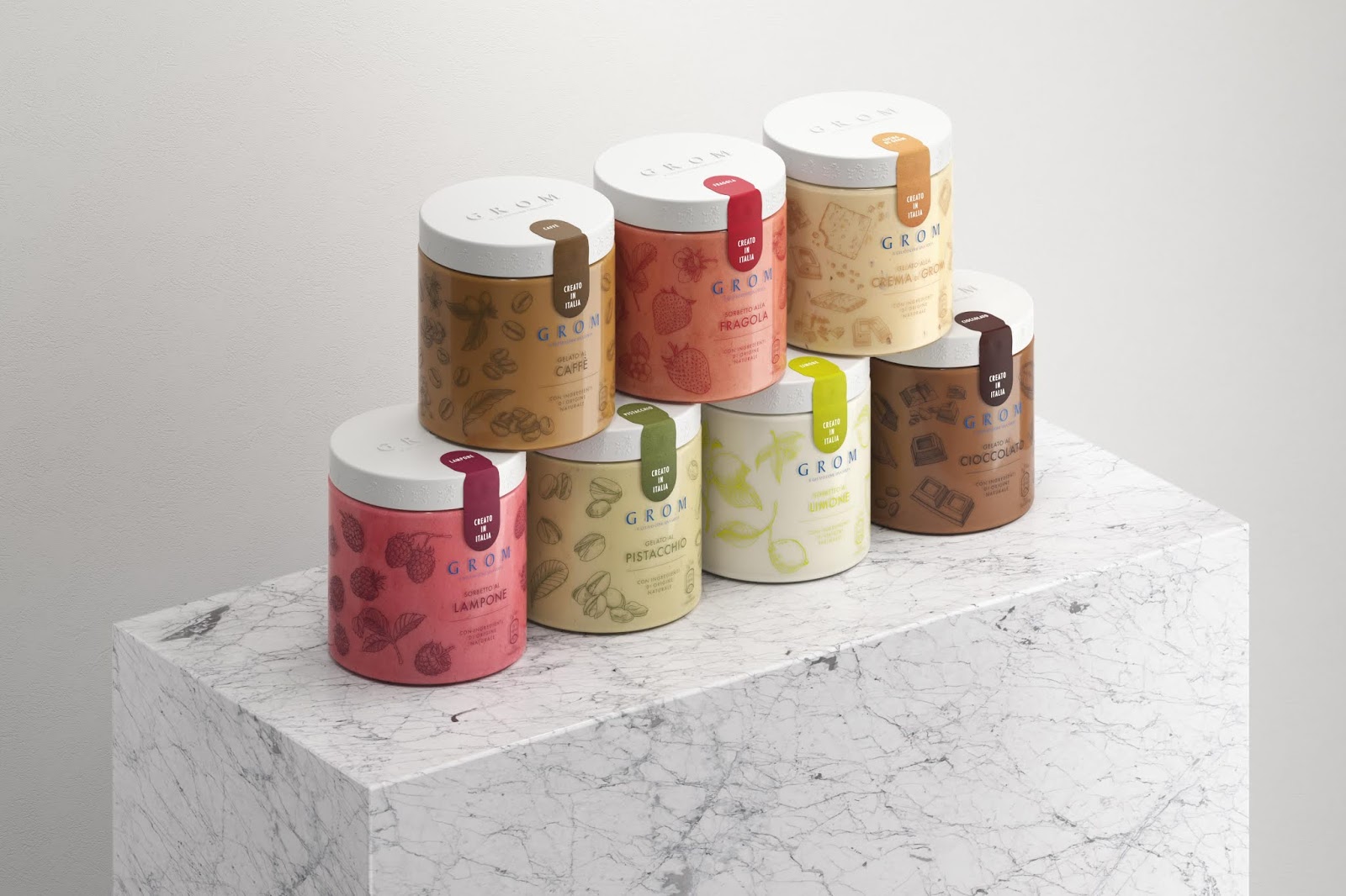
Packaging Contents: Ice-Cream
Packaging Substrate / Materials: Plastic
Printing Process: Screen printing
GROM, an Italian-based brand was recently acquired by the multinational Unilever and this gave an international breath to the tender and made it very stimulating.
The strategy following the acquisition was to expand the business of the brand by planning its entry into the large-scale retail trade. Hence the need to adjust the graphic identity and the communication image with particular attention to the packaged product, gelato in a pint first, then ghiacciolo on a stick.
The greatest effort was to translate the whole consolidated range of values of the brand into a broader but always coherent logic. The pivot on which the whole design revolves is the obsessive attention that the founders, still in the management of the company, have always had and continue to have in the selection and processing of raw materials; a source of pride. So much delicacy was needed to transpose that so convinced approach also in the GDO project.
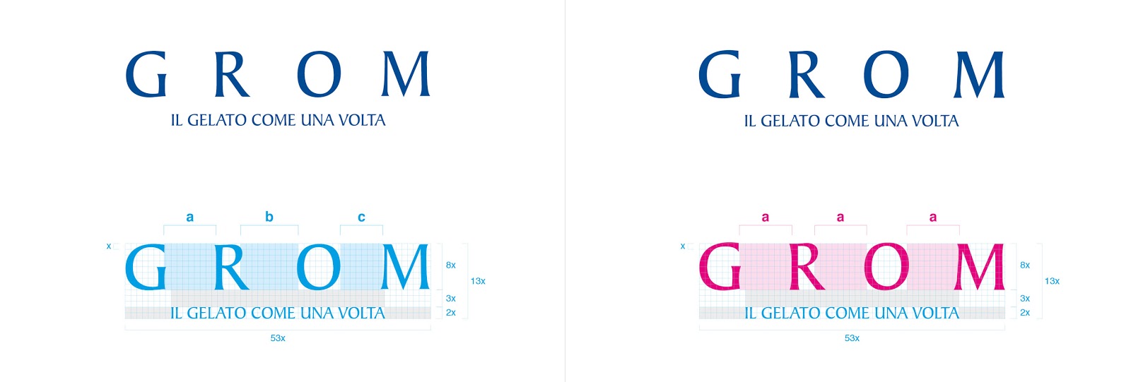
The first sensitive issue to be addressed was the revision of the brand. It was essentially a conservative intervention which has affected the architecture of the brand, which has been recomposed seeking greater harmony, more effective balance and formal rigor.
What’s Unique?
The GR∞MTROPIO – “The power of nature through the portrayal of a plant’s circle of life”.
We were asked to talk about the approach to the raw material, the convinced respect for what the earth can offer, both good and beautiful. We could not synthesize the concept into a single image to tell the cycle of nature: in fact, it needs more than one.We wanted to upset the custom that looks at packaging as something absolutely static.
This is how the space normally used for the simple function of grip in the opening action was enhanced by hosting a story for moving images. Indeed, we have drawn a sequence of illustrations along the edge of the cap of the pint which, by borrowing the mechanism of the zootrope, tell the magic of a seed that sprouts, becomes a plant, flowers, becomes a flower, then a fruit and finally a new seed, in a loop that tells the circle of life.