

Design: Here Design
Location: United Kingdom
Project Type: Produced
Client: Glenfiddich
Product Launch Location: United Kingdom
Packaging Contents: Scotch whisky
Packaging Substrate / Materials: Glass bottle
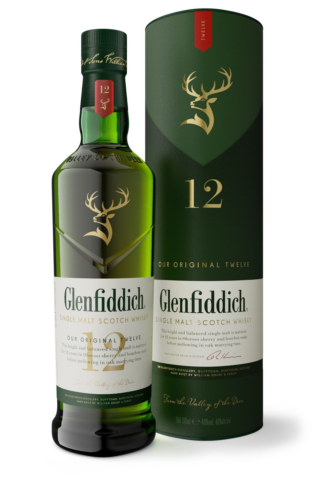
Award-winning single malt Scotch whisky brand Glenfiddich has unveiled a striking new packaging design for its 12- and 15-year-old whiskies, with branding by Here Design.
Building on a longstanding relationship with Glenfiddich, Here was approached to elevate and modernise the brand’s visual language and bring meaning to the core brand. The redesign needed to build on Glenfiddich’s established single malt credibility and establish a powerful structural equity that would be recognisable through the range.
The reimagined identity is rooted in the premise of the single malt category – that it comes from a single location. In Scottish Gaelic, Glenfiddich means ‘Valley of the Deer’ and refers to the Speyside location where William Grant, with the help of his nine children, hand-built the distillery. Simultaneously, Glenfiddich’s maverick spirit, symbolised by the stag icon, required a contemporary expression that would form a set of design principles for the future range development.
Valley of the Deer
An all-new bottle design echoes the established brand equities at every opportunity. The bottle cap features William Grant’s signature as a touchpoint of authentic heritage above the bottle’s proudly defined shoulders, embossed with ‘From the Valley of the Deer’ detail – positioned to be noticed while enjoying the liquid.The iconic stag is proudly positioned within a clearly defined ‘V’ cut into the front face of the now more pronounced triangular-round bottle, referencing the brand’s home and namesake – the Valley of the Deer. This chiselled ‘V’ shape establishes a consistent and ownable thread that unifies the full Glenfiddich range across all bottles and secondary packaging elements.

Heritage with a maverick spirit
The design of the main body labels for the core range balance a crisp clean modernity with the charm of classic malt category cues. A bold red tab on a traditional malt neck bulb draws attention to the liquid’s age statement across the range, adding premium detail that doubles as a tamper evident seal.Here has elevated the prominence of the stag in gold foil on the bottle and secondary packaging, taking Glenfiddich beyond the single malt category and becoming an instantly recognisable shorthand for the brand.
Beneath a new Glenfiddich word marque, the age statement heroes the main label with unconventionally layered product name and description detailing in micro-embossed foil finish to enhance the brand story.
“Here Design has been a collaborative and consistently creative partner on our biggest redesign ever,” says Claudia Falcone, Glenfiddich Global Brand Director. “Their cross disciplinary team has ensured that we have all kept focussed and delivered on the purity and ambition of the original vision – for our flagship range of expressions to reflect the unique heritage and special origins of Glenfiddich.”

What’s Unique?
Across the range, a new colour palette inspired by the natural landscape has been applied to the bottle and label design. The brand’s signature 12-year-old malt, now called ‘Our Original Twelve’ uses a palette of rich green tones echoing the landscape of the Scottish valley.Glenfiddich’s 15-year-old malt has been renamed ‘Our Solera Fifteen’ to reference its innovative aging process within the whisky industry. Bottled in clear glass, prominence is given to the colour of the whisky; a nod to its warmth and spicy flavour profile. This variation is complemented by a warmer colour palette incorporating plumb tones that draw on Scottish fields of heather.
Andy Giddings, Design Associate, Here Design, says: “Our approach returned to the premise of the Single Malt category – provenance. For us, this is symbolised by the ‘Valley of the Deer’ where the distillery was established in 1886. But Glenfiddich’s maverick spirit demanded that we go elsewhere, a behaviour symbolised by the stag icon. On a design level, our valley structural equity establishes a consistent and ownable thread to unify the product portfolio.”