Design: Butterfly Cannon
Location: United Kingdom
Project Type: Produced
Client: Roundwood
Product Launch Location: United Kingdom
Packaging Contents: Alcohol
Packaging Substrate / Materials: Glass
Butterfly Cannon capture the spirit of the season with Roundwood Gin’s Limited-Edition design
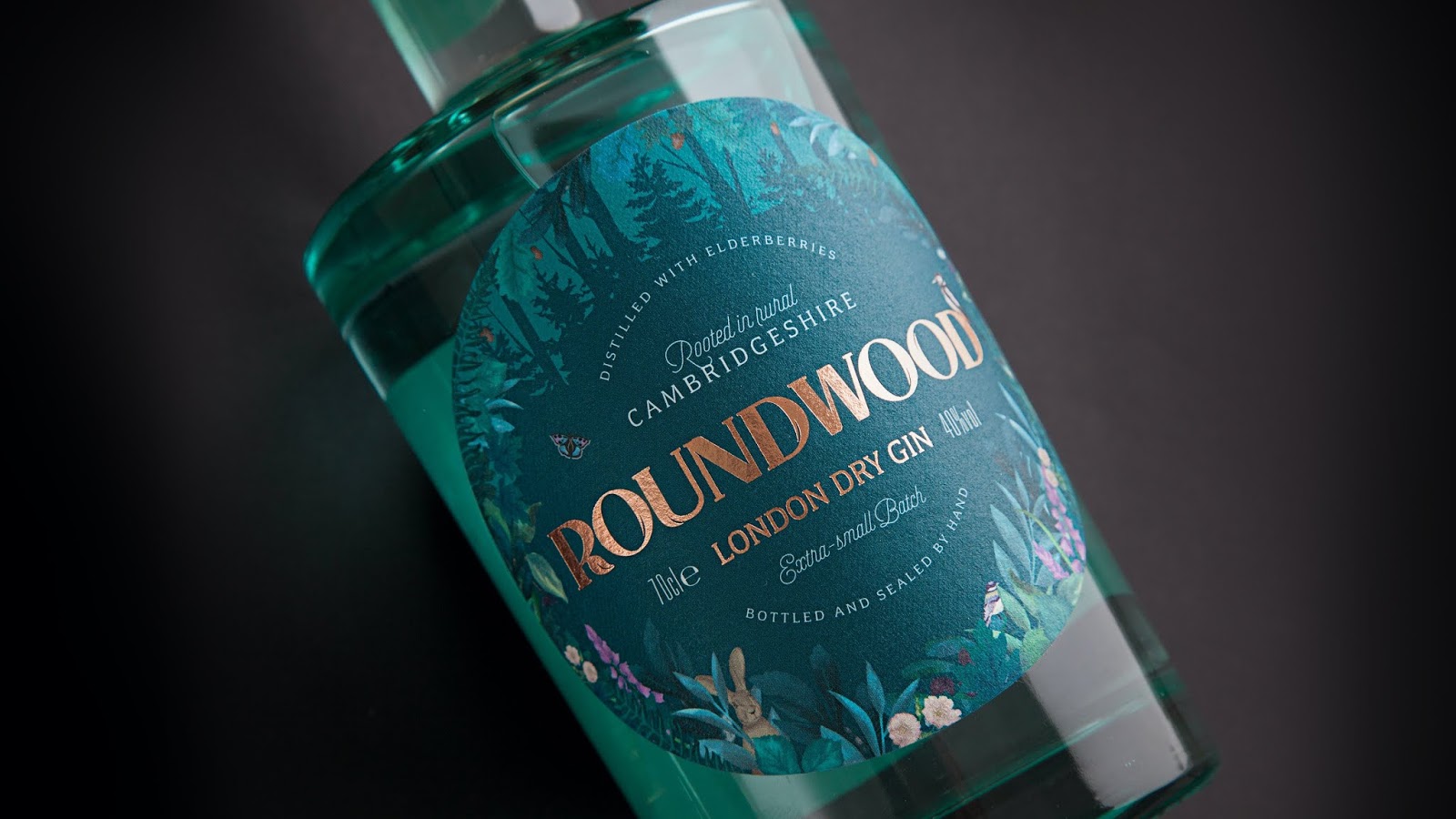
When we created the original Roundwood brand, our approach was to forget the ever-increasing novelty of the gin category – full of Colla-gins, Anty-gins and even Seaweed-gins; concentrating on the authenticity of our two “born in wellies” distillery founders’ desire to create a gin perfect for easy drinking & making G&T’s. Following an immersive distillery experience and many long chats with the brand team, we netted out that localness was the essence of our brand story. Local people creating spirit using local botanicals, foraged from the local woods. Exploring the woods with the founders, Emily and Rupert, we noticed that the protected area they were situated in was actually round, and when they told us they walked round them every day, our Roundwood name and creative concept was born!
This informed every aspect of our design execution, from the impactful bottle structure and symbolic ‘round’ label shape encircled with beautiful illustrations of woodland plants and animals, to the brand’s logo; with strong but rounded letterforms, crafted to give a feeling of growing leaves, whilst the uniquely shaped letter ‘R’ becomes a brand icon in its own right.

As a new brand in a category with new propositions launching every week, we knew the importance of cutting through the gimmicks with a strong, consistent brand narrative across all consumer touch-points; creating a clear and holistic brand world, covering everything from secondary packaging, website and stationery design, to the brand comms and tone of voice; all rooted in our localness brand story. So when Emily and Robert came back to us with their plans for a seasonal edition of Roundwood Gin, we knew that this small-batch release needed to stay true to the brand’s authentic rural roots – no Christmas Turkey-gins here!

In order to compliment the deep colour of the sloe berry-infused gin held within, crystal clear flint glass was chosen for the bottle, whilst updated illustrations of seasonal berries and foliage on the label were executed in rich, winey hues, reflecting the story of the Bordeaux red wine casks used to age the liquid.
As a finishing touch, a cheeky robin perched on the Roundwood wordmark is a subtle nod to the festive season, whilst a wooden stopper in a deep, conker brown was chosen to link back to the local woods that started our journey, complete with a tamper seal that holds the handwritten limited batch information.

“We have been thrilled with the fantastic brand that Butterfly Cannon lovingly created for us. We receive compliments daily on the original bottle design – the eye-catching glass bottle and beautiful illustrations really capture the spirit of Roundwood Gin perfectly. At every stage of the design process, the Butterfly Cannon team brought their creativity and eye for detail, making them a pleasure to work with. It was so exciting to see our ideas come to life and it is now a joy to present our first limited batch release to the world!” – Emily Robertson & Rupert Waters, Roundwood Founders