

Design: Van Heertum Design VHD
Location: Netherlands
Project Type: Produced
Client: Jan van Hest
Product Launch Location: Netherlands
Packaging Contents: Wine
Packaging Substrate / Materials: Glass bottle, labels
Printing Process: Offset, embossing
‘Jan van Hest’ is a vinologist who worked his whole life in the wine industry. Next to this, he is a very well know figure in the wine market in the south of the Netherlands and beyond. Instead of retiring at the age of 65, he started his own business selling his favourite wines.
He searches the world for the best wines to buy and then resell from his own town Tilburg in the Netherlands.
He has a big clientele that follows his advice without a doubt and trust his judgment completely when it comes to the wines he selects. Because of this situation, he wanted to create his own brand, from which to resell some of the best wines hey encounters.
We discussed the strategy of setting up a new brand with him and created the brand name and packaging.
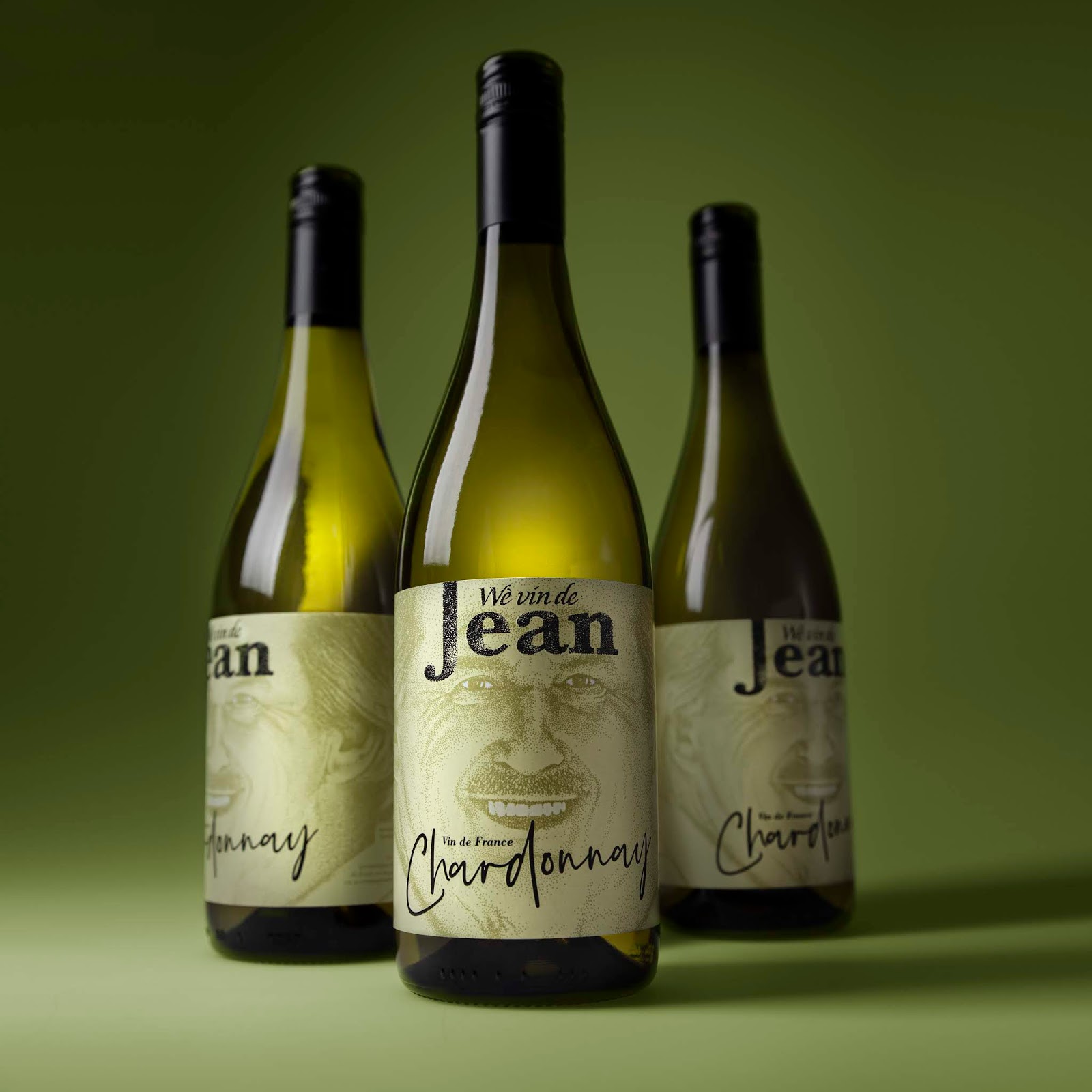
The design consists of a label setup where the label is literally the face/head of ‘Jan van Hest’. It is not just featuring the front of his face on the label, but if you turn the bottle you will see that the bottle/label itself is his complete head around the bottle. What better recognition for his clientele to immediately see that this is something Jan selected.
We illustrated his face with a special technique by hand, using dots to create the entire image, from a base photograph made by special 3D photography.

Embossing in the label has been used to subtlety create some extra effects in the hair and ears on the sides and the labels have been made for a red Merlot and white Chardonnay in this first release.
For the Brand name we created “wè vin de Jean”. The pronunciation of this name sounds very French and “vin” is a direct link to vine (wine). Jean is actually the French version of the Dutch name Jan. The joke is that this Brand name is an actual language dialect from his hometown Tilburg and means “what does Jan think”, which embodies everything he wanted to create with this brand. So, people from outside Tilburg will read it as a French-sounding name, connecting it to wine, and people from Tilburg will read it for what it is. What does Jan think? And he thinks this wine is just perfect.

What’s Unique?
The label “is” the face of the brand, the person, people know and the brand name says what “Jean thinks”.


