Design: Jane Wu
Location: United States
Project Type: Concept
Packaging Contents: Cosmetic, hair care, supplement
Packaging Substrate / Materials: Plastic, paper
Printing Process: 3D printing
The current gender-neutral packaging relies on the absence of distinct characteristics.
This project proposes that rather than stripping away gender qualities to create a gender-less package, a more vibrant solution could be developed by amplifying genderness. The use of maximalism for both the graphic and structural design elements will add all more gender qualities, thereby creating a gender-ambiguous package.

Skin Care For All Genders:
The primary package of the moisturizer is designed based on male preference, which is cubic shape according to my research. The whole package is covered with a texture of straight lines. A female preferred color, pink, is chosen to create a gender-ambiguous perception.The secondary packages are designed depended on female preference. Condensed, hand script and gothic typefaces are used since they are usually associated with femininity. Cones, spheres and organic shapes are used as a pattern. Iridescent effect background and pastel color toned are also added as decorated elements.
As for face wash, the primary package is designed based on female preference—an organic form with sphere cutouts. It is in blue to create a multi-genders feeling. The secondary packages are designed based on male presences. Typewriter fonts, typefaces with a hard edge and rigid forms are used. Rectangular and cube pattern, glitch effect background are used as male preferred decorated elements.

Cosmetic For All Genders:
Both the primary packages of eyeliner and lipgloss are designed in feminine forms, which are inspired by drapery and curvy form. They are in gold and gunmetal which are portraying a masculine feeling. For the secondary package, a pattern made of straight lines, geometric shapes, and photos of metal are used to decorate for male preferred design.The foundation stick is packaged in an upright cuboid form with a rectangular texture. It is purple which is the least preferred color for males. The secondary packages are in pastel gradient with feminine typefaces and organic pattern, a photo collage of flowers are also used.

Hair Care For All Genders:
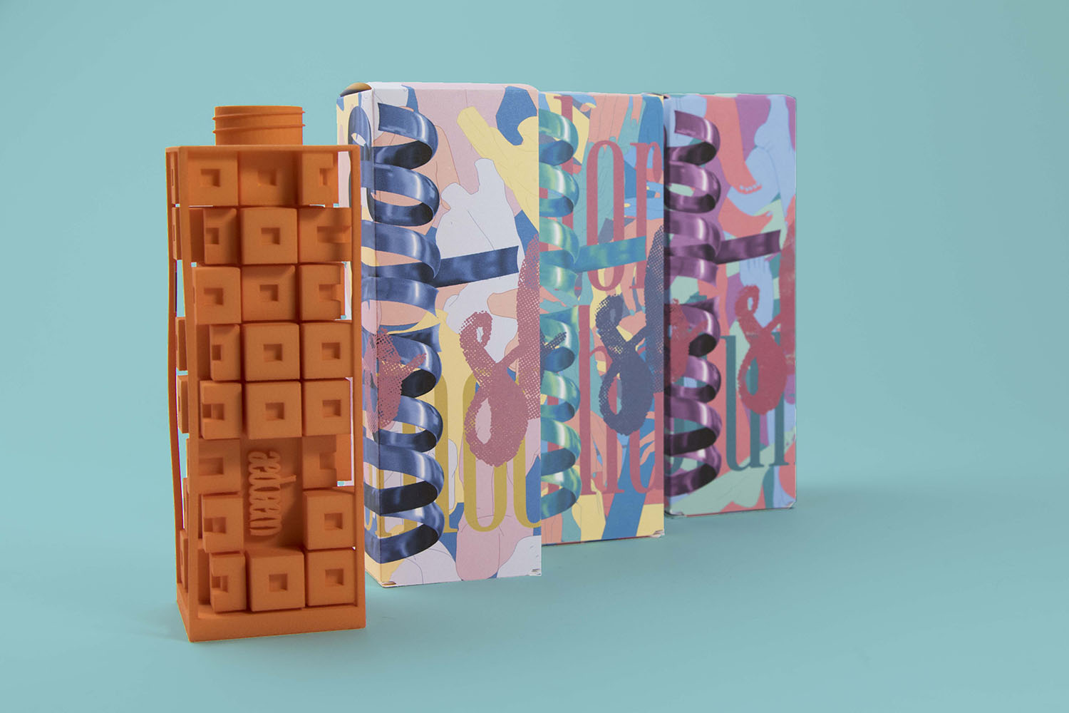
The black organic jar of hair paste is portraying a feminine feeling with masculine preferred color. The secondary packages are decorated with male body parts to show masculinity.For shampoo, the primary package is in a complicated form constructed by cubes. It is in orange, a warm color that female preferred. The secondary packages are in pastel colors with female body parts to show femininity.

Vitamin For Specific Genders:
For gender-specific products, both gender references are shown at the same time. The forms of both primary packages are designed based on the preferences of both genders. For vitamin for Eve, rectangular shape (M) from the top is transitioning to organic shape (F) in the bottom. For vitamin for Adam, sharp angular shapes (M) are transitioning to organic soft lines (F). Both packages are in white which is a gender-neutral color. For the graphics on the secondary packages, I experimented with using only typography. The combination of feminine and masculine typefaces reflecting both gender characteristics.
Both the graphic and structural design are in maximalist style.