Design: PG Brand Reforming company
Location: Poland
Project Type: Produced
Client: Krasny Pischevik
Product Launch Location: Europe
Packaging Contents: Gummies
Packaging Substrate / Materials: Plastic
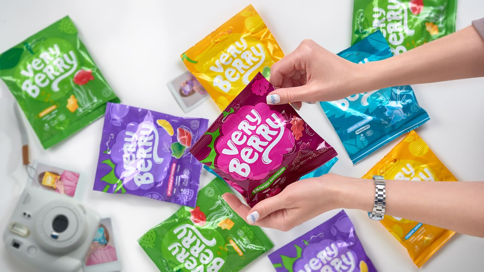
Most often, design and naming of classic gelatins aims at children’s audience: it may be a mascot character, bright and colorful packaging, simple and easy to remember brand-name. Our team understood that such elements needed to be taken into account, but at the same time we wanted to move away from perceiving our product as only a product for kids.
The name “Very Berry” is easy to remember thanks to rhyme. It reflects simplicity of the product — classical berries, that are very tasty & healthy. Very berries!
A key visual element of this packaging design is brand zone: friendly lettering, a fruit and berry-shaped plate with vivid color scheme that enhances brand identity. The cute SKU names along with the illustrated food zone immediately make it clear to the consumer what taste is jelly inside a particular pack.
To be sure that the brand will find its customer, focus groups were held with representatives of the target audience, organized by PG Reforming as well.