

Agency: My Creative
Designer: Ewan Leckie
Photography: Malcom Menzies
Location: United Kingdom
Project Type: Produced
Client: Isle of Iona Gin
Product Launch Location: Global
Packaging Contents: Premium Gin
Packaging Substrate / Materials: Glass bottle
Printing Process: Foil printed bottle, letterpress foil uncoated label
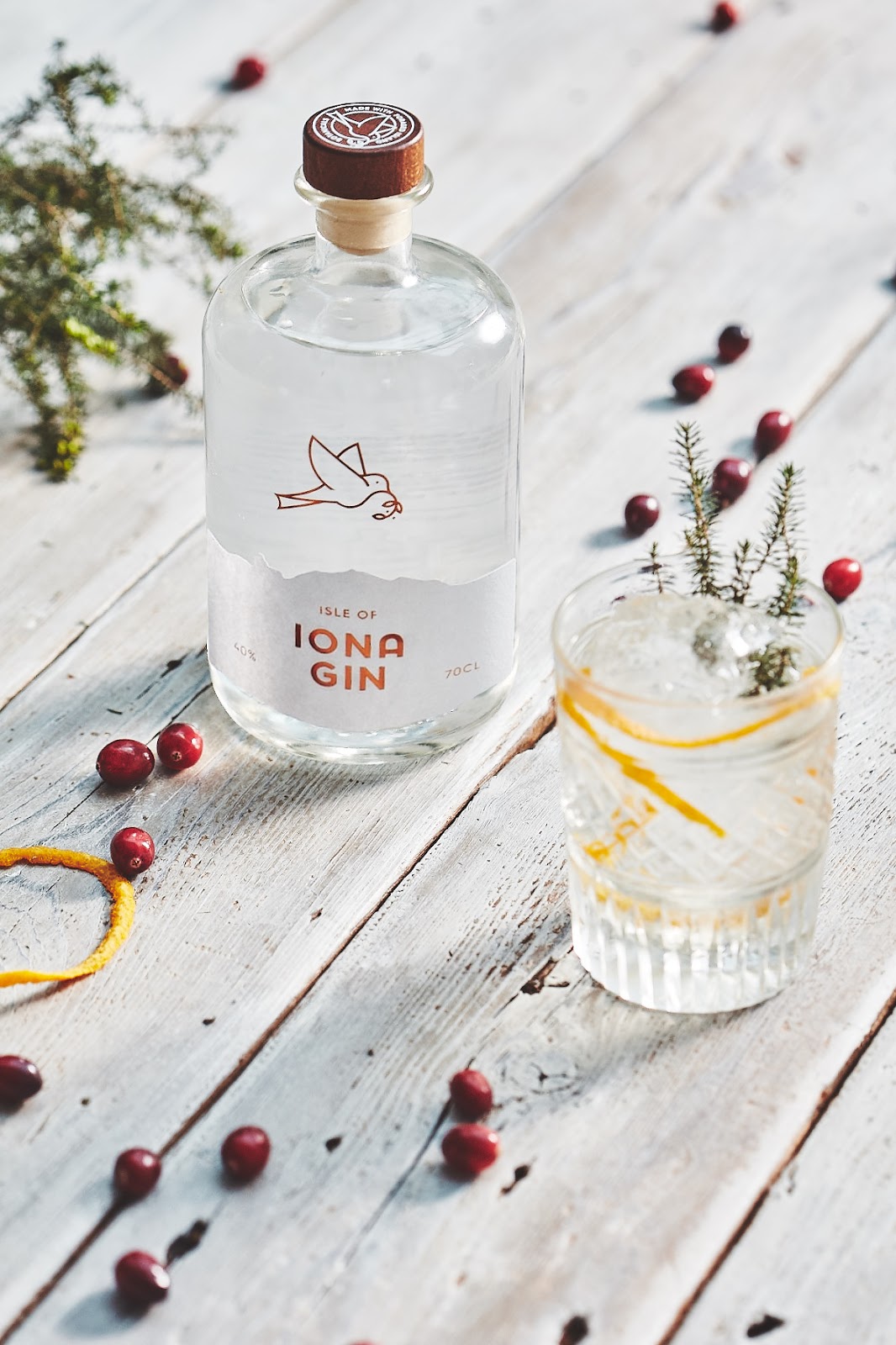
Isle of Iona Gin is a premium spirit distilled from foraged botanicals from around the Island. The Gin has a pure, clean and zesty taste (perfect straight on the rocks with a twisted lemon.)
With this in mind we wanted to create a brand that would capture the fresh and unspoiled beauty of the island. With a clear design, pure white nu-coated paper with a flash of bronze foil to show off its quality.
Throughout the design we used our dove motif that represents peace, a well established icon of the Isle of Iona and the world famous Abby. The dove was also used to depict the foraging of ingredients gathered to produce the gin. With a sprig of elderberry in its beak.
What’s Unique?
The island is a truly magic place. Visitors and residence all note how calm they feel on the island, and when you see the clear sea pools, wide open skies stretching out over the Atlantic sea you’ll be at peace. We had a strong sense of this after our visit and we agreed we could not over design this. It had to be pure and simple. Not boastful or loud, but true to the soul of the island.


