Design: Francesco Paternoster
Photo: Luca Meneghel
Location: Italy
Project Type: Produced
Client: I Tre Colli
Product Launch Location: Europe
Packaging Contents: Olive Oil
Packaging Substrate / Materials: Aluminium, plastic cap
Printing Process: Gold foil stamp, offset print
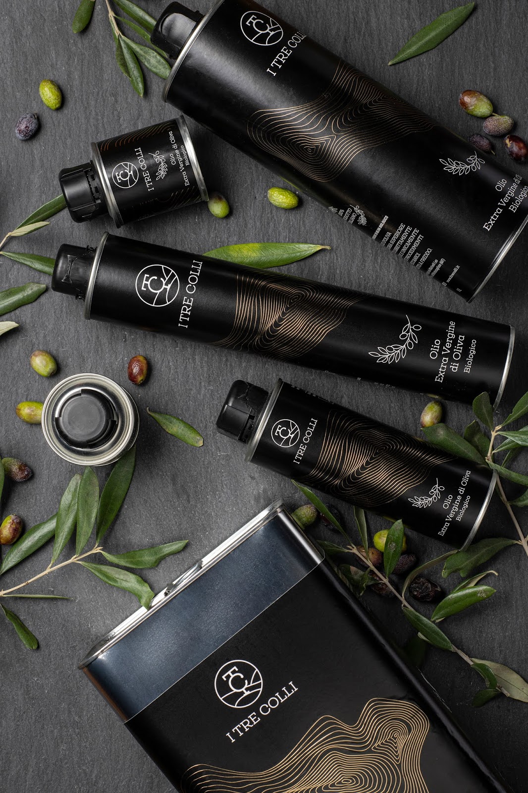
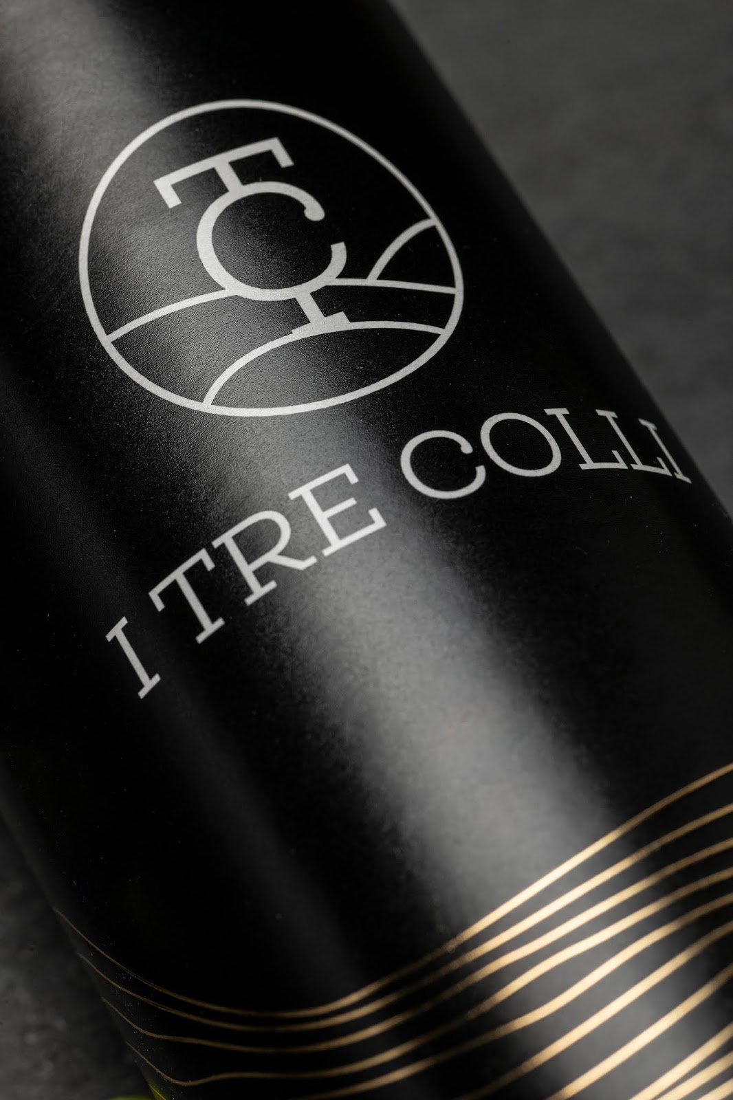
I TRE COLLI is a Lucanian family-run farm with an organic vocation since 1983. They produce extra virgin olive oil from century-old and newly planted olive groves, oranges, almonds, pistachios. The name means ‘three hills’ and originates from the three hills of Montescaglioso, a small town in Southern Italy where the activity of this wonderful farm is based.
The design consists of three hills represented by a series of lines used to visualize the height and volumes of the earth. The illustration in its outermost lines abstractly takes up the shape of the Basilicata region that stretches into an oil stain.

I Tre Colli has divided its olive oil production into two lines: the white one with more delicate flavors and a black one with a stronger flavor. The two product lines have labels printed on oil-resistant paper and differ according to color and printing technique. The white one is printed with a green and gold Pantone, while the black one is composed of the illustration in gold foil and a black background.
What’s Unique?
In the black variant the illustration creates a link between the preciousness of olive oil and the preciousness of a gold nugget found in the lands of Basilicata.