THE CHALLENGE
When we were approached to create a cold-pressed olive oil brand packaging, the challenge was showing all the product characteristics, and highlighting the unique and diverse features that it has to offer.
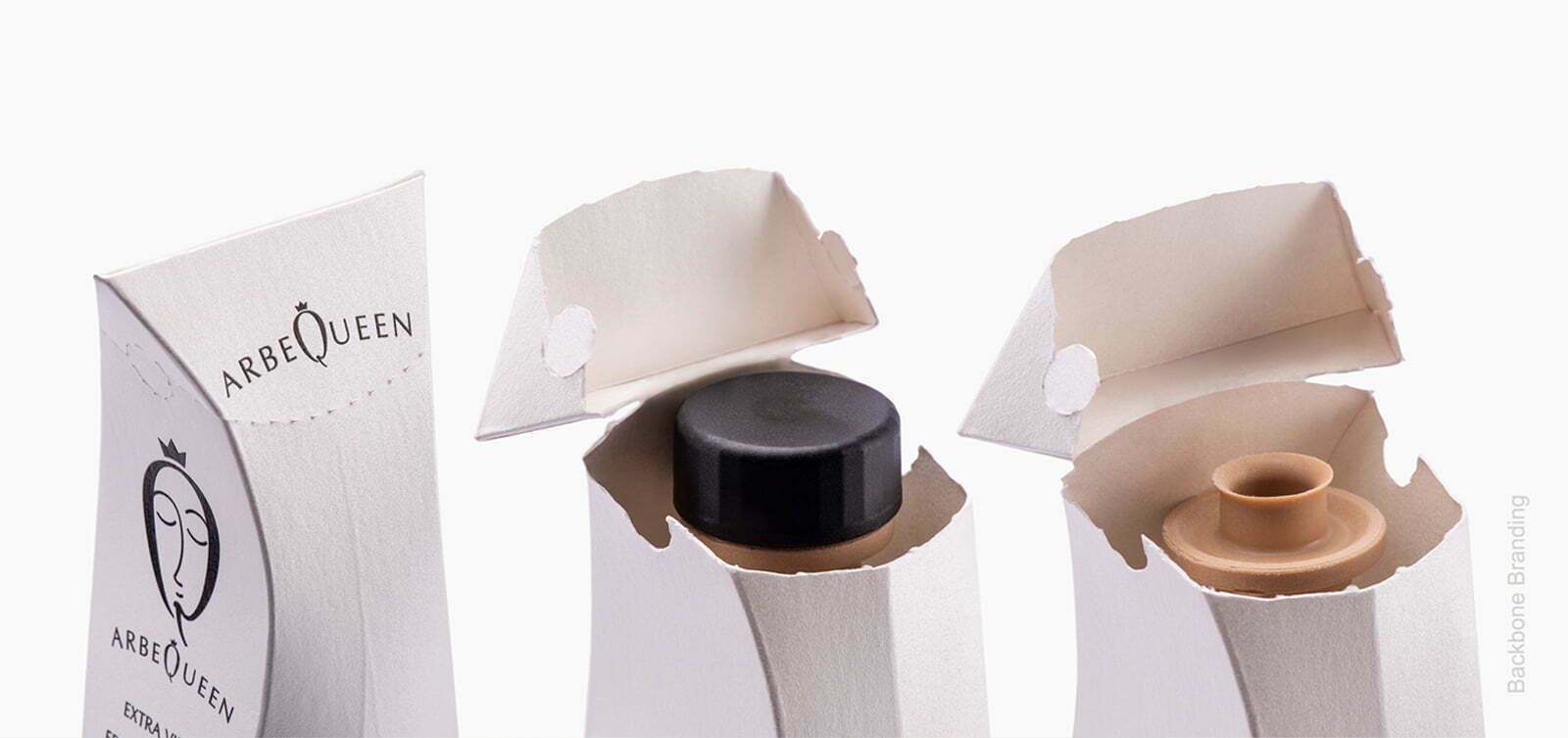
THE SOLUTION
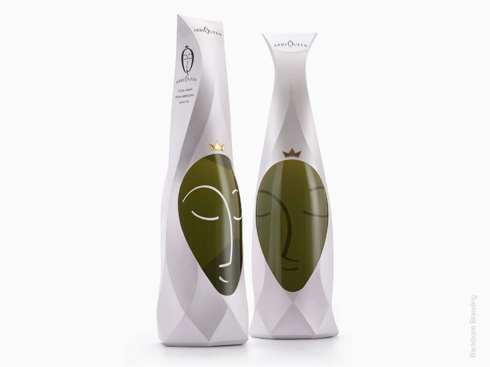
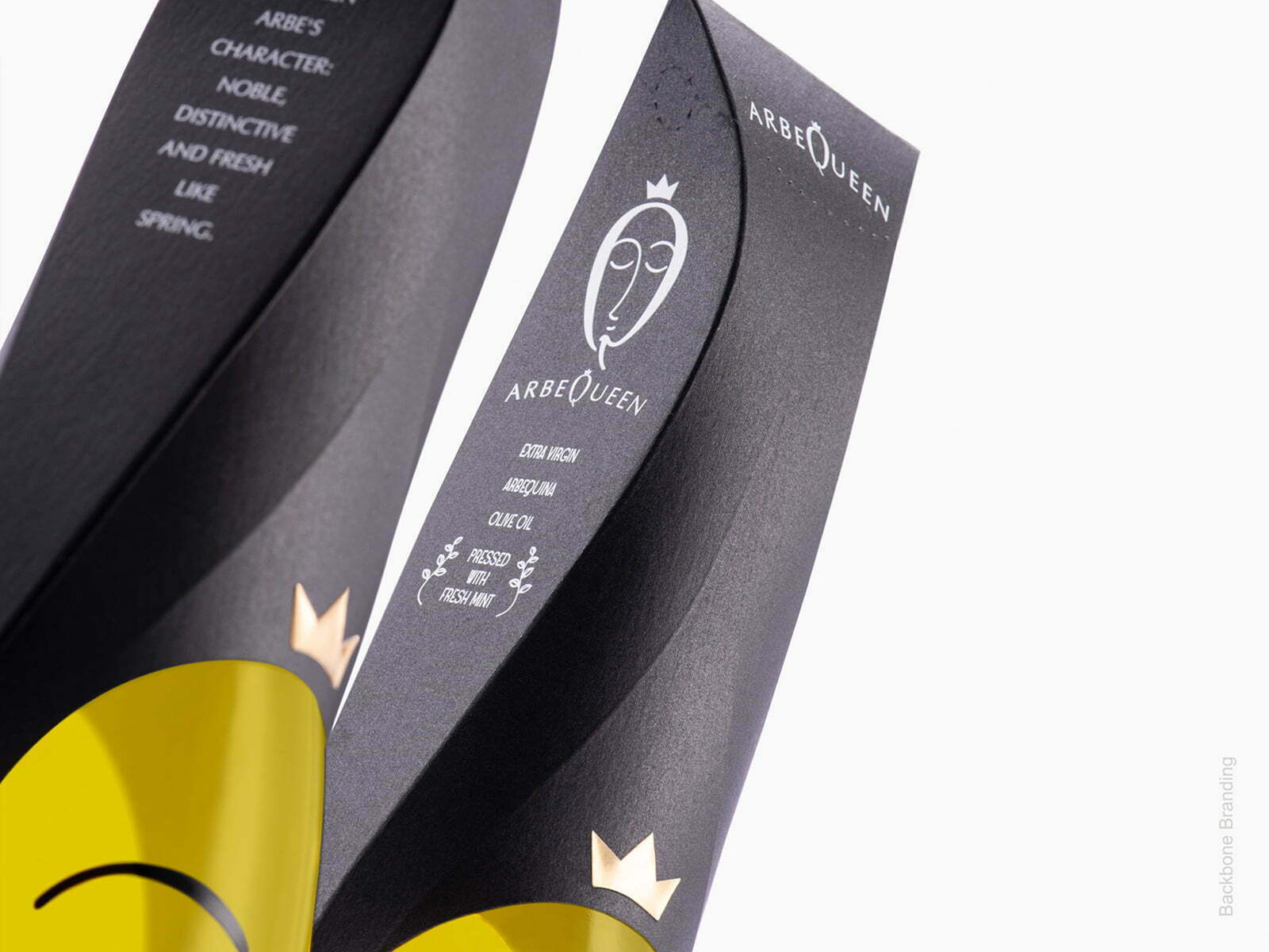
Arbequina is considered the queen of olives due to its unique taste and high quality. Another proof of Arbequina olive’s royal nature is the way it is harvested. It requires a special approach of harvesting by handpicking, one by one. Although small, we can extract a sizable amount of oil, which is frost resistant, and is adaptable to different conditions of climate and soil.
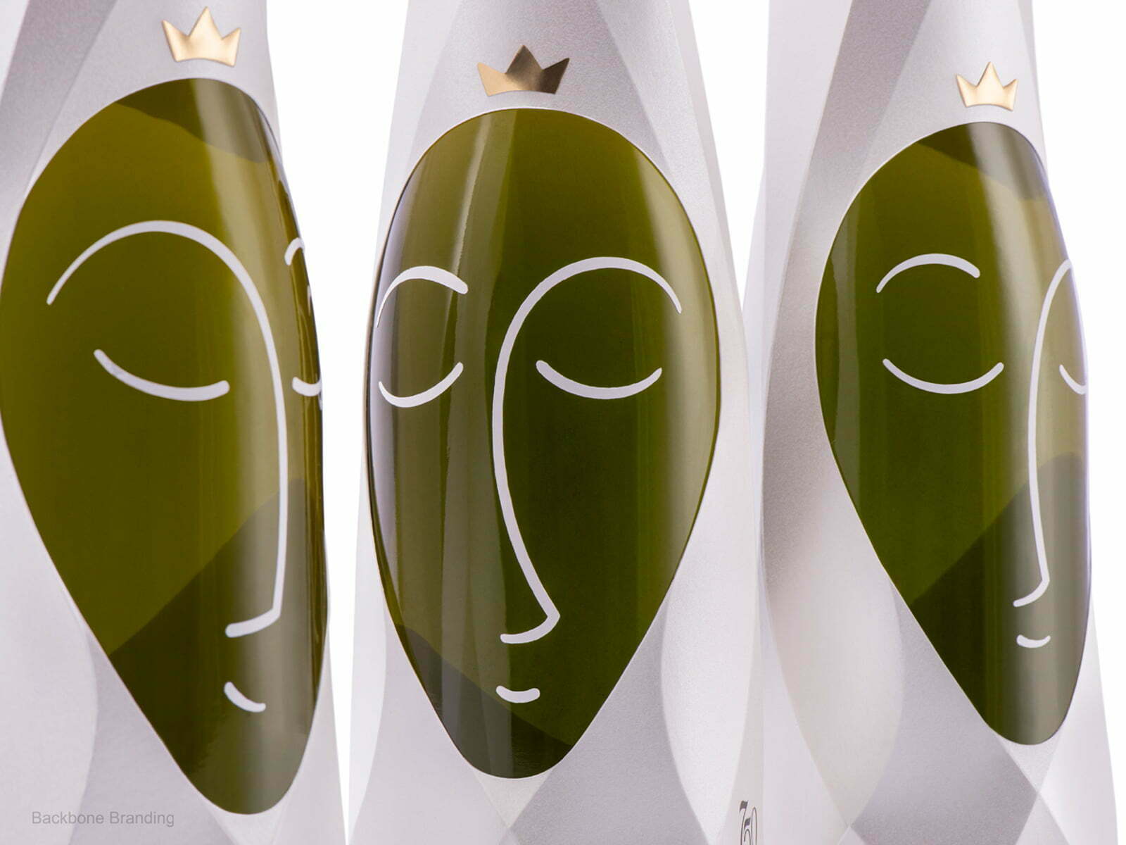
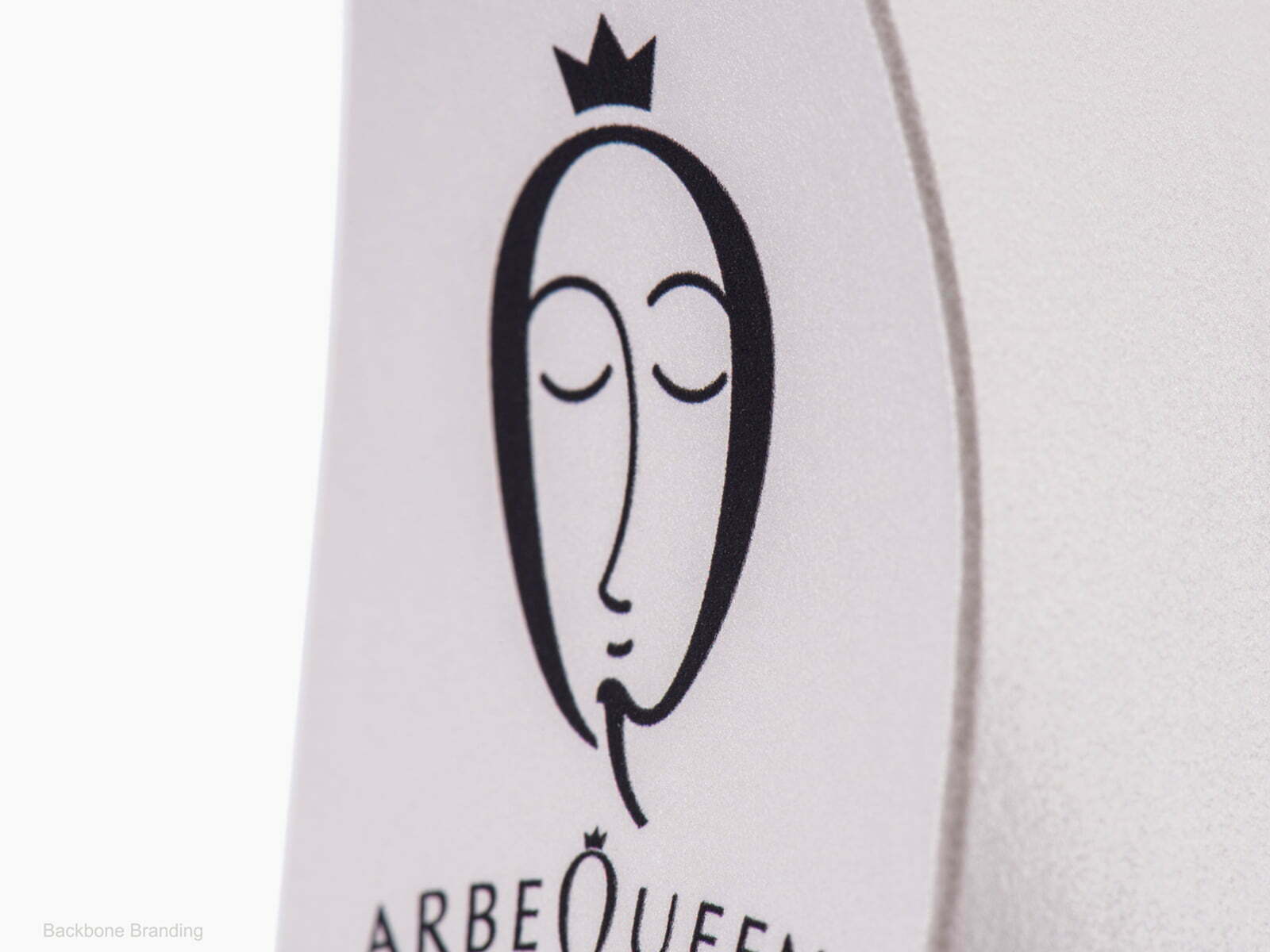
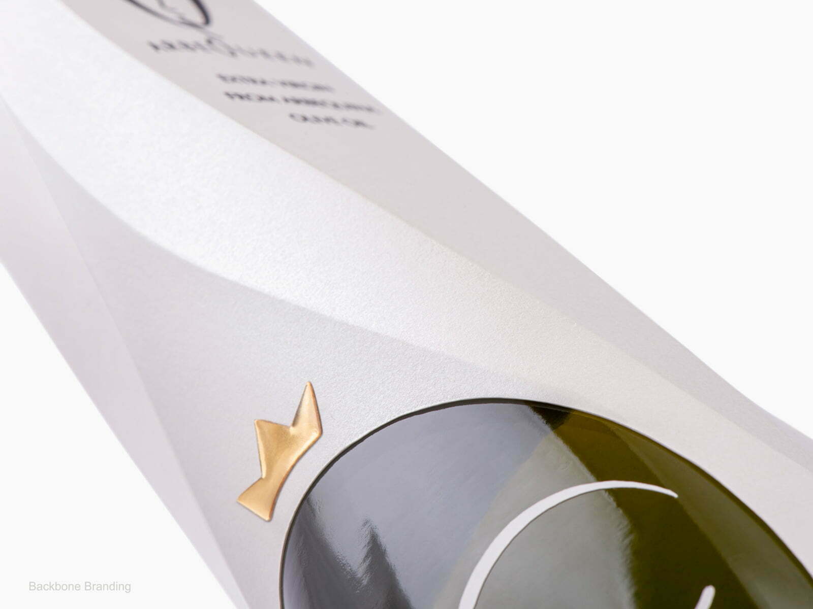
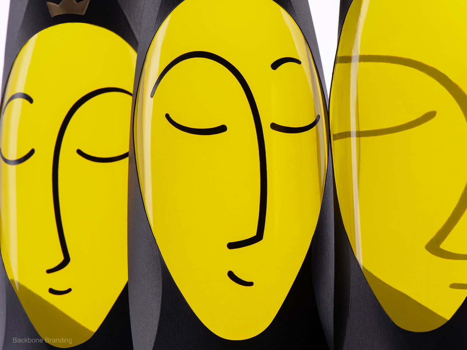
Accordingly, we decided to give Arbequina olive a character it deserves, a queen. We have depicted a crown, which emphasizes this unique oil’s advantages over the other similar products.
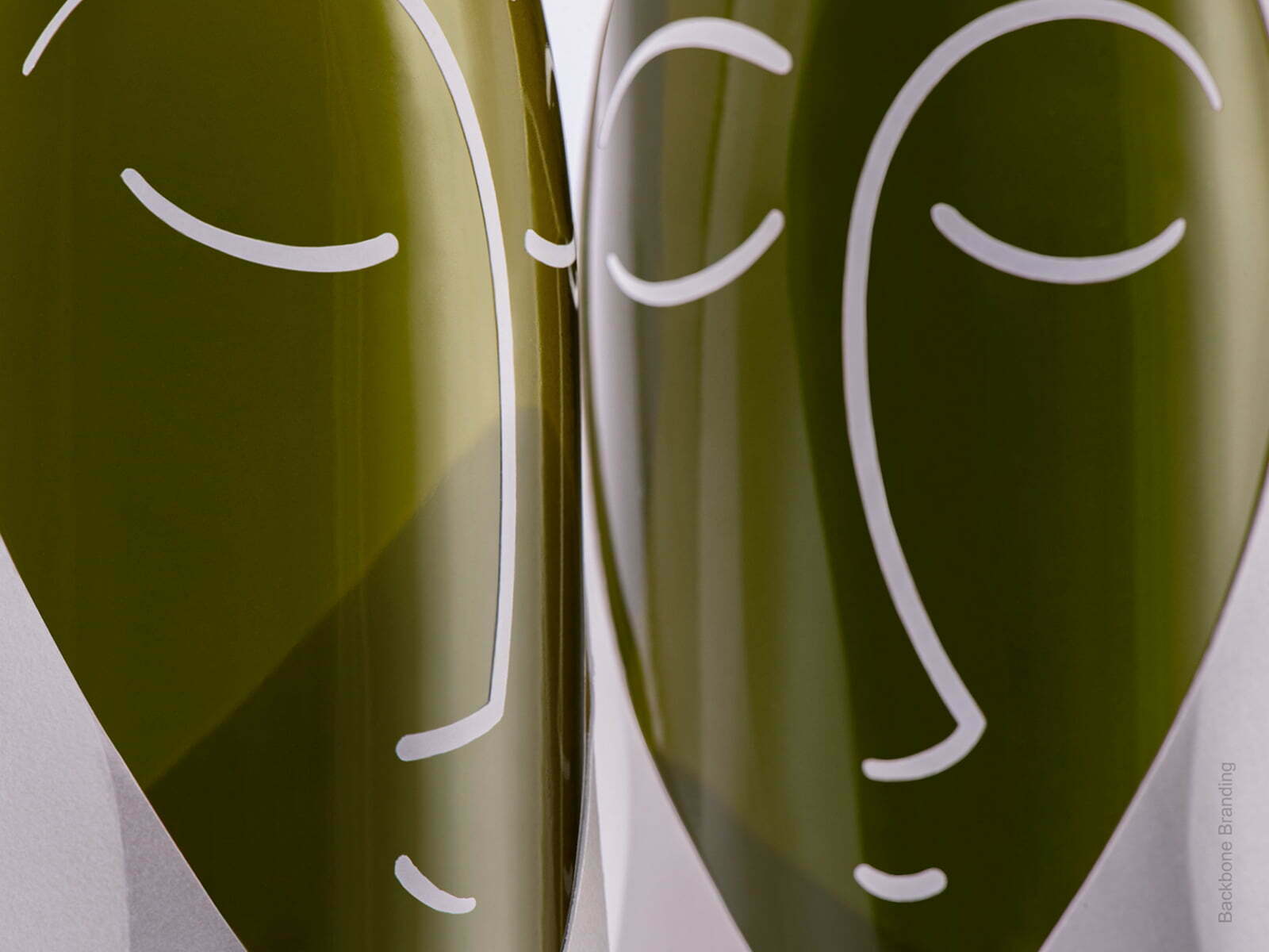
We gave the packaging the effect of a royal headpiece, through which the bottle is seen in the shape of an olive with a delicate illustration of the queen’s face, made of a whole piece of paper. It is meant to become a beautiful ornament in people’s routine.
THE RESULT
Therefore, with simple minimalist packaging, we depicted all the royal features that Arbequina olive oil has to offer. We have emphasized the taste differences through black and white packaging
The name was obtained through wordplay and reflects both the name of the olive and its royalty.