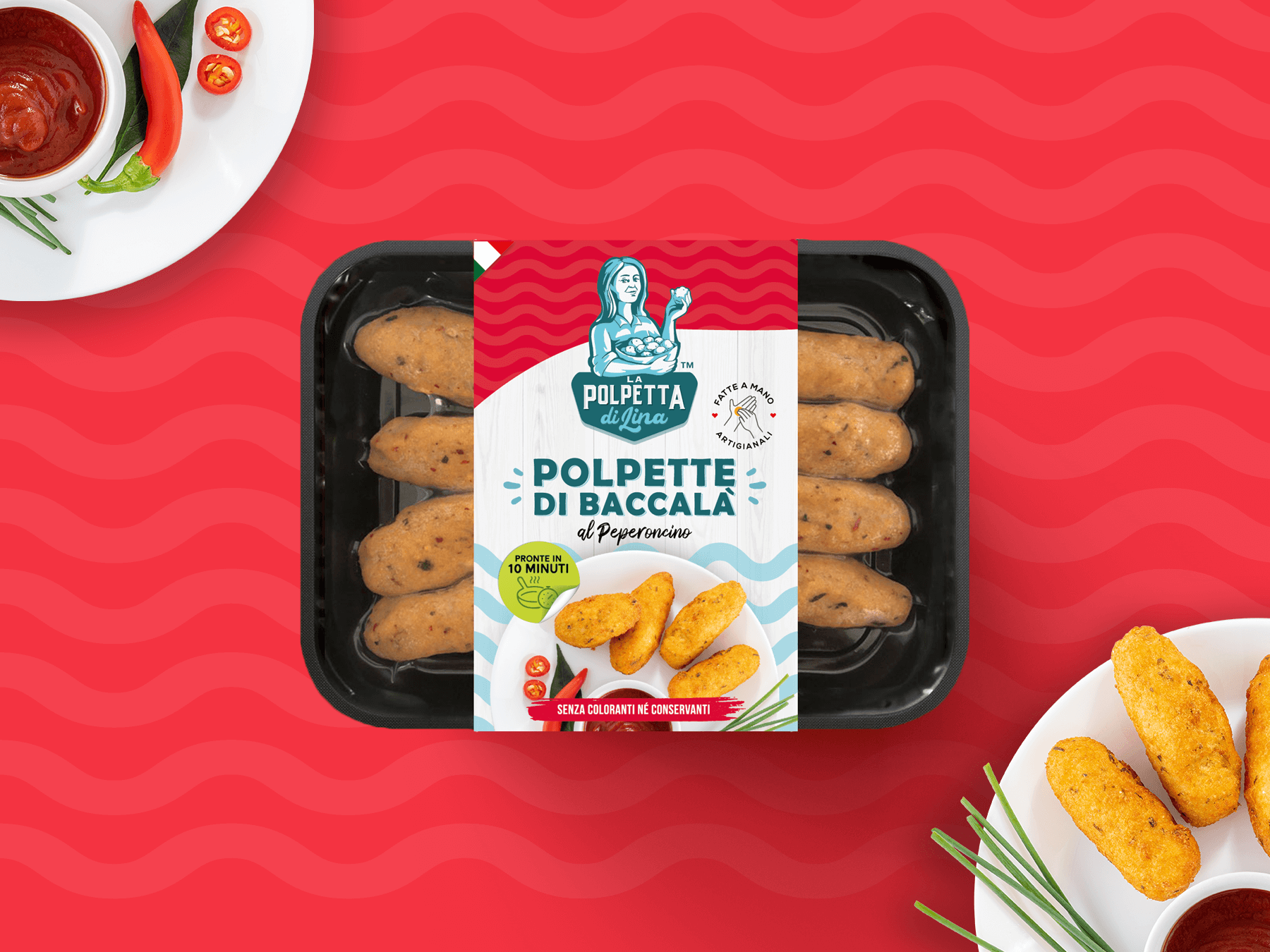
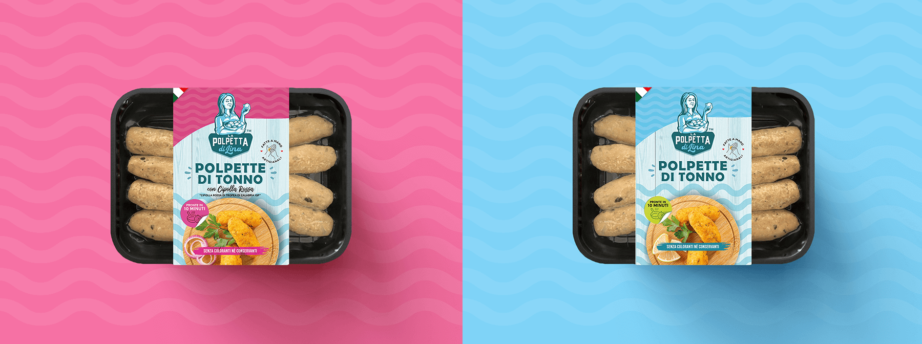
The processing of stockfish and cod is one of the typical culinary traditions of the province of Crotone, Italy. The Mesoraca family business has decided to market the typical codfish balls, using the recipe of Mrs. Lina, mother of the company founders. For this, they have chosen the “La Polpetta di Lina” as their brand name.
Studio La Regina took care of the image of the products starting from the creation of the logo, in which a similar but cartoonish portrait of the real Mrs. Lina stands out. All the recipes are curated by her, and paying homage to her directly in the brand allows underlining this unique feature of the product.
The packaging consists of trays, in recyclable materials, wrapped in cardboard strips printed with the information for conservation and consumption. Different background colors, all very cheerful and bright, help to easily identify the various flavors available: red for chili pepper, purple for eggplant, and so on. The entire design brings to mind the marine atmosphere, including elements typical of the white wooden structures that can be seen on the beaches of the Ionian Sea.