In the new age we live in, the competition for sales, branding and more effective communication with the audience has reached its peak.
Most insight business letters provide a better opportunity to compete with differentiation, and trying to look better and ultimately sell quality products requires different designs.
One of the most effective factors of a brand’s superiority over other competitors can be the packaging that both looks attractive to the audience and properly displays the product capability and ultimately leads to more sales.
Challenge:
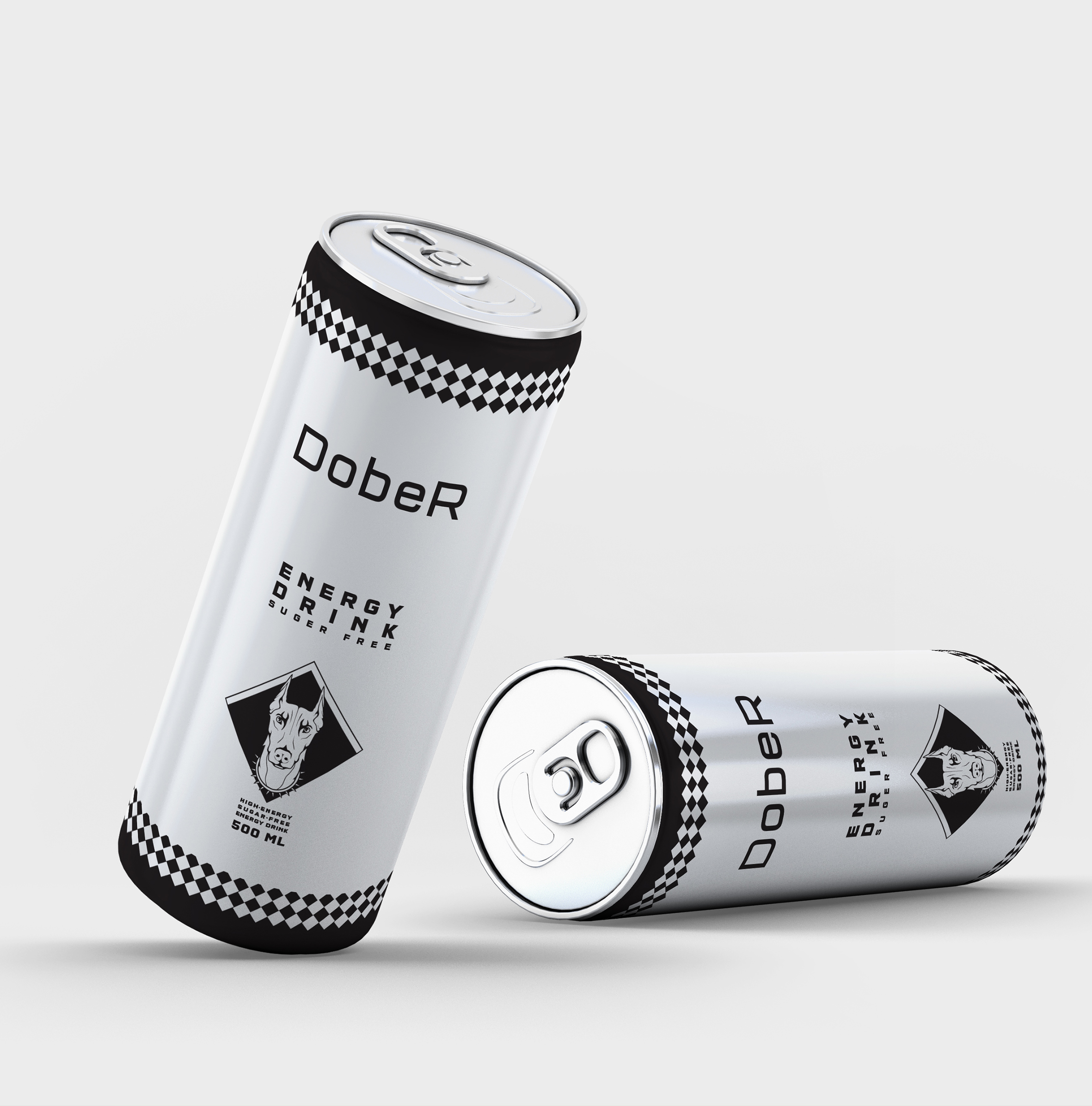
“Dober” energy drink is a new brand that emphasizes simple design and as a result, white and black colors in a simple space with white focus in the background and separation of information and design in black and create a contrasting atmosphere that contrasts with the design style. Makes it easy to see on store shelves when the product is on the shelf next to other competitors and the customer has an easy choice.
Due to the nature of the designs and symbols, the use of the image of the “Doberman” dog in the center shows the great power and energy of the “Doberman” dog breed. The use of this image conveys that feeling.
Black is used because of the most common color in this breed as well as the pure sense of the dog that can be placed in the background with white.
At the top and bottom edges, the two colors contrast again, and the design of the dog collar design is located at the bottom of the design, which integrates the whole design.