NOTRIX Pharmacology Company has been behind the scenes for many years in the field of supply and production of necessary and important pharmaceutical materials, raw materials, medical products and special drugs. In the spring of 2020, it was decided to introduce 4 new products to the market. The production and raw materials of this product were of very high quality, so it must also have proper packaging.
Usually, white or monochrome designs are used in the designs of pharmaceutical products.
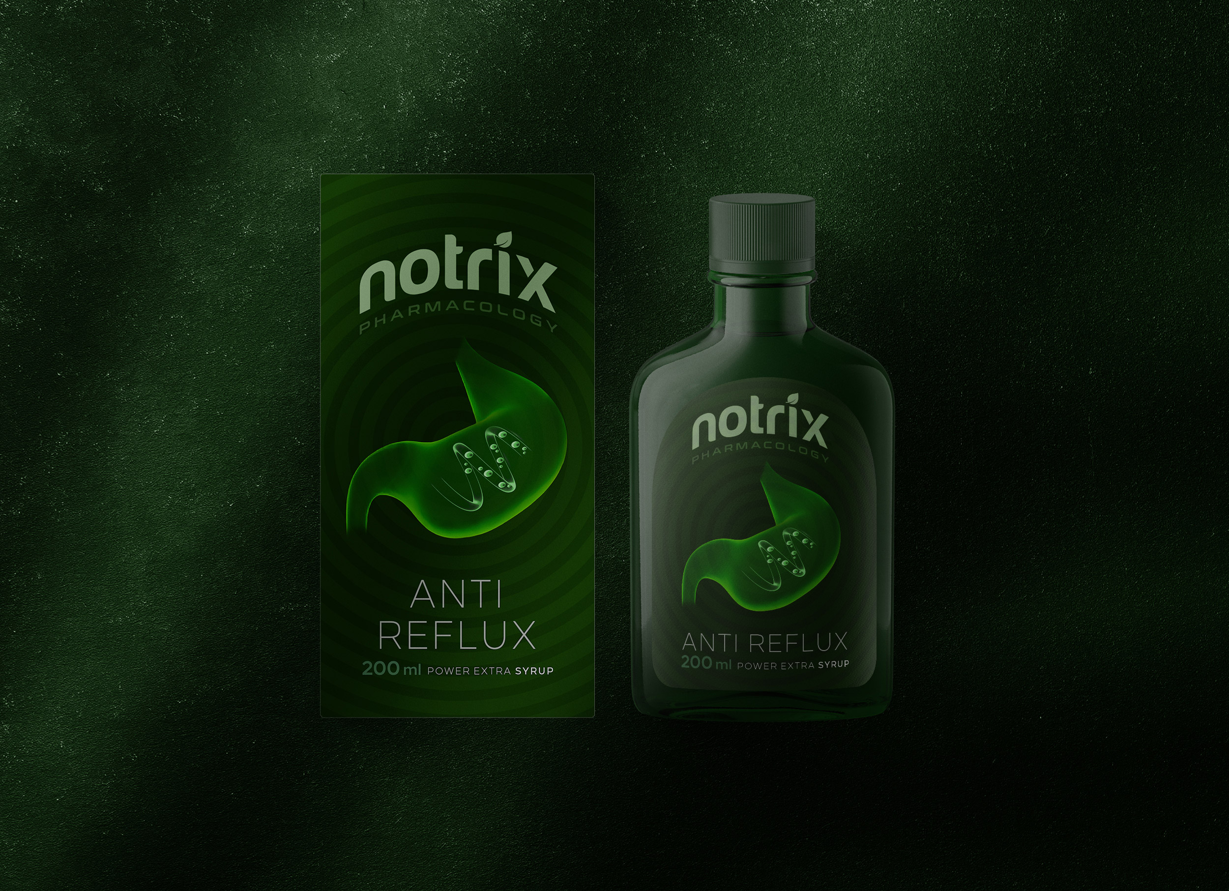
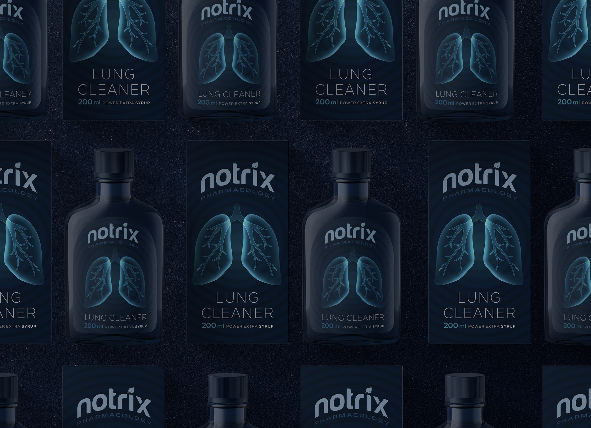
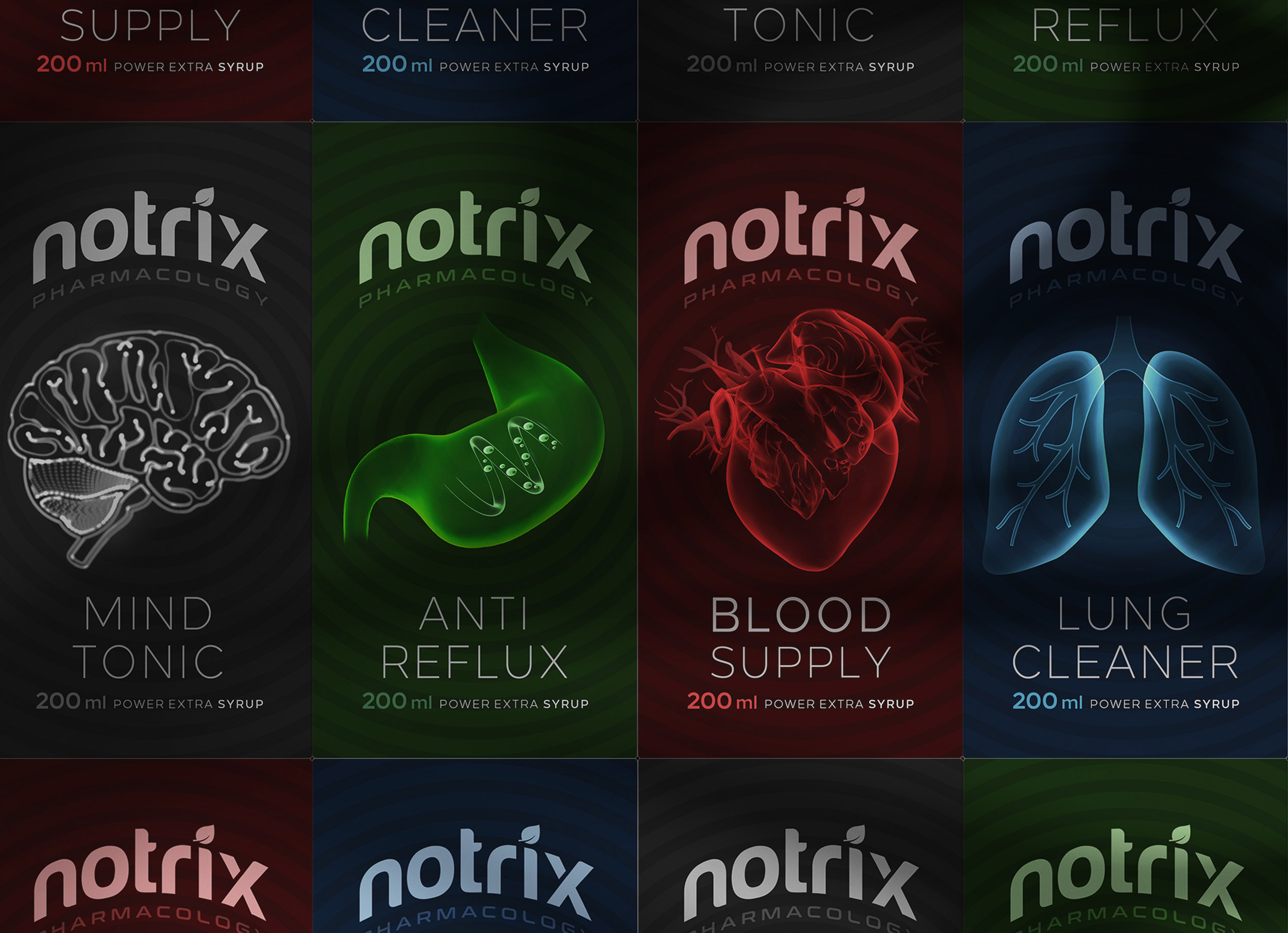
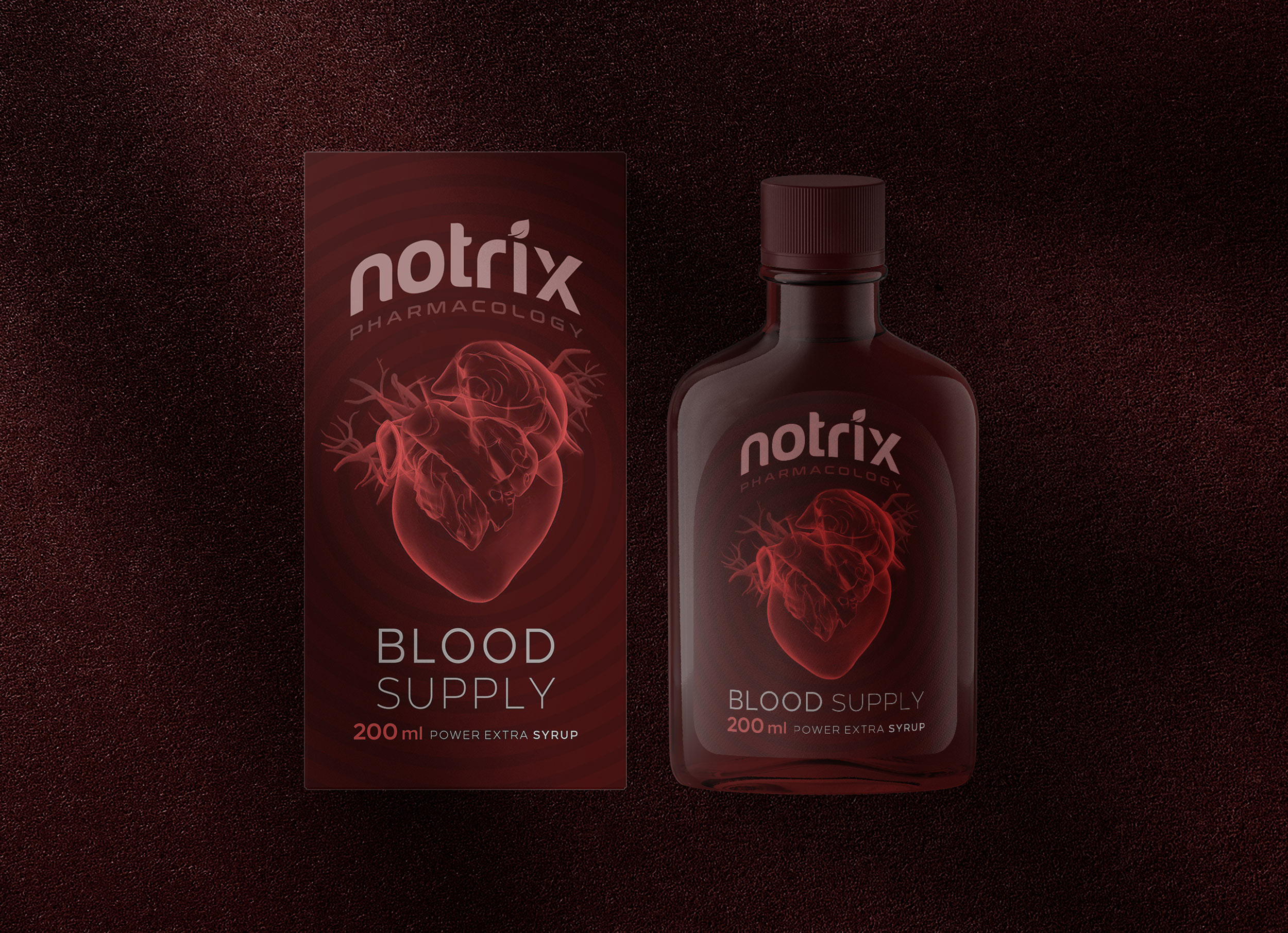
After much research, the use of dark colors was the idea and request of the client, which should have been included in the original idea of the design, because it had a great impact on the showcase of similar products. For this reason, in the initial idea, we based all products on dark colors.
The packaging design of the new products was the responsibility of the design team of Metis Studio. We had to present an impressive design on the first entry into the market. Product development was a very attractive challenge for us, which was done well.
Illustration played an important role in the showcase, so with the best elements and the least detail, we had to choose the best design. Finally, we combined the composition of the part of the body that was affected by the drug to the process that the drug was doing to reach the final image. The pagination and writing of the product were also important to us, so the simplicity and minimalism of the design helped the audience to reach the product at first glance.
The use of boxes for glass bottles was complementary to the placement of catalogs and how products were used. Also, the use of strong and high heat material was a priority and important item in this package.