In the new age we live in, the competition for sales, branding and more effective communication with the audience has reached its peak.
Most insight business letters provide a better opportunity to compete with differentiation, and trying to look better and ultimately sell quality products requires different designs.
One of the most effective factors of a brand’s superiority over other competitors can be the packaging that both looks attractive to the audience and properly displays the product capability and ultimately leads to more sales.
Challenge:
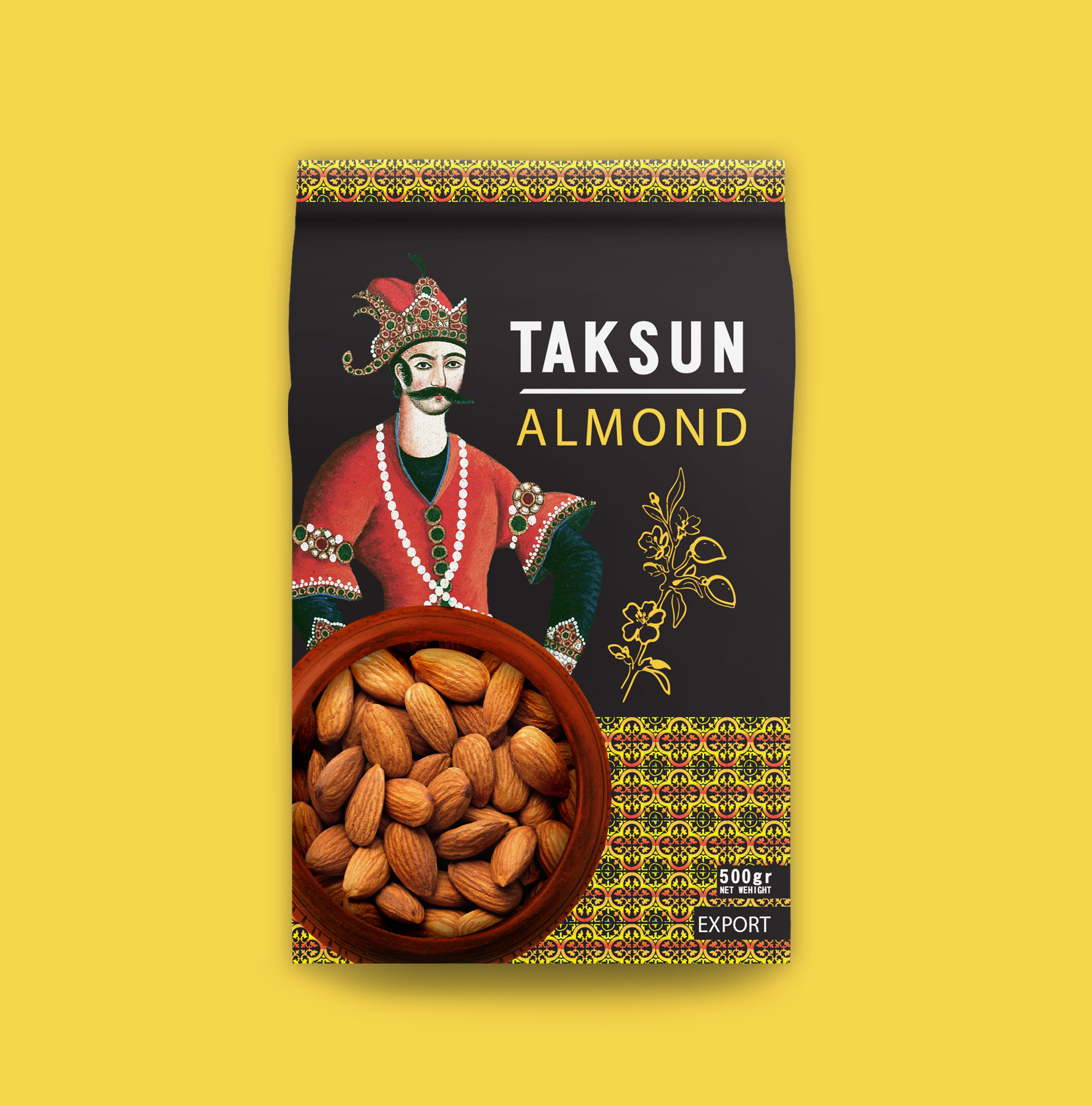
Since almond is one of the products that is grown in Iran and to export this product, packaging was needed, which in addition to being attractive to the audience, must be accompanied by Iranian culture and identity. Let’s get to the packaging, which in addition to high visual appeal, also expresses the identity of the country of manufacture of this product.
At the top and bottom of the design, the symbol of the Iranian tile with the color of the product, namely almond, is used, and also the Iranian prince is one of the Qajar princes, which is one of the symbols of culture and history. Iran, and since Iran is one of the producers of almonds, coordination has been made in the field of product and packaging. To the left of the vector image, a branch of the almond tree with its fruits is a symbol of a crop tree, and the overall dark color of the packaging is used to distinguish the design and the back.
And there is a high degree of product selection on store shelves that helps to sell more products in the end.