Do you remember when you were a kid? When after school, you headed to the kitchen at home and you ate your “merienda”. And then, after that, you when to play with your friends (if you had no homework); they were moments of pure joy, right?
In Mexico, we usually eat mango with our bare hands, getting fingers and face completely dirty (but tasty) that is something unavoidable, that is a sign that you enjoyed it.
—
Packaging & Visual Identity
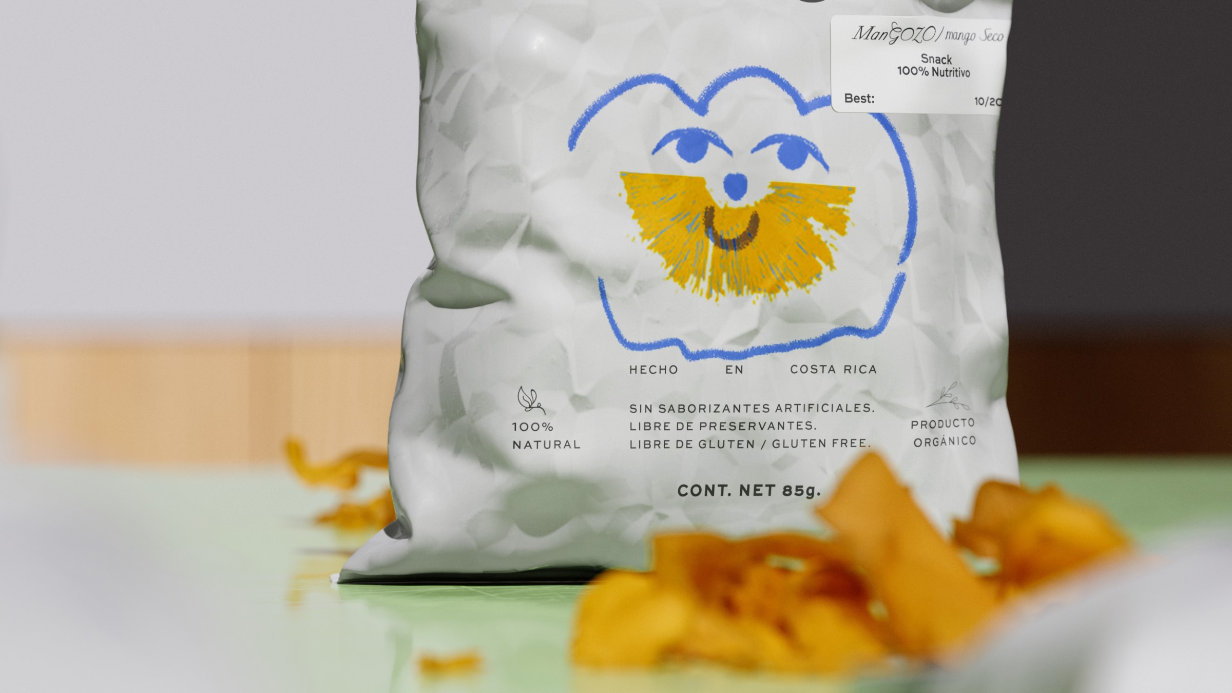
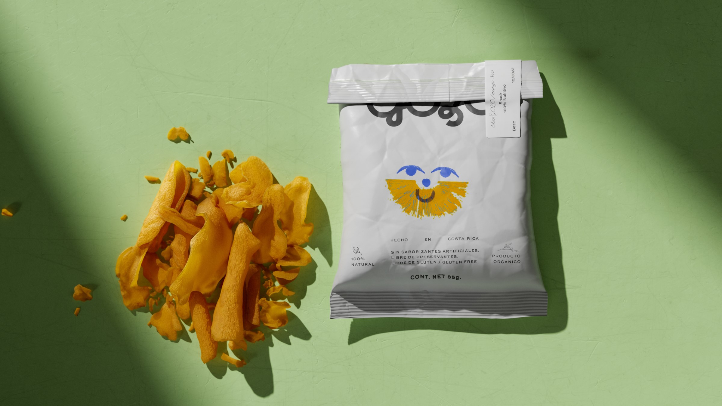
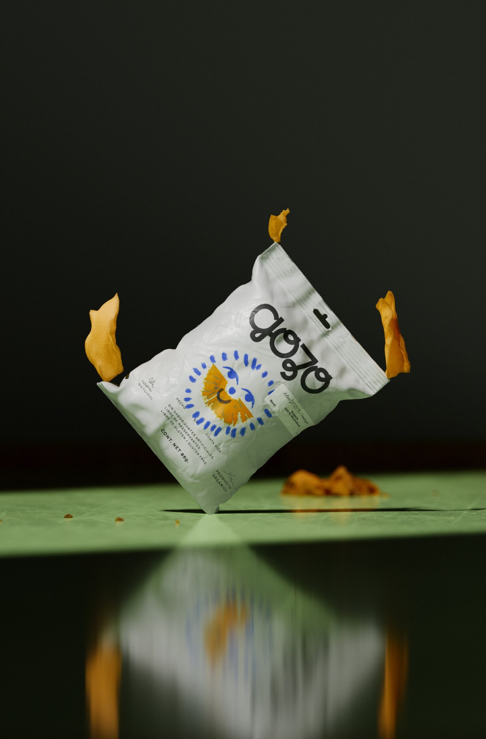
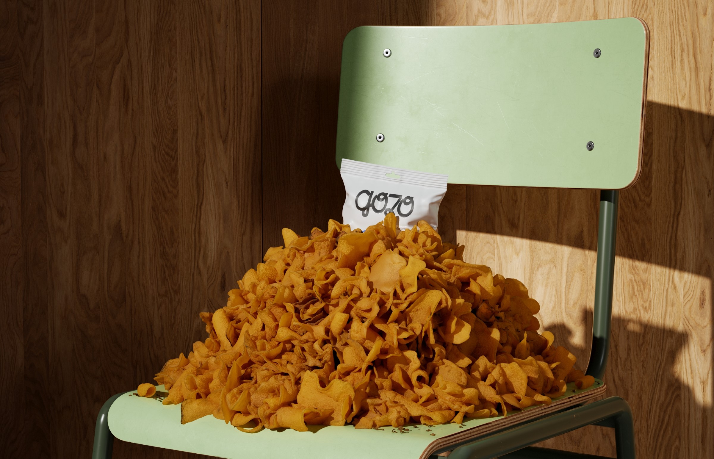
Mangozo (Gozo for “Joy” in Spanish) is a brand from Costa Rica which aims to revive those moments of your childhood, bringing back that experience into nostalgic snacks. They keep them as tasteful as fresh mangos; selecting the less handsome fruits that big brands do not accept on their shelves, and only bought from fair-trade, completely natural grown mangos.
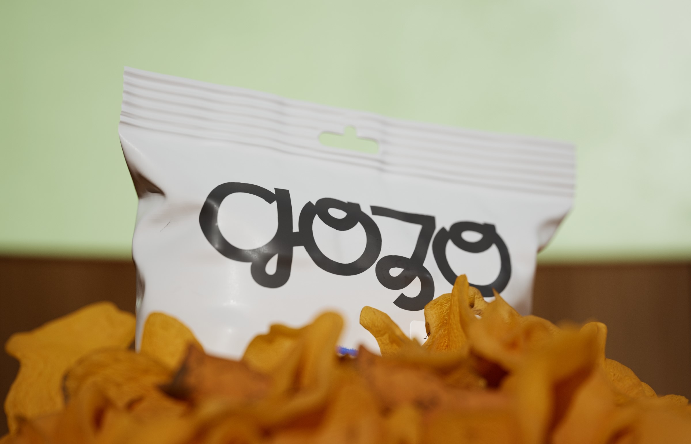
The packaging of Gozo recalls our childhood with a semi-dynamic visual language that invites you to take a pencil and play as the kid you use to be. The bag showcases a drawn slimily face full of joy with the face completely covered by mango. And you must finish that drawing, expressing yourself the way you want, making this moment of retrospection a time to enjoy.
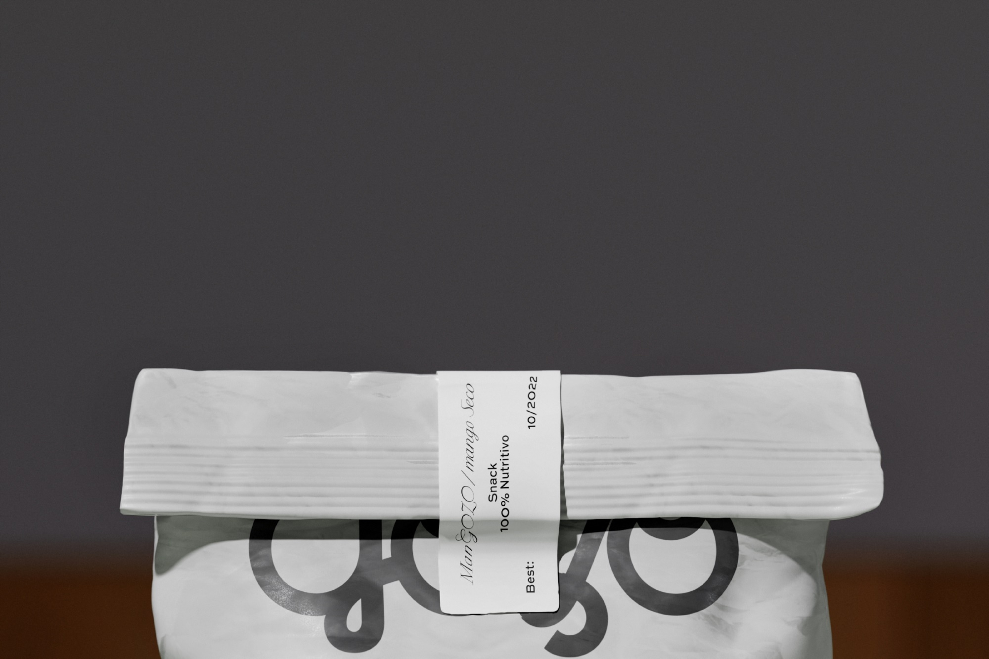
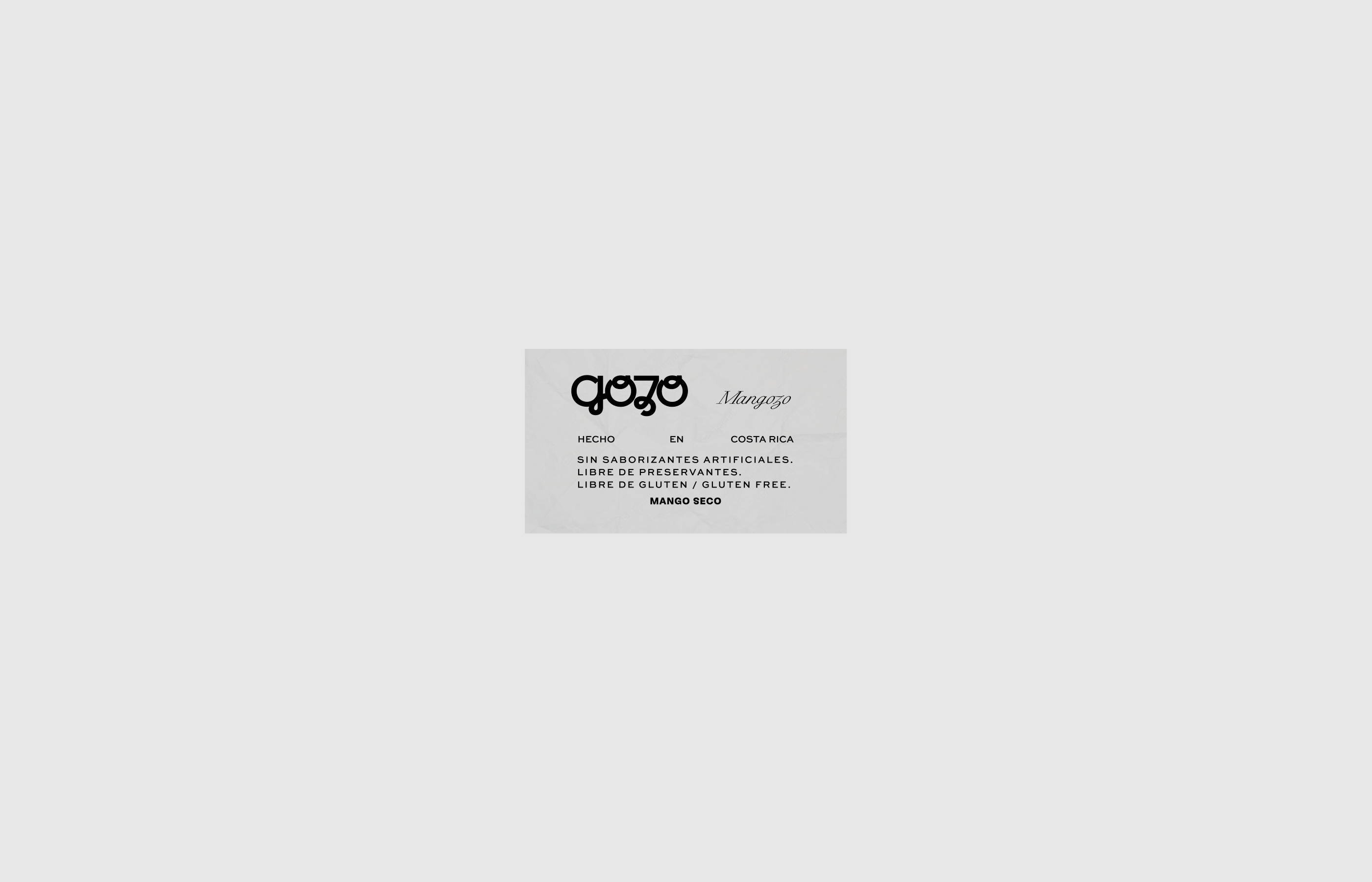
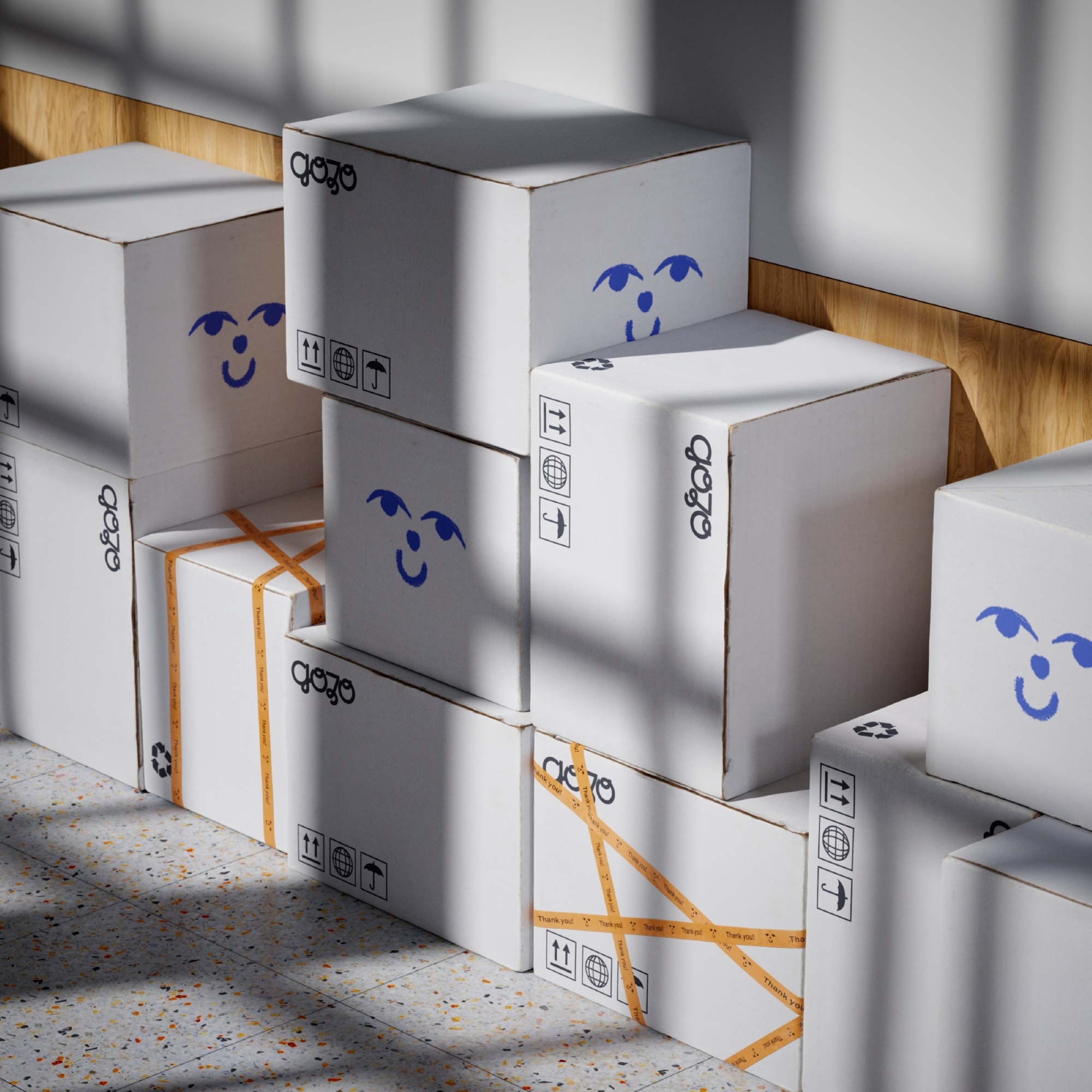
Since this is a product to bring back the childish feelings of adults, we designed a simple and playful typeface for the logo that contrasts with an elegant and mature font selection. A sticker is added to the side of the bag that consumers can peel it off to close the packaging if they leave leftovers for later. We want you to get your face dirty, not your pockets.