In the new age we live in, the competition for sales, branding and more effective communication with the audience has reached its peak. Most insight business letters provide a better opportunity to compete with differentiation, and trying to look better and ultimately sell quality products requires different designs. One of the most effective factors of a brand’s superiority over other competitors can be the packaging that both looks attractive to the audience and properly displays the product capability and ultimately leads to more sales.
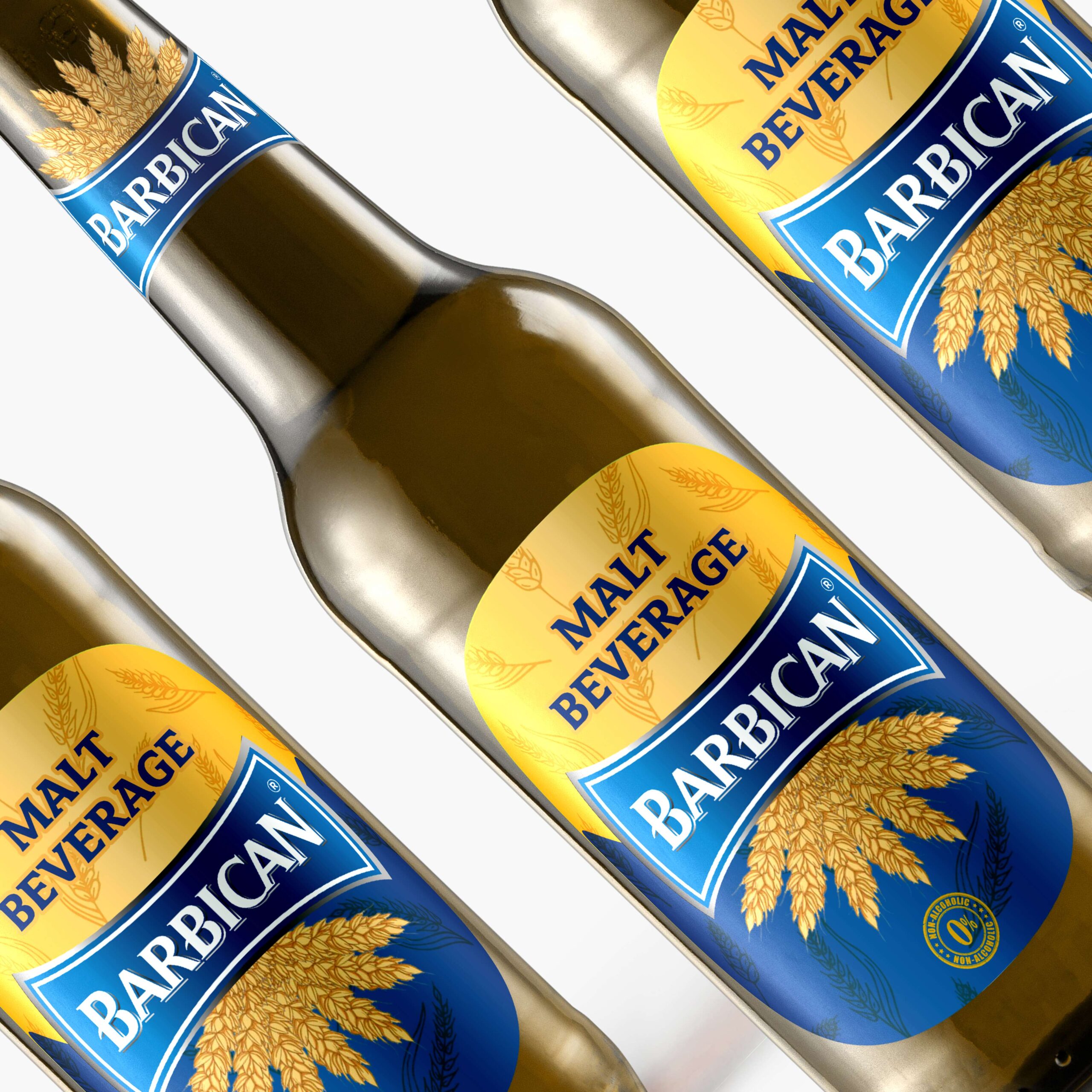
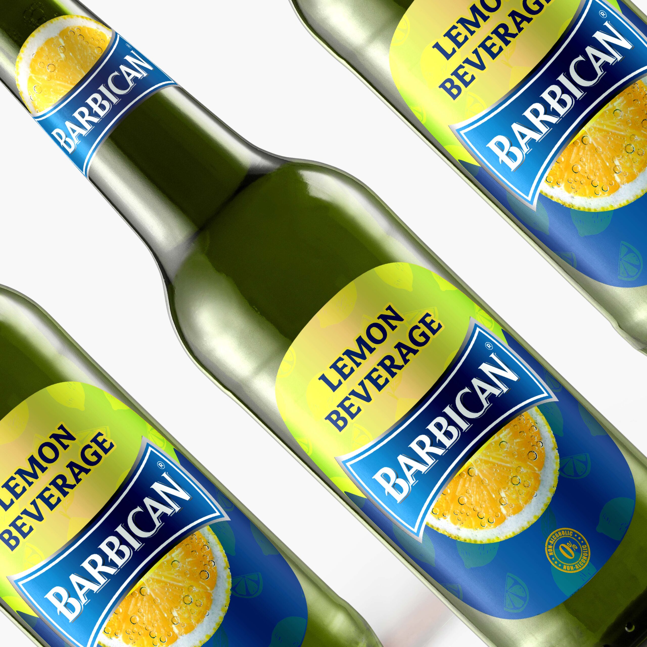
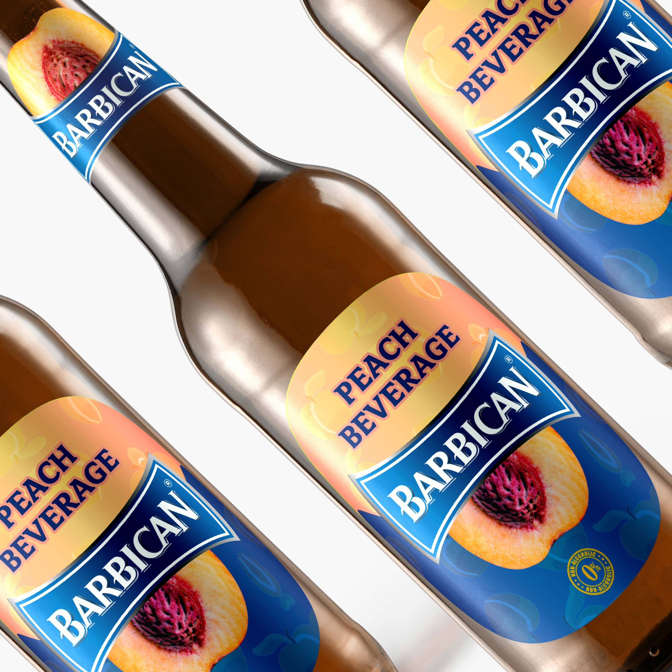
Packaging Challenge: We tried to make a difference in the redesign of Barbican bottles, but in the overall product framework, there was more variety in the three flavors of peach, wheat and lemon. In designing the label, we changed the design to two parts, in the lower parts of which the blue color of the brand is used and in the upper half, the color of the product’s taste is located. Peaches are used for drinks Peaches, wheat for wheat drinks and lemons for lemons. Also in the middle of the label is the brand logo, below which is the image of peach for peach, lemon for lemon and wheat for wheat drinks. The customer knows the taste of the bottle and makes it easy to choose, and we avoid the clutter of separate text, and only the logo and the image of the product on the neck of the bottle are used to redefine the taste of the product. . .. which facilitates quick selection in shop windows. This project was an experience and a concept work for me.