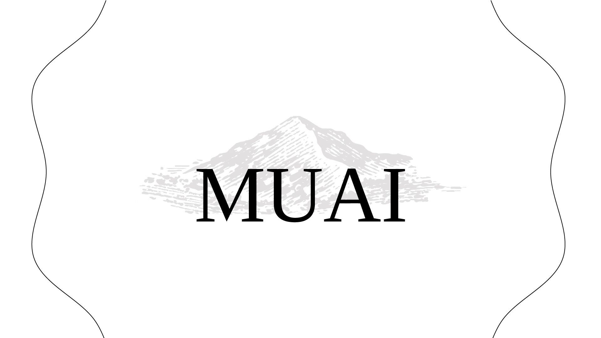
The MUAI brand, whose name emerged from the union of the sound of the cow’s moo (mu) with a popular term widely used by people living in the state of Minas Gerais (uai), was born from a concern of its founders who sought to build a dairy company that prioritized animal welfare and delivered a product of the highest quality to its consumers.
To obtain this result, it was necessary to combine the excellence of the mountain milk produced on the Bom Retiro farm, with the technology and innovation of processes that a new brand requires to consolidate itself in the market.
Within this ecosystem, all actions are planned and executed daily to keep the production cycle aligned with sustainable practices that respect nature and especially animals, which must be observed from birth to milking.
Process automation guarantees the quality, benefits and freshness of type A milk, which is reflected in an excellent raw material.
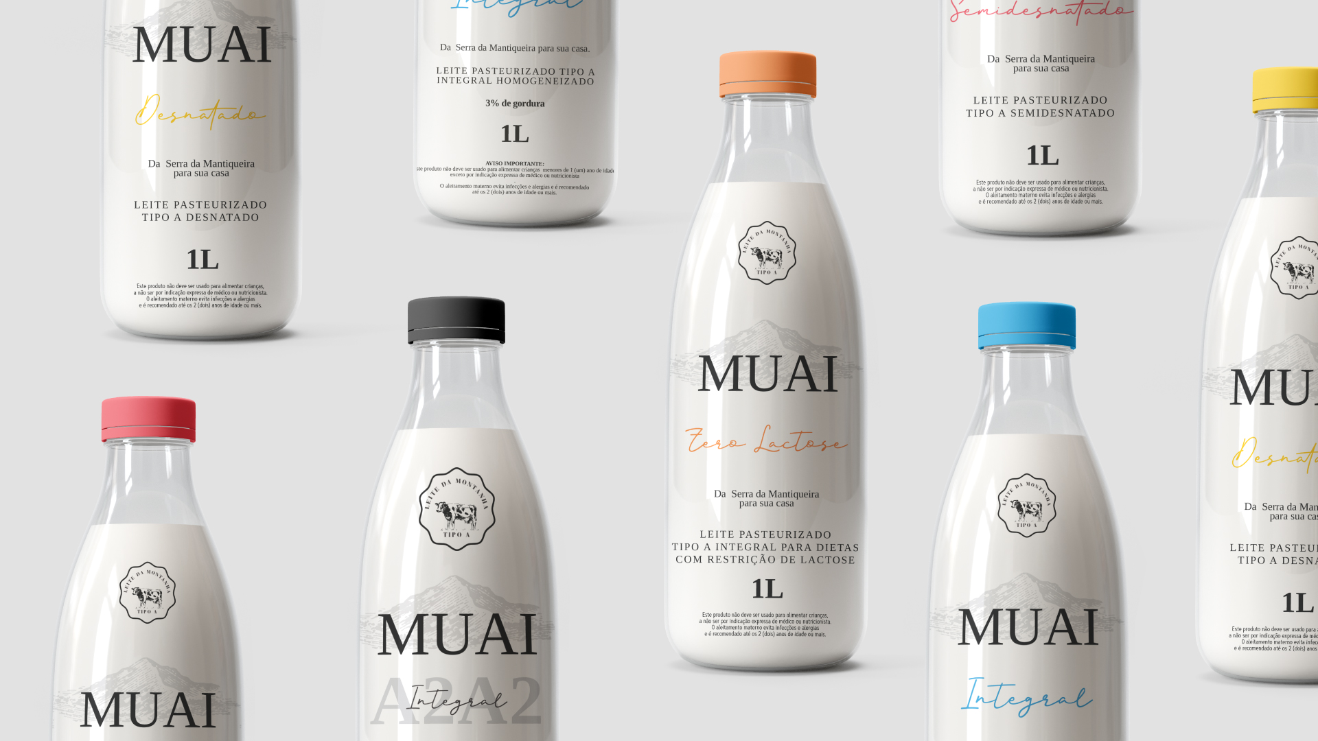
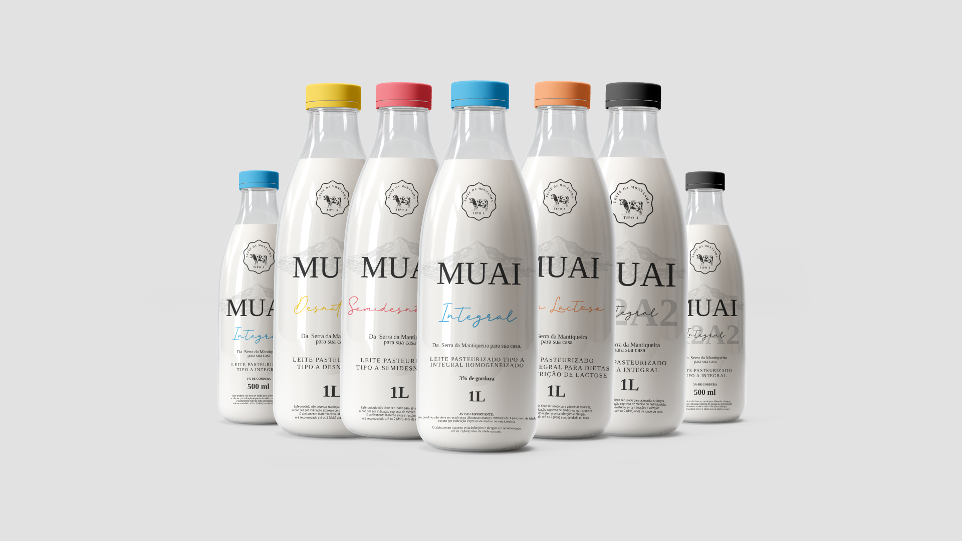
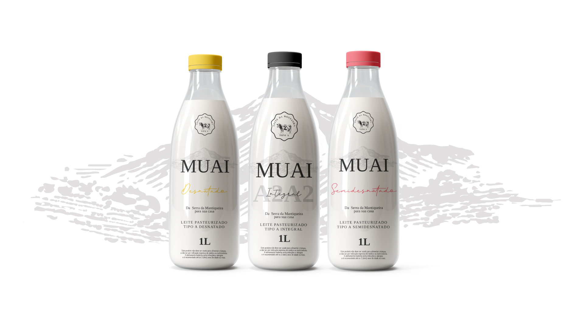
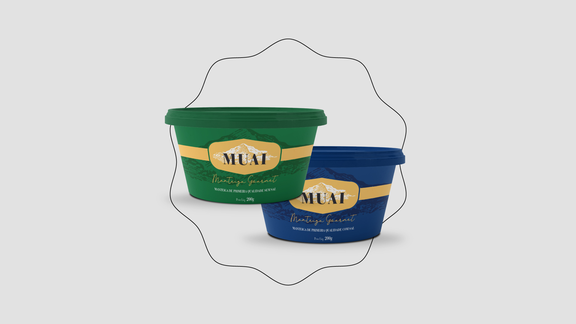
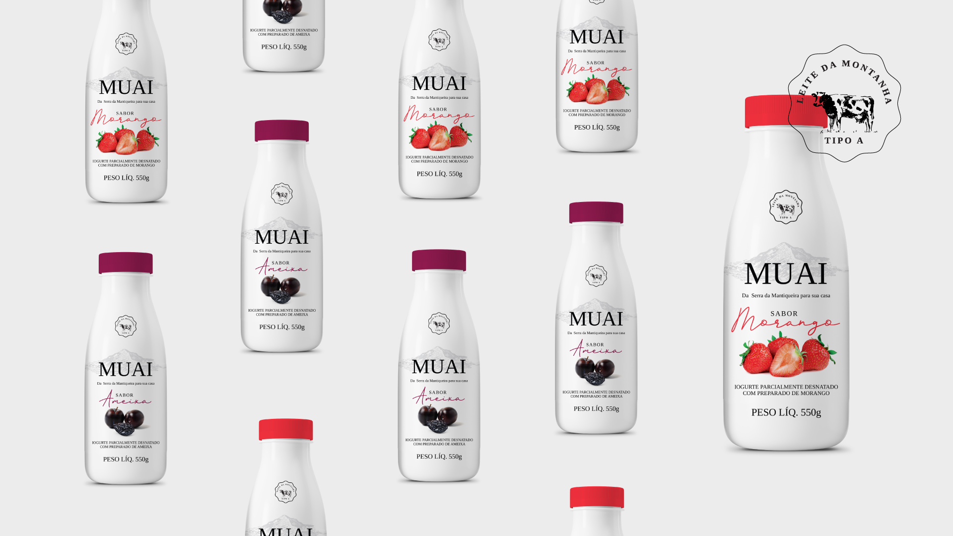
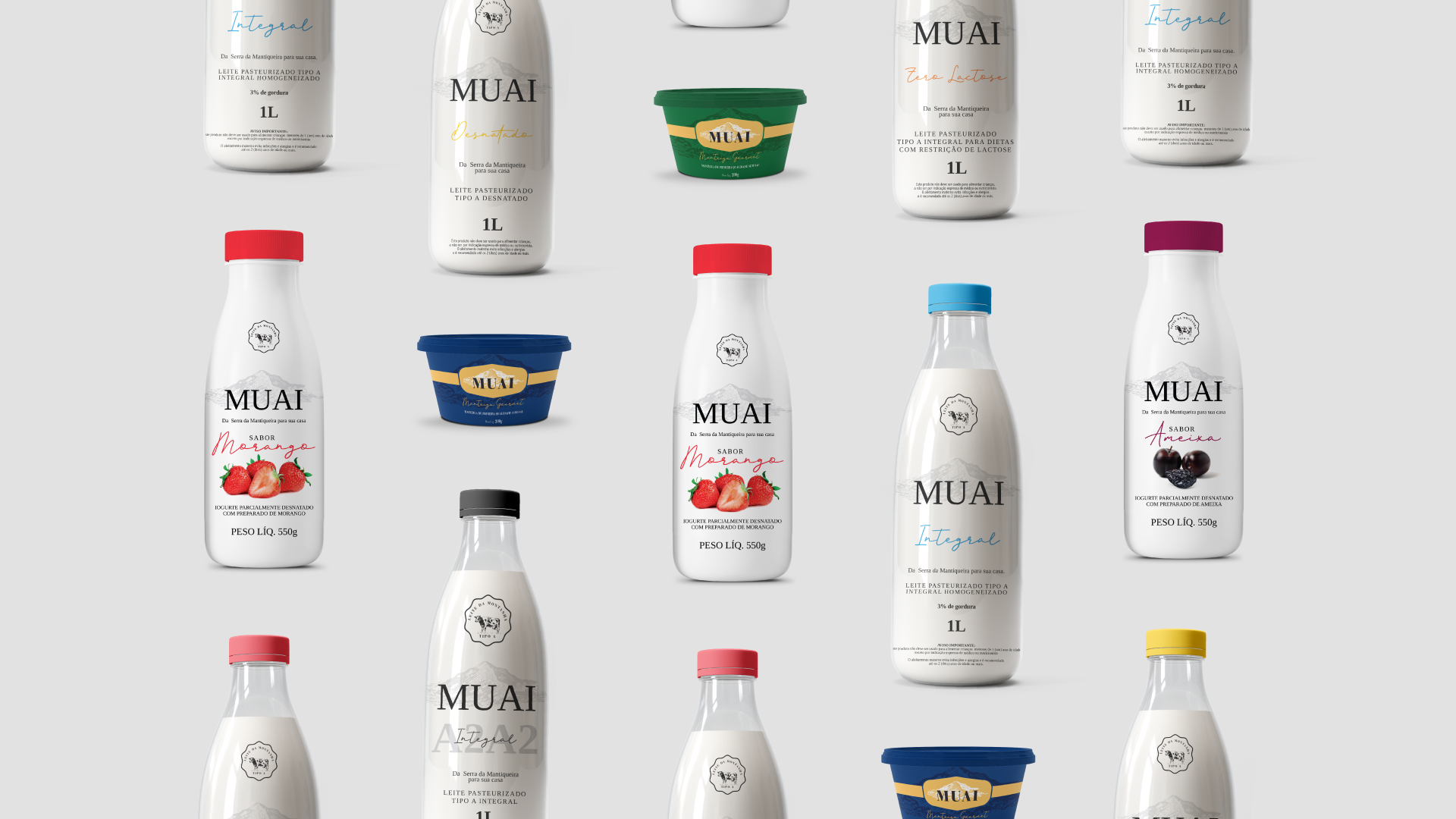
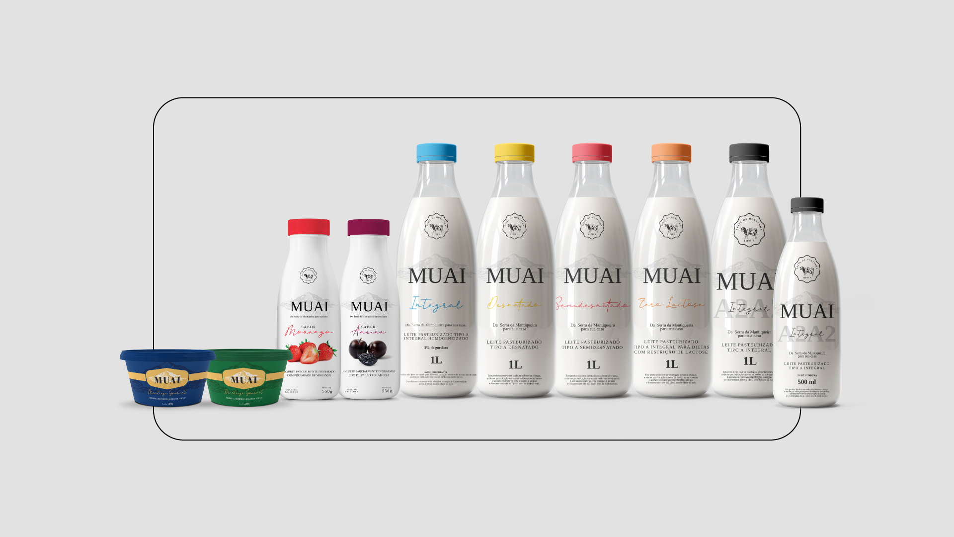
The brand’s product catalog has a line of milk (whole, semi-skimmed, skimmed and A2A2), butter (salted and unsalted) and yogurt (strawberry flavor and plum flavor).
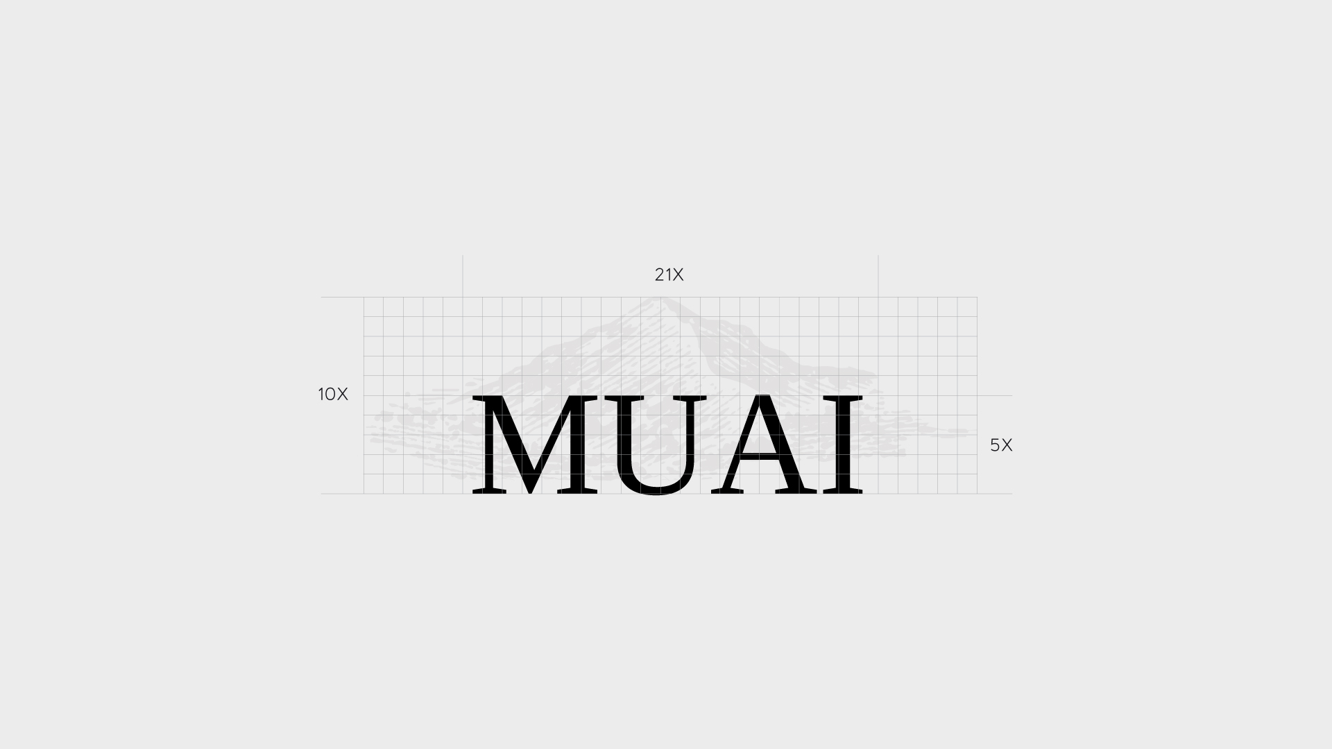
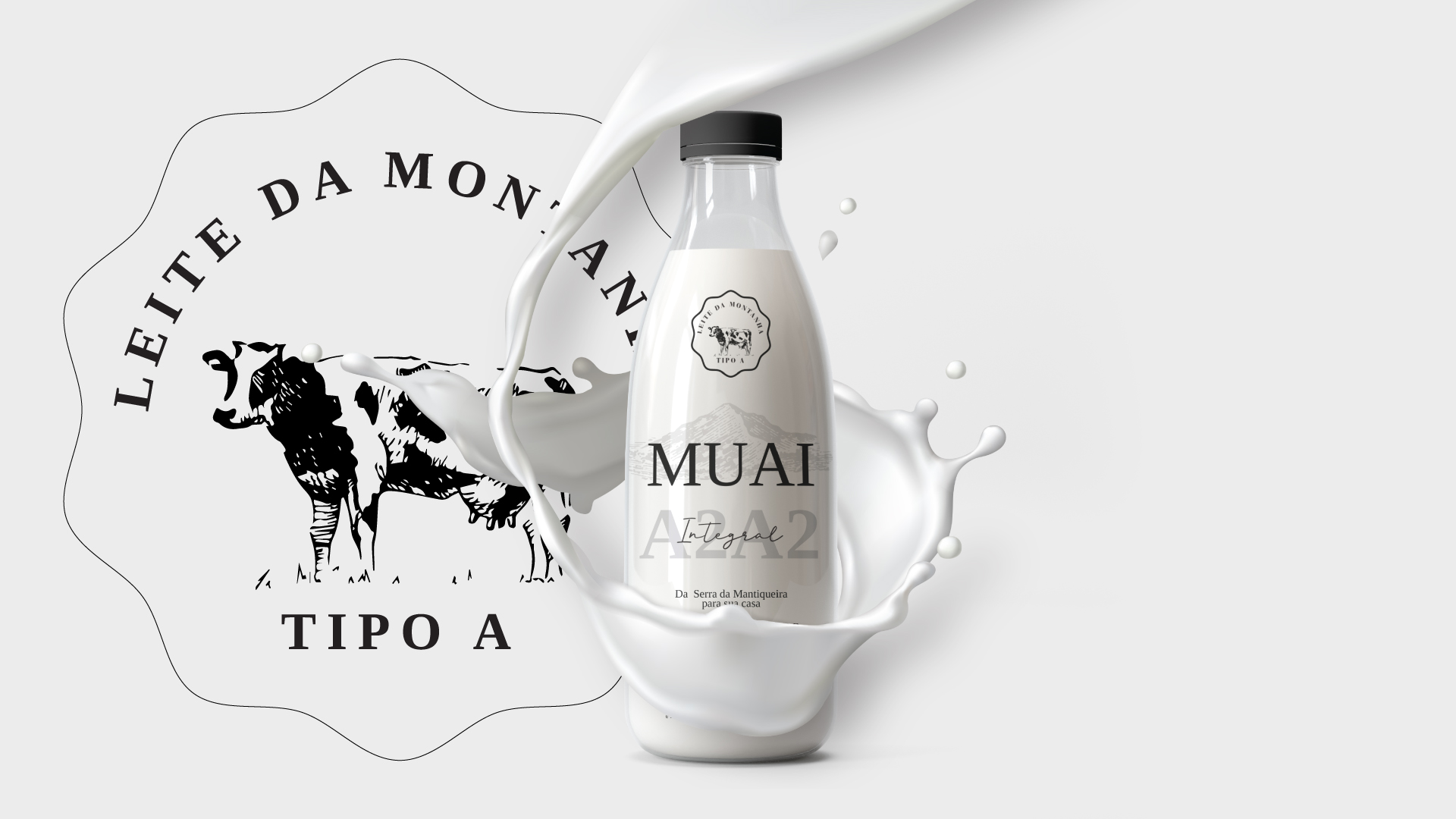
For the visual identity, a minimalist language was adopted to highlight what was main, in this case, the brand logo in capital letters and behind the illustration of Serra da Mantiqueira, where the farm is located.
The variety of colors was also a strategy to highlight the product on supermarket shelves, discreetly and effectively. For this, we opted for bright colors and little used in the dairy sector, as is the case of orange and black.