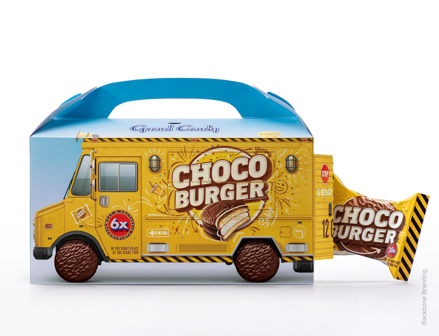
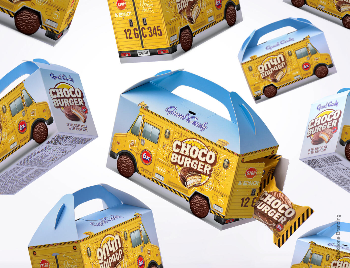
Jump on for a fun-filled trip as we deliver the new breaktime favorite, the CHOCOBURGER! We have created packaging that looks like a fast-food delivery truck, just the right vehicle for burger deliveries, and we know that these days a quick burger is just what everyone is after when they have a break.
The truck has been created with the intent to become a brand icon for this product. The words: “In the right place, at the right time” are a statement to alert anyone to put in their orders for an exciting and quick new treat.
The truck is painted yellow, as yellow is an appetite-stimulating color, associated with the source of energy, and is widely used in the fast-food industry. The image of chocolate cookies instead of wheels conveys the idea of energy and motion.
The packaging design also serves as a bag, allowing the customer to leave the store without having to purchase an additional bag.
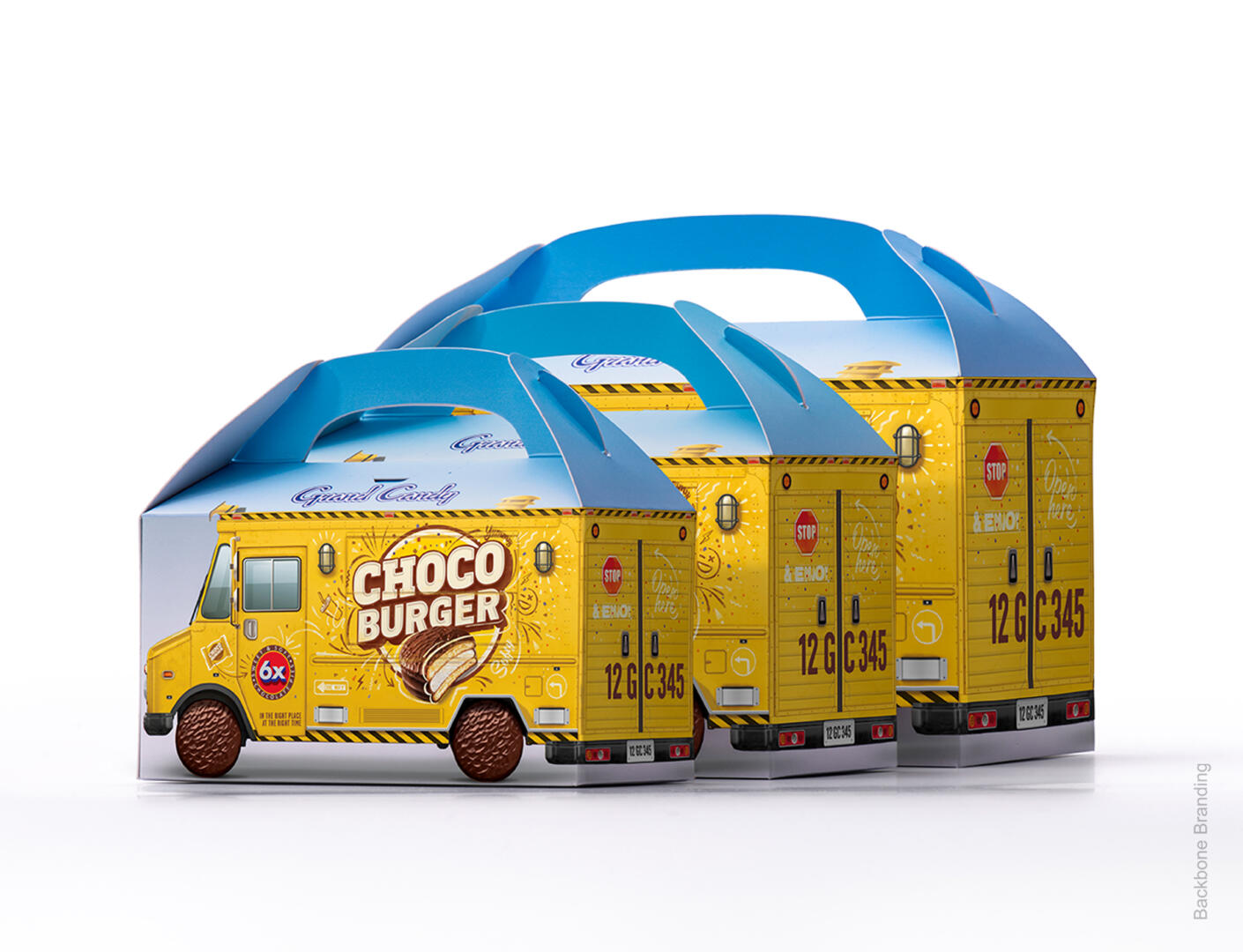
We designed takeaway packaging with interactive ideas and selected colors especially to attract active young people, children, and teenagers.. By making it the size of a toy truck, and attaching a handle to the top, the sweet truck is in the hands of its driver as they “drive” on their way.
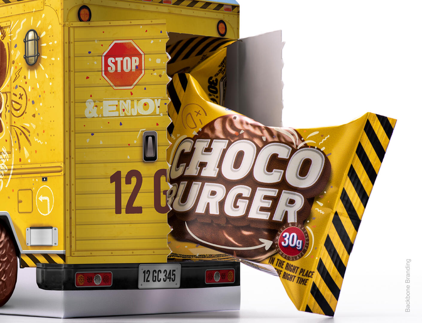
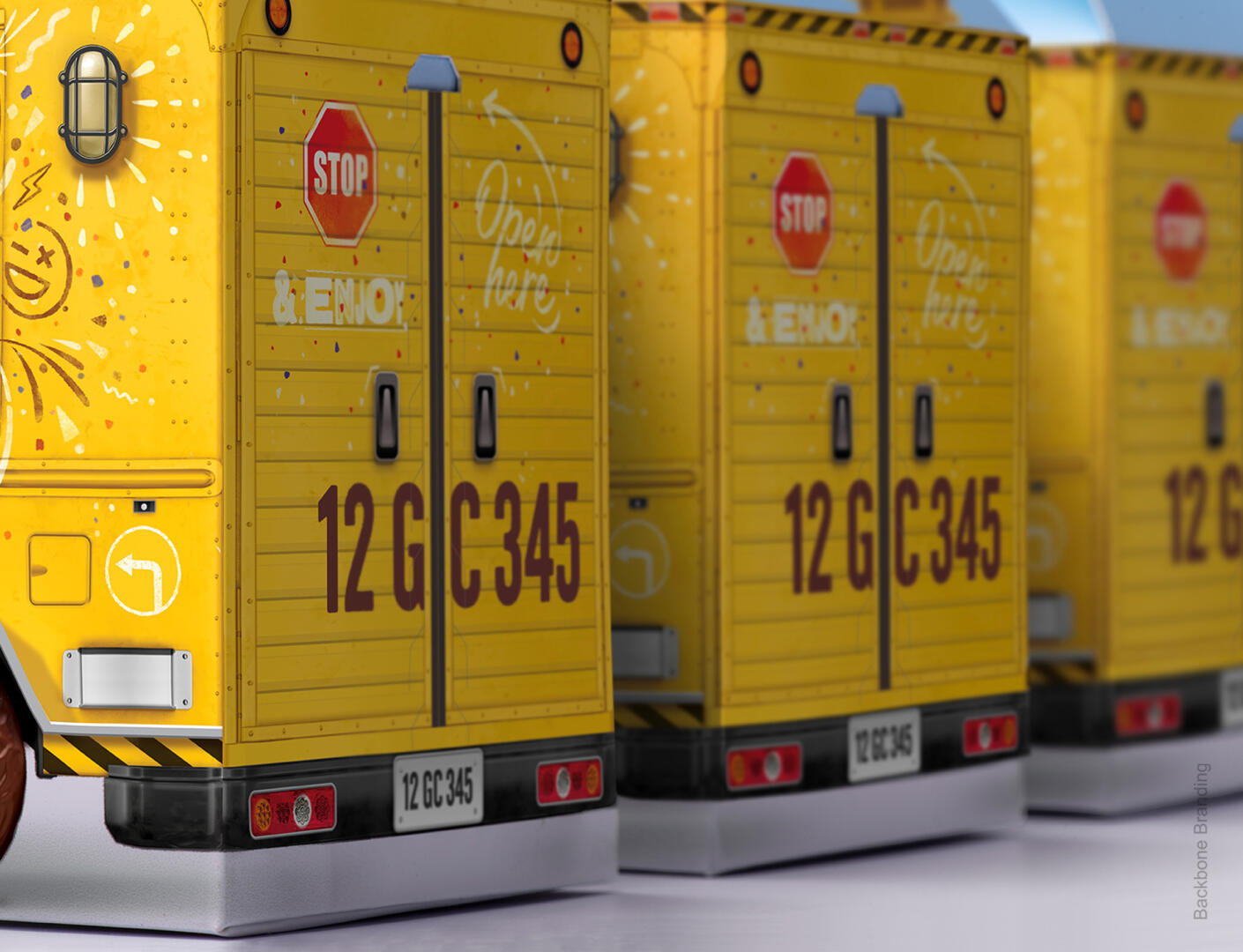
When the truck “stops,” they open the back of the truck, take out the real Chocoburger, and enjoy the new and fun quick snack.