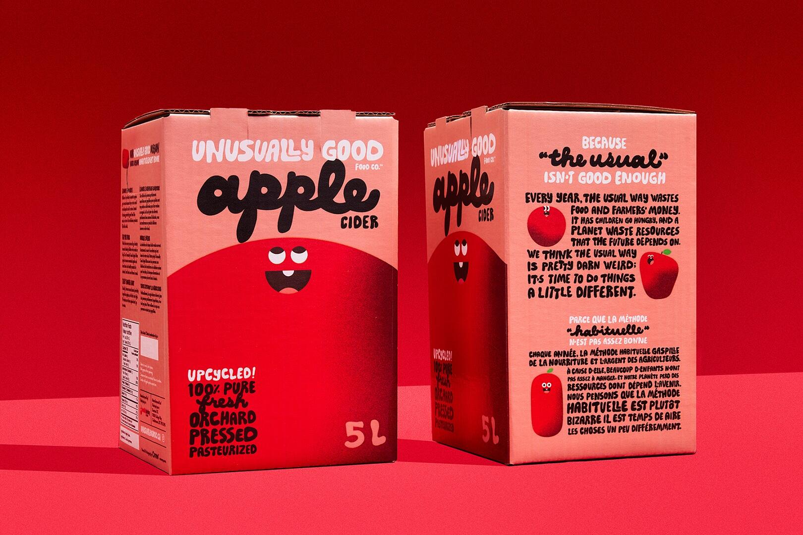
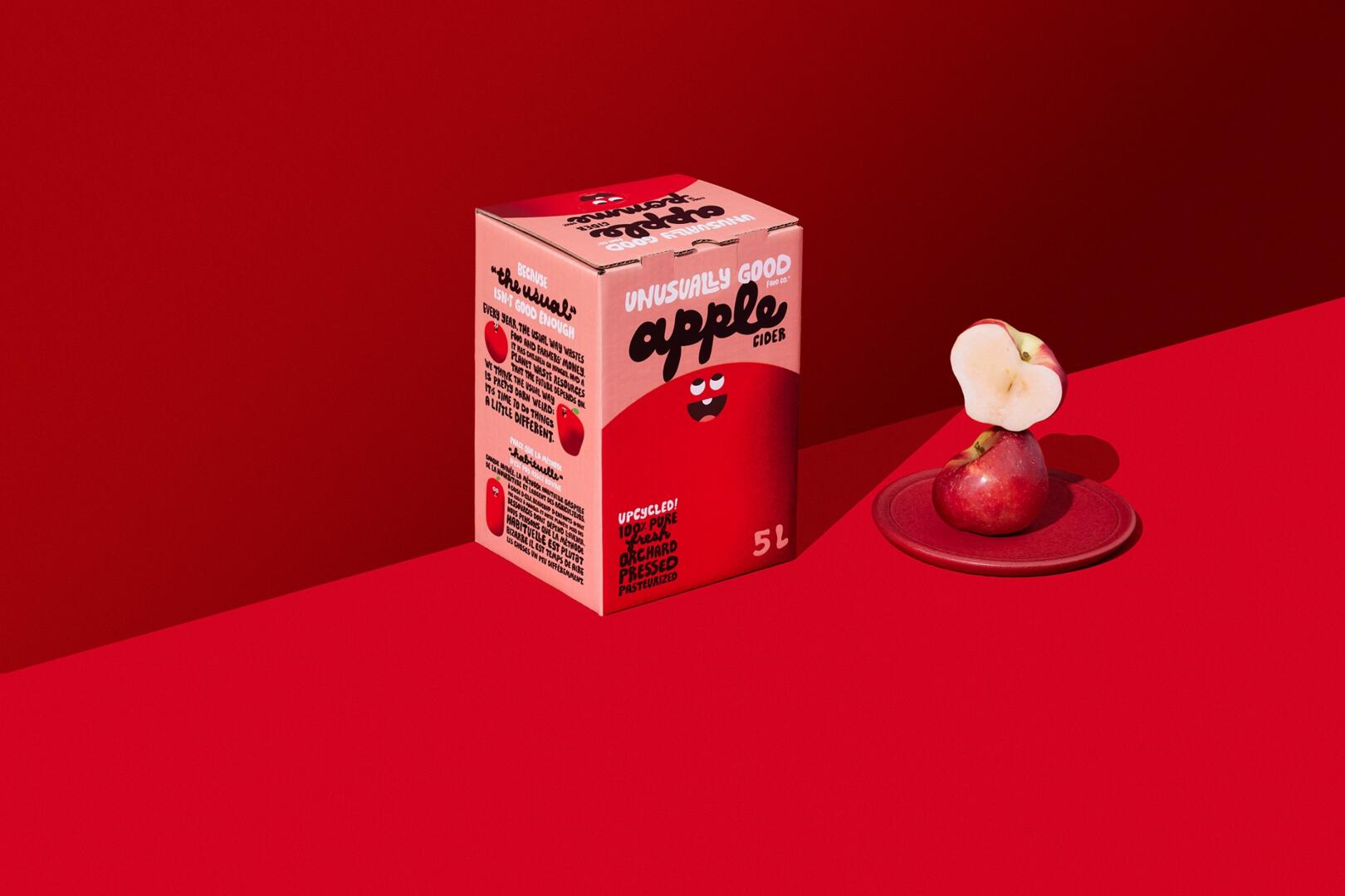
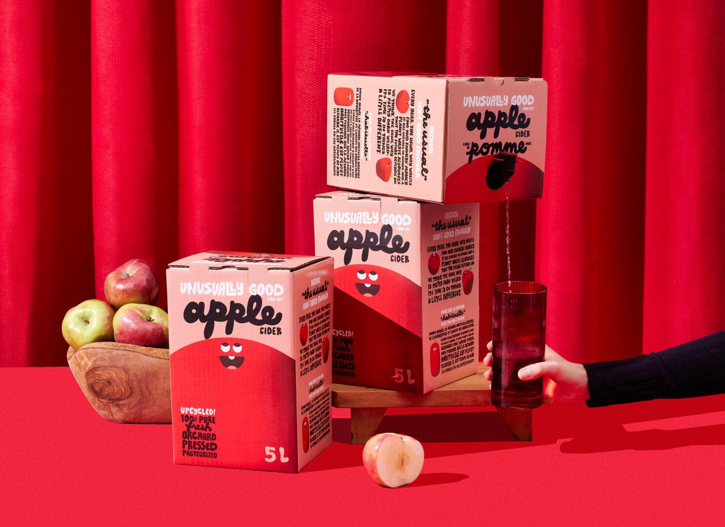
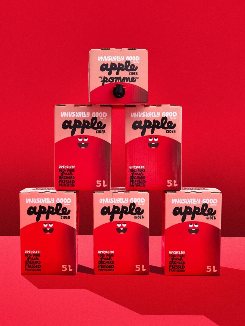
This package design is inspired by a company who does so much good in the world, we found it rather unusual. We started by giving the brand a name: Unusually Good Food Company. Next, we crafted a look and feel intended to disrupt the ‘usual’ products we see in the juice aisle. Unusually Good upcycles imperfect apples, so we brought that right into the design. Instead of using real imagery of perfectly shaped apples, we created bold, playful, perfectly imperfect apple characters to help tell our story. Our apple characters are strikingly awkward, misshapen, and awesome in every way. And it didn’t stop with the apples; our wordmark is unusual too. We created a custom typeface with oddly shaped letters which embody an organic flow and whimsical personality.
Unusually Good was founded by students, so we made sure that youthful, hopeful energy was brought into every aspect of the packaging. We used a vibrant, punchy red for the characters to contrast well against the pink background. The combination of these colours demands the consumer’s attention and elicits a sense of taste and connection. Our brand story is bold and easy to digest, making this delicious product even more desirable for people who want to do good in the world. The message of making positive change and helping our neighbours is a powerful one, especially for the next generation. Our playful, colourful, and childlike approach played a big role in the development of this brand. We think it’s going to help this unusual little company do lots of good in the world for years to come.