Packaging Design for Speak Easy – Hard Seltzer
Speak Easy is a low-calorie, fizzy drink that you can have at any time of the day. The name, Speak Easy was derived from the Prohibition Era in the USA, where drinking and selling of alcohol in secrecy was commonplace. The name Speak Easy has struck through the ages and has become synonymous with having a good time. We wanted the brand to be a testament to an ‘Easy life’ where life is simple, slow, and relaxed.
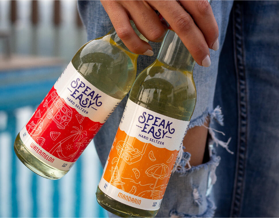
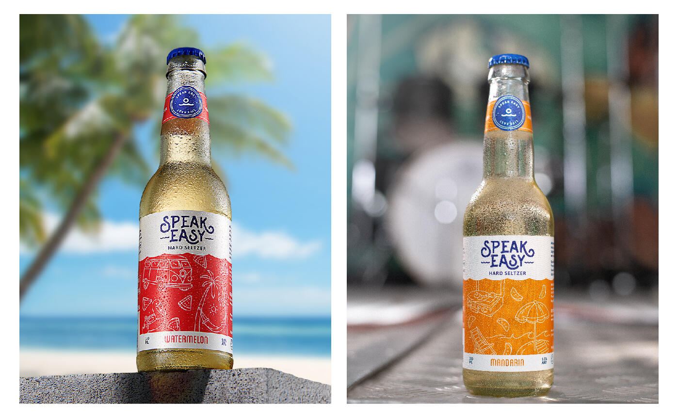
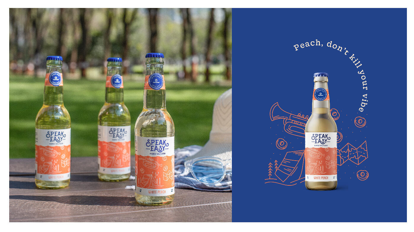
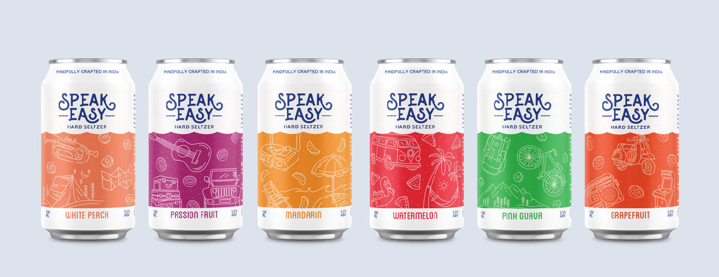
Speak Easy seltzers were launched with 6 distinct flavours – Watermelon, White Peach, Passionfruit, Mandarin, Pink Guava, and Grapefruit.
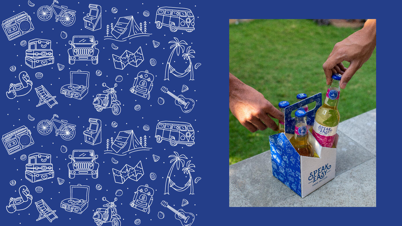
We wanted to showcase the easy life with vibrancy, energy, and storytelling. We believe there is beauty in discovery, so we moved away from conventional label designs. for each label, we created hand-drawn illustrations to revolve around a story, a conversation, and a vibe.
Drinking is now more than just bars and pubs. People now enjoy it at beaches, treks, road trips, music festivals etc. And these scenarios became the central concept for each label. The scenarios are expansive which enables us to keep the system flexible for future addition of flavours.
Tapping into the emotion of drinking and moving beyond the functional nature of alcohol. The hand-drawn line illustrations created were inspired by various activities and scenarios enjoyed with friends and families where memories are created!