„téli fagyi” is a retro Hungarian sweet since the 1970s. It’s a kind of ice cream, but not frozen. Téli fagyi is a unique, typically Hungarian thing, which has a nice, nostalgic vibe. The product itself has not changed since its release. Today it is bought mainly by those who tasted it in their childhood. But will there always be room for this „oldie but goodie” on the shelves anyway? Heres comes a new packaging design what can solve the problem. The new packaging for téli fagyi should remain recognizable to keep current consumers. But in order to attract the interest of the younger generation, it needs to be modernized a way more.
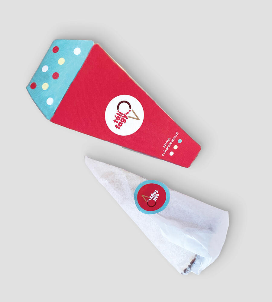
Shape: What makes téli fagyi easily recognizable? The special shape! This gives the character of the product. The packaging should follow this as well. Cone shaped packaging is rarely encountered on shelves. A distinctive appearance like that will attract children’s attention too.
Colors: Reinforcing the retro line, I used pastel colors. The shade of red dominates, referring back to the color of the old brand image. To the top of the packaging I designed patterns to help distinguish the type of toppings (colored sugar, dark chocolate, roller blinds).
Mechanism: The packaging has 2 parts. One is the cone part, inside with the product. Easy to open and after unpacking there is a kind message to read.
The other unit is the topping box. If you can ask for different flavored topping to traditional ice creams, why not get it to your téli fagyi? So I designed a topping box to cover the cone part. Once opened, it can be folded over the open part below it, so that its contents can be sprinkled to the téli fagyi.
The icon system on the side of the packaging explains well how to open it. Easy to learn right after the first consumption.