Læpoca is a mezcal with the mission of evangelizing the german and austrian consumer palate to turn them into the ancient mexican distilled, through a smooth taste, mixology and design. One of the most important challenges was to make Laepoca a player not only among other mezcals, but Gin, due to the geography where the product wants to make a name.
Laepoca not only exports mezcal but also brings with it cultural aspects of the environment, history and crafts from a part of Mexico, opening up a panorama waiting to be discovered, in a place (Austria – Germany) in which mezcal and all that it carries with is still a bit unknown.
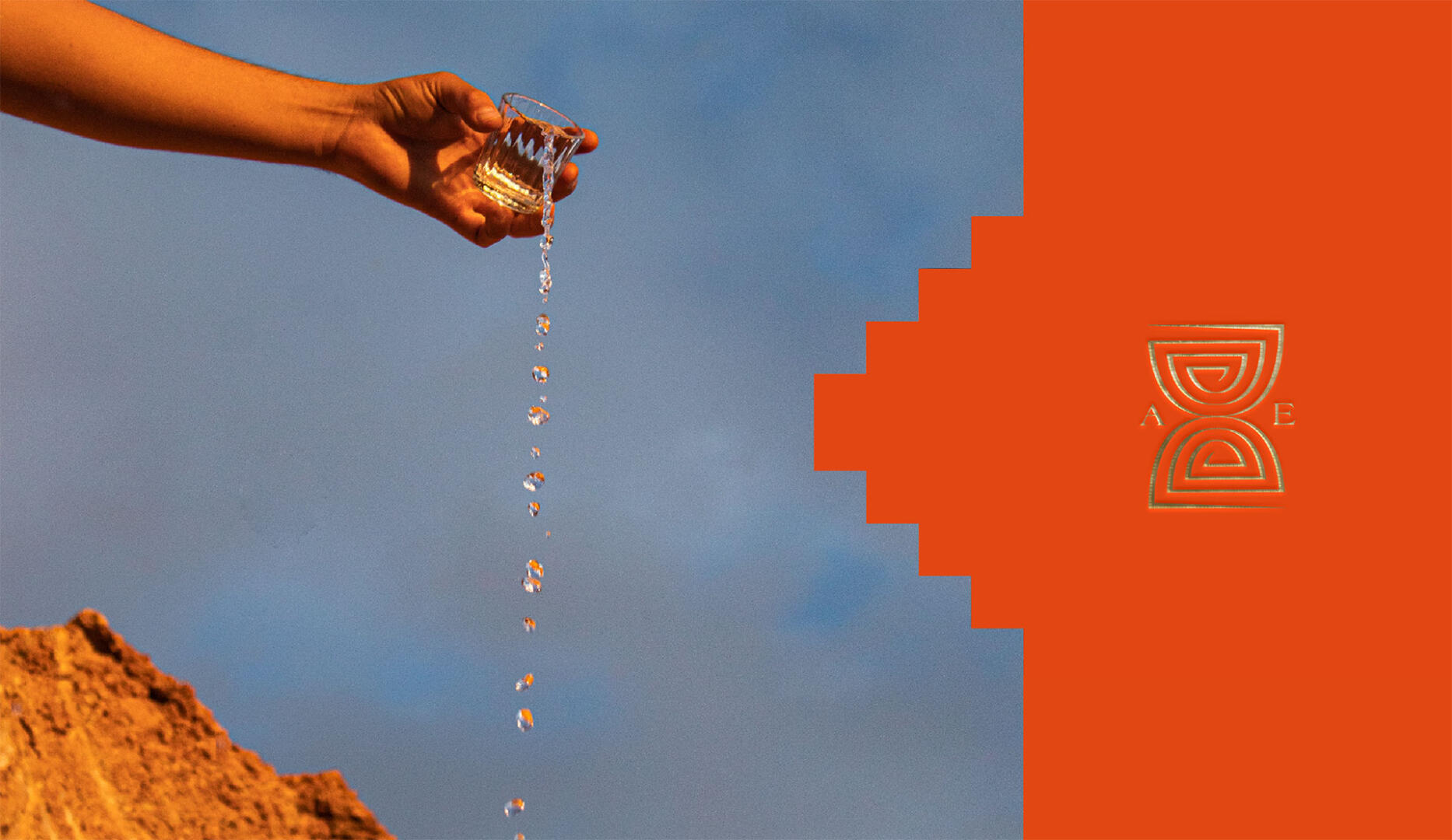
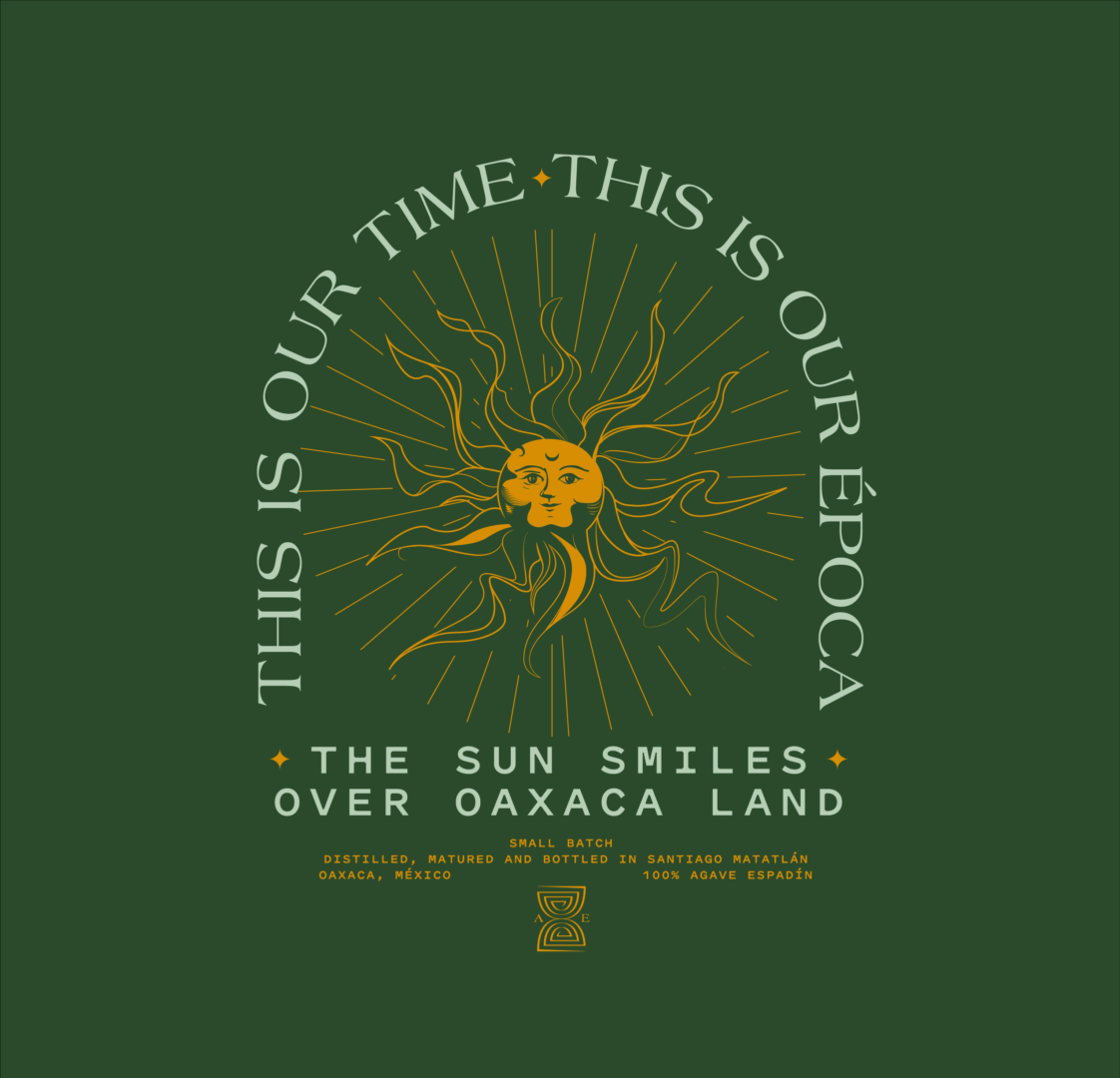
The word «Epoch» has a relationship with time that is symbolized by an icon that, although it works like an hourglass, is an abstraction/deconstruction of the «ash» (æ) symbol characteristic of the brand, it’s labyrinthic style is associated with the state after having some mezcal shots.
I built a complementary set of icons that represent conceptual elements of the brand. Also took brutalist-pre-Hispanic geometric inspiration from the Mitla area.-The illustrations were also key to bringing the brand and the label to life. For the main illustration, I recovered the essence of the botanical aspects of the gins, but here representing aspects of the region where the Laepoca agaves grow, using the engraving style which is one of the well-known arts of Oaxaca, and was executed in a fully artisanal way by the talented artist Mari Mariel.