ABOUT
Hacea Coffee Source is a family-operated specialty coffee importer with decades of industry experience in sourcing, logistics, roasting, and consulting. They cultivate longstanding partnerships with responsible producers to connect to a passionate community of coffee enthusiasts, budding startups, and microroasters through shared coffee experiences.
Their desire to open up shop comes when the United States is second only to the European Union for coffee imported annually: 25 million bags. Nevertheless, Hacea faces a market saturated by local competitors with years of brand equity established through their expansive operations. So their chief concern was getting their brand off the ground as if they’d operated for years. Wanting to hit the ground running, the team at Hacea figured they’d need a logo to start but understood their growth potential at the same time. So after partnering with Playstead, we set out to build their brand for scale.
Playstead’s role meant distinguishing Hacea Coffee Source as a trusted mentor by fostering a mature image valued for the level of engagement with its community, forward-looking environmental initiatives, and open-book services devoid of clichés. It included creating everything from the brand’s identity to packaging designs, info sheets, merchandise, web graphics, and all other touchpoints in between.
SOLUTION
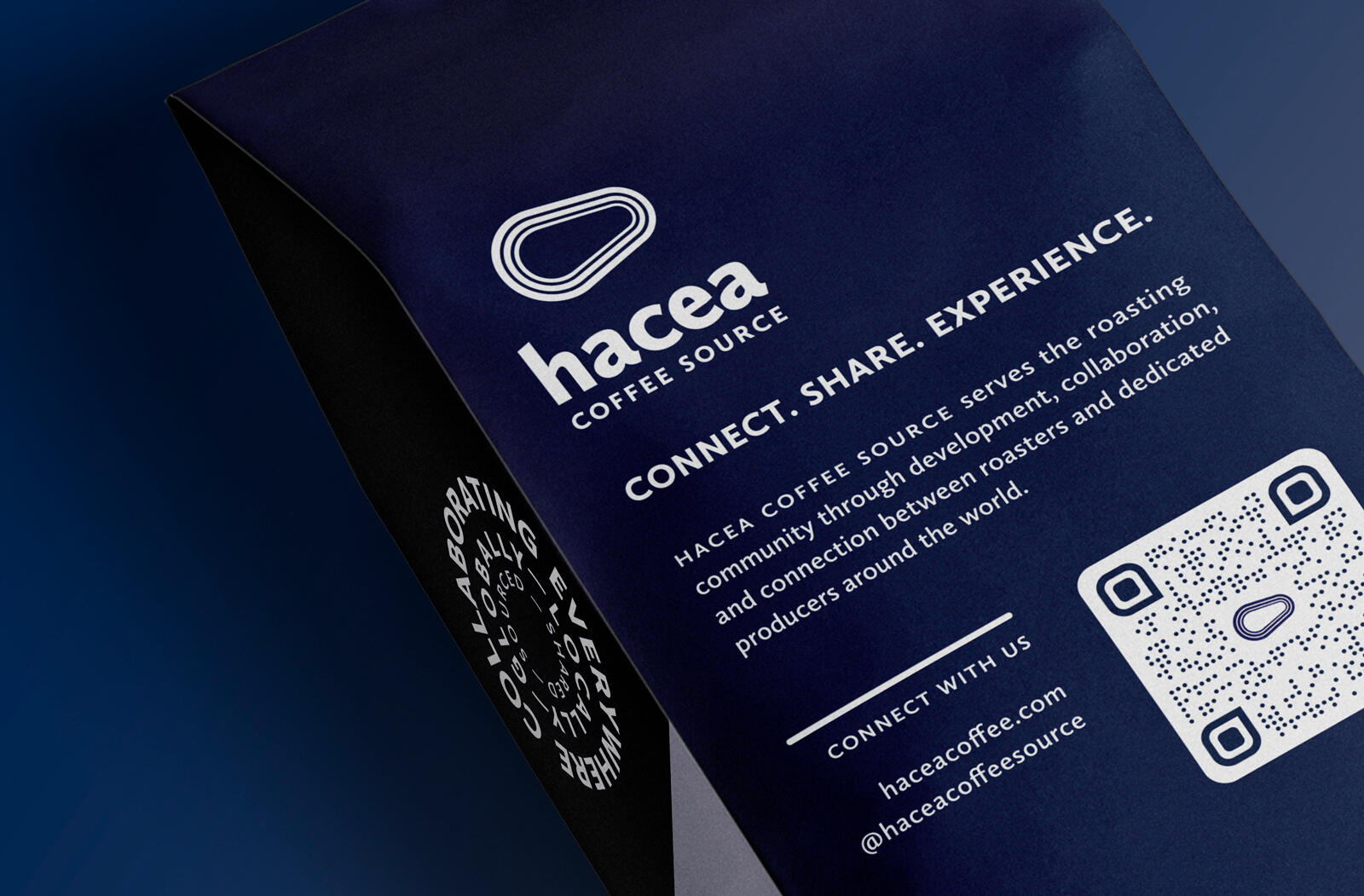
The design puts Hacea Coffee Source’s community of roasters and producers first by highlighting Hacea’s collaborative spirit, a tenet of their brand. Labels showcase the producer, country, and an origin color derived from their national flag. The wordmark on the front corresponds to the progressive nature of their brand—its enlarged scale heightens tension, so it’s never static; meanwhile, the secondary typeface on the label hearkens back to the United Farmworkers protests to share an evocative voice for their producer partners. Since the package is their hero product, we built it to scale in stores and on shelves. For instance, the logomark on the front and back of the packages can brand-block large lengths of shelves and is visible from a distance. When both front and back are placed side-by-side, Hacea’s primary logo (with wordmark and symbol) is whole.
RESULTS
The design activates the package through consistent visual communication using brand elements that support their established narrative across touchpoints. Playstead developed Hacea Coffee Source’s visual identity and designed its brand to include a revenue-generating hero product. This package did that and led to a 368% Year-Over-Year sales increase with over 24 consecutive months of growth at the time of this writing.