For many reasons Office Depot, the largest Czech provider of office supplies decided to undergo a necessary rebranding. We are honoured to have been part of the process that helped this company freshen up its vision and set new brand foundations from a visual standpoint.
We started by running workshops with the top management, which revealed the crucial meanings and values related to the brand and presented its future course. This fresh strategy, and therefore the brand identity, reflect a more active role which the brand needs to play in customers’ business lives, including its ability to arrange anything related to daily office life, whether in the physical or virtual space and to be flexible and empathetic and offer always-available solutions, products and services. We focused on creating an identity which would express competence and progressiveness, yet still fully embrace the customer-centric and comprehensible language.
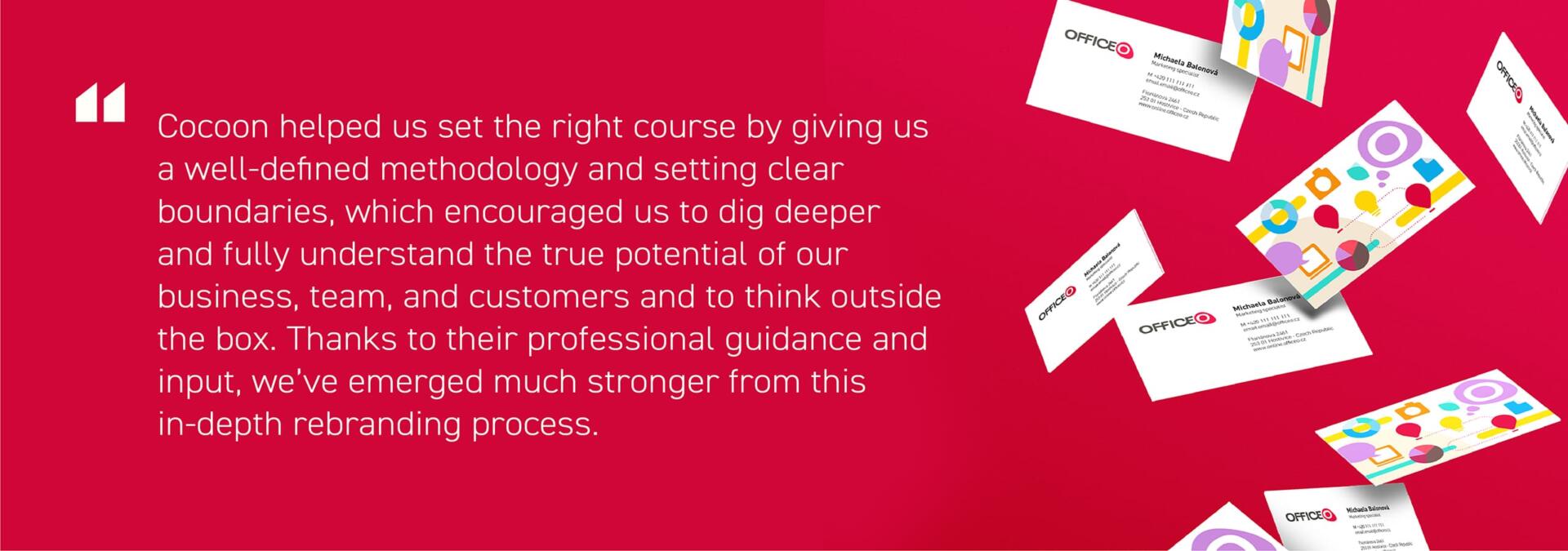
The new brand identity’s main goal was to express an inclusive, playful and broad brand that revolves heavily around the “Officeo for all” statement. The Officeo logotype with the adaptable final “O” cropped into a red cell became the key symbol of the identity. The shape of the red cell used in the primary logo is purposely abstract with the intention to then adapt its shape to specific functions and symbols based on the type of industry where Officeo’s customers are coming from, the type of service that Officeo provides, or even different departments and teams that the corporation has. Amplifying the O letter has an extra purpose – to enhance the memorability of the new name, as the dual O in it is a sweet spot for remembering.
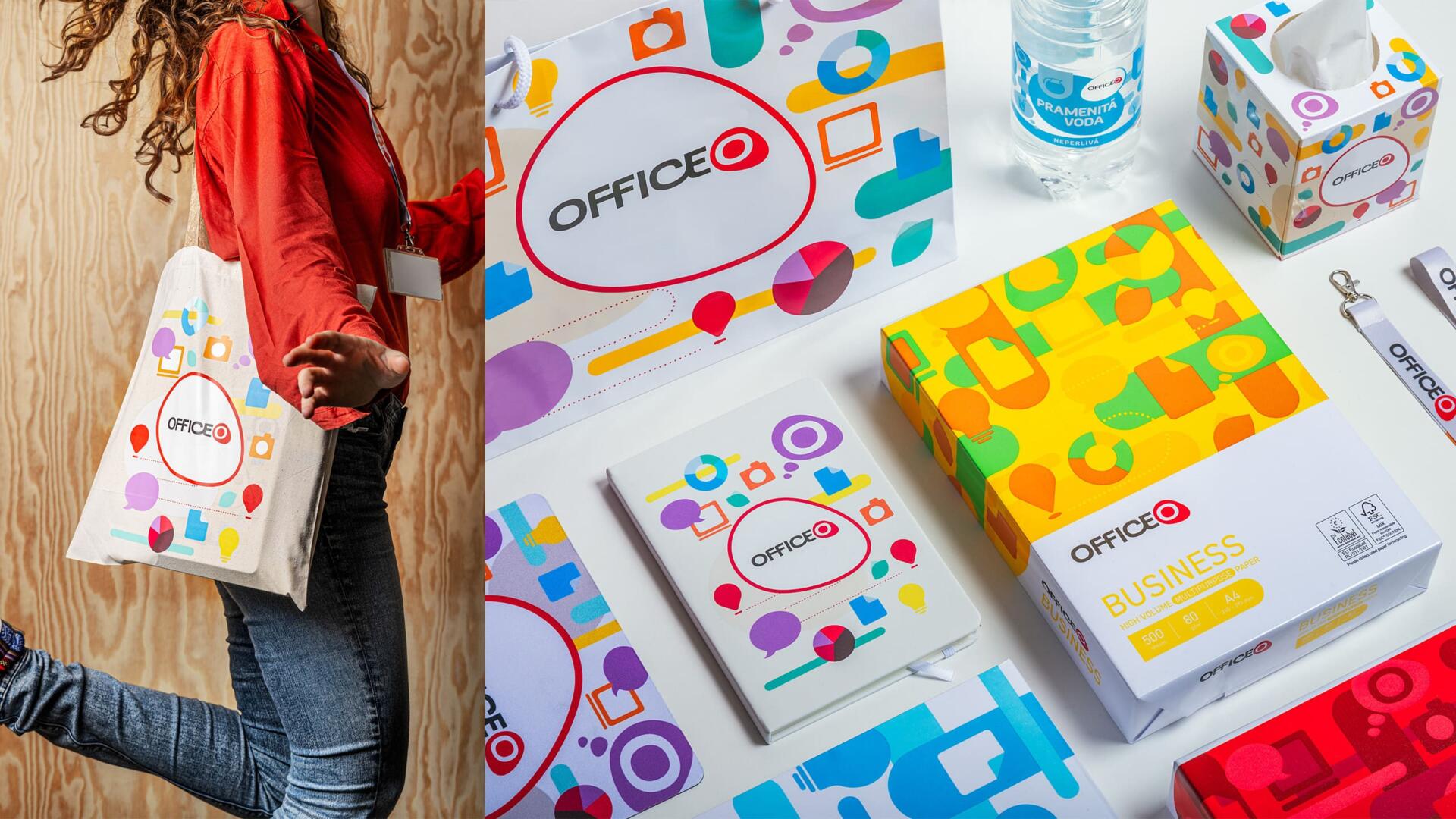
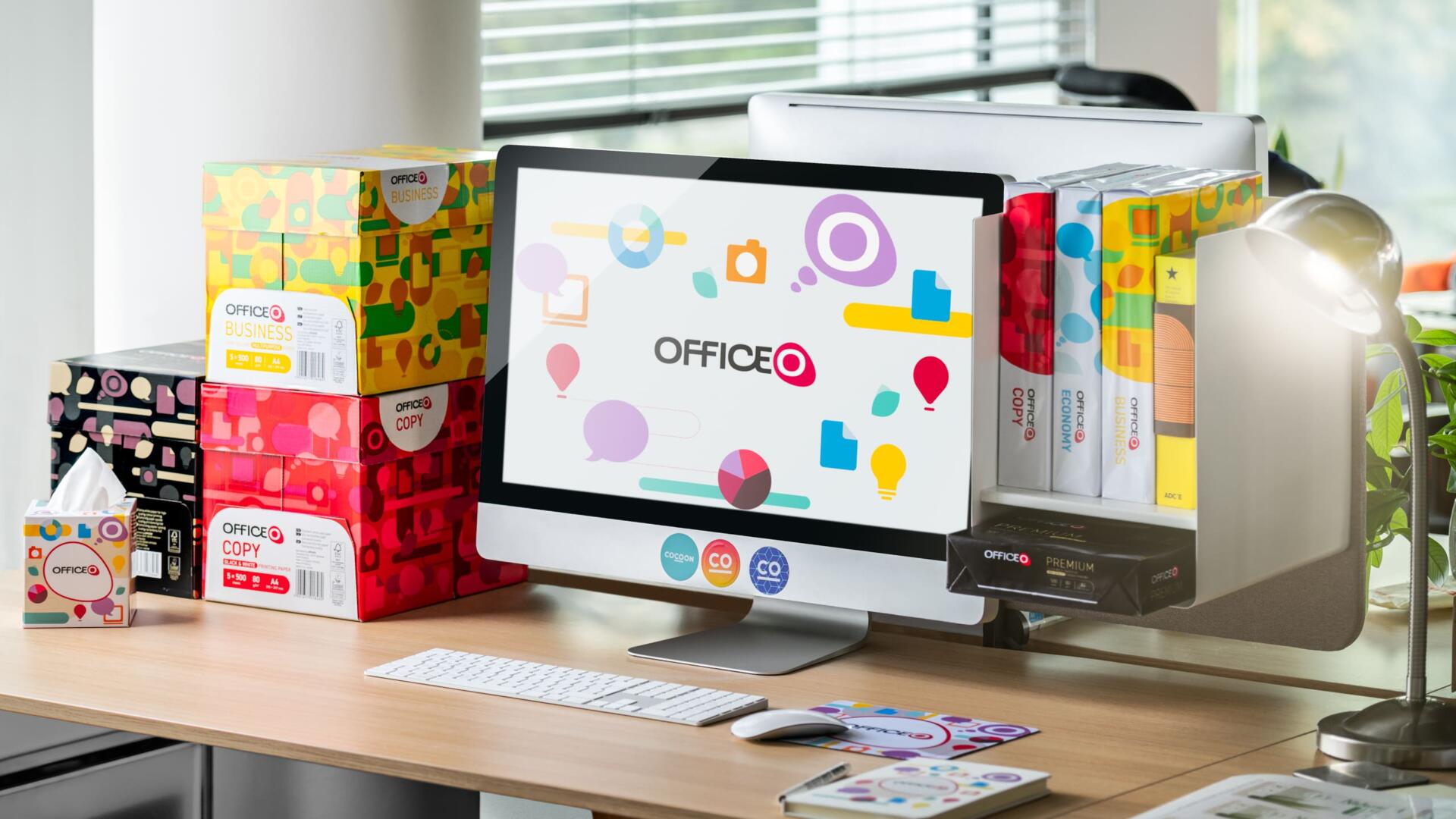
The overall identity is friendly and vibrant, full of colours, shapes and seamless patterns. However, it honours Office Depot’s past by using three main colours (red, grey & white). Carefully designed icons are simple in shape but significant to their meaning, as they are the symbols that represent the different customers and services of the brand. These icons are used in many ways – either independently, or within the seamless Officeo pattern.
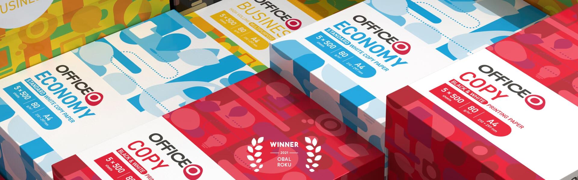
The pattern brings out the flexibility aspect of the brand. It is a crucial element of the identity that can be used on papers, boxes, promotional materials, catalogues, water packaging, and within the digital space while keeping the brand connected through a recognizable visual element.
This flexible and colourful identity system was developed to express this brand’s approachability and enable visual consistency in its thousands of items on offer. As a final benefit, what was perceived as a rather formal office supply brand in the past is now seen as a welcoming place where people from various disciplines can grow to rely on a company which speaks their language no matter what type of business: big or small, on-site or remote, professional or hobby, work or even school and studies. In any case, thanks to Officeo, your place of work can become a place to love.
Of notable mention are the paper boxes that have already been awarded in “Obal roku 2021” (Packaging on the Year) on the Czech market.