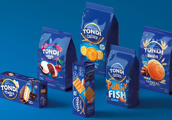
Tondi is a new brand set to debut on the Australian market in the category of bakery products, both sweet and savoury. Over a 100 SKU will be marketed under the new brand, a very high number for a launch in a new market.
After creating the name, logo and packaging system of the brand, Break also implemented every single SKU.
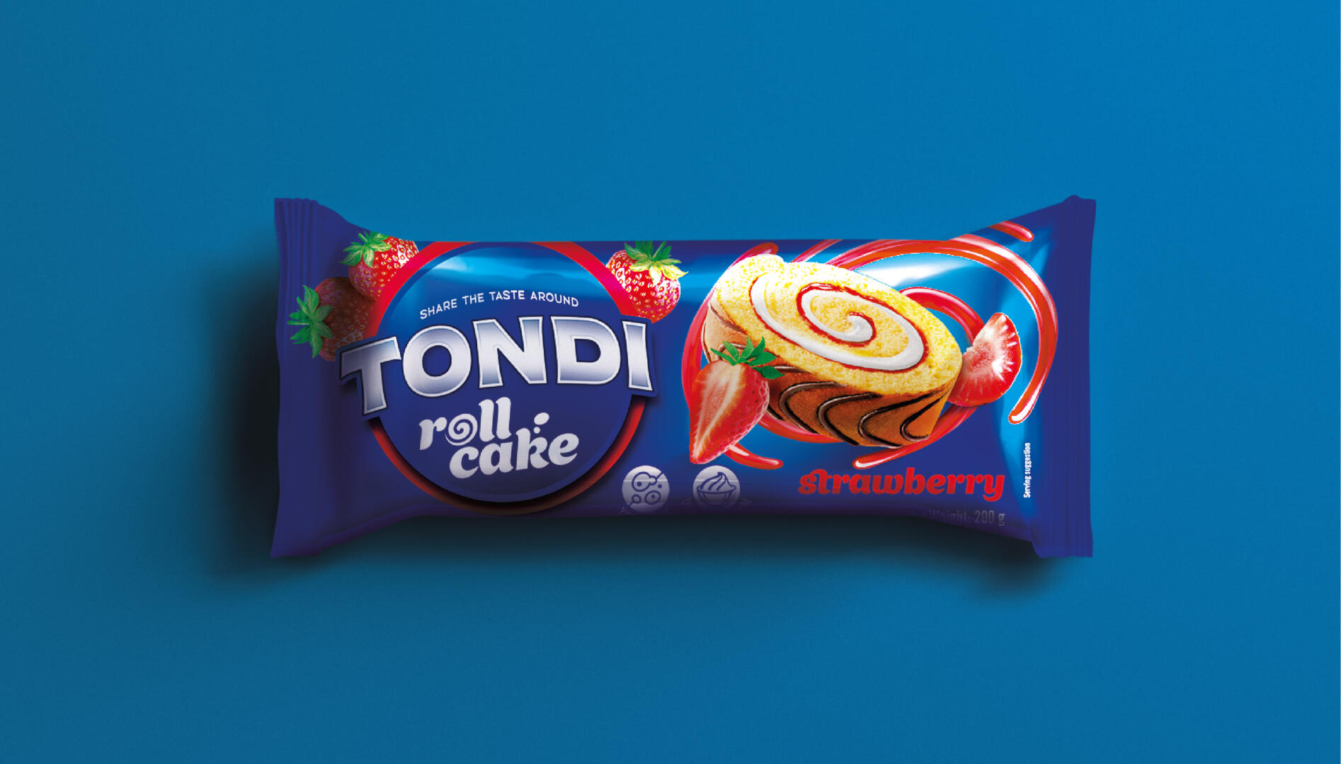
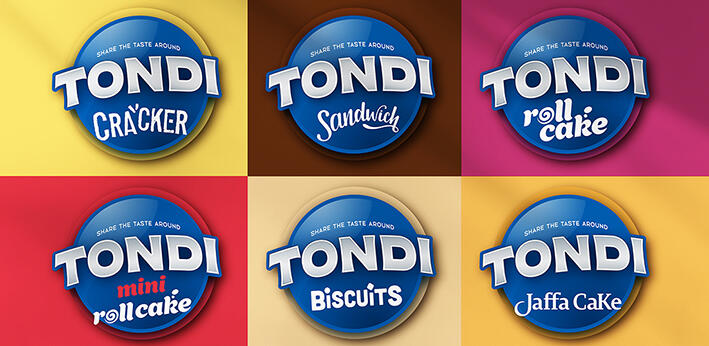
The naming revolves around the creative concept “Share the taste around”, where the pleasure of taste becomes the pleasure of sharing and vice versa, in a loop described both by the name (Tondi means “round” in Italian) and the shape used for the logo itself. The sub-brand is to be found right below the brand name, a solution designed to make it easier for consumers to orientate through a wide and new offering.
The packaging has a blue background for all references in order to facilitate brand recognition and create a “family feeling” throughout the range. Such a choice has made it mandatory to mark the differentiation between categories with other devices, such as an ample space dedicated to illustrations (which stand out against the blue background), dedicated fonts for each category and different graphics for the product pluses.
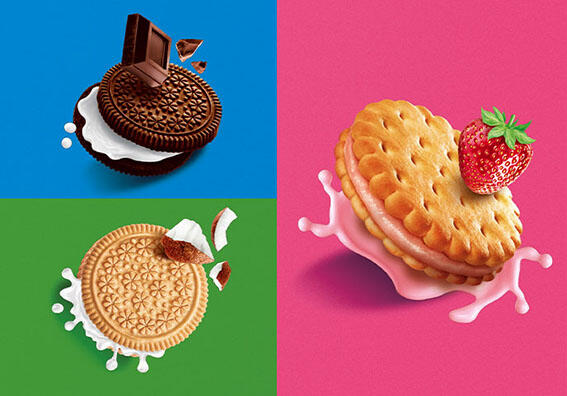
The visuals were hand-illustrated to convey taste and ingredients in the clearest and most appetizing way.