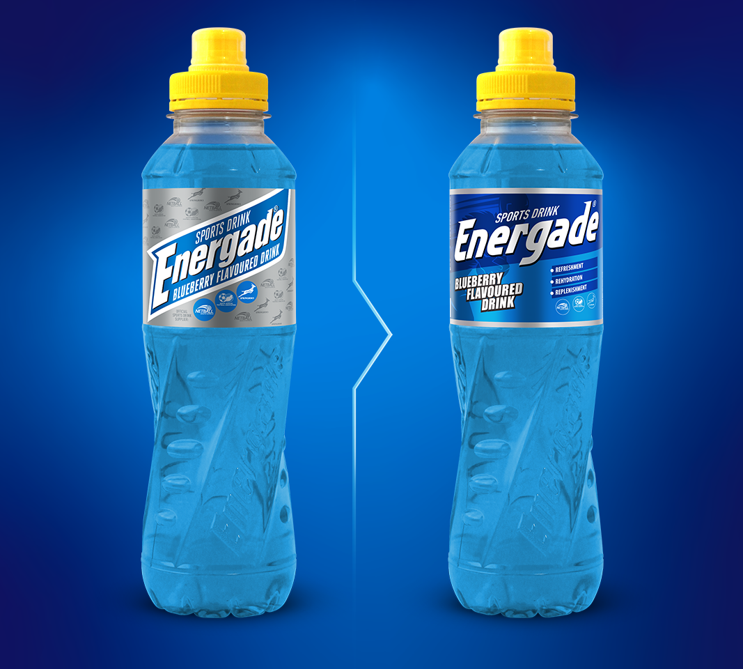
INSPIRATION
Since its inception in 1993, Energade has been focused on sportsmen and -women. The everyday consumer is looking for products that promise improved physical and mental performance. Energade needed to shift its age-old perception and packaging to appeal to the everyday consumer and not just the serious athlete.
IDEA
We looked to the ever-popular energy drink category for inspiration. Energy drinks are consumed by one and all – irrespective of fitness level. The design cues are bold, simplistic and energetic, often reflecting a design ‘nod’ to technology and pace.
DESIGN SOLUTION
The upgrade is stripped of all non-essential design elements and boasts an obvious upweighting (and modernising) of the logo and motherbrand colour. A strong diagonal break was created for dynamism and optical shelf disruption with a metallised substrate to add punch and textural differentiation. RESULT This new pack has pushed Energade into the lead in terms of shelf impact, leaving competitors wanting…. And with this new look comes a whole new range of consumers – from the professional athletes to the everyday drinker looking to perform at their best.