The Client
Frosty Dream is an Italian ice cream brand that offers natural and healthy ice cream made with natural ingredients.
The Challenge
Our objective was to build fans instead of just a consumer base through the creation of brand assets that make Frosty Dream a lovable and memorable brand. Project The logo is designed with a serif font with the name of the brand and next to a small symbol of the ice cream.
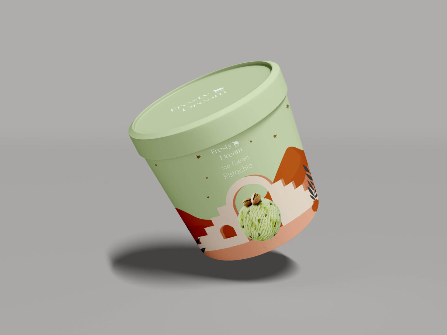
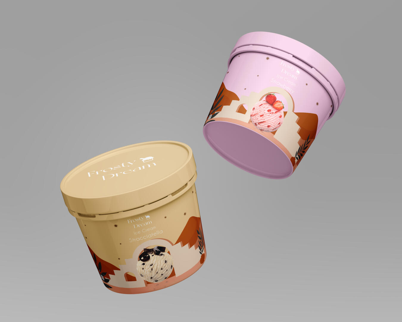
Packaging
The packaging designs for each of the six flavours; Chocolate, Triple chocolate, Stracciatella, Strawberry, Mango and blueberry. Flavours are differentiated through a wide colour palette, making the product more appealing to our target audience. We used ice cream colours. We wanted the colours to match the ice cream — in pastel colours Through the design process there was always a consideration to how the entire range looked on the shelf together and not just as individual tubs which stemmed from being a new product and needing a point of difference to have some impact in the marketplace.