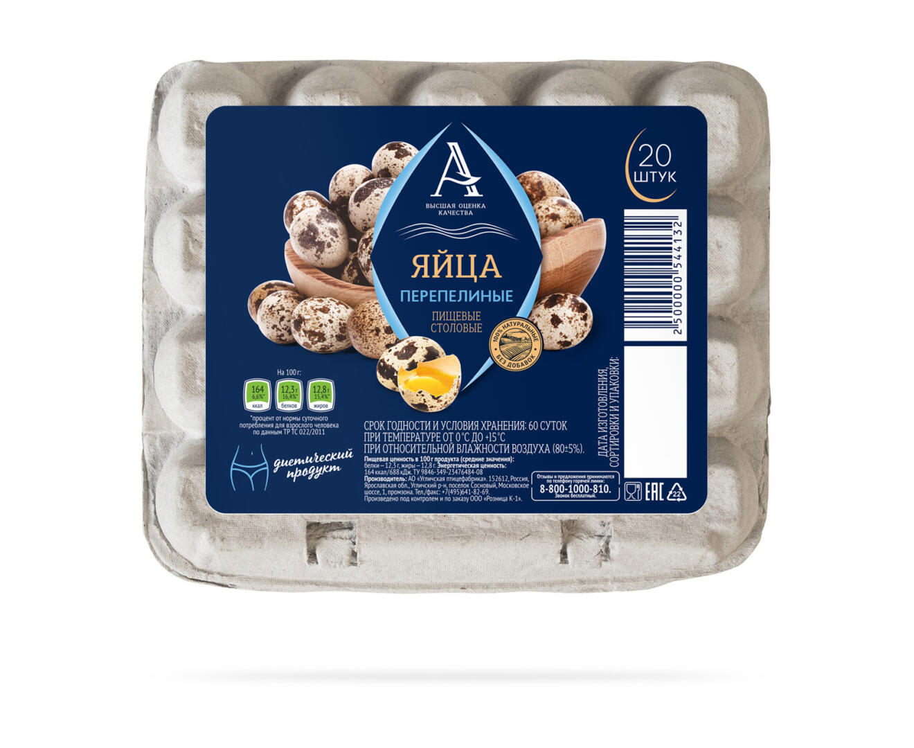
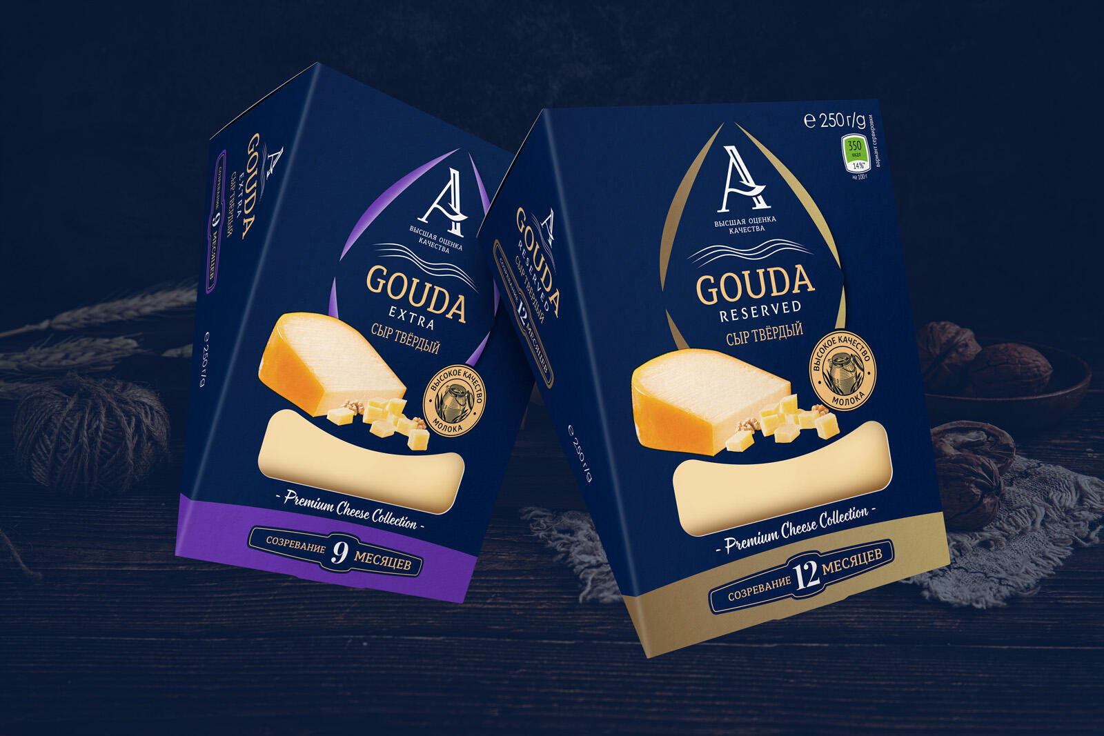
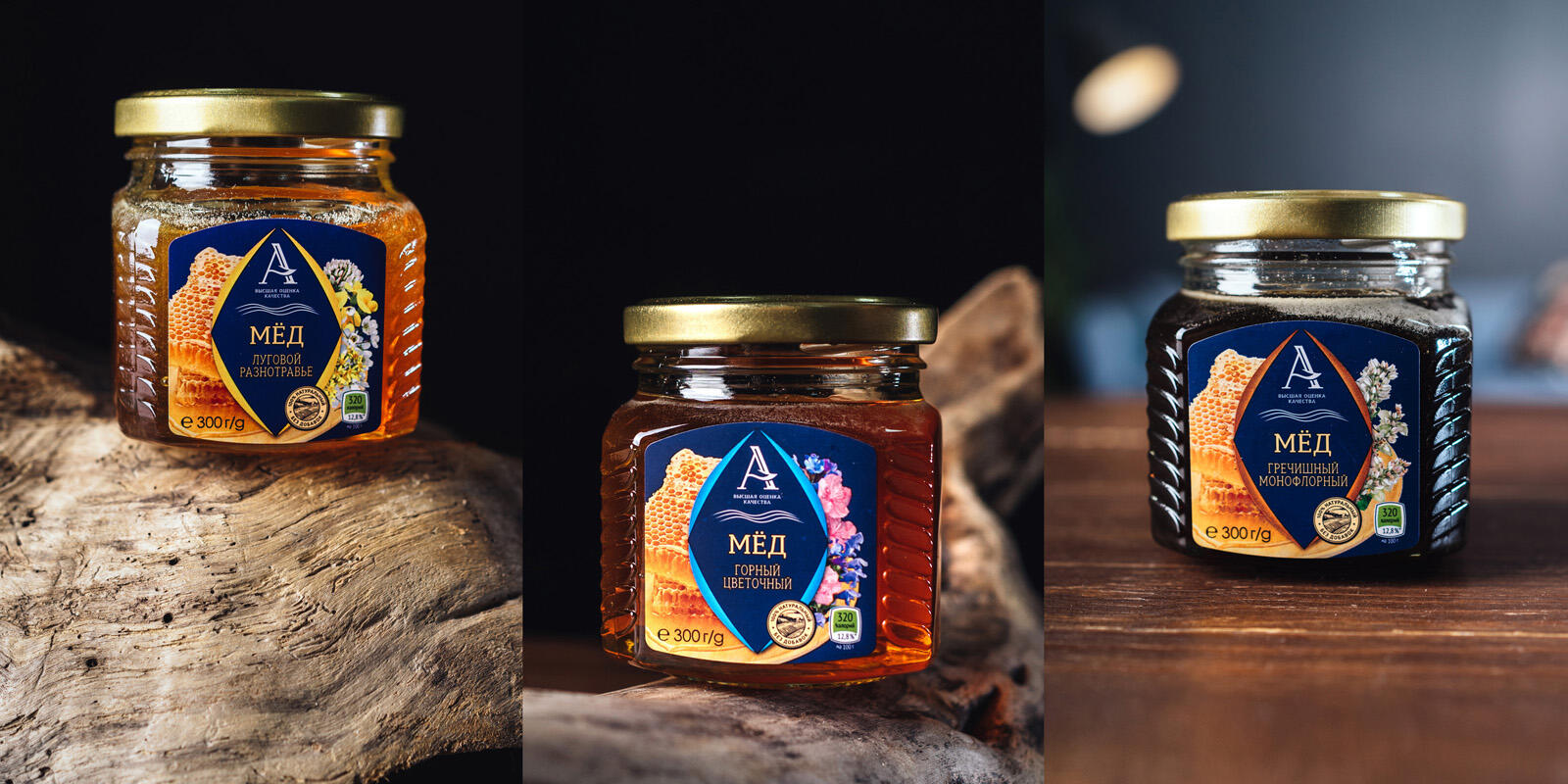
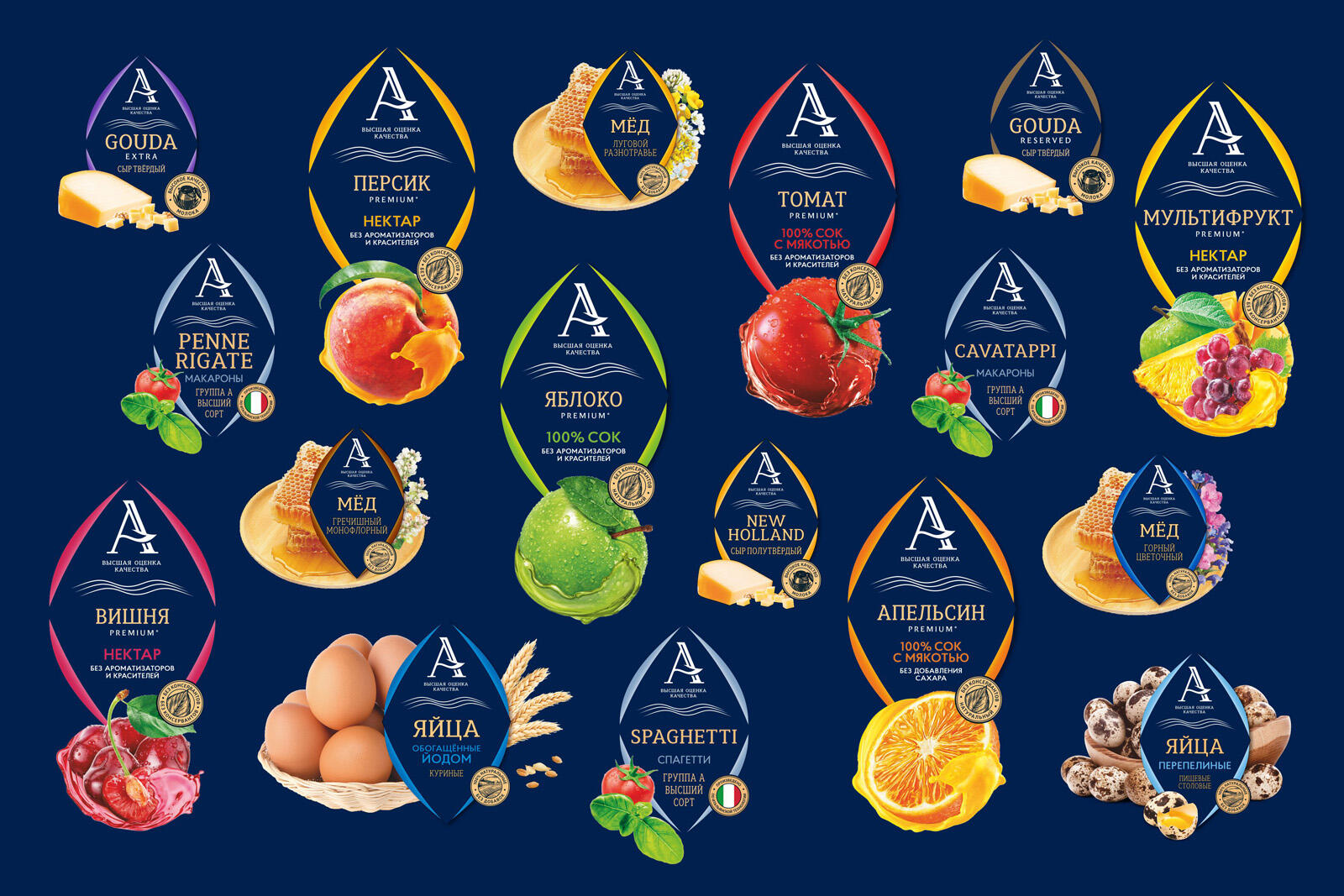
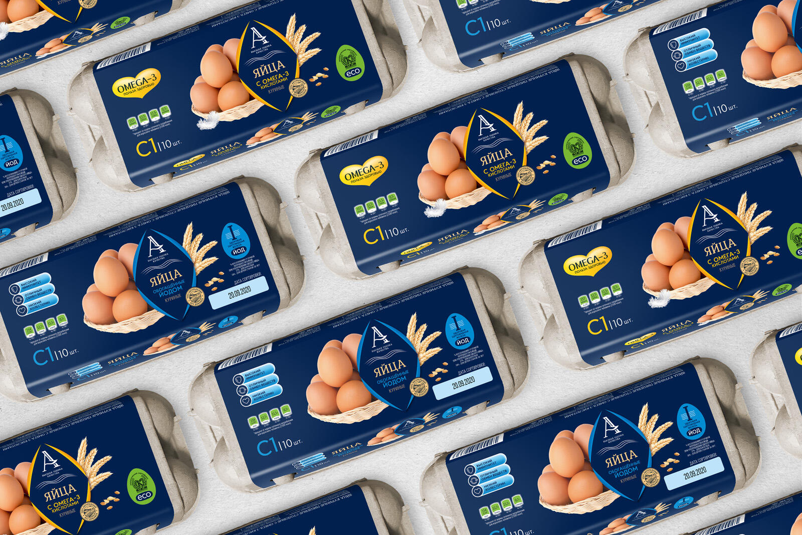
The Brand A is Maria-Ra’s own brand in the upper-middle segment. Many different everyday products are produced under this brand and the line continues to expand. At the beginning, the logo was rethought. Its shape became more confident and modern. A descriptor has been added under the main letter, revealing the essence of the brand, namely, that only the best quality goods can receive a grade of A. Wavy lines symbolize the Altai field. During the work on the packaging concept, a signature graphic element in the form of a rhombus was invented, which makes the goods under this brand easily recognizable on the shelf. The background color chosen is dark blue for a reason. It evokes confidence and the food area stands out against it. The basic layout rules, color coding, the design of the food area, and the combination of package fonts were also thought through. The result of the work is that we managed to relaunch the A brand and make the products recognizable on any store shelf.