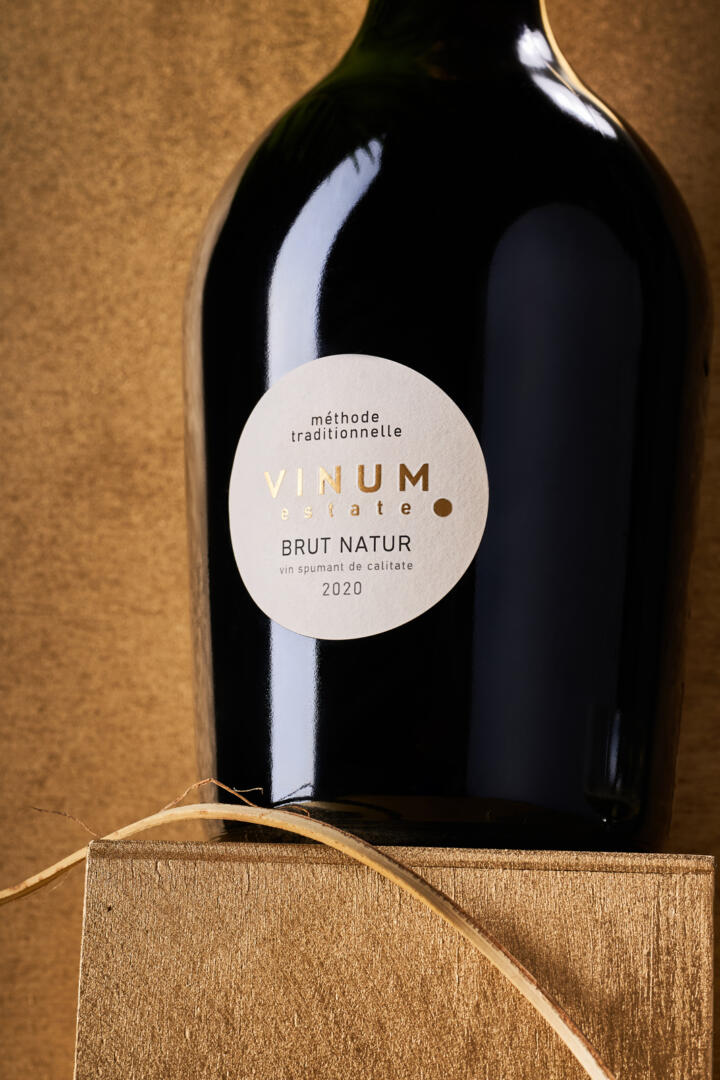
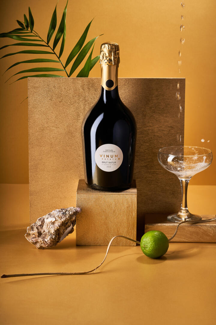
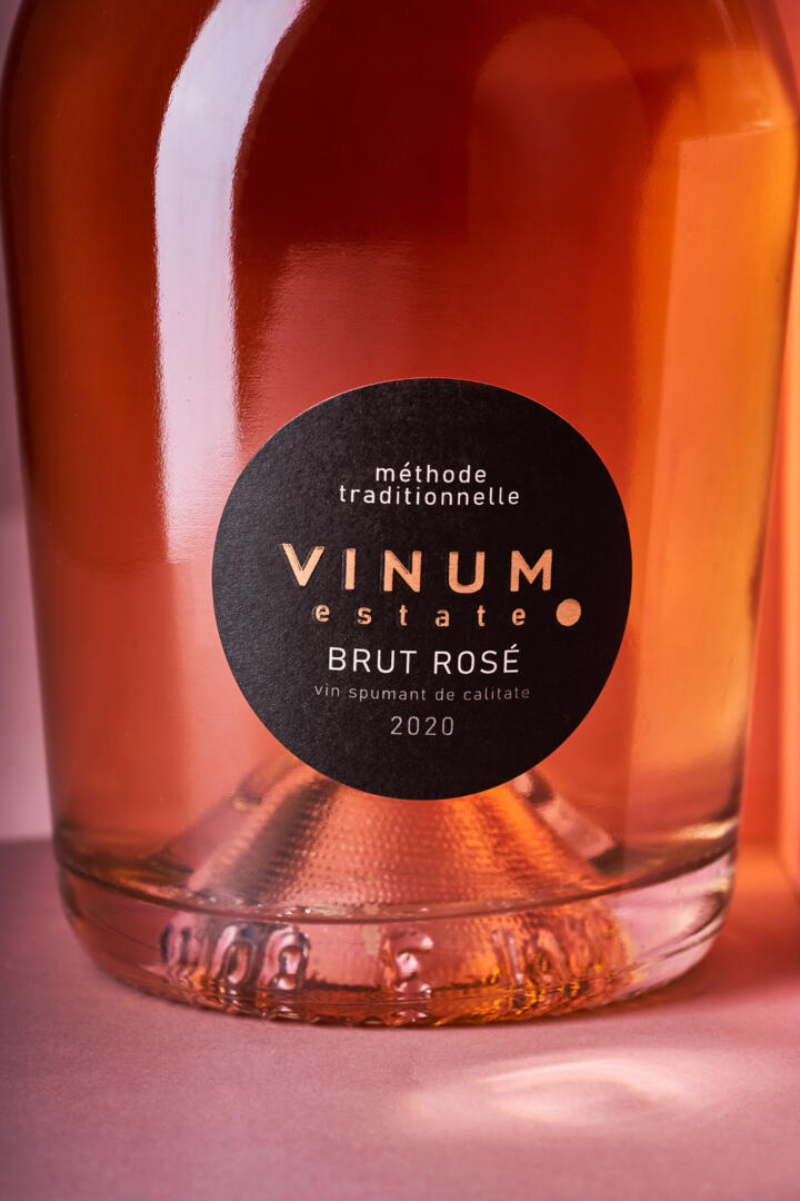
When embarking on large-scale label design projects, we always assume the use of certain elements in different variations and on different media. In such cases, the same element can look completely different and emphasize different aspects of the product. A good example of such a case was the global redesign project for the Vinum Estate brand, for which we created a common concept and applied it to different product lines. In the case of sparkling wine created using traditional champagne technology, it was necessary to focus on the refined and premium nature of the product, which holds a special place in the company’s portfolio. At the same time, it was necessary to maintain the unity of the visual component of the brand, built around the concept of a dot. This is how the label design for Vinum Estate sparkling wines was developed.
The central element in the label design for Vinum Estate sparkling wines is the dot symbol, on which the overall concept of the redesign of this brand is based. However, in the case of this particular product, this element has taken a special form. First, the shape of the label itself repeats the dot from the logo, which is, in its own way, a visual recursion. Second, the dot is also present on the cap, which enhances the overall visual effect. Combined with the overall minimalistic nature of the composition and the particular shape of the bottle, this approach effectively highlights the sophistication and exclusivity of a drink that is created in limited quantities and has a special place in the Vinum Estate portfolio.