Helping a community of pour-over coffee enthusiasts build fun & sophisticated Brand.
Sedate is a coffee brand introduced by a duo of best friends who have an immense passion for pour-over coffee. Over the years, they have experimented with it and shared their passion with like-minded people, forming a lovely community of Pour-over coffee enthusiasts.
After sharing this love with their community for a long time, it was finally time that they wanted to take on this passion and bring it to a larger audience. The initial strategy for the brand was to introduce themselves to the market by launching three of their favorite coffee blends and they approached us to help with it.
The Challenge
Sedate didn’t have a proper brand identity since it was only a community based, therefore we had to create a brand identity from scrap while keeping in mind that this new identity doesn’t offend the current community.
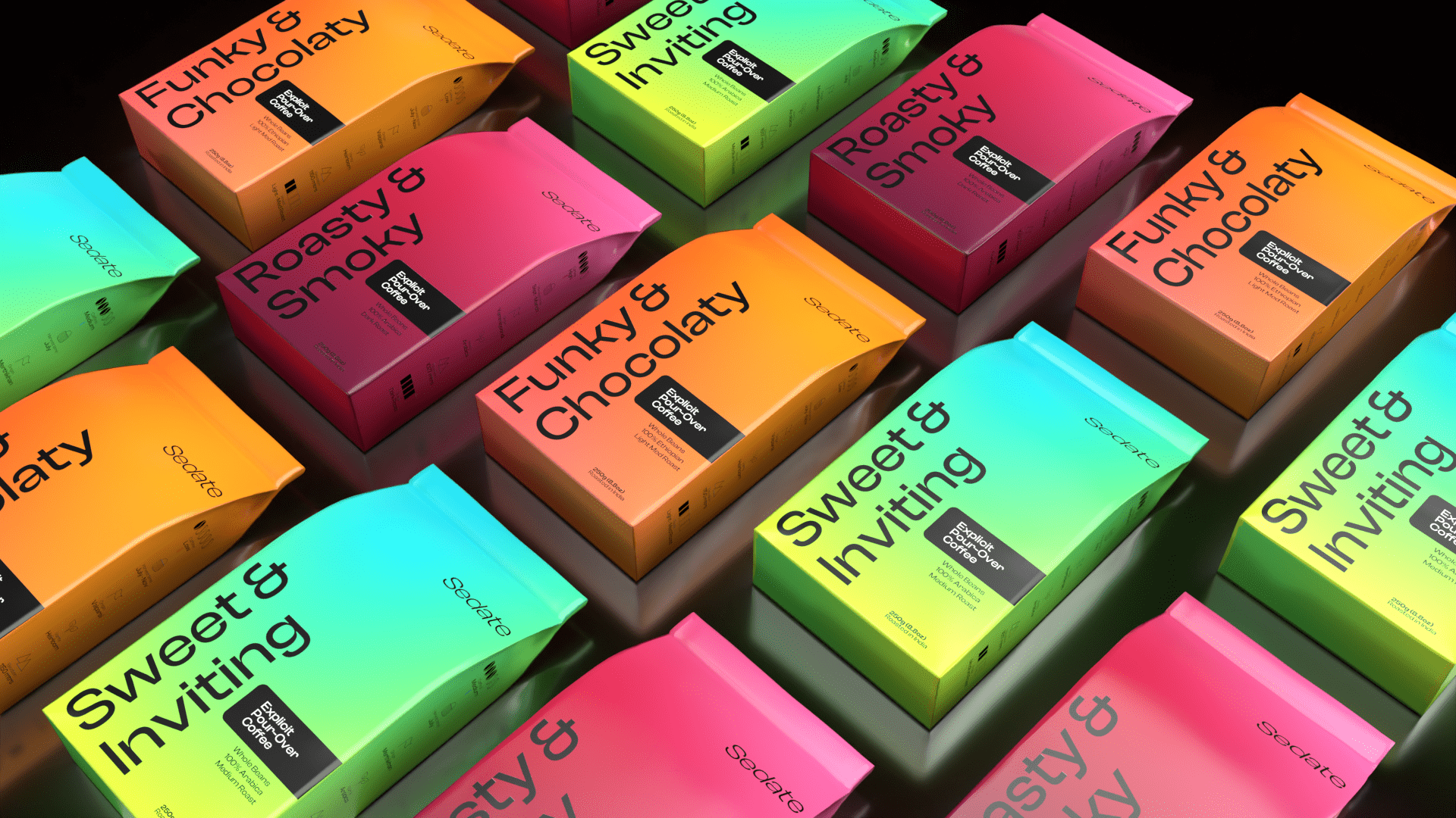
Since this was their first time working on packaging, one of their main requests was to keep the use of illustrations minimal or none, since they wanted to stay away from the trend of using illustrations in the coffee market.
The Solution
Having done a lot of research on the brand and communicating with their community, we could represent the brand with a simply tilted logotype and using minimal colors.
Inspired by the brand’s name ‘Sedate’, which means calming down, we imagined of using gradients as the base for the packaging, since mixing two or more colors is perceived as pleasant and calm by the human mind. Therefore, based on the unique blends, we create a unique set of gradients that evoke the flavors of the coffee.
What are your thoughts on the Packaging?