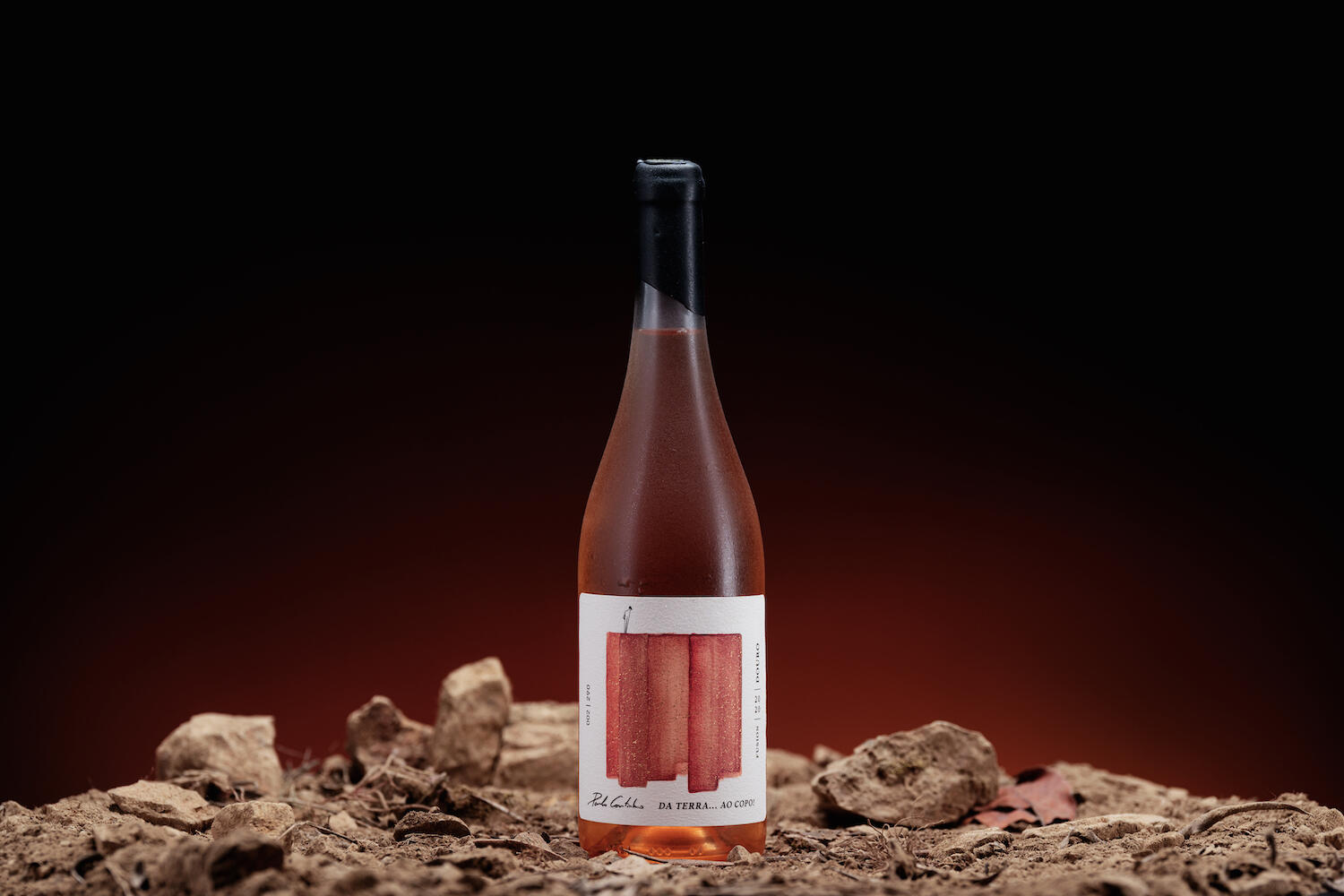
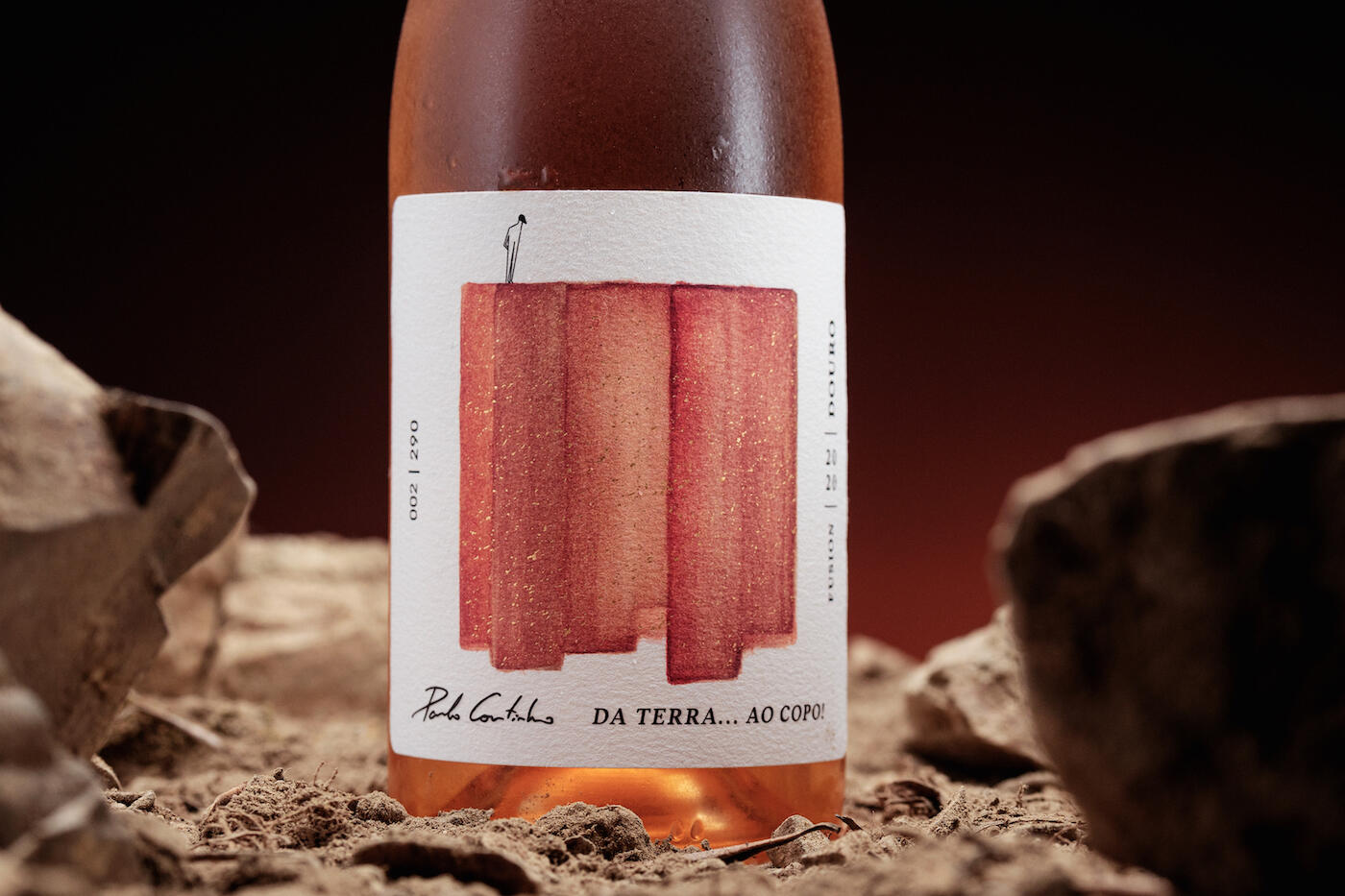
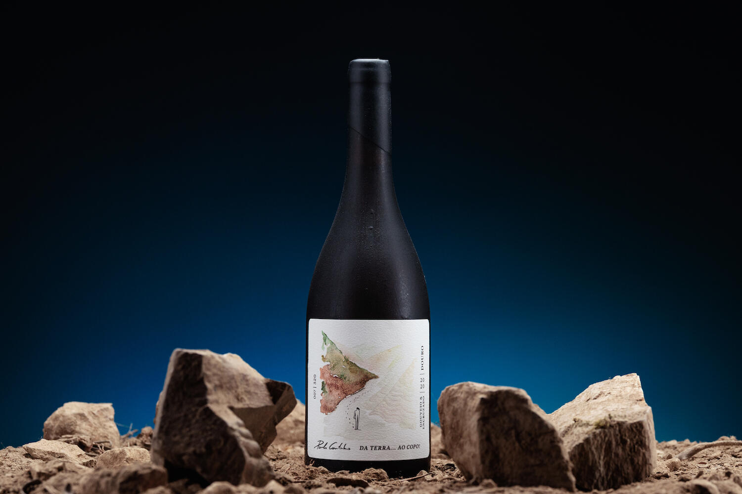
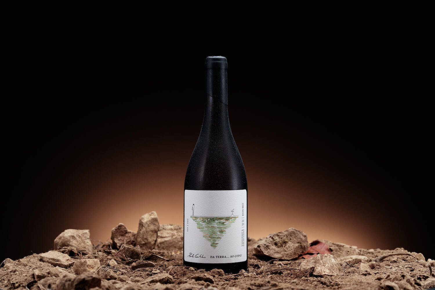
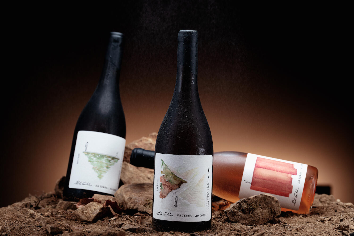
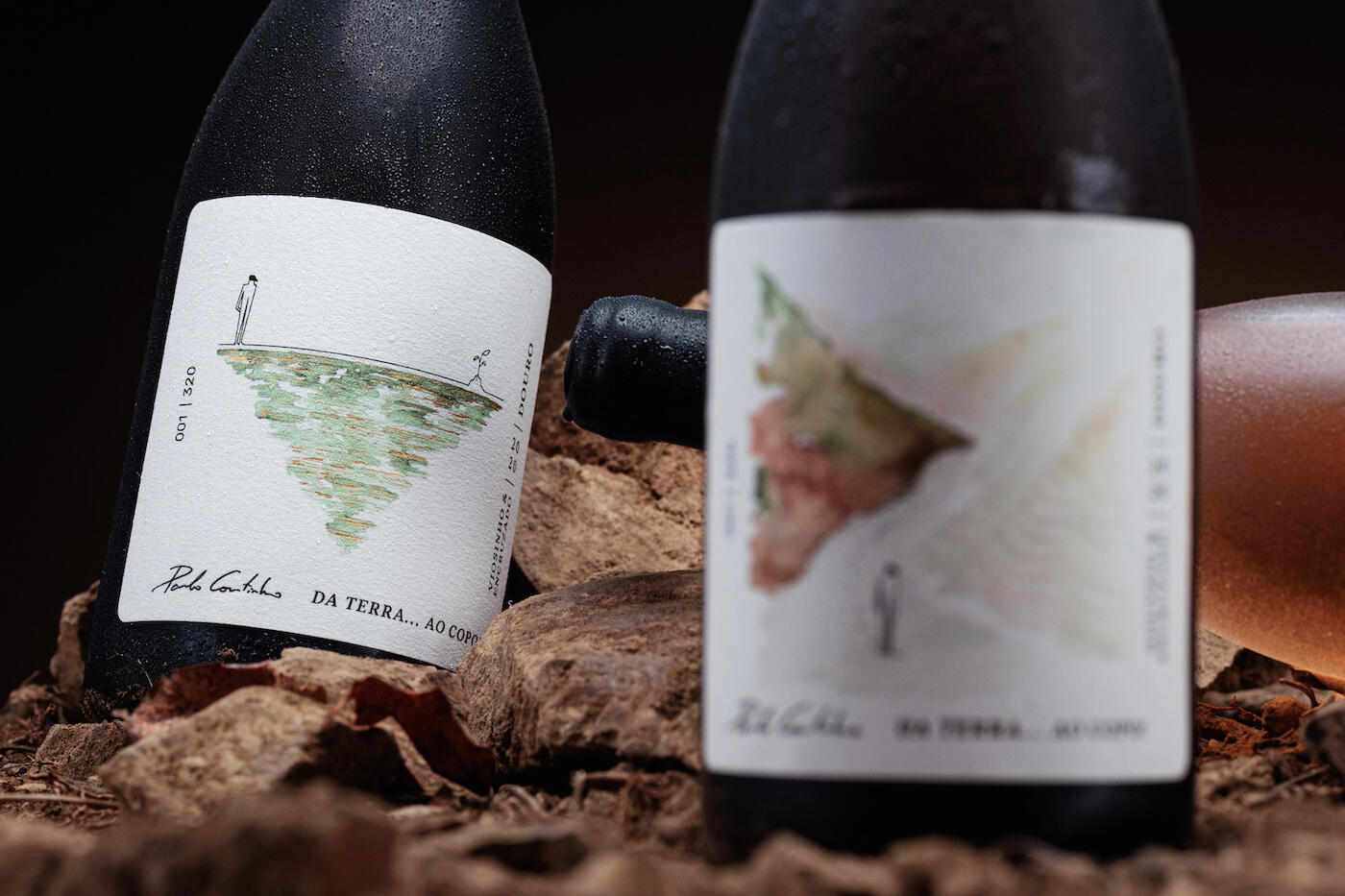
Paulo Coutinho is a Douro winemaker who started working in the early 1990s and produces wines under his own name. Among them, in 2021, he inaugurated the experimental series “Da Terra… ao Copo!, which includes these three wines, two whites (Viosinho & Encruzado and Gouveio & Encruzado) and another, an organic wine, which he called Fusion. The whites use a natural approach, using indigenous yeasts and chestnut flower as a preservative; the Fusion is, as the name implies, a fusion, in this case of red must and white grape skin, which brings together the firmness of the red and the elegance of the white.
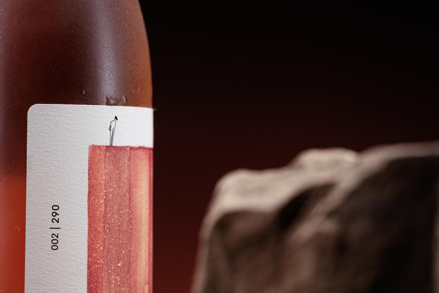
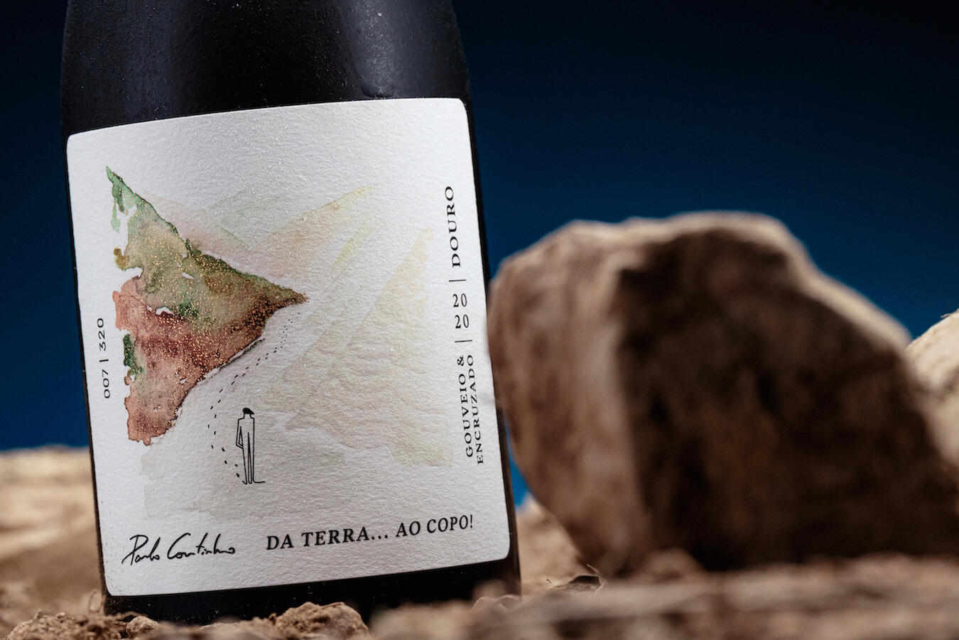
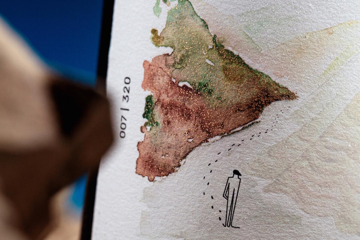
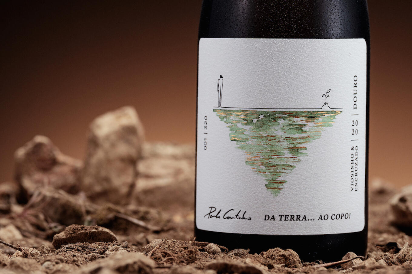
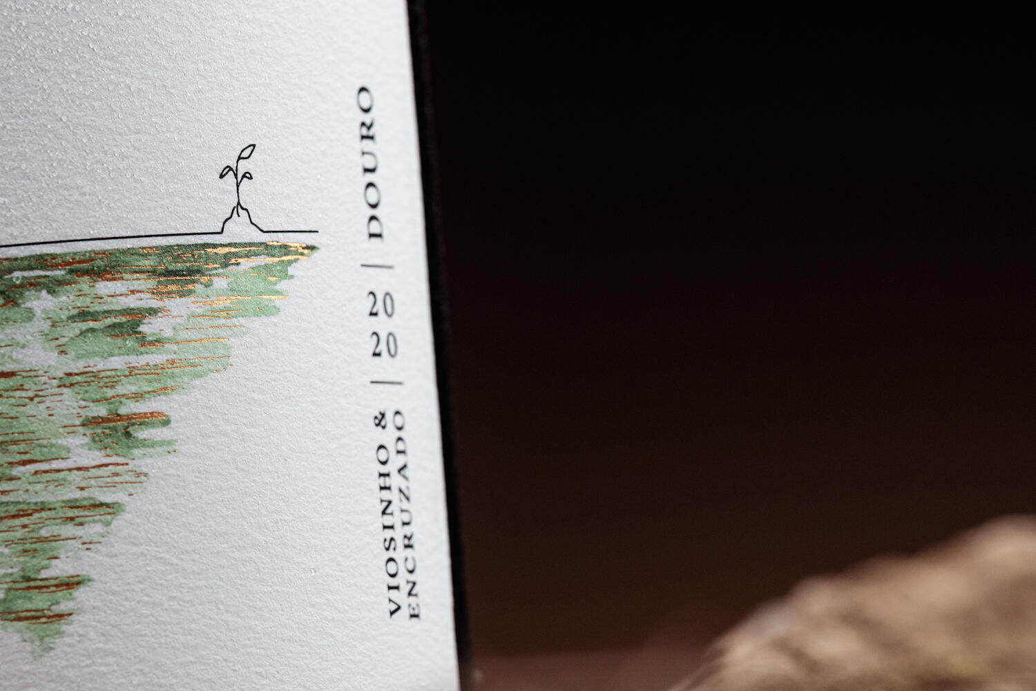
The figure of the winemaker was the inspiration for the creation of the character that walks around the labels, with the characteristic beret that Paulo Coutinho usually wears and his observant air. Besides him, the most important element to convey in this project was the earth itself.
The experimental and personal component of these wines made us leave the computer and the usual digital universe. We enlisted the help of Cláudia Martins, a visual artist, to explore shapes, and colors and create the world of the character.
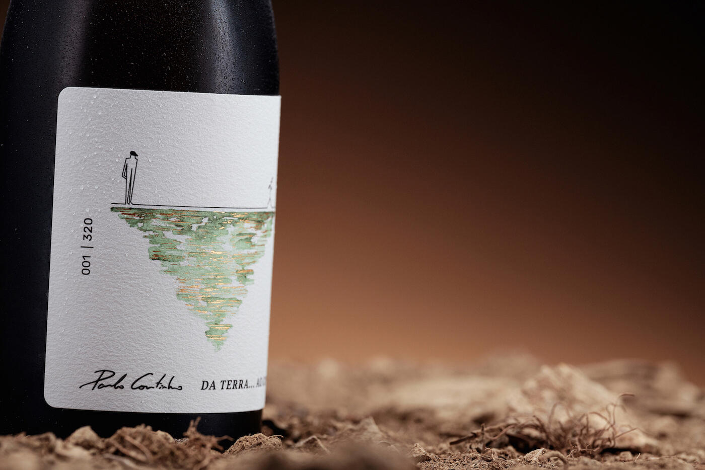
Viosinho & Encruzado represents respect for the environment, conscious agriculture, responsibility for the quality of what is produced, and respect for future generations: it represents, succinctly, the balance between Man and Earth. The spot of color, in a triangle, illustrates this natural and fragile balance. Gouveio & Encruzado is a stroll through the Douro, a tribute to the Mediterranean forests. The character walks through the landscape, leaving footprints that disappear on the horizon.
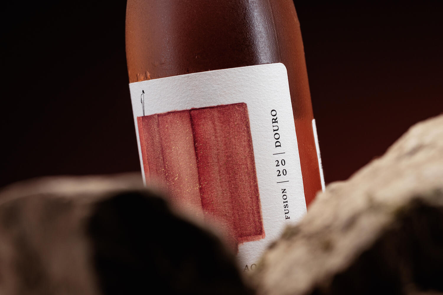
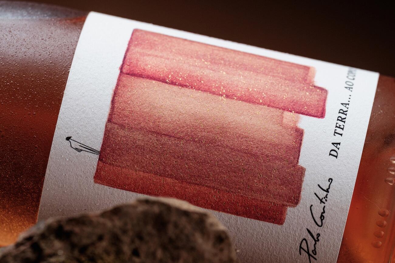
Fusion pays homage to the rock, the schist and its silica, the hue of the fusion between the red must and the white grape skin. The color, the hue of the wine inside, and the vertical stripes remind us of the warm schist soil.
The graphic composition around the designs is minimalist – and thus allows the central design to stand out, like a frame – and homogeneous among the three labels, making them belong, graphically, to the same family, besides, leaving open the possibility of new experiences to join this special range.
The labels were printed on Fasson Cotton Extra White paper, which gives them texture and tone. In addition to the printing, gold stamping was included on the landscapes, a detail that gives the wine more tactility and highlights the richness of the Earth, so central to the philosophy of these wines.