Redesign of the Alolivo brand for the Mexican market Alolivo is a Guatemalan product from the Agrade company, it is a mayonnaise that is distinguished by containing olive oil. Our client required that their product be positioned in the Mexican market with great strength, that it be seen as premium and of high quality.
Market studies were carried out, one of the in-depth interviews, which allowed knowing the opinion of the consumer in a more assertive way and an organoleptic study to know the acceptance of the flavor in the Mexican market. These studies were analyzed in depth, to give life to the new identity of Alolivo. They also went to the shelf to observe the brands that were competing, to know what they were communicating, the colors, claims and designs that were being used.
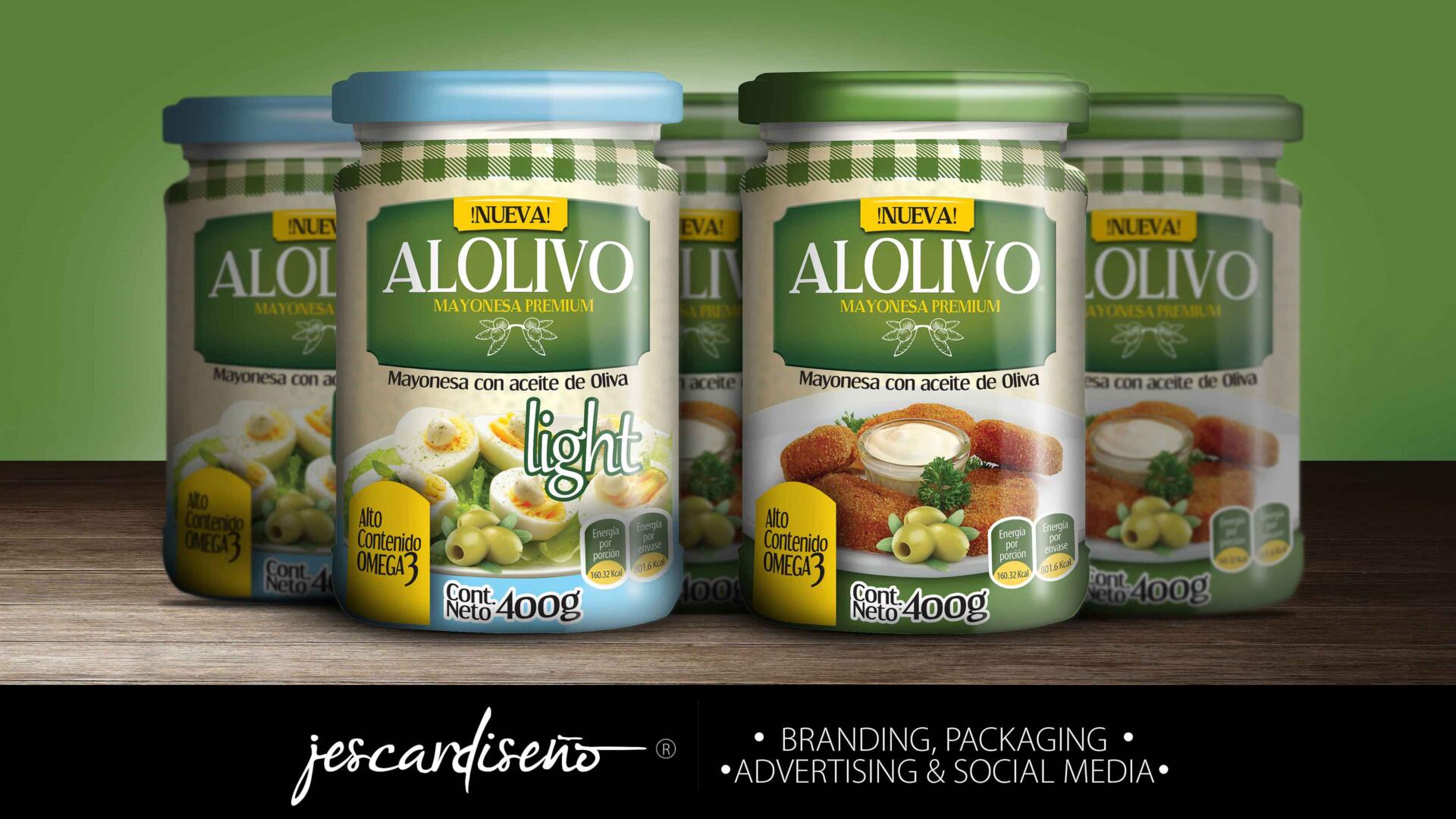
We found that few mayonnaise contained olive oil, so it was an important item to mention. After understanding the data, the identity of the new packaging began to be carried out, two lines were created: Alolivo and Alolivo light. Elements of the olive plant were added to both packages and it was highlighted that they contained Omega 3, one more claim that helped us position the product. Some delicious cheese fingers accompanied with mayonnaise were placed on the Alolilvo packaging as a suggestion of use, a tablecloth texture was added with the intention of making it look more homemade, and the colors that were used were green following the line of the olive.
For the packaging of Alolivo lighte, several elements were preserved, such as the tablecloth texture, and the green color, but a blue stripe and lid were added to communicate that it was a light product, the suggestion of use was sought to be one more option. healthy, in this case, boiled eggs, and salad, accompanied by olive oil. The client was satisfied with the proposal, it perfectly met the objective and was visually very attractive.