A part of the Justice Cannabis Co. brand family in the U.S, Crops provides euphoric, inclusive and easy-to-use cannabis experiences, made to facilitate joy and elevate wellness. This is the fifth brand we’ve developed for Justice Cannabis Co., with each one as unique, inventive and informed as the other. Crops was no exception.
Crops make flower powered products that bring freedom, ease and joy to your everyday. Their product range works symbiotically with your body’s central nervous system to unlock wellness, expand tranquility and find perspective shifts in a way that is natural, therapeutic and good for both you and the planet.
All brand elements for Crops were developed by the team at Smack Bang including the initial strategy, visual identity, packaging, digital, brand language and art direction.
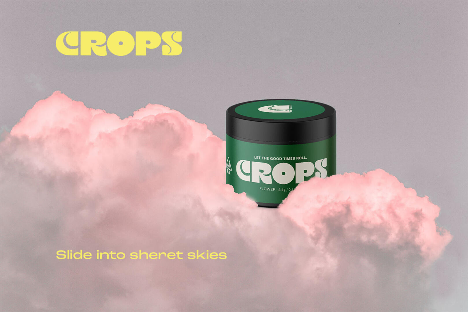
As a brand, Crops is about seeking the sublime. Using kaleidoscopic colourways, old-school typefaces and playful motifs of clouds, smoke and flowers, we employed a high-vibe, retro-feel that is innately positive. As flowers are the most common form of cannabis use, the Crops branding reflects this across all touchpoints by visually communicating inclusivity and approachability. The result is a brand that is welcoming and transportive, with a relaxed, retro vibe that lends itself to being accepted by many, thus creating a safe place for people to feel connected.
Through expressive copywriting, Crops communicates with flair and ease, using a tone that is direct, light and occasionally philosophical.
Whilst Crops conveys a familiar design language, it is imbued with more subtle meaning. Brand accents and layered, cloud-like iconography are a reference to reaching “cloud nine” and the O in the Crops brand mark takes the shape of a record – a nod to the transformative power of music and the associations of cannabis with counterculture and the arts.
Smack Bang started their process with deep and deliberate dialogue with Crop’s founding team and immersing ourselves in their vision.The strategy came to life from the central desire for Crops to encourage new perspectives, cultivate freedom and enhance the lives of those who seek ‘more’. The positioning reflected a desire to show Crops’ audience that they don’t have to experience the world in the way they have been told to.
Through strategy, identity, packaging and language design, we’ve built Crops a brand with a distinct and accessible personality – the kind you want to be around because you know they make you feel good. With its inclusive ethos and blissful aesthetic, Crops is a brand that is already gaining impressive traction in a saturated market.