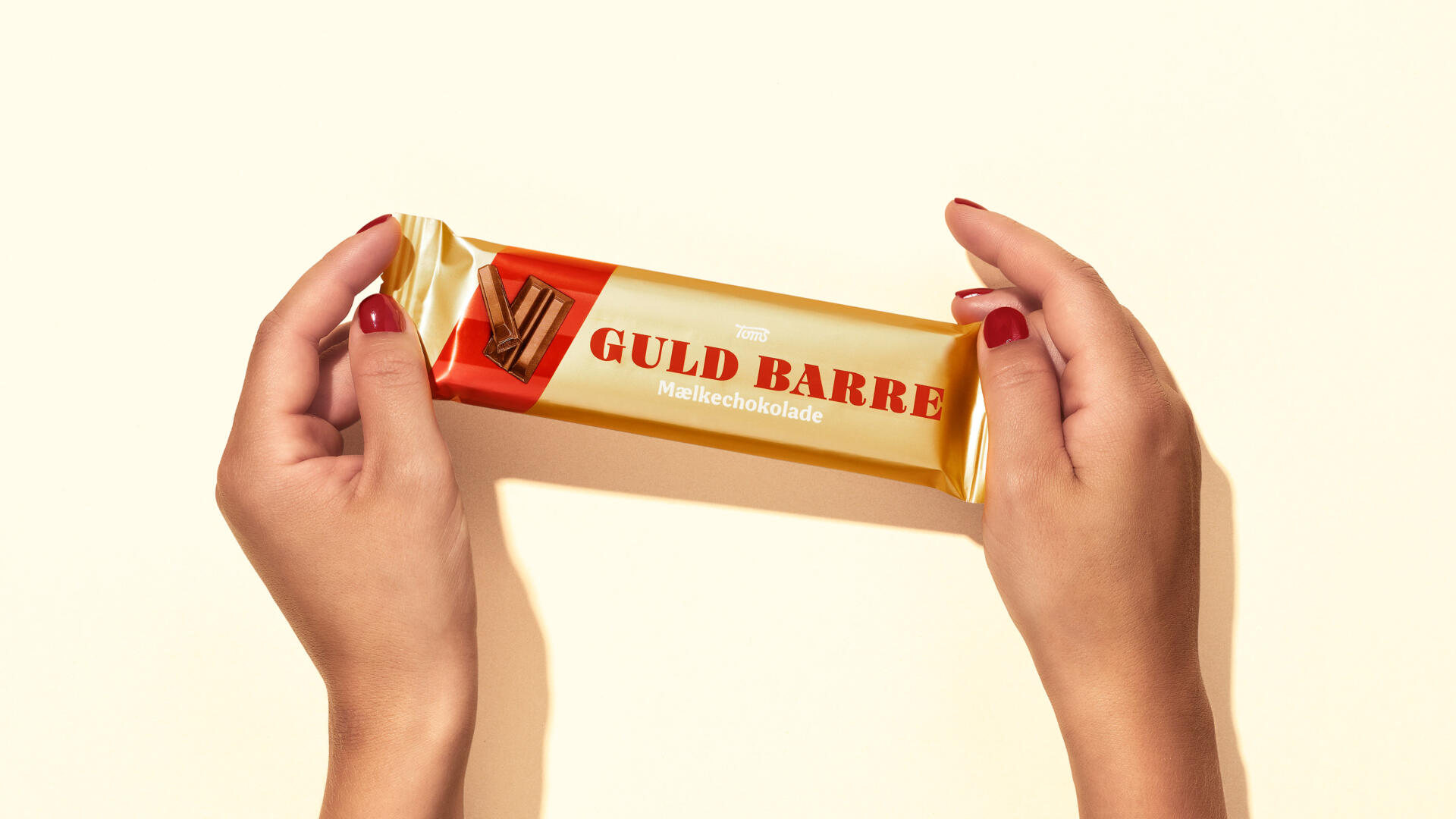
Ask any Dane, and they’ll know the Toms Guld Barre (Golden bars). So to call it a Danish icon is almost an understatement. Born in 1932, the iconic chocolate bar in gold packaging is on every candy shelf and is synonymous with quality, taste, and good times. A chocolate gold standard, so to speak.
Fast forward 90 years, and Toms is ready to give their classic chocolate a new lease on life. Scandinavian consumer brand agency Everland was brought in to develop a new design that would revitalise the brand legacy and make it contemporary.
Sabine Wahl, Marketing Manager at Toms, explains the collaboration, “Everland’s track record of redesigning Danish icons made us confident in choosing them. They understood our brand history, position and ambition, which they condensed into a design that truly rejuvenates the Guld Barre brand.”
A TASTE OF HISTORY
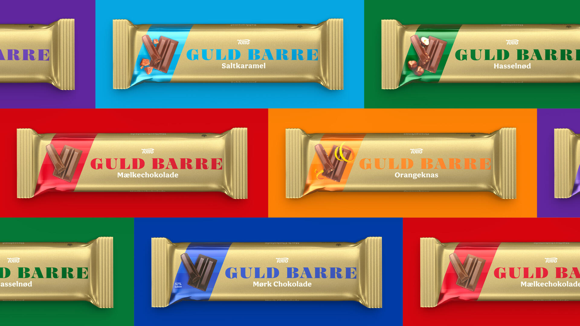
What makes Guld Barre unique is its heritage, shape and mouth-watering chocolate. So, Toms and Everland introduced a new logotype with hints to the original design. We amplified the taste appeal with vibrant colours and created an efficient design system, so consumers can easily find their favourite flavour. The stripes reflect the original chocolate bar shape and the satisfying sound of the chocolate breaking apart.
“The new design speaks to all ages and personalities”, comments Sabine Wahl. “It’s true to the Toms Guld Barre brand and timeless but still fresh and contemporary. It truly reflects our brand essence.”
Jonathan Faust, Design Director at Everland, adds, “Gold. It’s exclusive. Aspirational. Sparks the imagination. Kind of like Toms Guld Barre. Working with a Danish icon is humbling and exciting, and I believe we truly achieved a design ready to last another century. It’s the rebirth of a classic.”
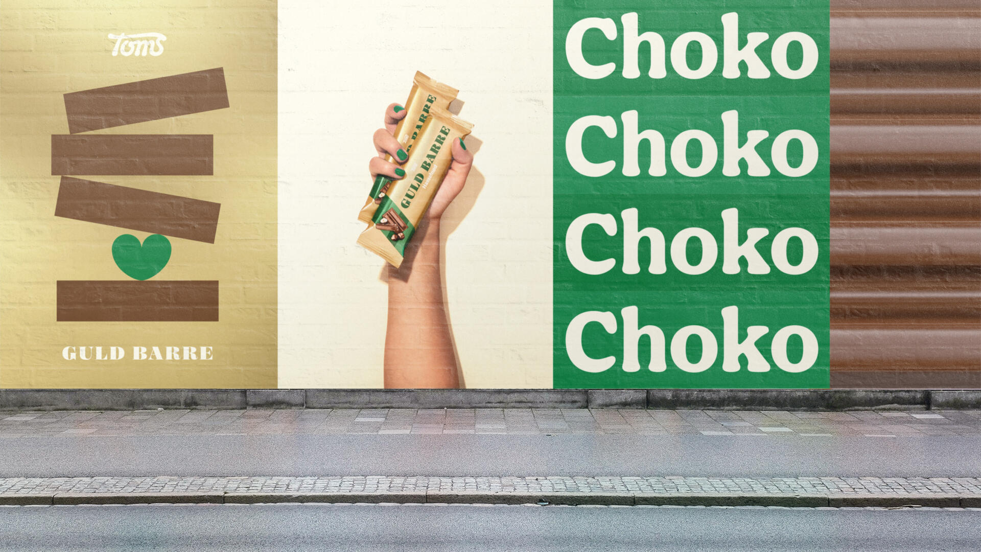
Besides the rebrand, Everland also helped with brand activation, like designing outdoor commercials, packshots and animations.