THE CLIENT
The Bodynell is a body lotion brand based in the United Kingdom.
THE KEYWORDS
Memorable / Stunning / Minimal / Contrasting
THE SOLUTION
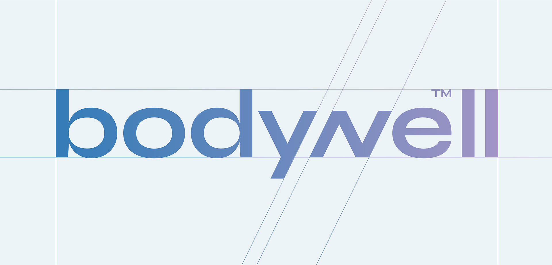
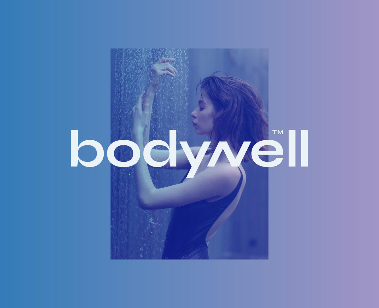
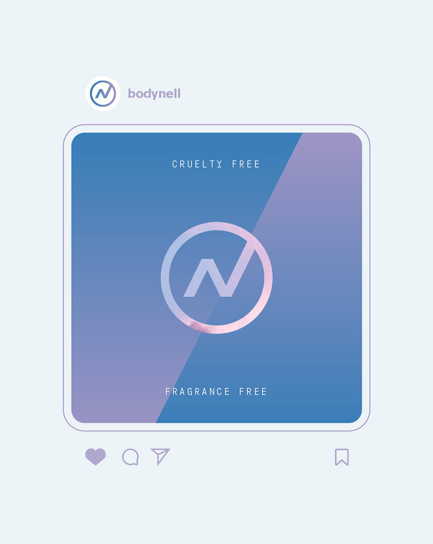
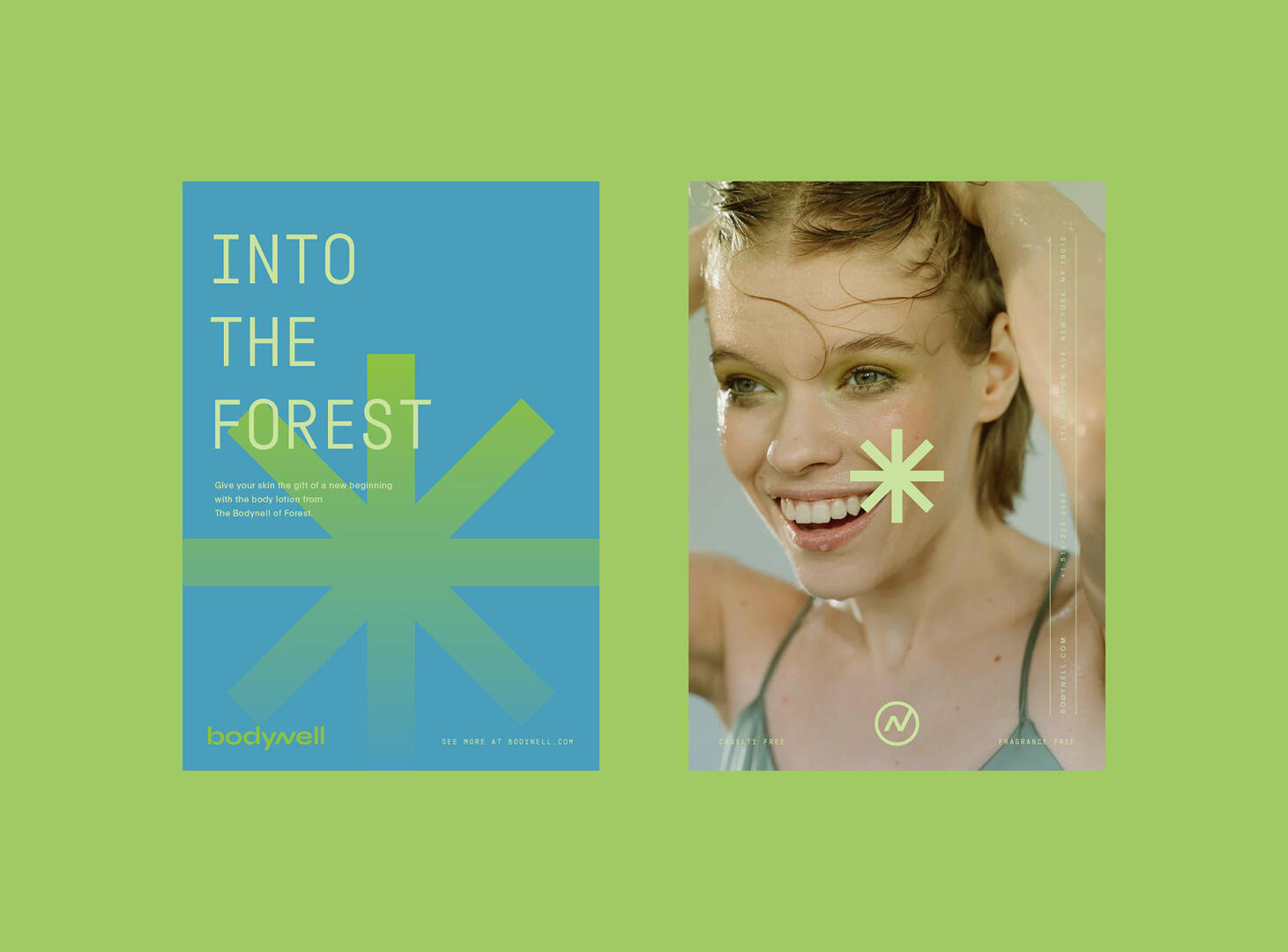
We decided to create a minimal logo with the highlight on the “N”, which has a slant as it is the “w” letter. This way, the logo has more association with something “well” for the body.
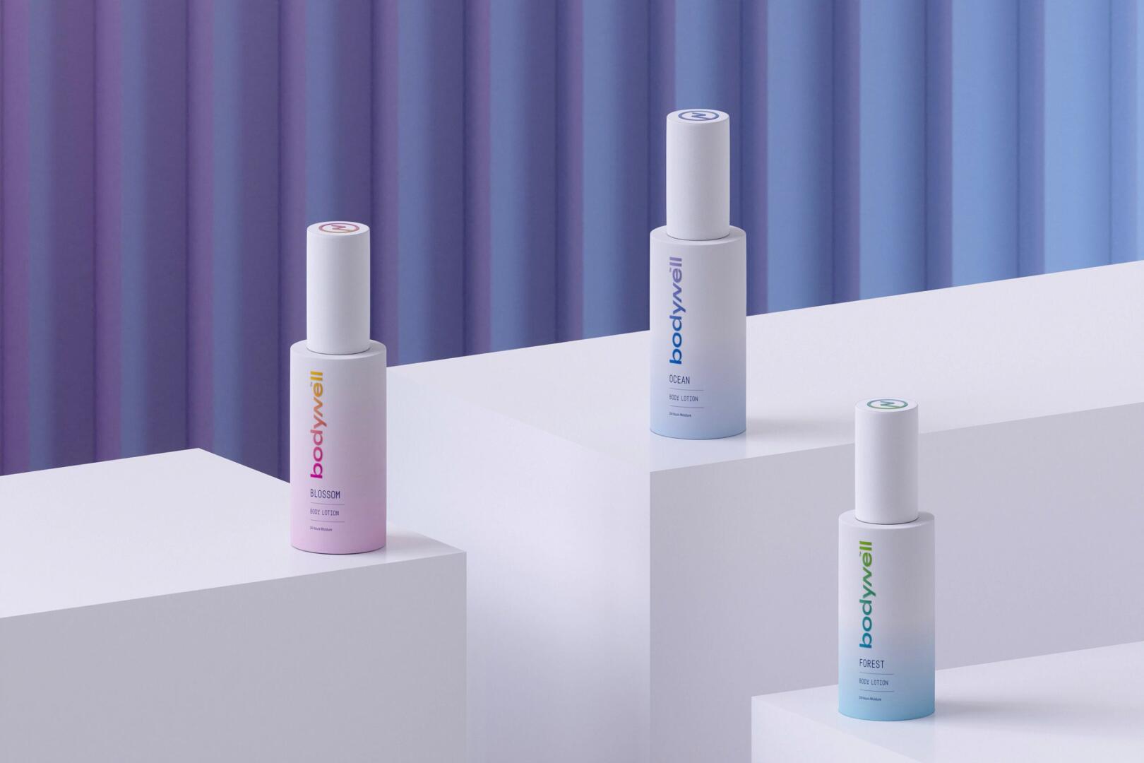
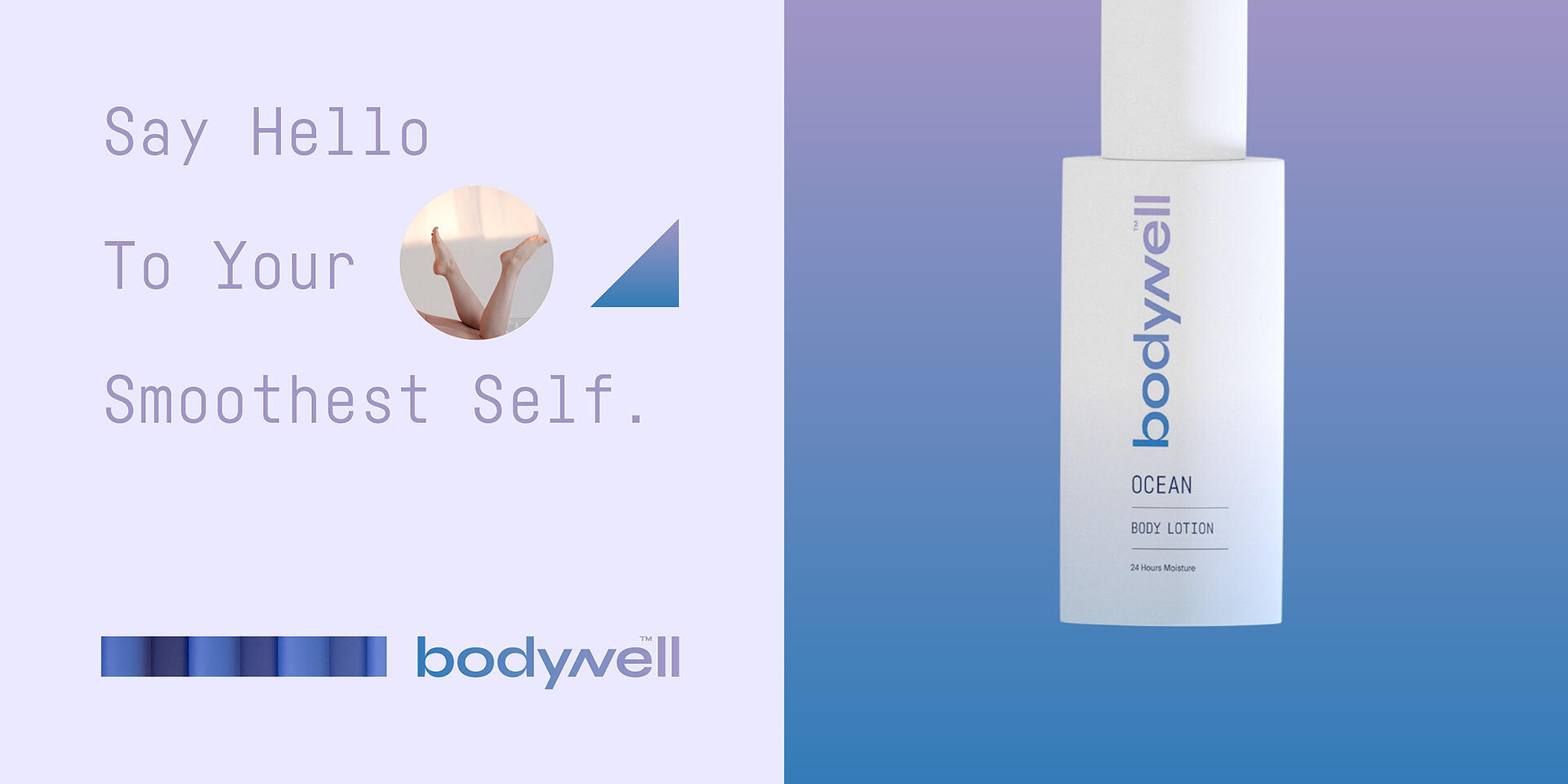
The colours we selected are contrasting and vibrant. Each colour combination has been picked for a specific body lotion flavour. For the “Blossom” aroma, we chose pink, orange, and yellow as these colours have associations with flowers and have meanings of positive, enthusiastic, and caring energies. For the “Forest” aroma, we applied blue to the green gradient, associating it with nature. For the “Ocean” aroma, we selected this blue-to-violet gradient because of its association with water and clean energy.
As for the packaging, we designed a simple layout with a white background. For simplicity, we have stated only the logo, aroma, and moisture time on the front part of the bottle. This way, it looks more professional and luxurious.