Leeds-based strategic brand design agency Robot Food has worked with Breez, a California-based premier range of cannabis infused products, on a full rebrand of its range that pushes the boundaries of accessibility and inclusivity of cannabis and paves the way for bringing the category into the mainstream.
Breez was founded in 2015 and comprises a range of THC and CBD-infused mints, tincture sprays and tablets. Since then, the cannabis industry has undergone huge changes in terms of legislation and the boom in product launches, with Breez’s range likewise seeing a rapid evolution, expansion and refinement. This rapid growth made Breez the #1 cannabis pill in California, and the #1 non-gummy edible, but it also created a branding challenge.
“These changes excelled at market, but the expansions have been ad-hoc and rushed,” says Anna Walters, CMO at Breez. “As a result, the design and brand identity had grown a bit feral.”
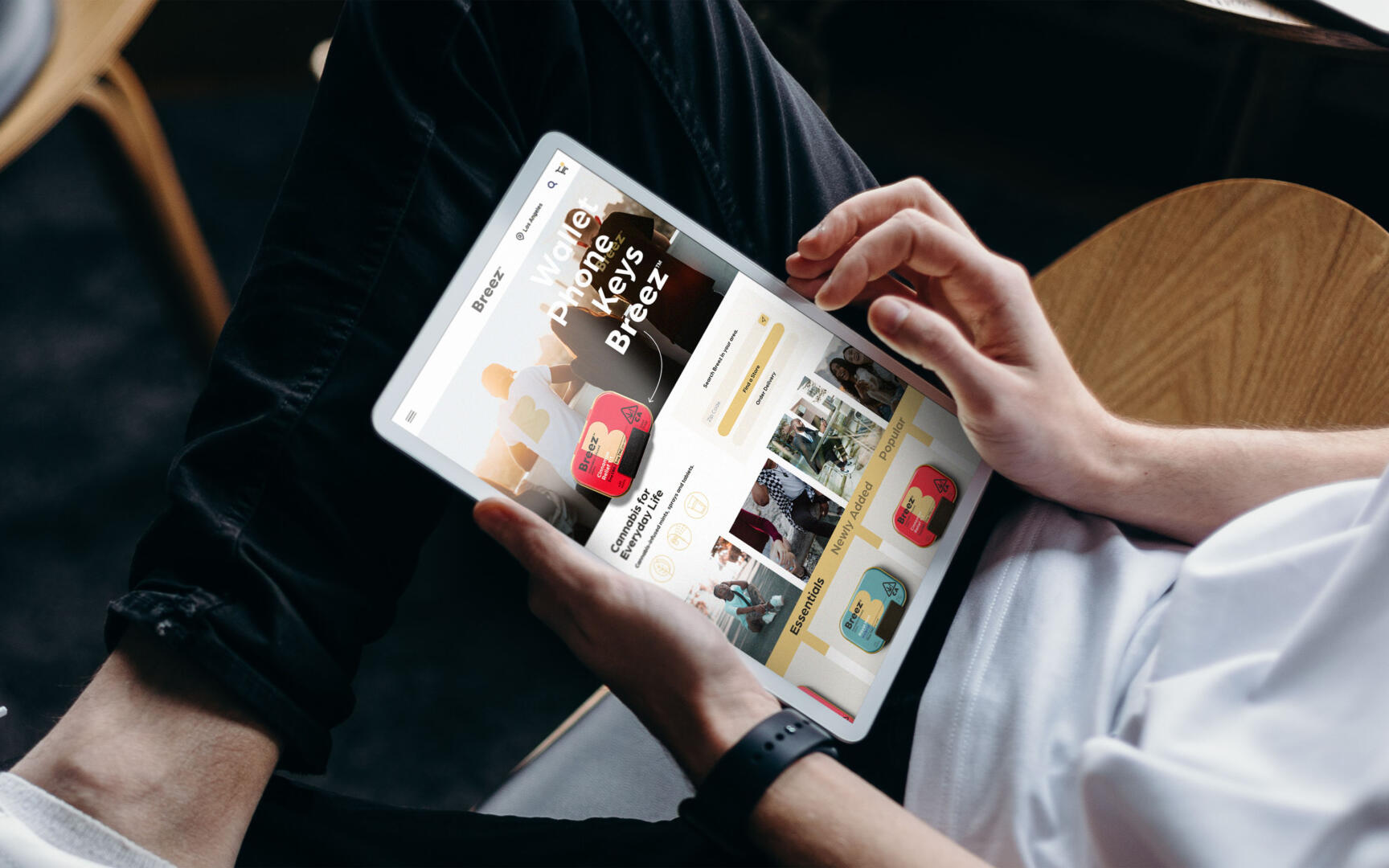
Robot Food was brought in to help Breez convert their success in California into a fully realised global brand, opening up its wholesale-only model to direct-to-consumer sales, and expanding nationally and worldwide.
Elevating the brand through inclusivity and functionality
Robot Food’s strategic and design work centred on positioning Breez as a functional and utiliatarian lifestyle product – an essential ritual in daily routine – by empowering everyone to unlock the benefits of cannabis from an easy, reliable and trusted source.
As a part of this, Robot Food aimed to strengthen, reinforce and defend Breez’s bestselling products and position the brand as a future household name. This meant broadening the appeal of Breez products to those who were less familiar with cannabis products and their benefits while also strengthening the loyalty of Breez’s existing fan base.
During the workshop phase, Robot Food found Breez’s customer base to be “very broad,” says client director Jess Cook. “They have so many amazing stories in the feedback from their users – real people saying how the products have helped them with things from aches and pains to creative inspiration.”
These stories struck Robot Food as an untapped goldmine that showcased the product benefits in a human way that engendered trust and reinforced the brand as the category guide. They affirmed that rather than positioning Breez as another ‘hipster’ niche brand, there were multiple opportunities to open it up to a much larger segment of the population and position as an accessory to our everyday.
Strategic naivety
The fact that Robot Food had never worked on a cannabis product proved advantageous: the team applied its expertise in FMCG branding to the cannabis category, which seemed in dire need of a shakeup. “We were quite naive about the category until we started working on it,” says Robot Food founder and executive creative director Simon Forster. “That was a real benefit because it meant we could look across the existing brands and ask, ‘why does it all look the same?’ There’s no reason for it.”
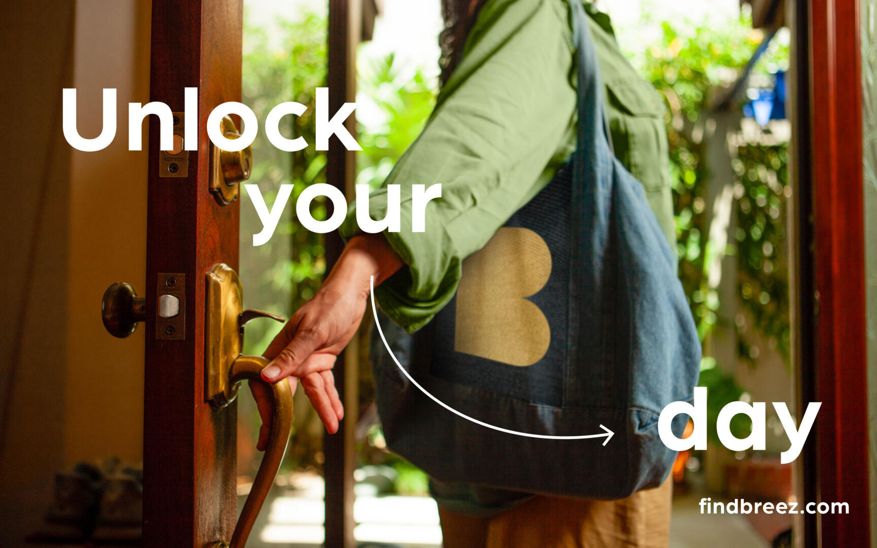
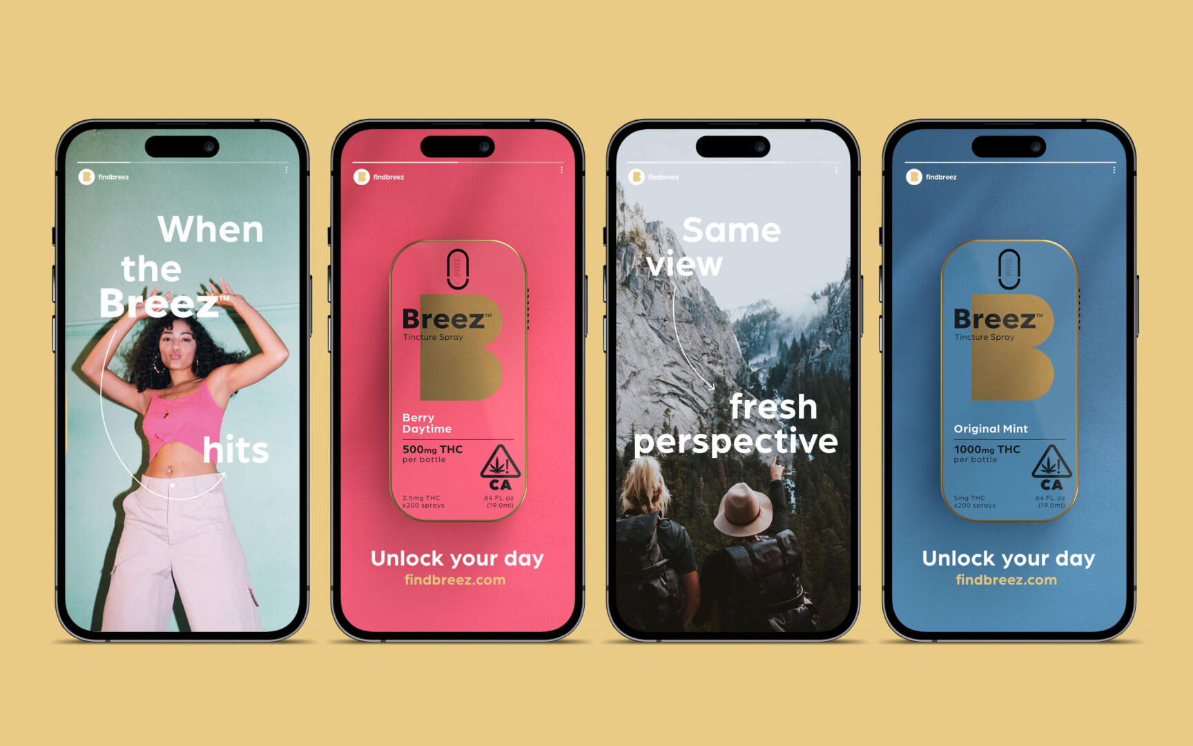
Robot Food identified Breez’s key offer as helping people ‘unlock’ their day: each product in the range directly targets a specific wellbeing issue, such as enhancing fun, aiding relaxation, or helping with sleep. By highlighting the ways Breez products can help enhance our everyday, the new brand cements itself as the cannabis brand for daily life.
The cannabis industry’s recent boom of competing brands has created an overwhelming choice for consumers, but often these brands are lacking in authority and trust, with inconsistent products that don’t live up to their promises.
“The category was still missing a beacon brand that stands above the rest, bridging functional, emotional, flavourful and benefit-led in a way that just fits into your life,” says Forster.
Clarity, functionality and accessibility
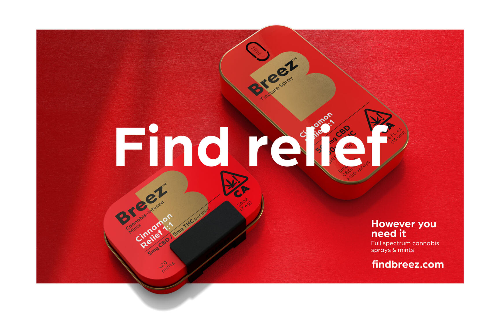
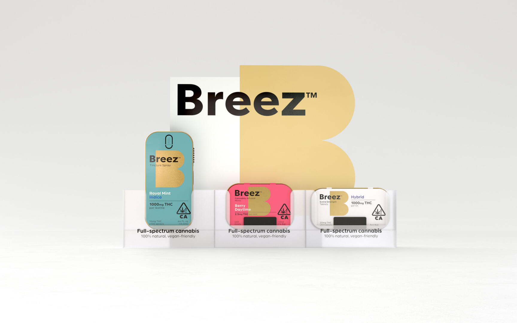
Where new products had been added over the years, Breez’s brand architecture had become muddied so Robot Food’s designs simplify the range, with clear definition between differentiators like phenotypes, cannabinoids, strengths and flavours.
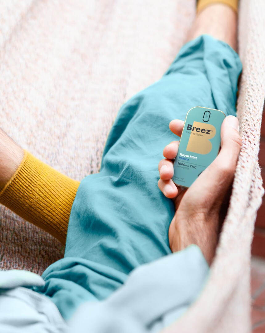
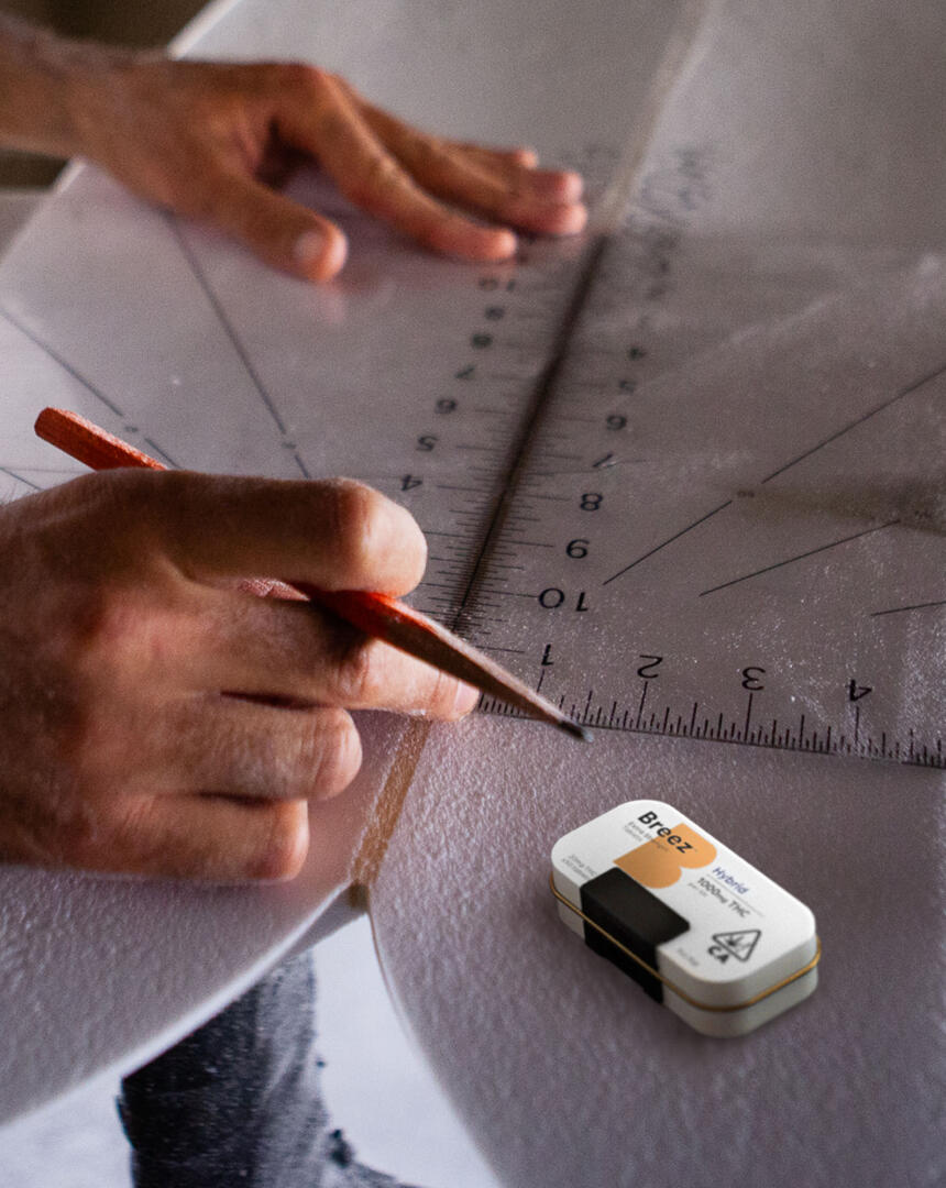
The new designs retain the playful friendliness of the vibrant colours and ownable gold of Breez’s previous branding, introducing a reworked version of the brand’s distinctive blocky typography to make the identity more utilitarian in feel and unite the entire range to create firm brand recognition.
Overall, the new packaging designs lead with functionality and consistency, enabling messaging on pack to convey a lot in a limited space. The designs prioritise clarity and communication using unfussy language and functionality without compromising aesthetics.
This evolution in tone, typography and visual identity has seamlessly opened Breez up to newer would-be cannabis product consumers, demonstrating Breez’s potential for everyday wellbeing usages like unlocking creativity, enhancing motivation or simply helping people to pause, take stock and “see the beauty that’s around us,” says Cook.
“The packaging is almost functional, but it sits within this beautiful brand world,” Forster adds.
“A lot of consumers in California are very aware of the category and they know what they’re looking for. But for a lot of people, it’s still quite scary if you don’t know anything about it. Breez’s new branding feel a lot more accessible: not this closed off cannabis ‘club.’ If it’s the easiest to read and get to grips with, then you’re on to a winner.”
He adds: “We referred to Breez almost like a Swiss Army Knife. It has a utilitarian feel, but it still feels friendly, and our positioning is all about unlocking your potential.”