THE CLIENT
Dose is a natural and contrasting herbal tea brand that is based in North America.
THE KEYWORDS
Friendly / Natural / Vibrant / Unique
THE SOLUTION
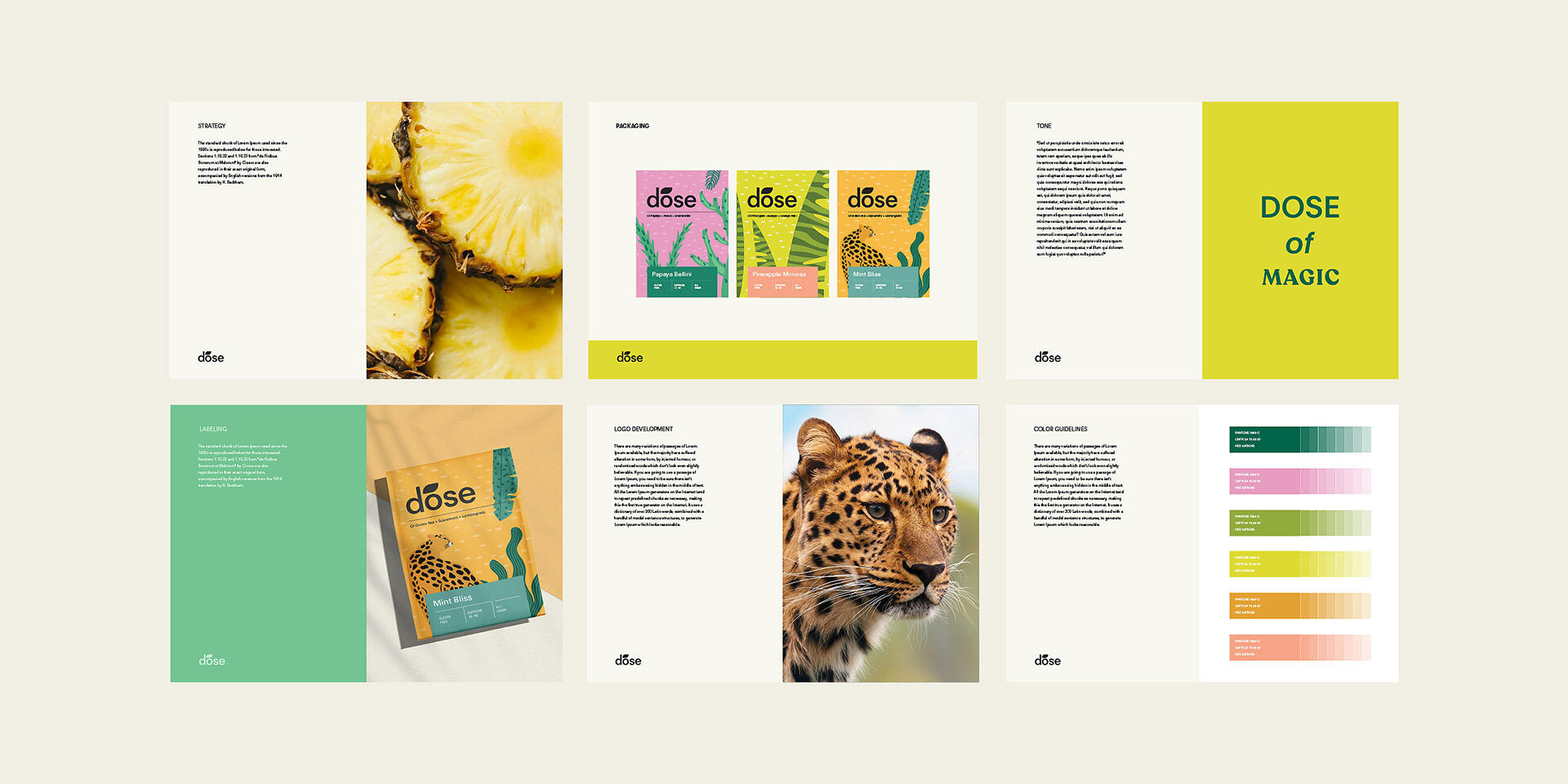
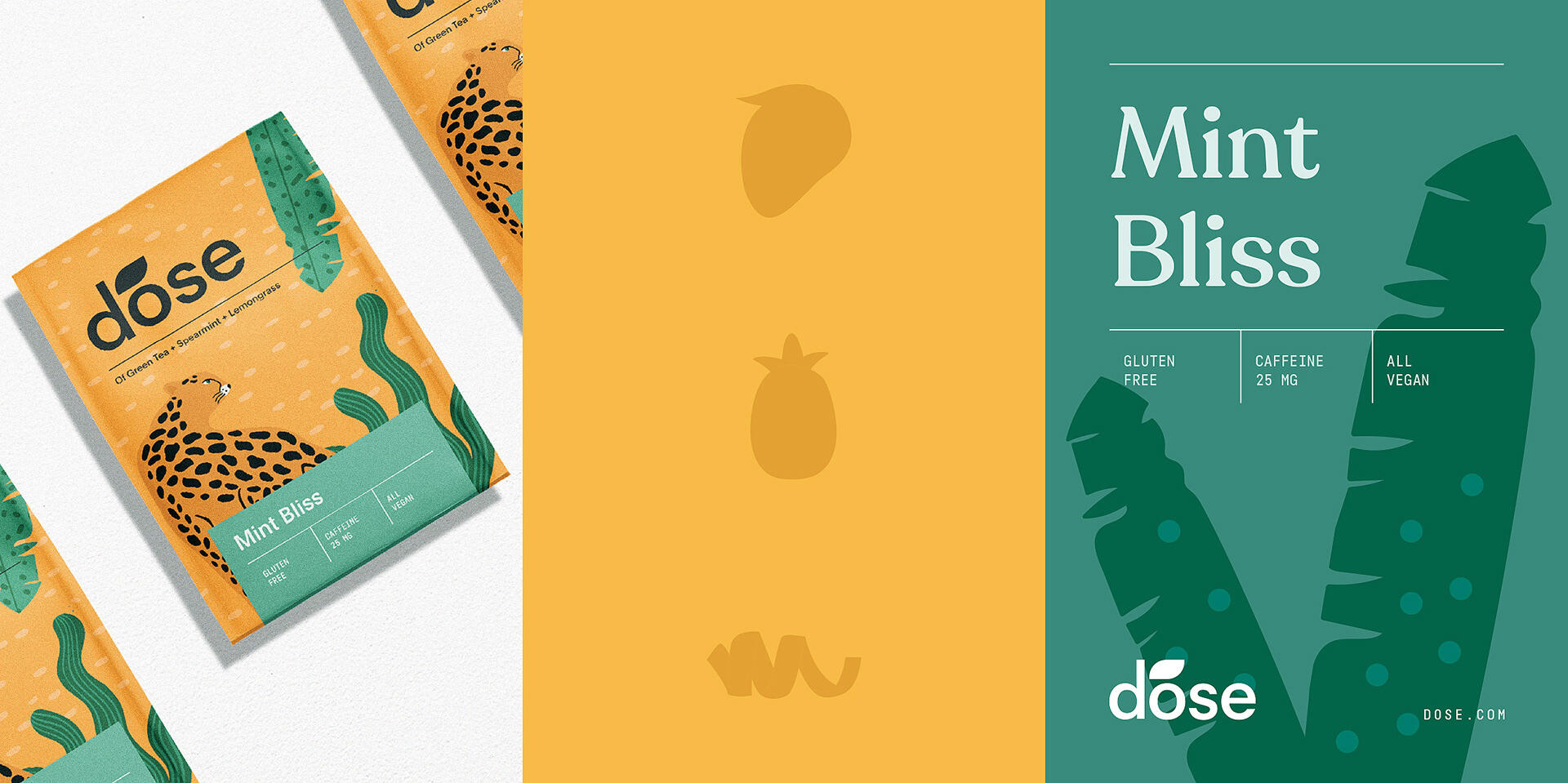
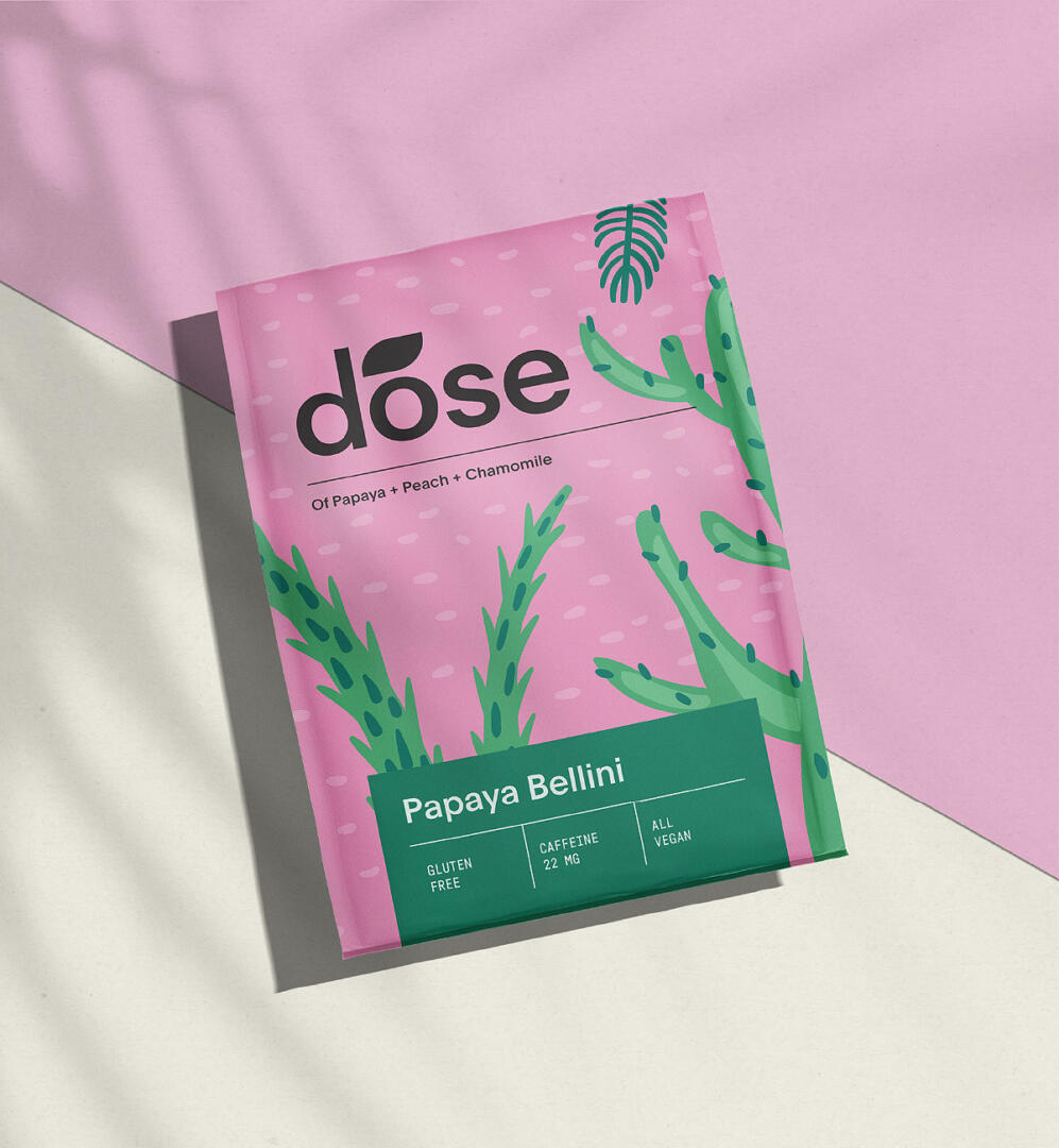
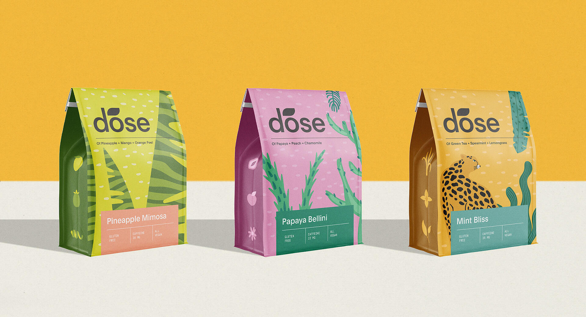
For the logotype, we have selected a sans serif type of font and integrated a highlight as a leaf illustration above the “O” letter. This way, the logo has a minimal, timeless, and modern look.
We selected natural and fruit-associated colours, which are mostly green, orange, and pink, for the contrasting combinations. We have also included black to create a highlight on specific parts with it.
The packagings are vibrant and brightly colored. For each flavour, we created different illustrations with vivid backgrounds. This way, the packaging designs become unforgettable and noticeable. The layout is made simple and minimal due to the illustrated background.