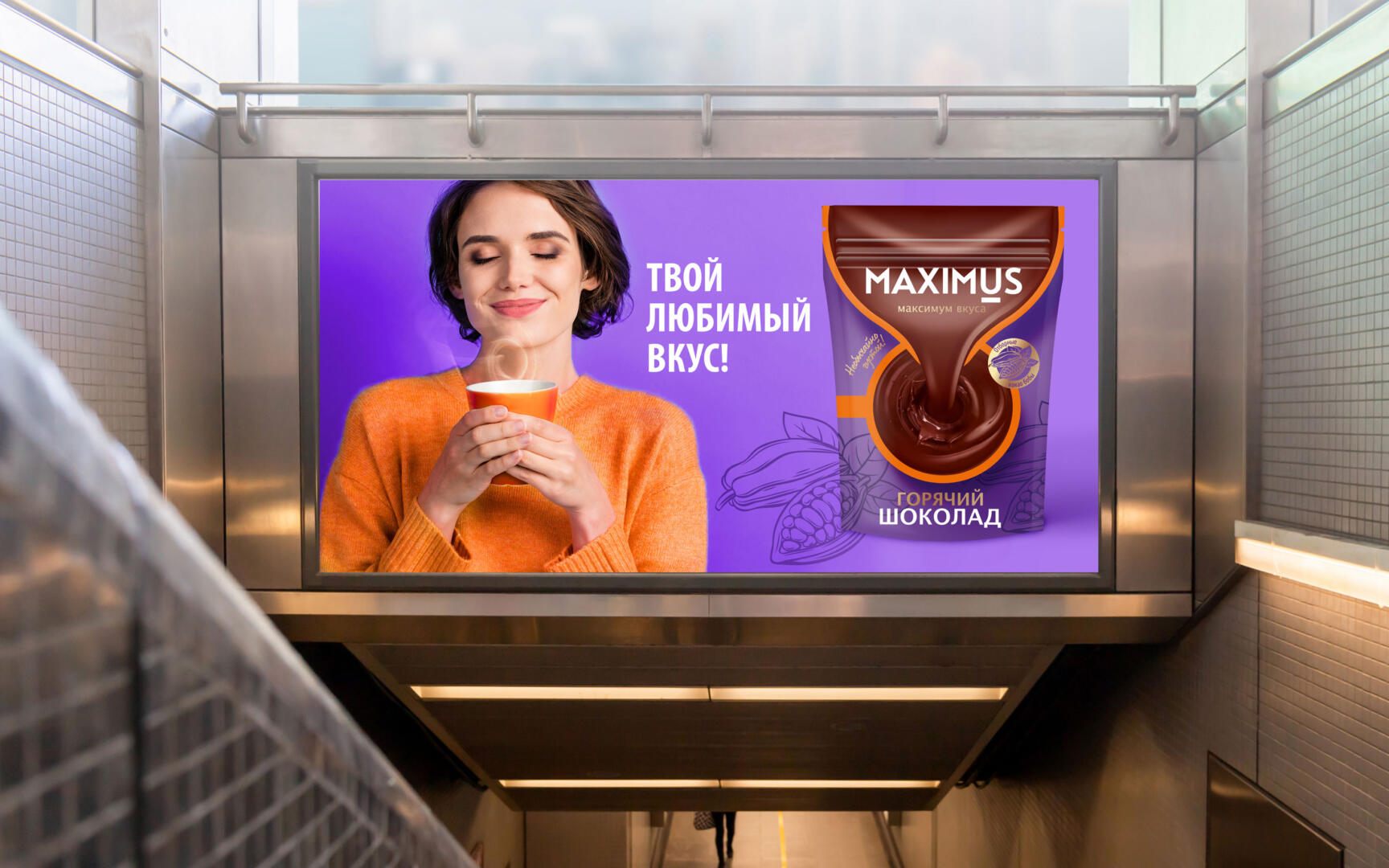
Maximus – maximum taste!
Dobrynya-Dar is a dynamically developing company that produces and imports tea and coffee in the CIS.
Dobrynya-Dar produces products of the following brands: coffee “Maximus”, “Strong”, “Indiana Gold”, black tea from the collection “London Tea Club”, green tea “Good Morning”, a series of Ceylon, green, flower and long leaf trademark “Dobrynya Nikitich”, fruit tea “Frutos Ceylon”. The entire technological cycle of production is built in such a way that the consumer receives a high-quality product that meets high requirements at the best price.
A task
To create a recognizable bright design that will be able to highlight the brand on the shelf, “move” federal and local competitors and convey the benefits of a new product from the Maximus brand.
What do we need to do:
Highlight the logo and packaging on the shelf Develop a tasty, appetizing food zone that will help attract attention and desire to buy a product Develop a system of differentiation between SKUs and product lines Communicate the benefits of the product and brand
Solution
Before starting work, we proposed to audit the current Maximus packaging in the “coffee” category and identified a number of details that we would like to correct in the new design for the hot chocolate brand.
The design of the current brand was not the most noticeable on the shelf among competitors such as LaFesta, MacChocolate, which have a good food zone and a rather catchy design. In addition, it became clear that if we copy the basic principles of building the packaging architecture in the coffee category, then this will rather harm us in creating visibility, since the use of bright patterns will make the design blind – it will not attract attention, and a small food zone will not allow create a sense of taste.
Shelf analysis helps us to offer the client a clear packaging design model that can increase the commercial effectiveness of the brand. Having presented the result, we proposed several options for further cooperation – a full-fledged project with options and final implementations, or one concept that most clearly meets the task within the Startup tariff.
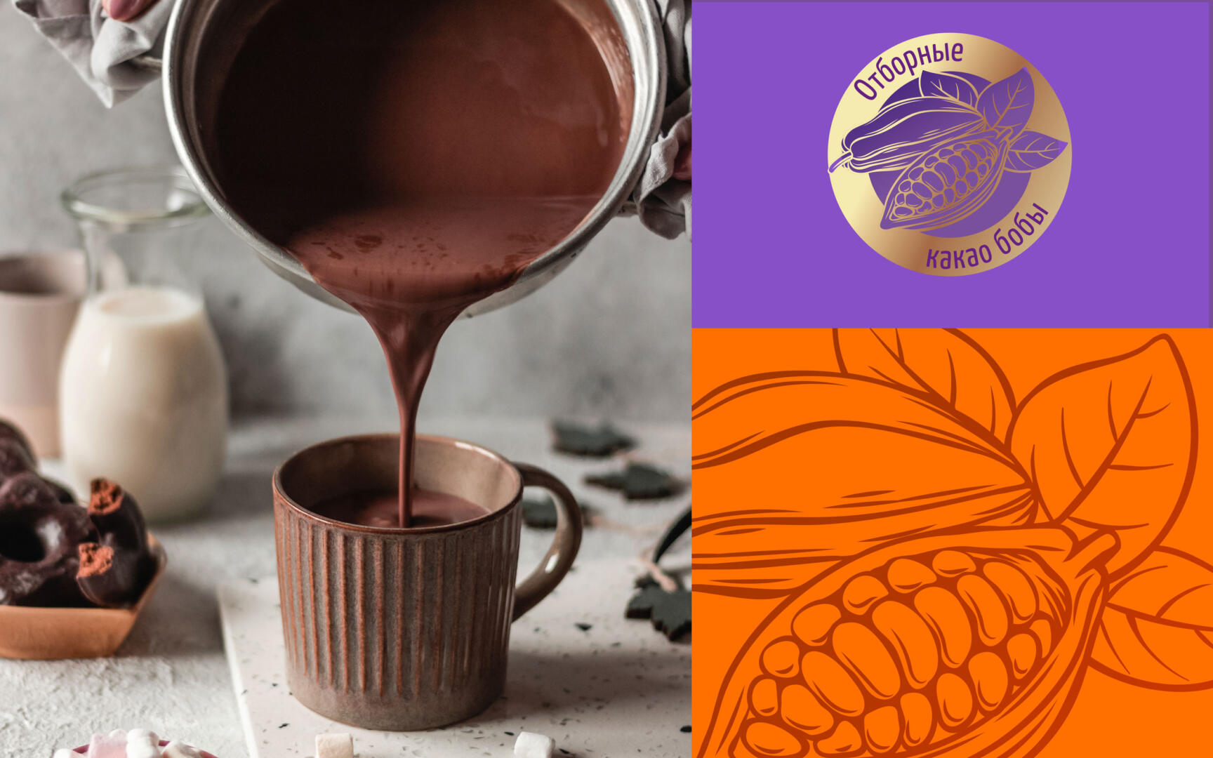
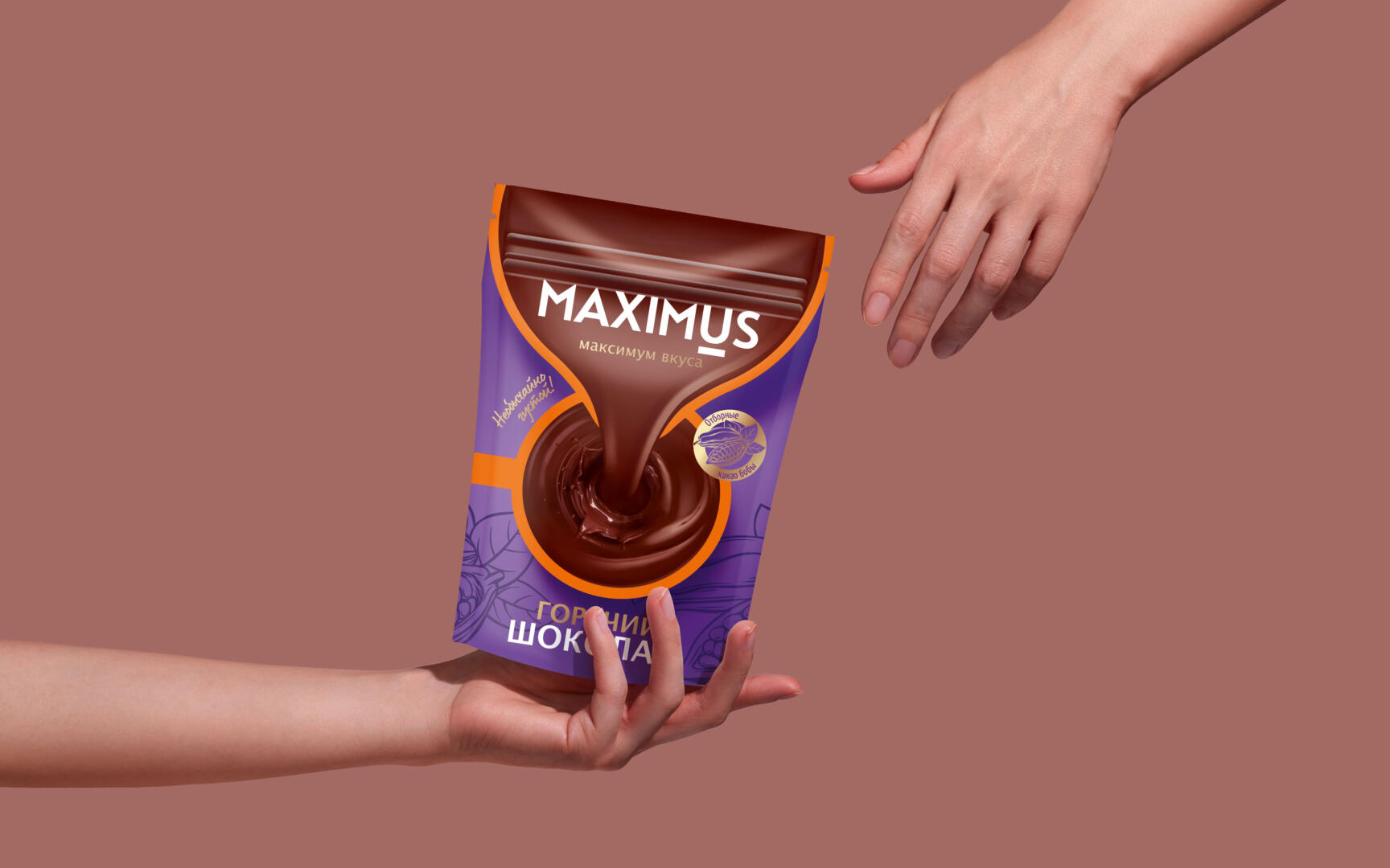
We made the largest possible delicious food zone in the brand block zone, where the brand name Maximus is written. The use of purple in combination with orange and chocolate gives a sense of maximum flavor for this category. The central part of the entire architecture of package is a grandiose food zone, which is larger than that of all other competing brands and perfectly demonstrates the density and richness of the drink. A large logo, category, listing of characteristics and properties of the product – “selected cocoa beans”, “extraordinarily thick” – form a good contextual and conversion layer.
After work, we analyzed how the new design looks on the shelves and was able to compare it with the coffee category, as if we were simply transferring and adapting the coffee brand attributes to hot chocolate packaging. In this case, the efficiency would be much lower. Having studied the category and competitors, we managed to create an excellent option that strengthens the position of the Maximus brand on the shelf and takes its rightful place in the category among the competitors.