Nemi Design Re launch
Our client:
Nemi: Best healthy churritos snack brand in the US
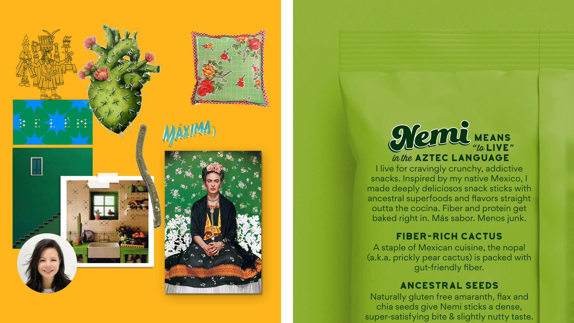
Nemi is a growing company that proudly represents Mexican culture through a taste full of crunch. The name of the brand means, “to live” in the language of the Aztecs.
Nemi was founded by Regina a Mexican entrepreneur who is greatly connected with her heritage. Her company follows the dream of love and nostalgia from a homeland that is represented by Regina’s abuelita and the scent and flavors of Mexican traditional cuisine.
Nemi’s flavors are inspired by Mexican traditional food to bring the Mexican style to a brand-new snack experience.
As main request Regina told us that she needed a design that represented Mexico in a respectful and meaningful way. Many of the Mexican products that can be found in the US use stereotypical references on their designs that hide the truly meaning of the Mexican culture. Our client wanted to emphasize these genuine values of a country full of culture, color and joy.
Brief/ Outline:
The main task was to re-design the identity and package of Nemi through a new fresh style and language that allowed bonding in a more effective way with the new generation that is more aware of the transcendence of a healthier way of life and the importance of a wholesome diet. The product is a snack, but a healthy one.
The package’s new design had to be created based on the organic nature of Nemi’s ingredients and the Mexican origin of the flavors and the brand itself. It was fundamental to adequate the design to reassure the “Made in Mexico” trademark with authentic pride and avoid cultural stereotypes that minimize the value of the product.
Solution /Problem solving:
The new logo was designed inspired by traditional Mexican iconography that can be found on the streets of most Mexican cities but adds a contemporary look that merges tradition with modernity to denote a dynamic and up-to-date product. The bold colors, round edges on the typography and lively energy of the logo itself were achieved by summarizing the features of the product.
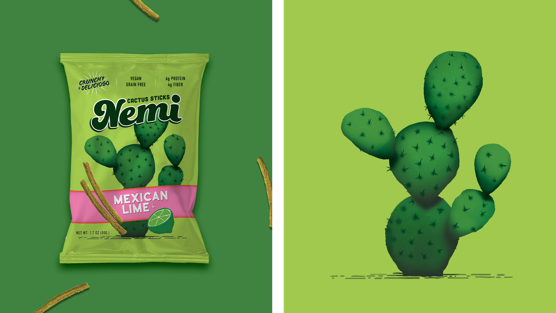
The nopal (prickly pear cactus) was conceived as the main character of the whole redesign and so it became the central piece of the package. The vibrant green of the cactus was used as a symbol of a vegan and healthy product with numerous assets that contribute to achieving a healthy lifestyle.
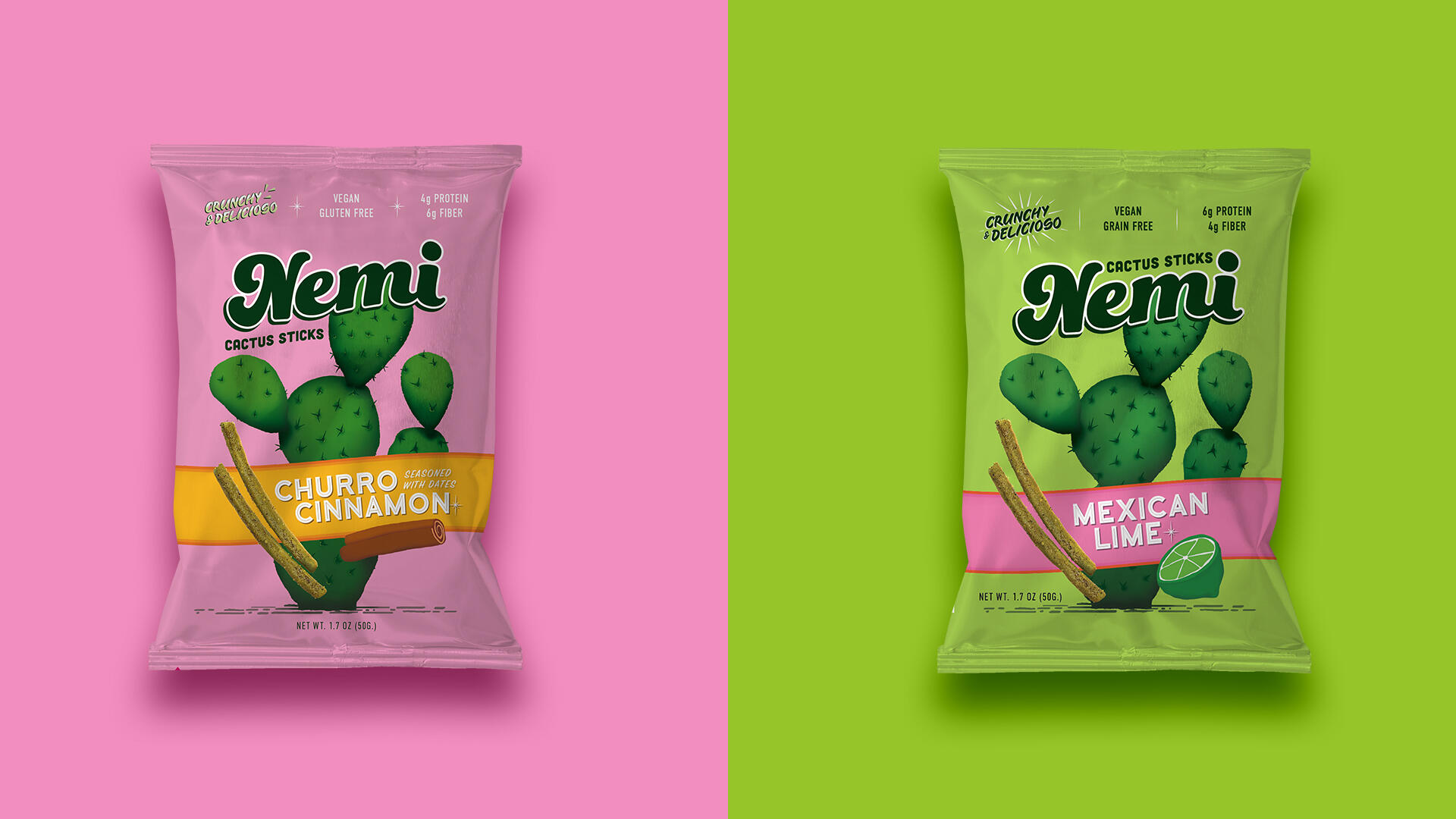
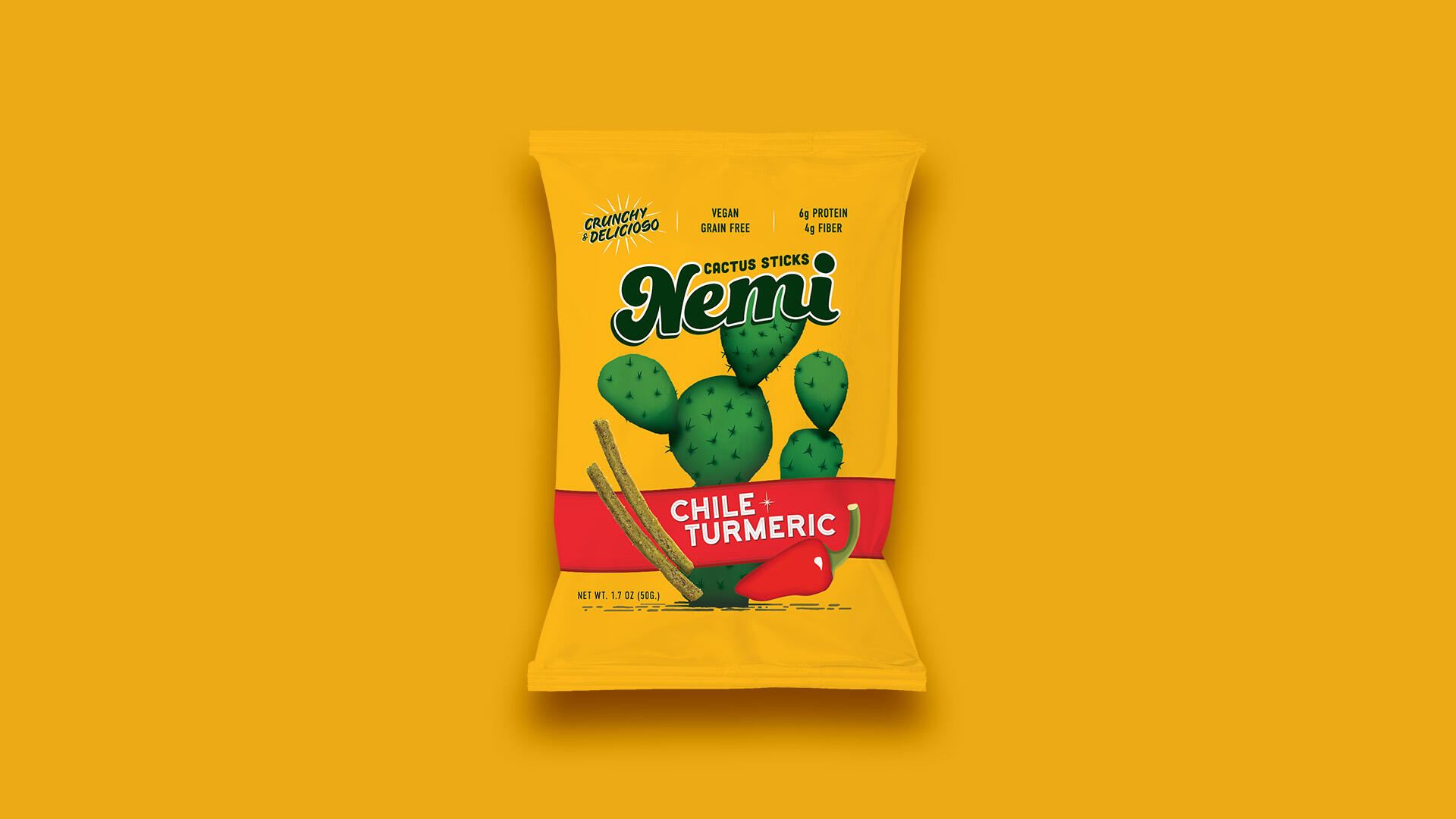
Every color and detail in the package and the logo was chosen to emphasize the personality of the product and its origin. The flavor of every package is highlighted by a colorful stripe that reminds the image of a traditional Mexican rebozo (shawl), embracing the ingredients and accentuating the visual connection with the flavor.
The new design of the package and the logo re introduces Nemi with a vibrant, dynamic, colorful, cool and minimalistic design.
Process/ Design process:
There were many challenges during this process but the most important was the relationship between the message we wanted to communicate and the specificities of the product.
A snack that is made of fresh organic ingredients requires a fully opaque package that doesn’t allow light to go through it so the design should be made considering the whole space of the bag but keeping a neat and simple look.
The first stage of the design was an approach through Mexican arts and crafts that served as a starting point for the identity of the re-design of the product. With this premise, we started to clean up the look for a more consistent result.
It was fundamental to acknowledge the importance of a clear and simple design that was able to introduce the product to the American public who are not familiar with the main ingredient of the product (nopal/ prickly pear cactus) or with the peculiar features of the Mexican churrito. With this in mind, we started to visualize different prototypes to emphasize the shape of the churrito and as result, we used a 3D picture to illustrate the aspect and crunchy texture of the product in a more accurate way.
The design layout had to be clear and simple but strong enough to help the customers to identify easily every different flavor of the product through a fun and powerful package.
The flavors were another challenging element as some of the product ingredients are not generally popular in the US yet. In order to solve this challenge we created visual representations of every flavor to show the tasty ingredients in a clear and attractive approach.
The result of the design process left us with a bold and powerful package that proudly introduces a Mexican product that can’t be missed on the shelves and makes you curious about what’s inside and what it tastes like.