THE CLIENT
Nutrio is a vitamin and supplement start-up that targets students, middle-aged office workers, and definitely professional sports lovers in North America and Europe.
THE KEYWORDS
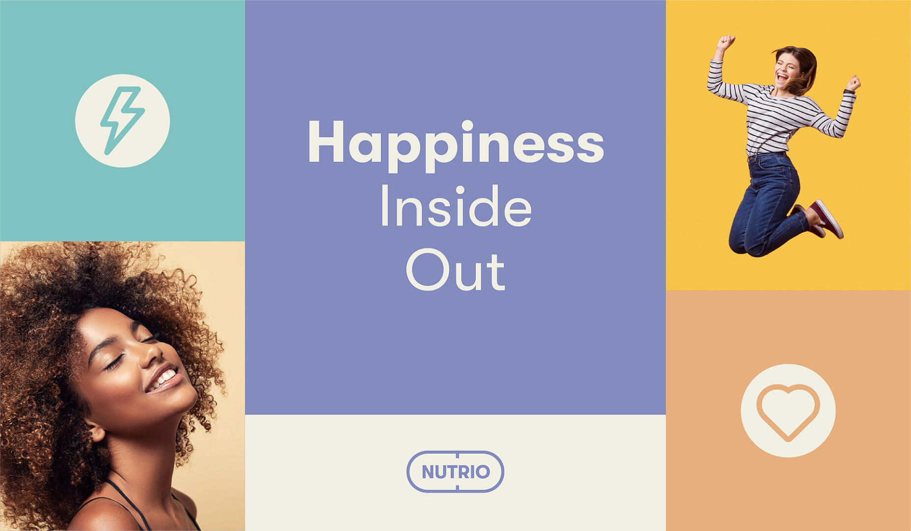
Understandable / Simple / Clean / Meaningful / Modern / Energetic / Friendly
THE SOLUTIONS
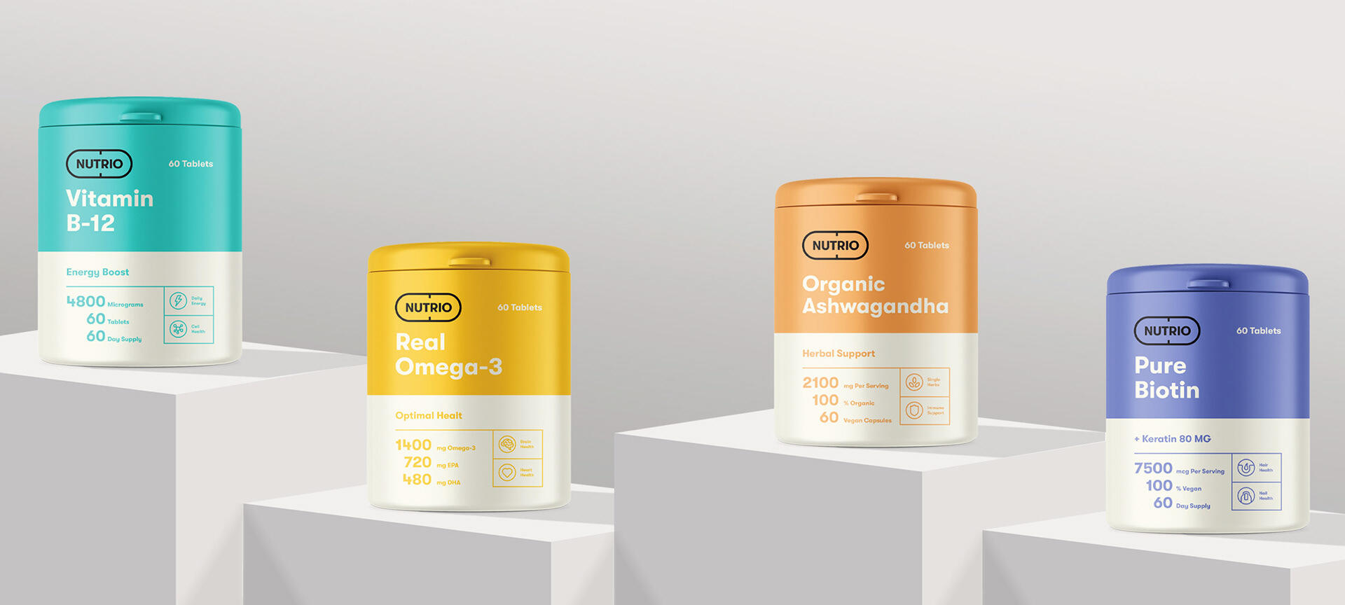
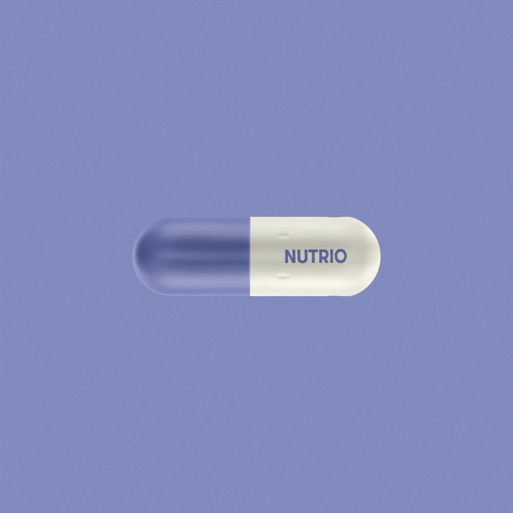
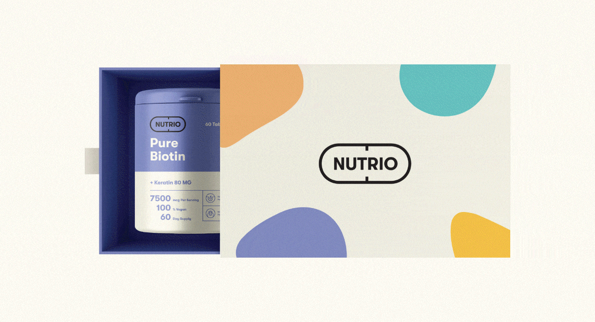
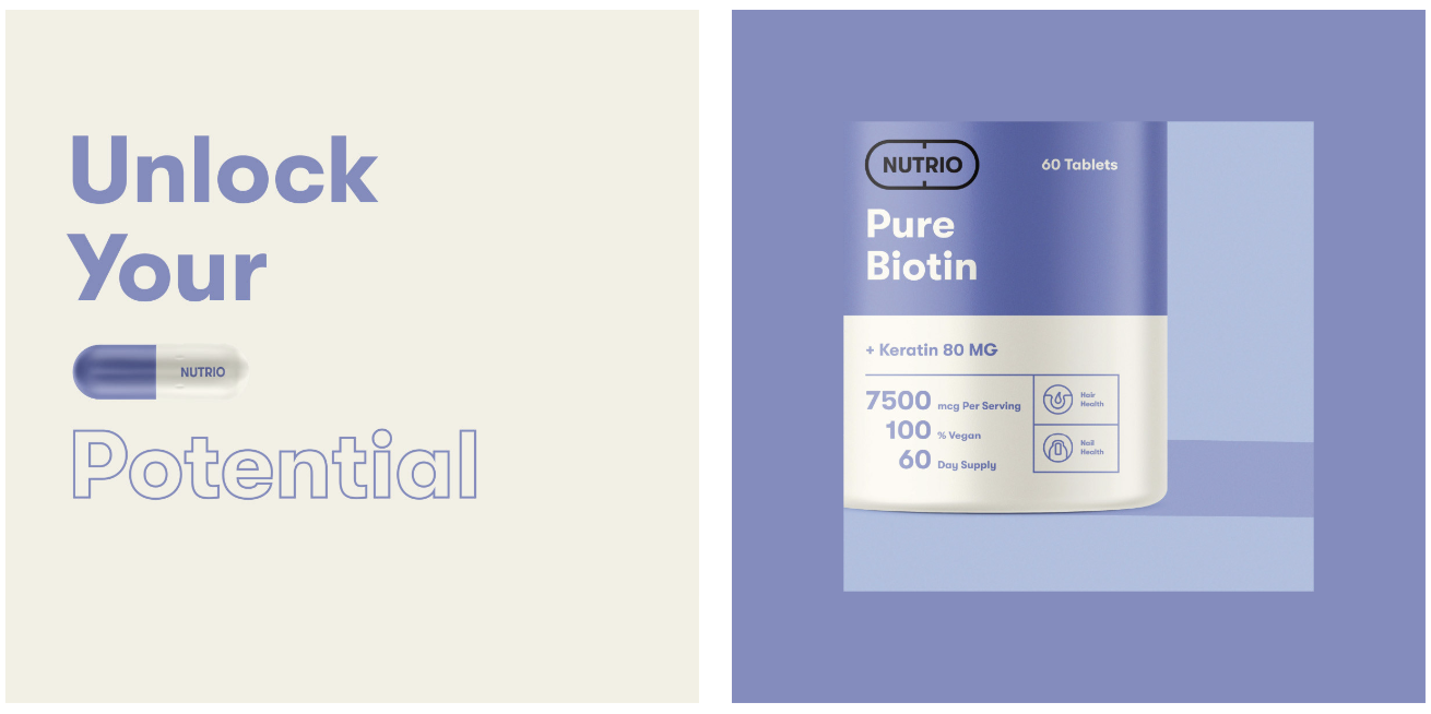
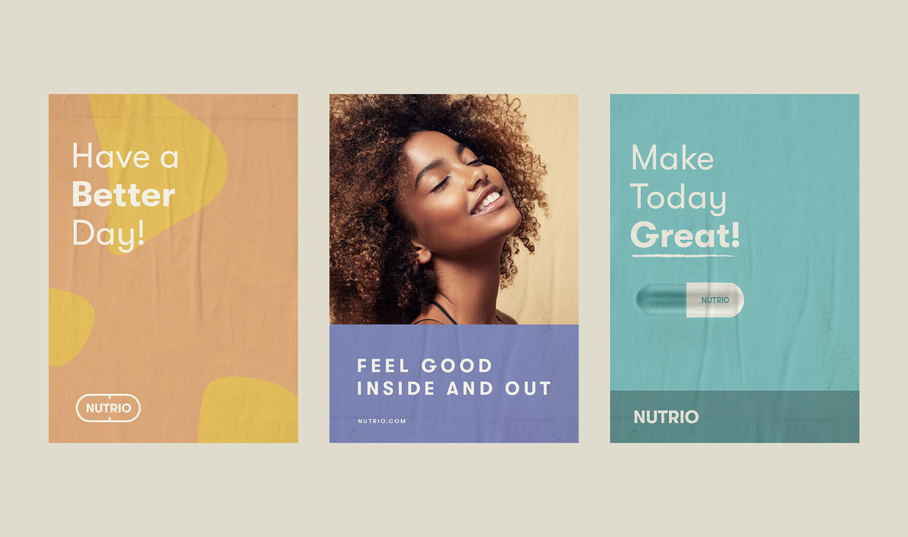
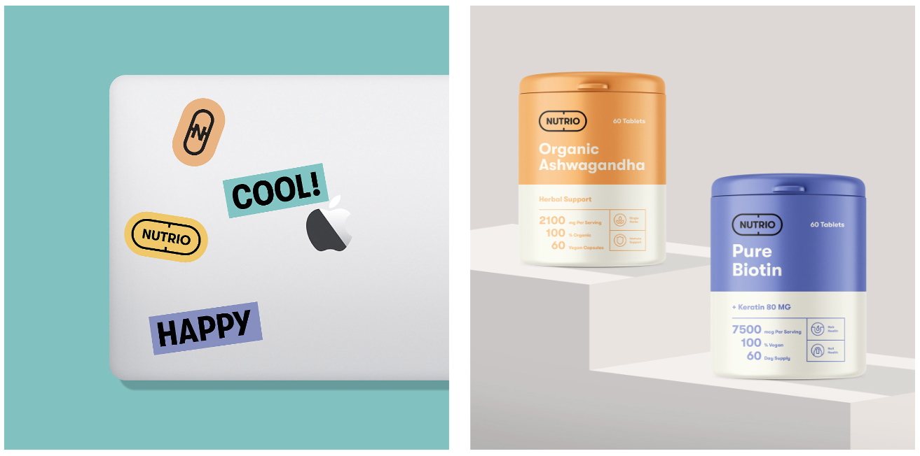
To build a strong association with vitamins and supplements, we created a logo emblem in the shape of a pill. The typography for the logo was made with capital letters of a classy font type to create an affirmative feel.
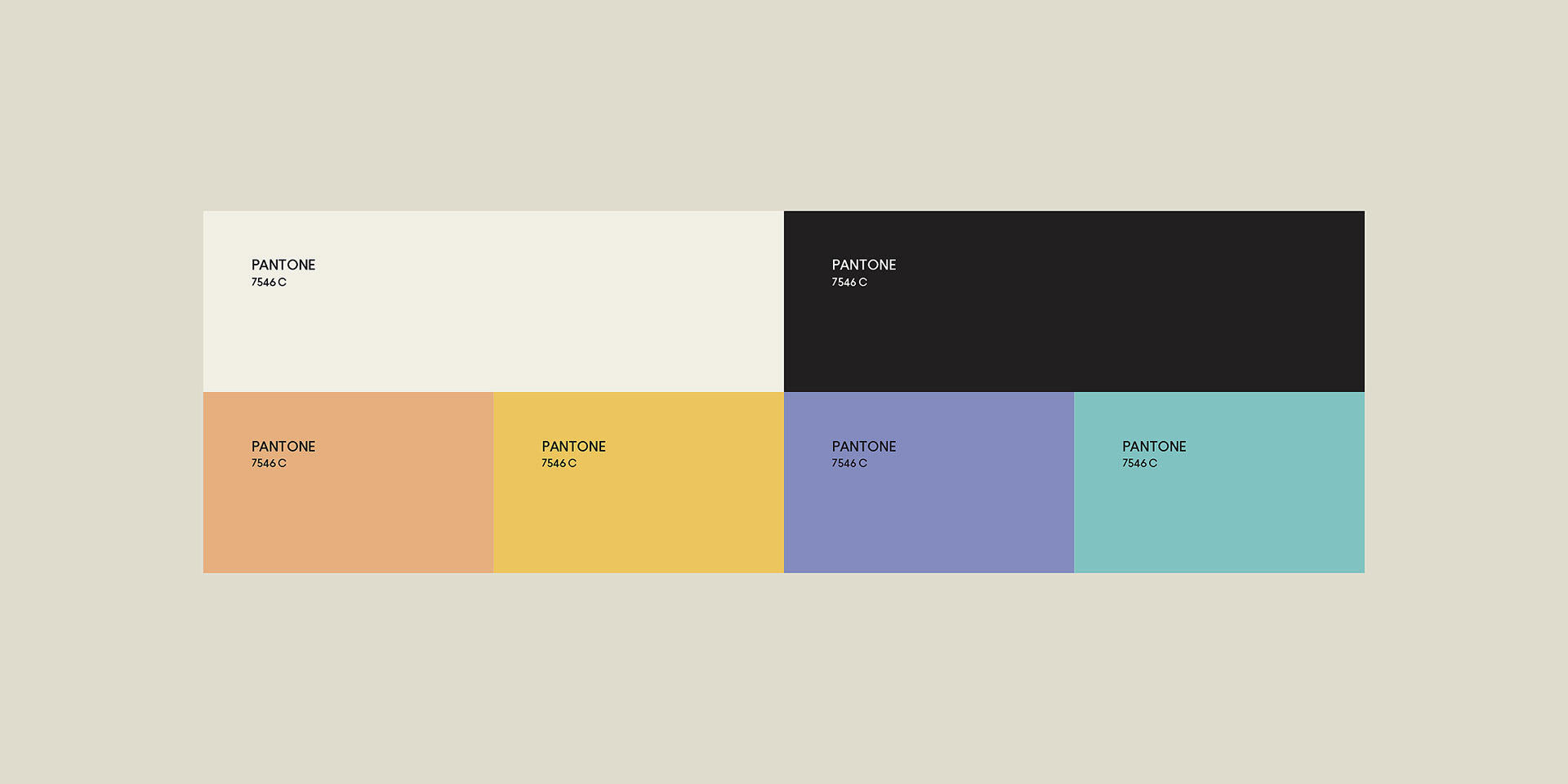
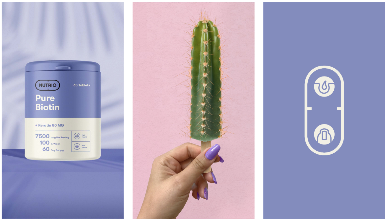
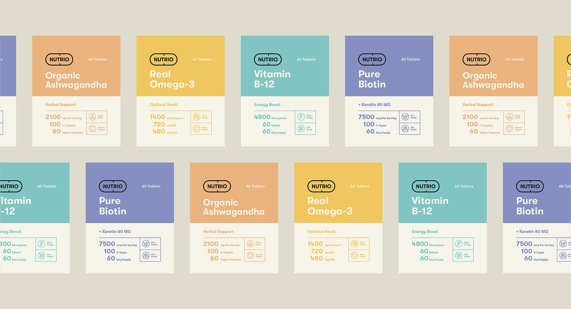
The colors we selected are vibrant pastel shades that represent different meanings and have various associations. It was done purposely for the differentiation of product groups by colors.
For the packaging design, we came up with a two-color palette. The packaging details and product information were also highlighted in the same color we picked for the specific product to create a positive and dynamic look.