Located in Los Angeles, Satori Labs is a company that operates in the extraction and sale of cannabis oil, a product that is sold to companies and end customers. Used for a variety of purposes, cannabis oil extracted by Labs’ specialized laboratories is extremely pure. The extraction of such a pure oil takes place through the work of specialized chemical professionals and highly technological equipment that make up the company’s laboratories.
Appropriating the history of cannabis: the technological impact that its cultivation and use provided for the civilization of ancient Egypt, and the cultural symbols of this ancient civilization used to communicate the most varied concepts, part of the visual representation of the eye of Horus (Egyptian god) in the creation of the Satori Labs logo precisely because of its meaning and relationship with the brand’s purpose and products.
Known as the sun god according to history, Horus was in charge of guaranteeing the birth of days and represents light, royalty and power. And its iconic eye, known as an Egyptian symbol throughout the world, at that time was associated with the phases of the moon, a very important element for the successful planting and harvesting of cannabis and other plants.
The relationship of origin and purity that the eye of Horus represents, and the historical civilization of which it is a part, with cannabis, was rich enough for it to give the main form of the Satori Labs logo.
Incorporated into the eye, there is also the representation of an “S” and a drop of oil in the logo. The joining of these symbols also makes it possible, subjectively, to identify a 3 “part” cannabis leaf.
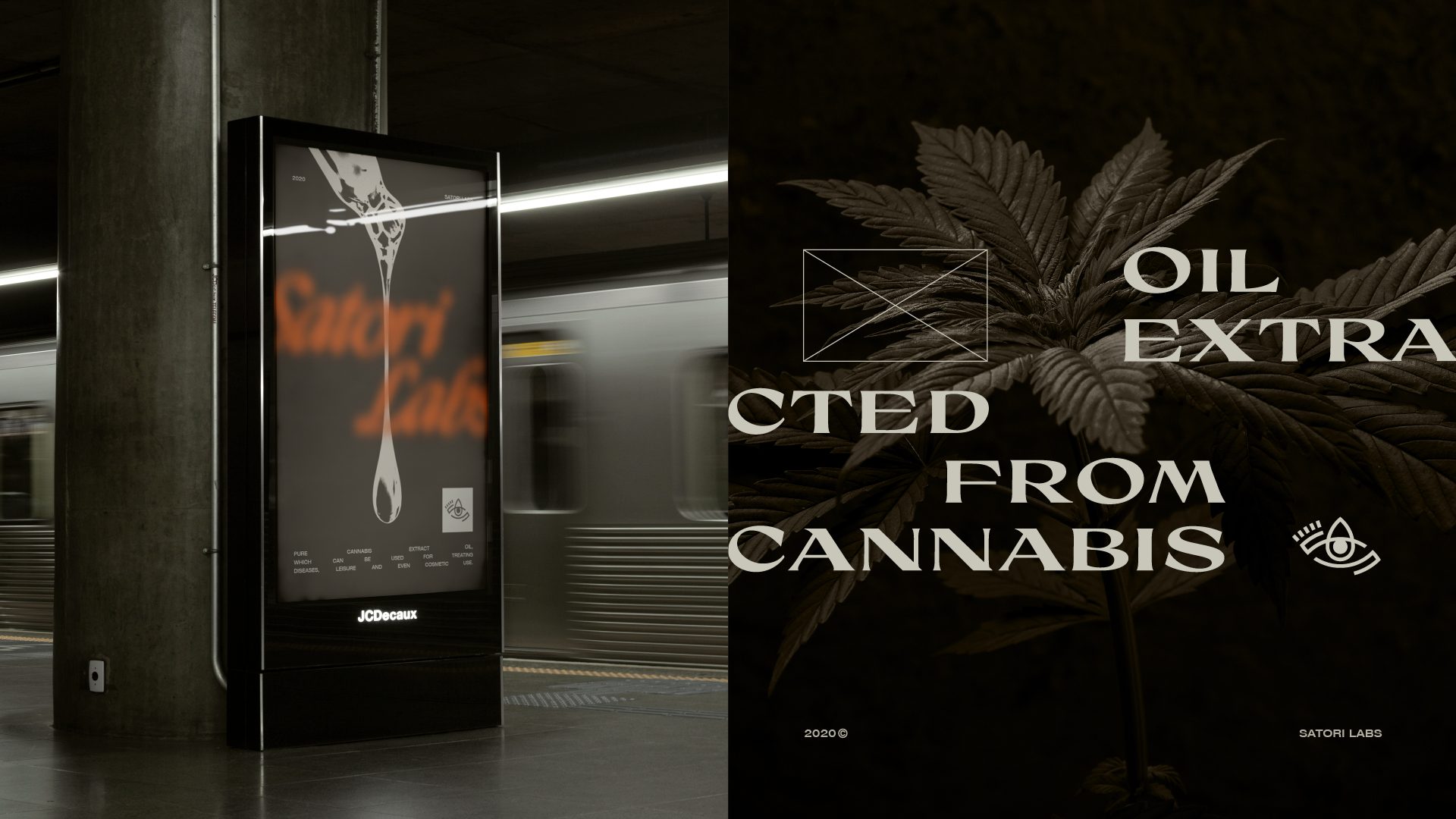
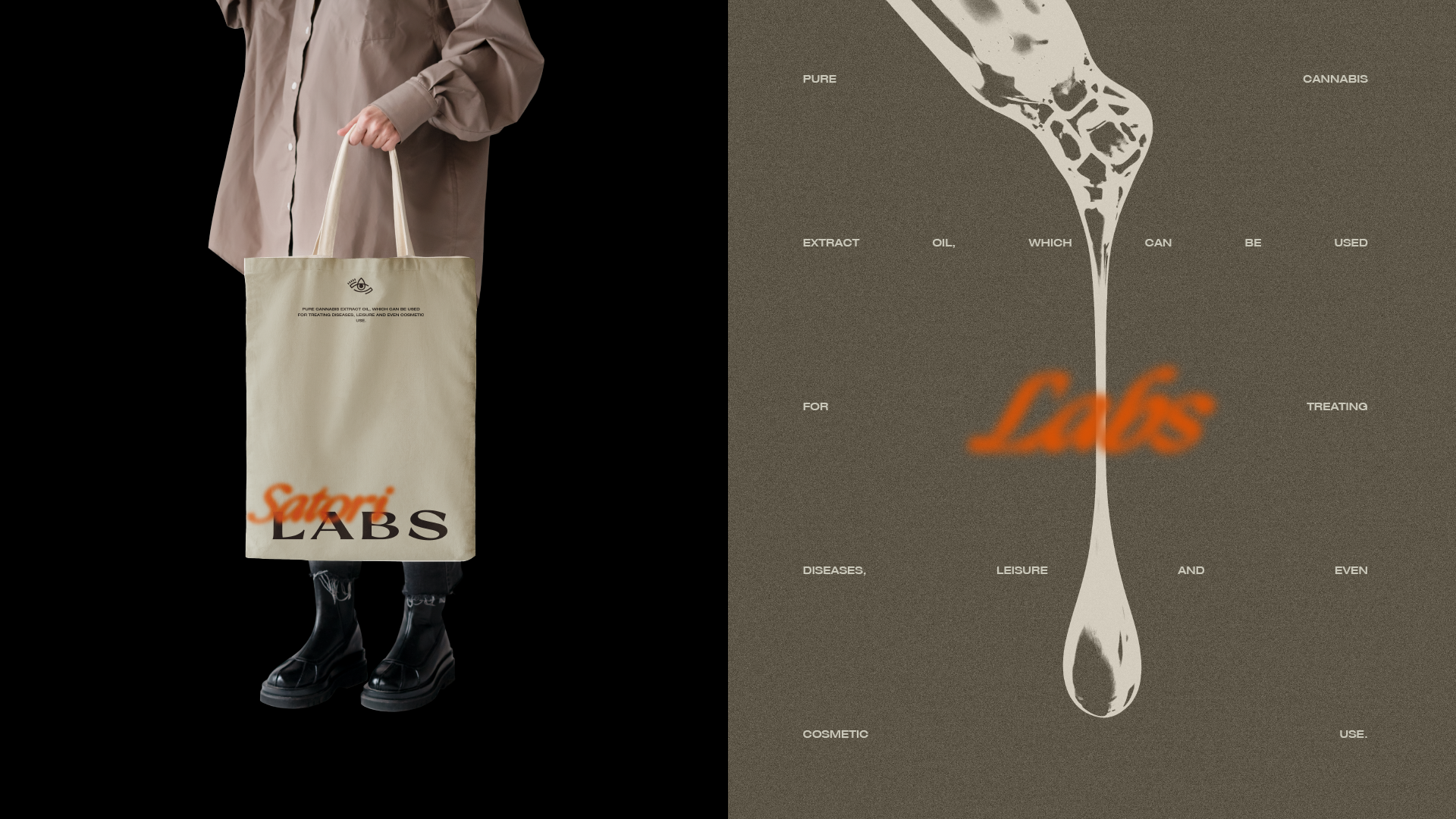
To create a counterpoint with the logo, all loaded with concepts and history, the visual identity of Satori Labs was thought and created to be simple, objective and easy to replicate. Since the brand seeks to communicate and relate to companies and also to the final customer, the objective here was to use a universal and fast-absorbing language.
The complexity, or rather the personality of the visual identity is due to the unusual treatment for a chemical laboratory used in the photographs, as well as the main typography, which drinks a lot from the characteristics of the Egyptian symbols and signs through the irregular bases and pointed serifs.
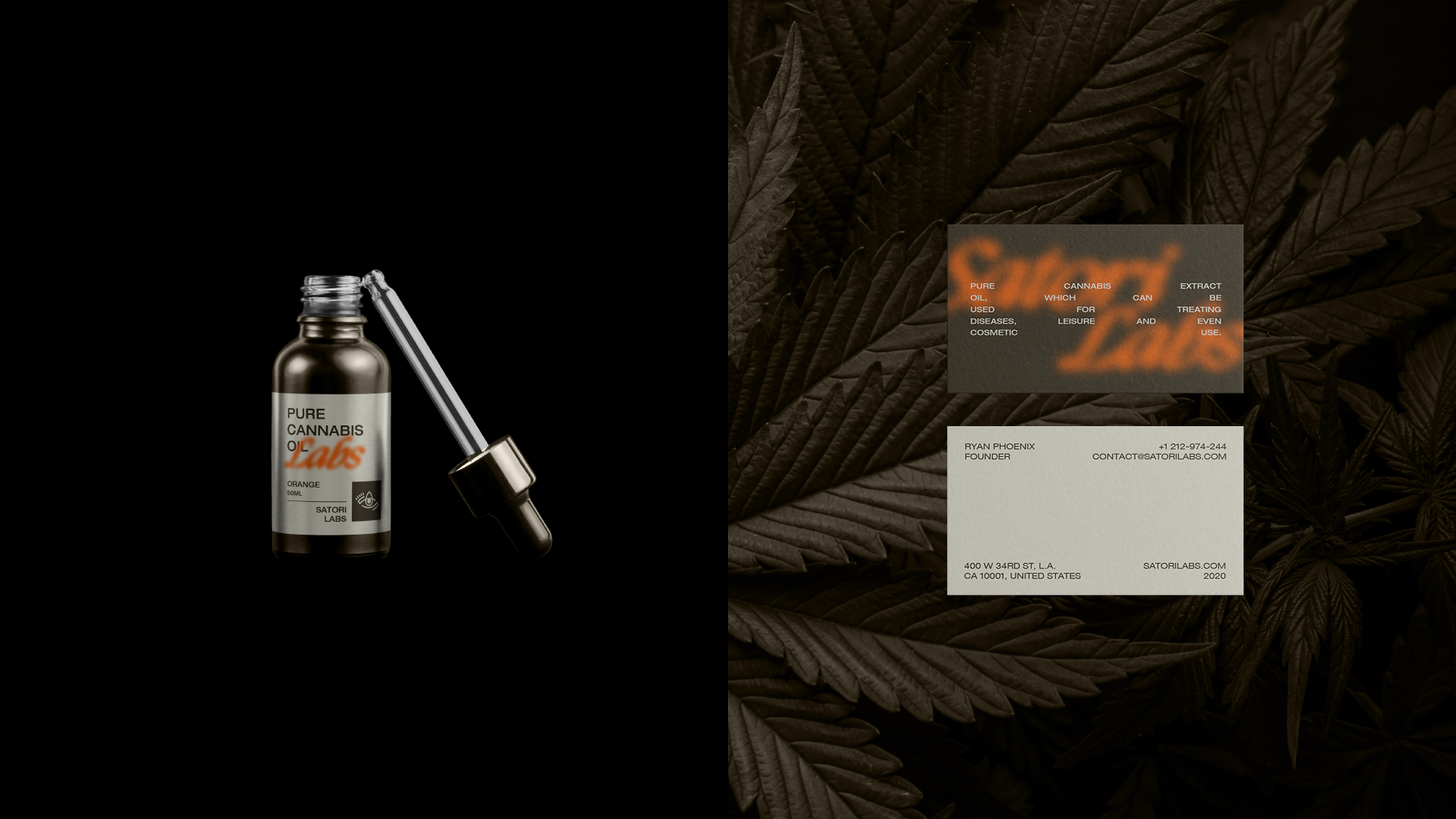
Highlights were also created through the color palette, which mixes cool and warm, sober and vibrant tones. They compose and provide exceptional functionality also for the labels created for the brand’s dropper line, which adopt a clean and objective look and layout.
The result gives life to a modern brand, full of personality, and which communicates the history and technology behind its products.