CLIENT
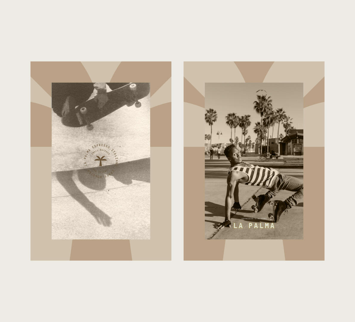
La Palma was founded by coffee lovers who were inspired by the palmas which surround them. They wanted a timeless brand and the perfect packaging design to attract viewers’ attention immediately.
KEYWORDS
Minimal / Modern / Earthy / Associative / Timeless
THE SOLUTION
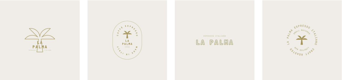
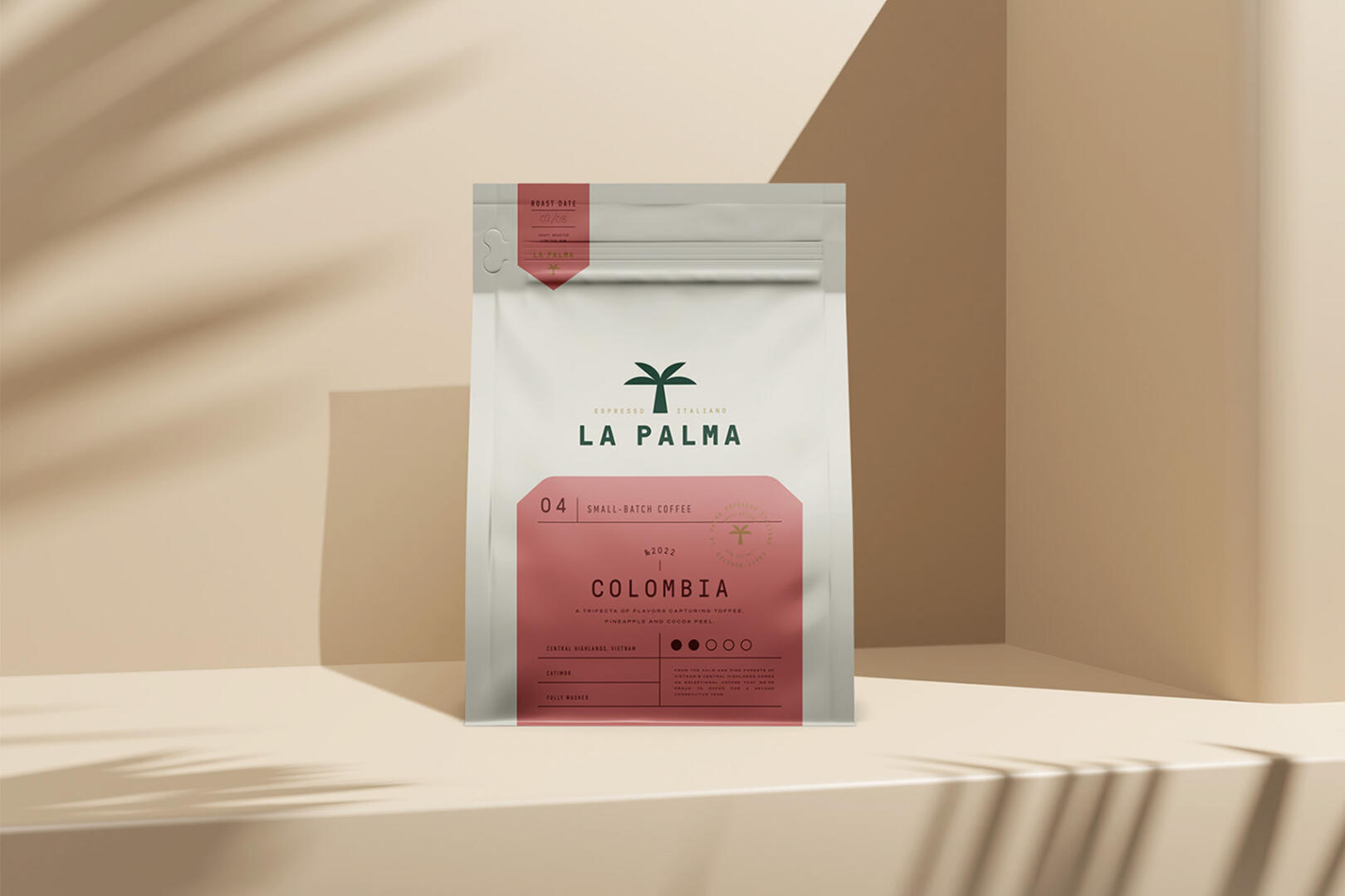
Creating this palm leaf symbol was very exciting, as it should have been minimal and at the same time eye-catching. So we came up with this vectorial palm illustration. As for the logotype, we used bold and simple fonts for a more professional feel.
We have also created 4 variations of the logo emblems for different surfaces and usage purposes.
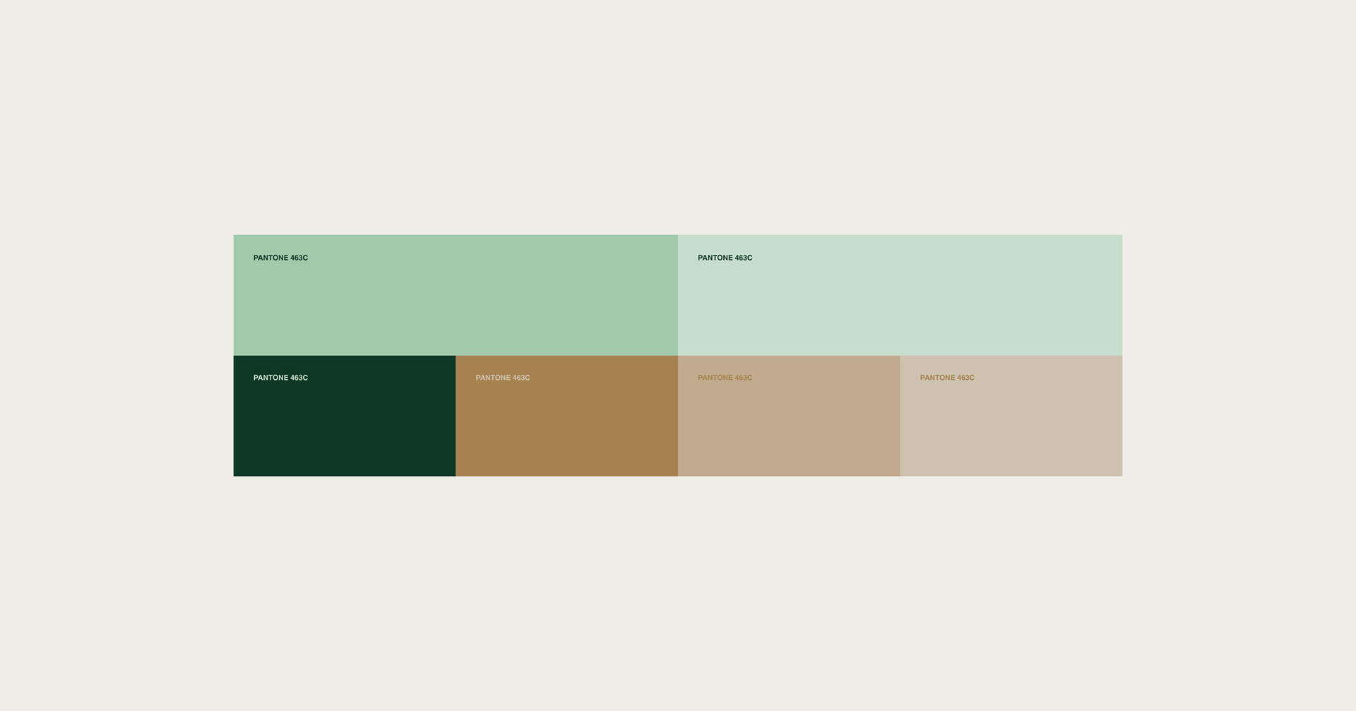
As for the color palette, we selected earthy shades of brown and different shades of green. The colors that we selected are closely associated with natural and organic products.
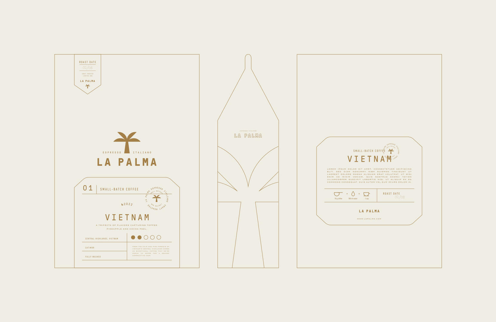
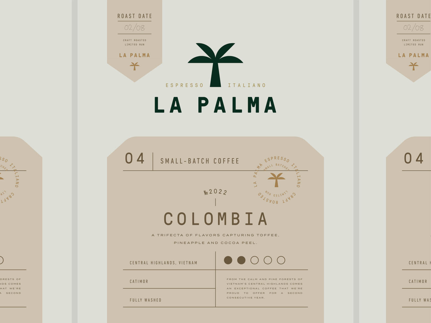
The packaging design has a white background because of its compatibility with all the colors we selected for the color palette. The label designs vary from the coffee taste. At the same time, the layout we have created is minimal, comprehensible, and clean. It was made to fit all the important information without overcrowding it.