Company: Madoc Creative
Project Manager : Sargis Mughumyan
Marketer : Anahit Gevorgyan
Graphic Designer : Grigor Mnoyan
Client : La Meron
Packaging Substrate / Materials: Concrete, Glass Bottle
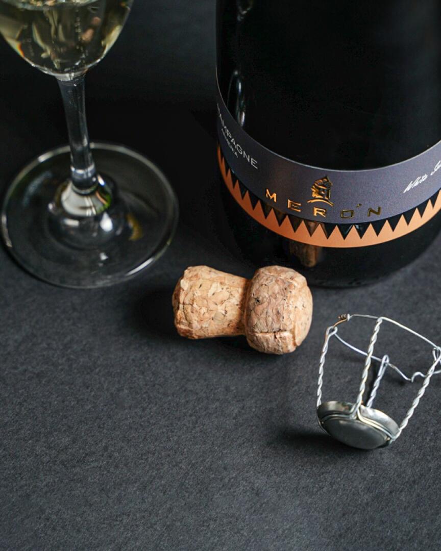
The logo depicts the Armenian king Argishti, who ruled in the Urartian period. The pattern on the crown is an example of the Urartian period, which emphasizes the origin of champagne, that it is Armenian champagne.
The label is made in a strict minimalist style, made in small narrow sizes, we made it even more complex, giving the design lightness. In the naked part of the label we can see triangular patterns symbolizing the cuneiform inscription of the Urartian period, as well as the Armenian Highlands. Triangular patterns are orange, and together with gray they immediately stand out, the chosen orange color, of course, was not chosen by chance. So, we emphasized that champagne is good, and Merron’s hard work is a guarantee of quality.