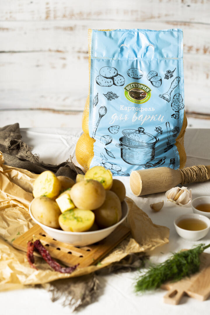
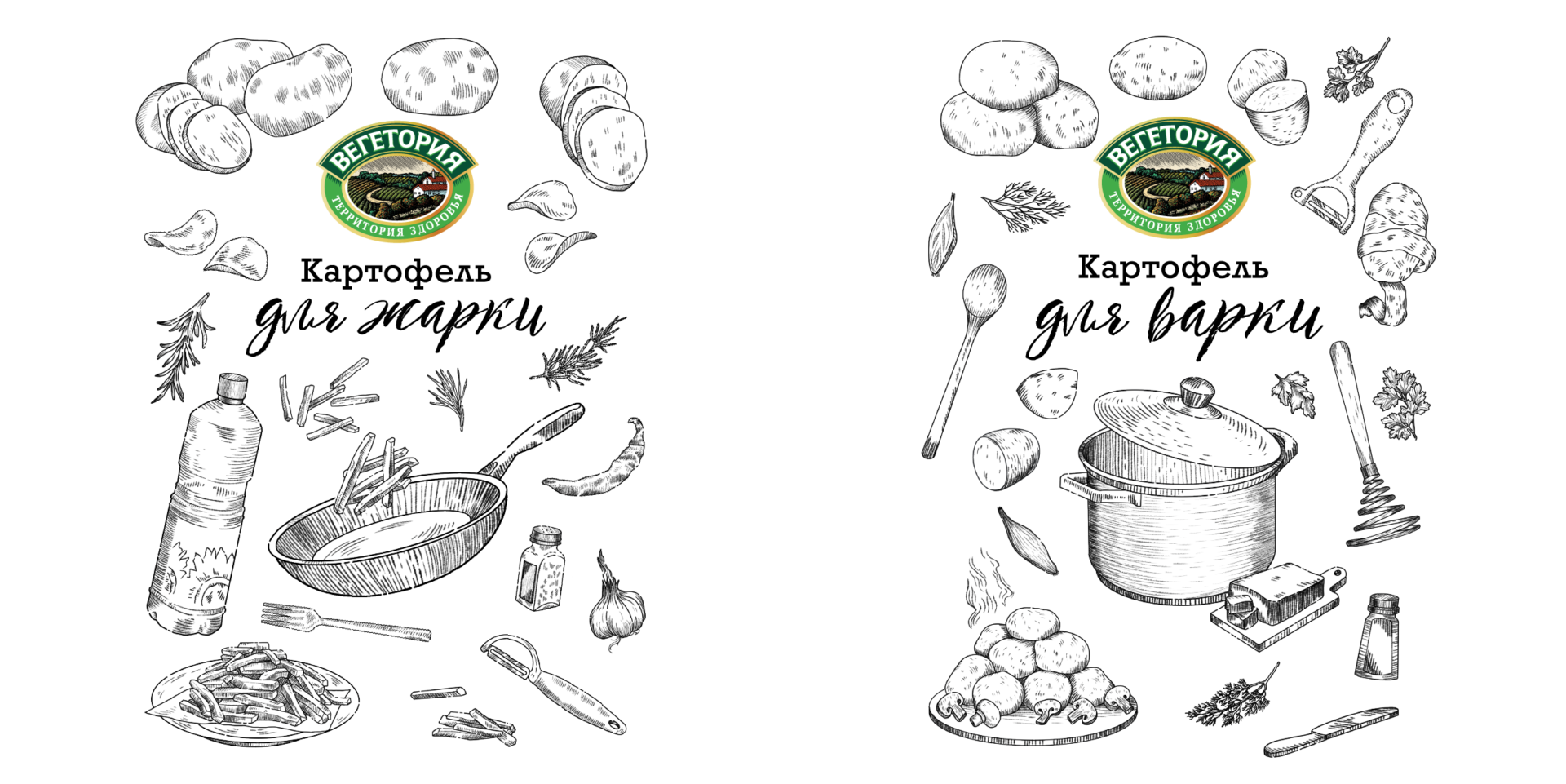
Rebranding of Vegetoria potato packaging
For the rebranding of the “For Boiling” and “For Frying” potato packaging, we chose a style that refers to old cookbooks, where modern photographs are replaced by carefully drawn engravings.
The illustration contains: the potatoes themselves, kitchen utensils, ingredients and various cooked dishes. The center object is a pot and a frying pan. We took them from the original illustrations, which we came up with ten years ago.
Fonts should also remind of old recipe books: one is strict typewritten, the other looks like someone made a note in the recipe by hand.
It was important to choose the right shades of colors for packaging.
Red matches the color of the tubers themselves and the fire on which they need to be fried, only our red had to be friendly.
Potatoes for cooking turned out to be light blue suggestive of water. In addition, it goes well with yellow potatoes and yellow mesh on the sides.