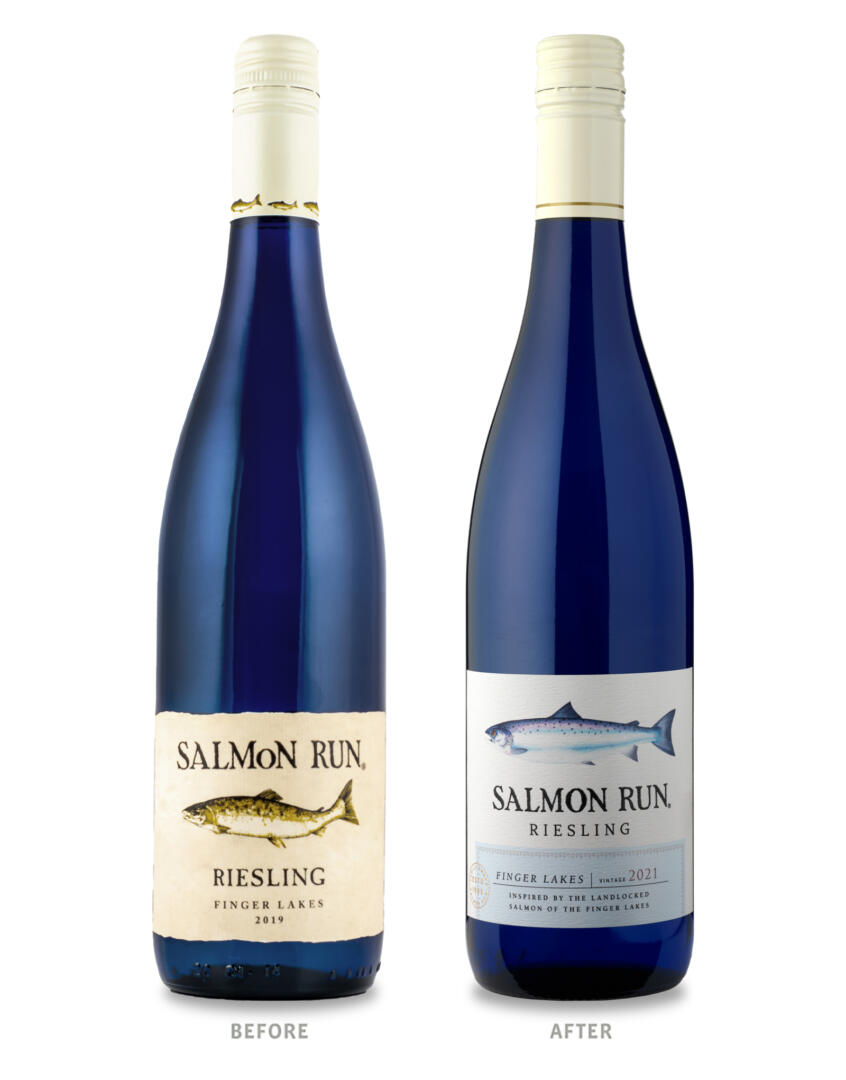
When Finger Lakes-based Dr. Konstantin Frank Winery came to CF Napa to refresh their Salmon Run brand packaging, the label had remained nearly unchanged for 30 years. This created strong brand awareness, but the design had become dated and did not reflect the quality of the wine. The wine packaging needed to look more premium while retaining the brand’s equity elements to remain recognizable to the winery’s loyal clientele.
Named after the landlocked fish that call the Finger Lakes home, a drawing of a salmon was an integral equity element of the brand. CF Napa commissioned a refreshed illustration of an Atlantic Hen Salmon by an artist who specialized in natural artwork – the new drawing was more detailed, representative of the area’s salmon, and worked in unison with the brand’s signature blue bottle. The cream and green color palette of the previous packaging was replaced with a modern white and blue motif. A blue faux tax band label highlighted the wine’s AVA and pulled together the hues in the illustration with the signature bottle. The brand’s equity wordmark was refined to create a bolder and more premium expression. A gold foil seal was the finishing touch and a reminder of the family-owned winery’s pedigree in New York winemaking history.