Studio Unbound have been busy bees collaborating with Jam Packed Preserves
Jam Packed Preserves originally launched their award-winning preserves company straight from a humble allotment. After a few years of trading, Jam Packed was ready to level-up their brand to the next stage. So, they turned to Studio Unbound, who knew immediately that this brand needed to have top-tier packaging to mirror the unparalleled quality of the product itself. Studio Unbound have worked closely to nurture this small-but-mighty brand with its social mission to help British farmers, wildlife and pollinators thrive.
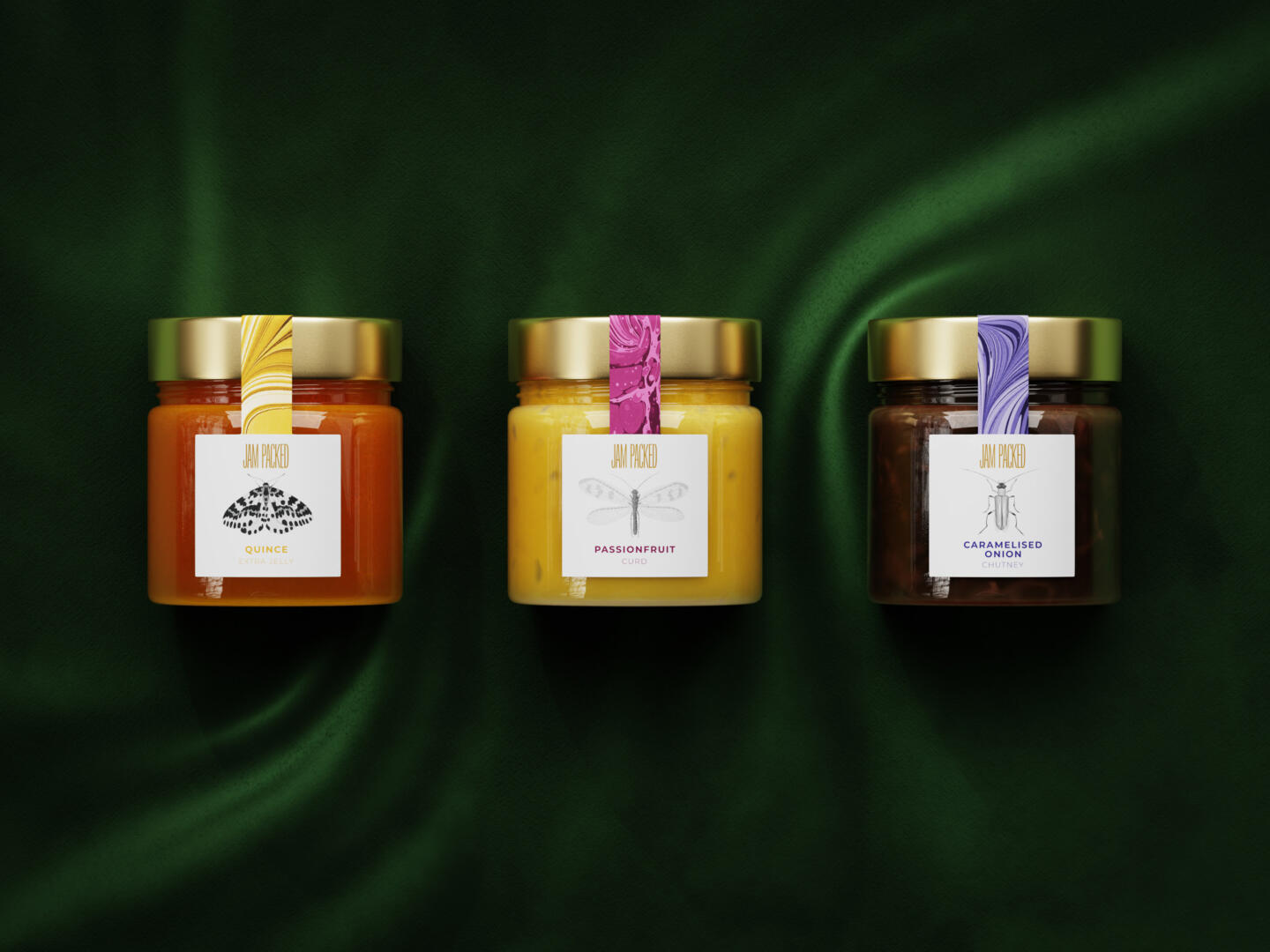
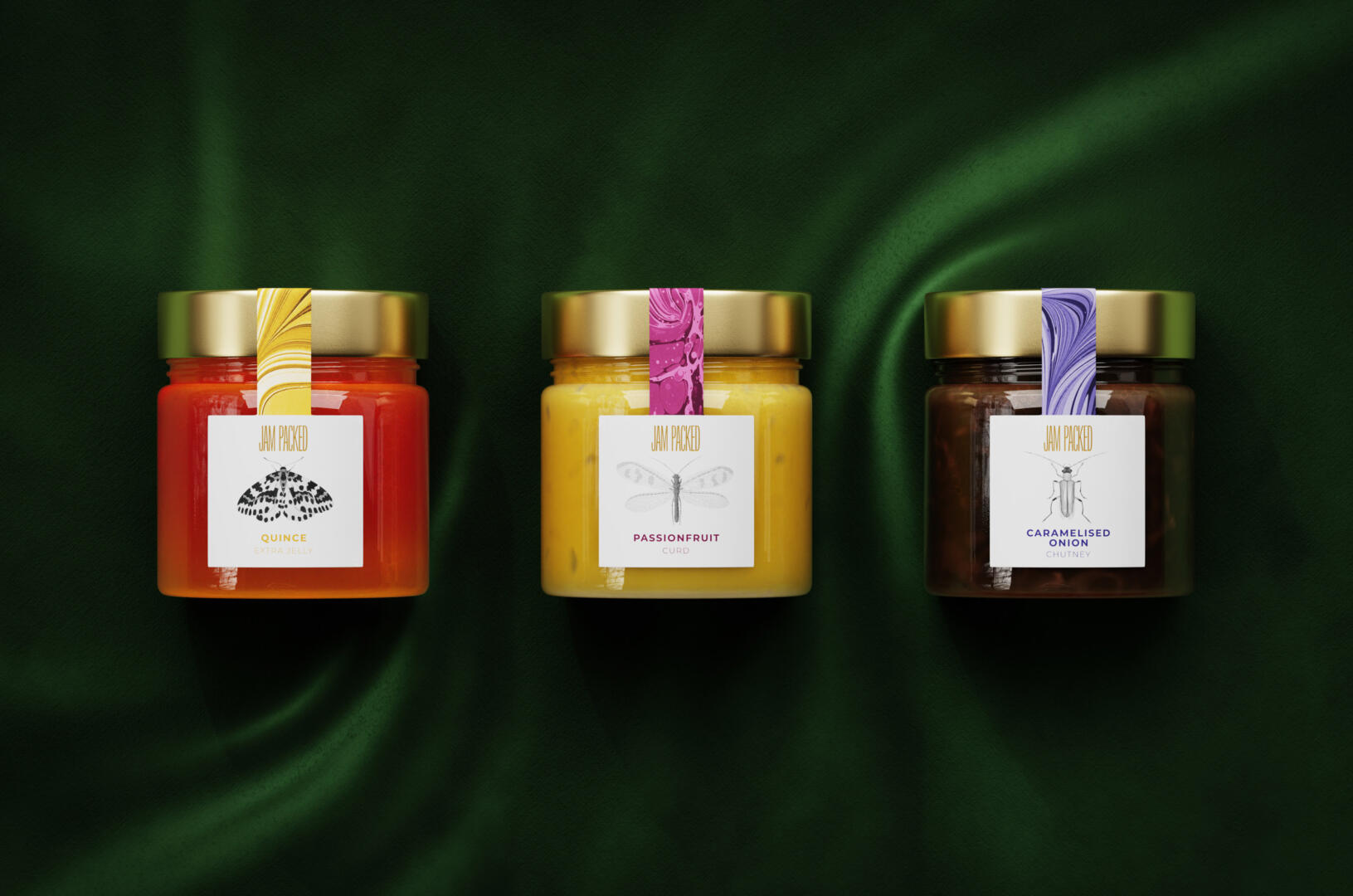
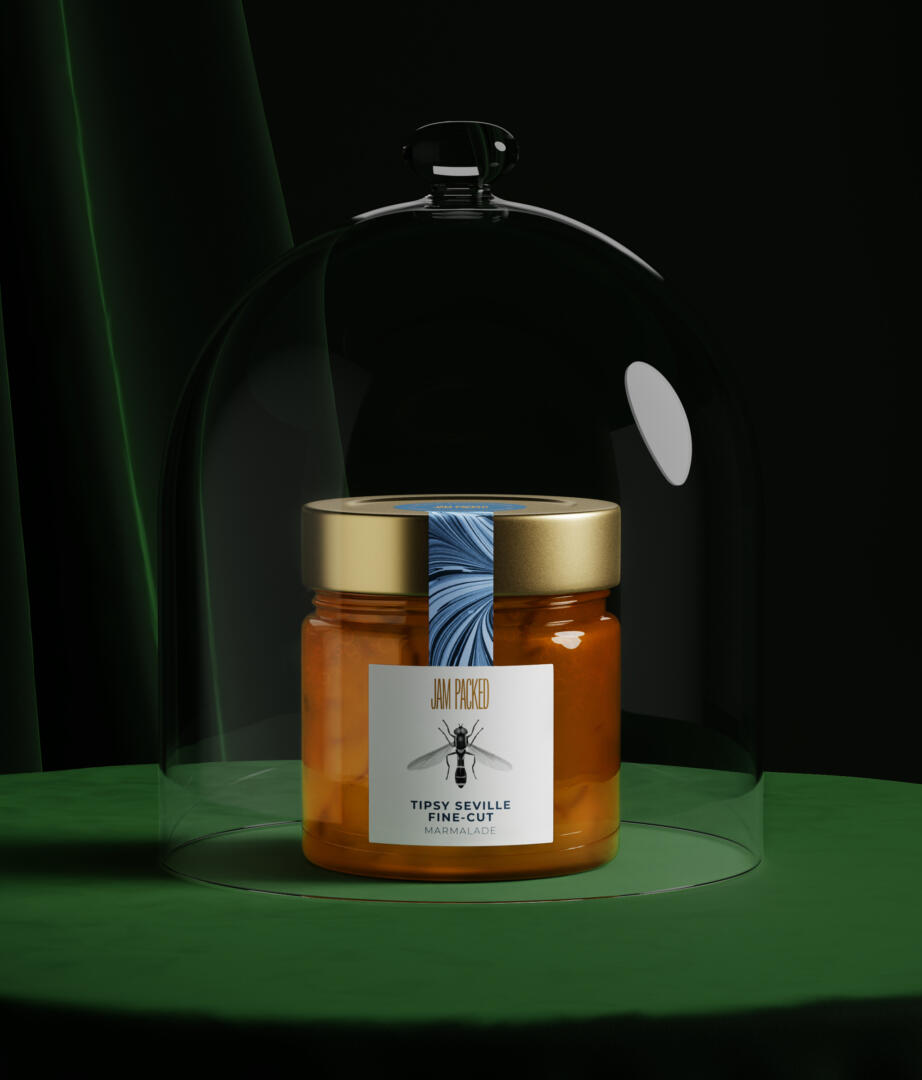
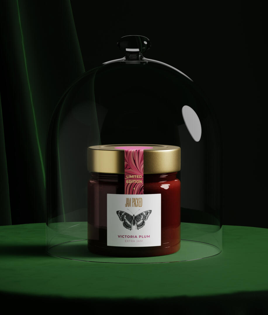
Starting with the logo, the name was the inspiration. A condensed wordmark was crafted so that the logo appears tightly packed to reflect the jar’s delicious contents, which too are literally packed full of fruit – more so than the leading supermarkets alternatives.
With a range now over 50 products, Jam Packed Preserves are staying true to their initial roots and use British fruit and veg where possible, which reduces their food miles and ensures the careful and conscious hand-selected quality of ingredients. It’s natural, then, that Jam Packed’s social mission is rooted in support of the conservation of British insects – which comes full-circle as these insects help pollinate the fruit and veg that are in their products.
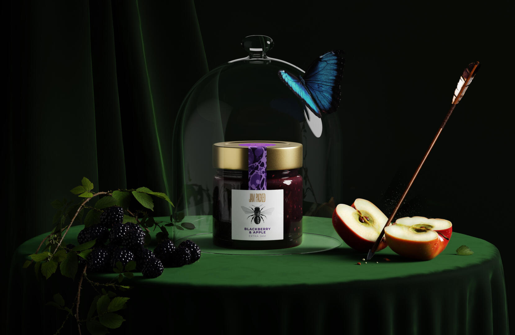
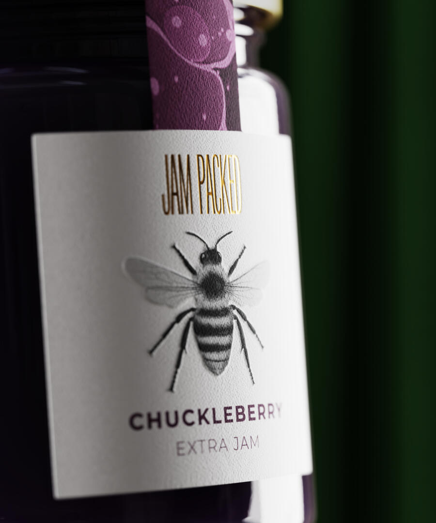
Their social mission has closely informed the design choices: each preserve has a different type of British insect on its label. These insects have been selected as they either pollinate or benefit the growth of plants. Studio Unbound illustrated over 50 different insects and grouped them with each type of product. For example, on the Jellies there are different types of moths; on the jams there are different types of bees. Marmalade has hover flies, chutneys have beetles, seasonal products have butterflies and so on.
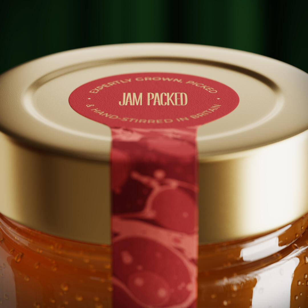
To give it that classic British look and feel, Studio Unbound have used paper marbling on the seal strip. Giving that house in the countryside feeling, you can almost picture the jars sat atop a beautiful oak table in a traditional country home kitchen.
The result is now a brand that truly reflects the premium quality of the products and also what they stand for.
Business owner Sue Woodward says ‘From our initial contact with Studio Unbound we felt confident that they understood where we were coming from and wanted to go to with our brand – they simply got it. The evolution began with the jar and ended with a “sophisticated, classy and elegant” branding – our customers words, not ours – exactly what we were aiming for. We sell our products at farmers’ markets and similar events. People used to say, “Jam Packed – great name!” Now, without fail, they say “I love the packaging!” instead at every event we go to. Our stockists have seen increased sales as well. One customer of a farm shop told me that they thought our products were new in the shop as they had just seen them, even though they had been in the same position on shelf for five years. That is the power of the branding that Studio Unbound have created – they make products stand out.
We are delighted to continue to work with Studio Unbound as we develop new products and ideas for our luxury British preserves. I have no hesitation in recommending them to other small FMGC brands. This was one of the best decisions we have made!
Studio Unbound is a small-but-mighty branding studio that works with aspiring founders of FMCG brands. They always try to deliver work that’s a little different, breaks the mould, and demands to be noticed.