ABOUT
Bonita is a coffee company that focuses on serving instant coffee for people’s daily coffee needs. Bonita Coffee established in December 2020 and freshly prepared drip bag coffee with 2 types only (Signature & Mixture).
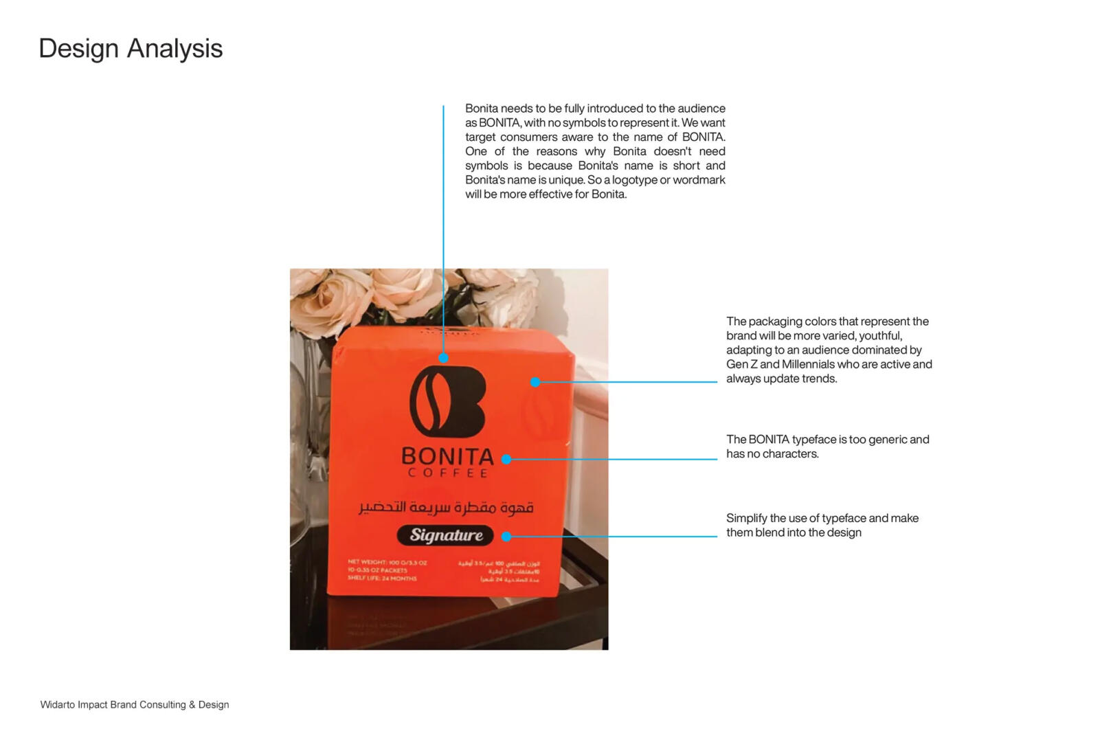
With a focus on targeting millennial consumer types, 60% women and 40% men, the owner wants to review the packaging designs that have been made before. Owners feel the current design does not communicate the unique value of the brand, does not represent the personality of the target consumer, is generic/lack of appeal while on the shelf and lacks competitiveness with competitors.
CHALLENGE
After exploring the diagnosis of Bonita Coffee’s visual identity and its comparison with competitors, to be able to compete and become a more competitive brand, Bonita Coffee’s appearance must represent the brand’s personality and target audience.
Bonita Coffee’s identity will be more simple, more lively, more characterized, and functionally easier to apply and connect with customers. This personality identity will guide how Bonita Coffee communicates with its customers, both offline and online.
SOLUTION
The Bonita Coffee identity should find a balance a long modern, clean, unique and timeless. The new Bonita will simplify the previous logotype,
It should feel;
youthful than old,
bold and dynamic,
simple, unique,
modern than classic.
This identity will strengthen the concept of Bonita Coffee which specialized in providing instant coffee products, a unique experience and a representative atmosphere of emotional benefits for customers.
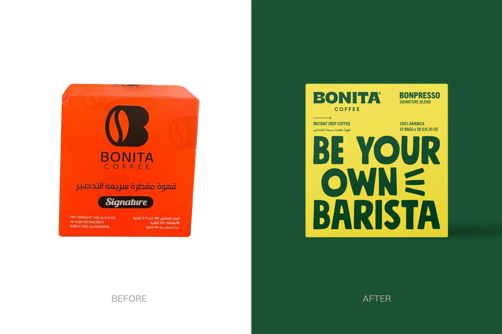
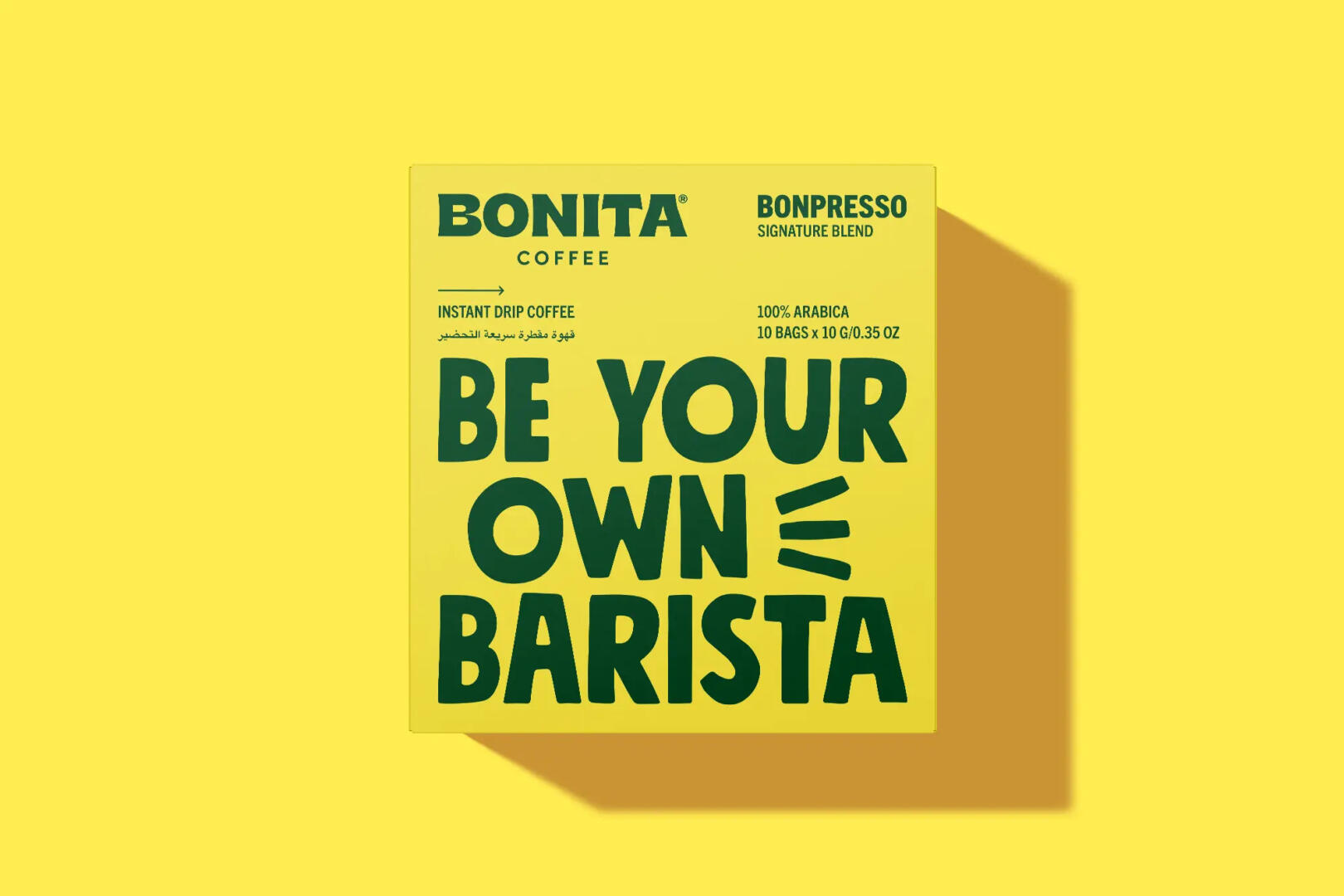
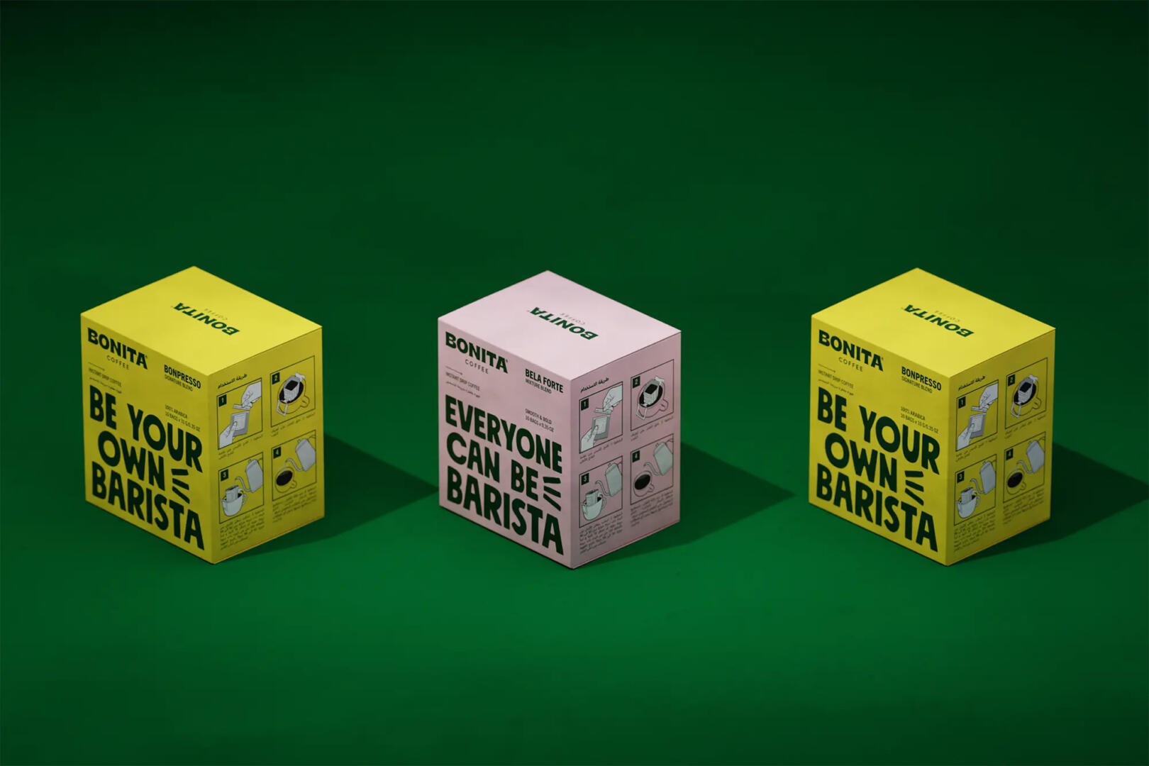
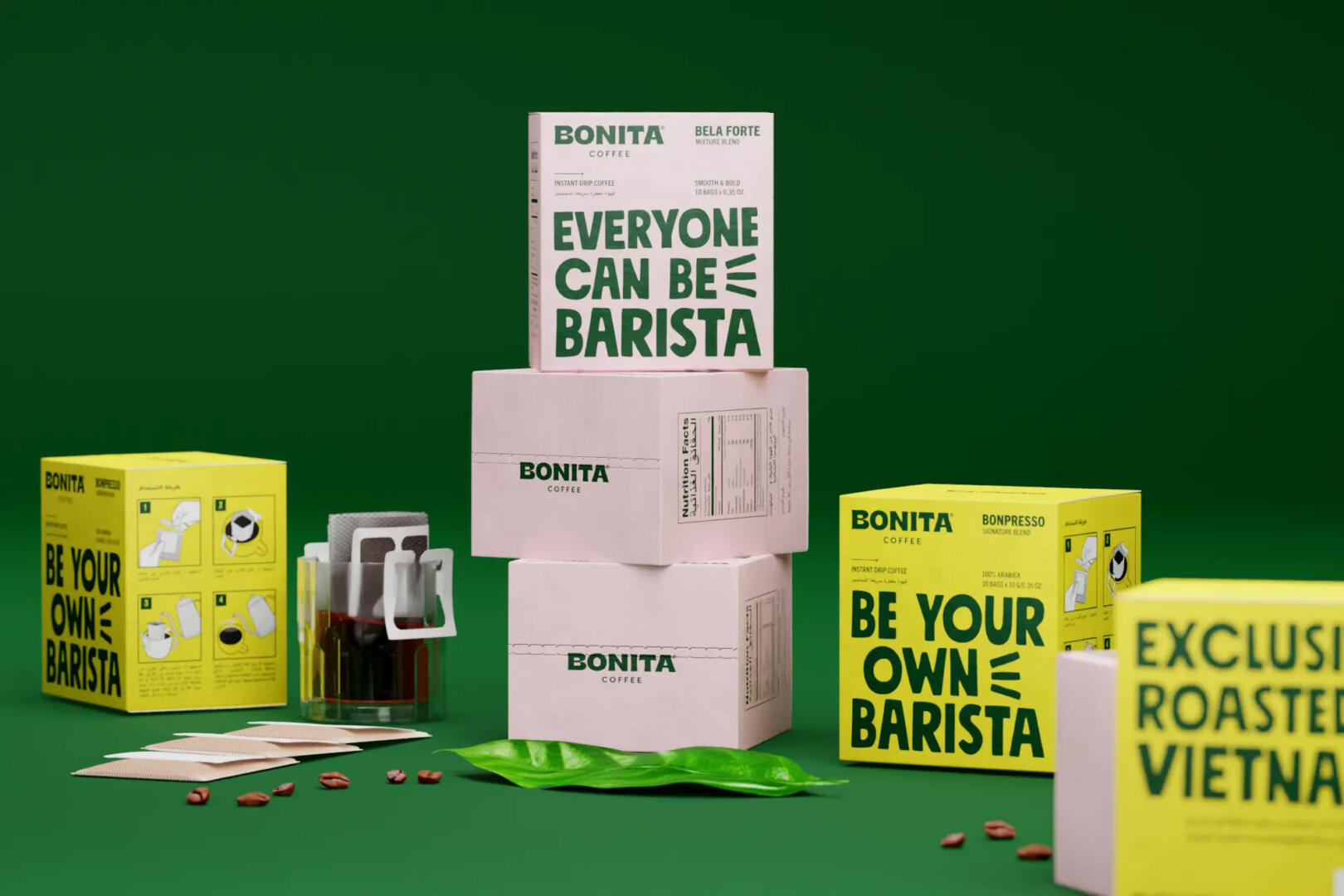
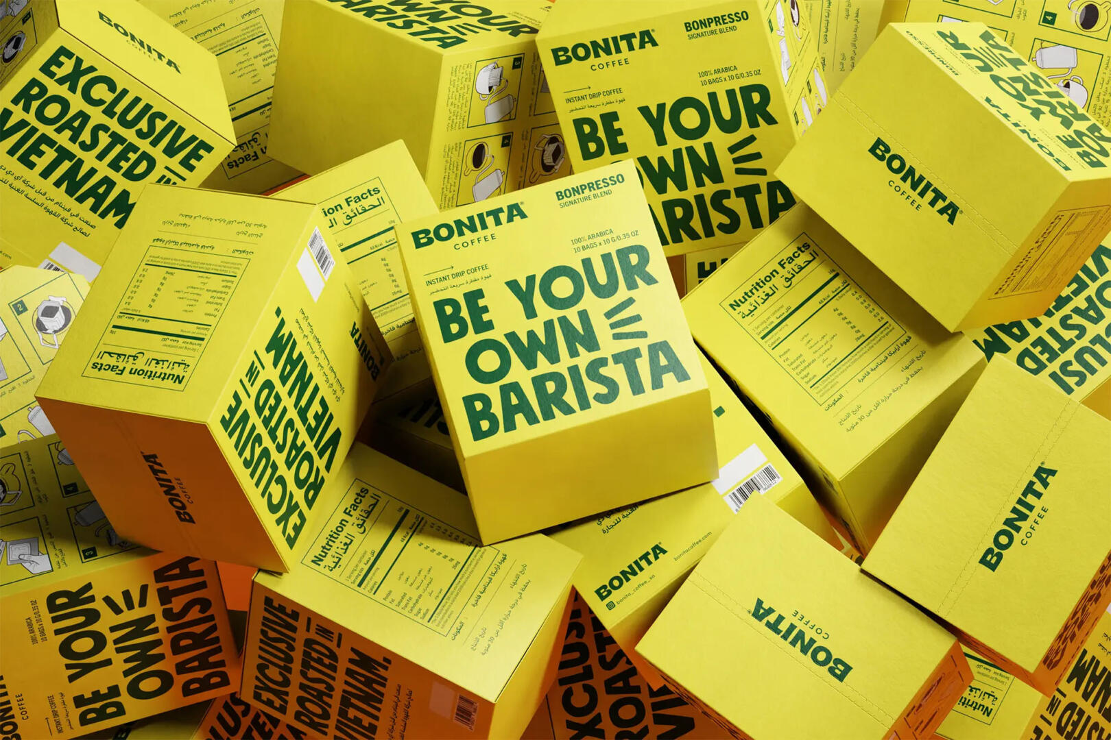
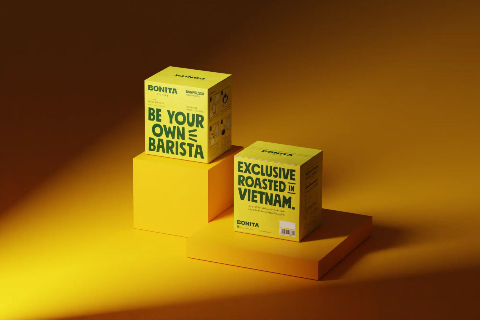
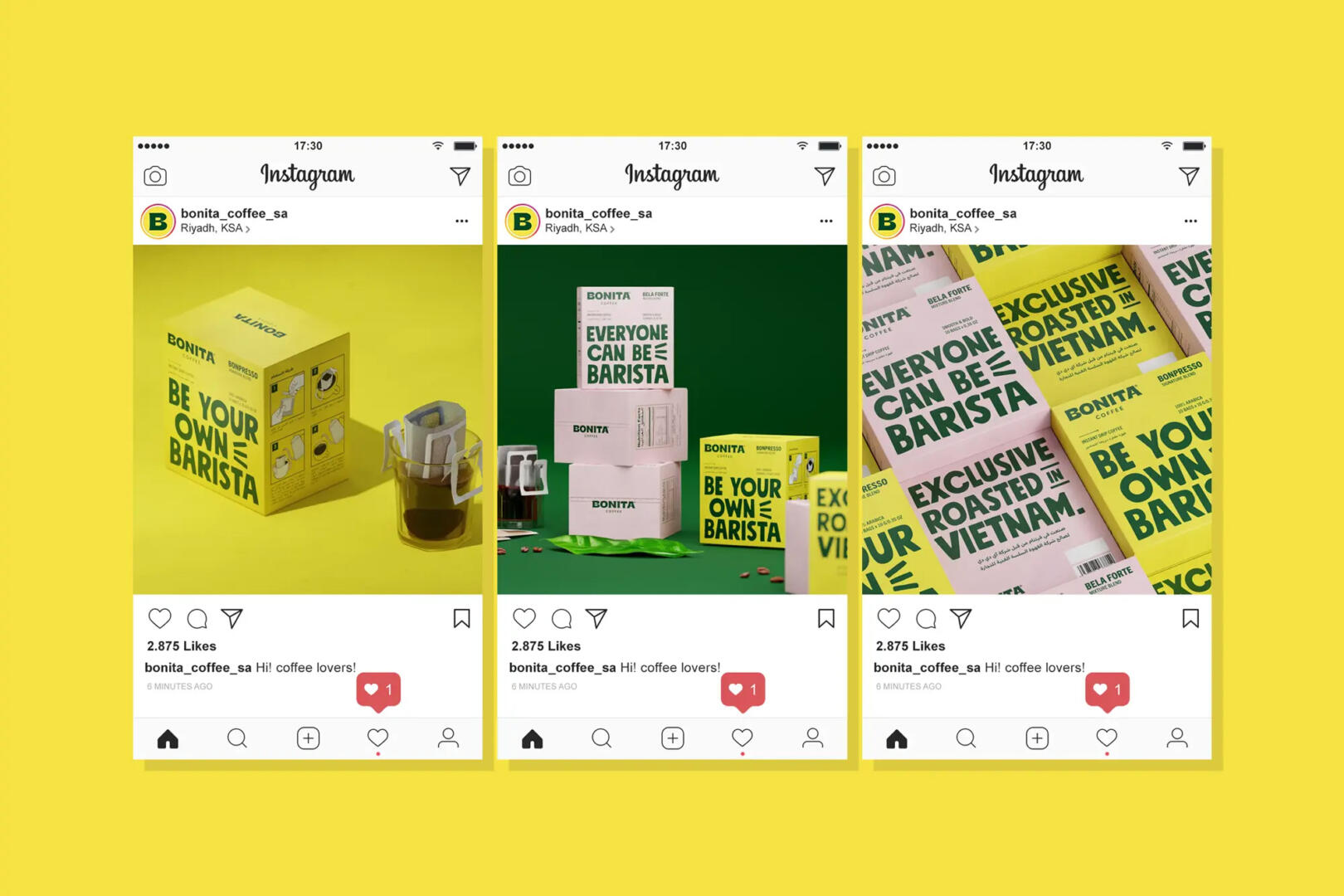
For packaging, we create design strategy to present Bonita Coffee to be bolder, younger, clean, clear and playful. By raising the brand message “BE YOUR OWN BARISTA” as a striking headline on the packaging to represent the product benefits, as a “Stopping Power”.
We develop the potential of using colors that represent the personality of the target audience, which are bright, cheerful, and slightly feminine but feel natural so as to evoke consumer emotions when they see them on the shelves.
In addition, we changed the name of the product which was previously called “Signature” where this name looks generic, we made personal names namely BONPRESSO (BONITA ESPRESSO) and BELA FORTE where these names were taken from the coffee flavor notes as well as names that only belong to Bonita for convenience further development of the product name architecture.