About. Brand Sojel own trademark of the company “GROSSLINE”, which appeared on the market with a brand of cosmetics for car care. Dealer network of the company covers more than 90 regions of Russia and CIS countries, and production has been on the market for more than 17 years.
We were faced with the task of developing a sublease of Sojel – household chemistry for the home. The company wanted to abandon the old brand positioning and enter a new market, reaching a new target audience. Expanding the assortment and the appearance of new items implied the abandonment of all existing at the time graphics.
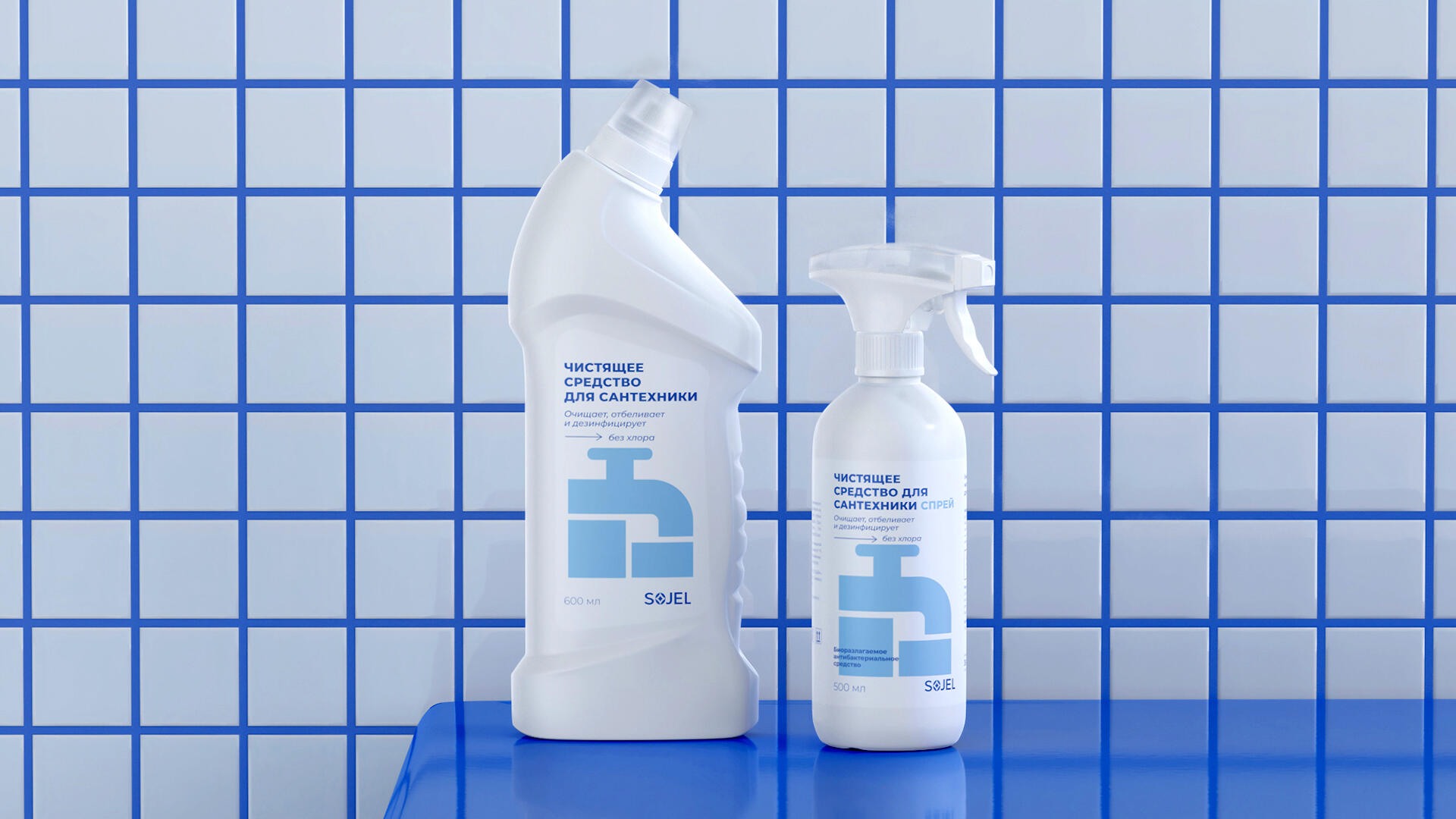
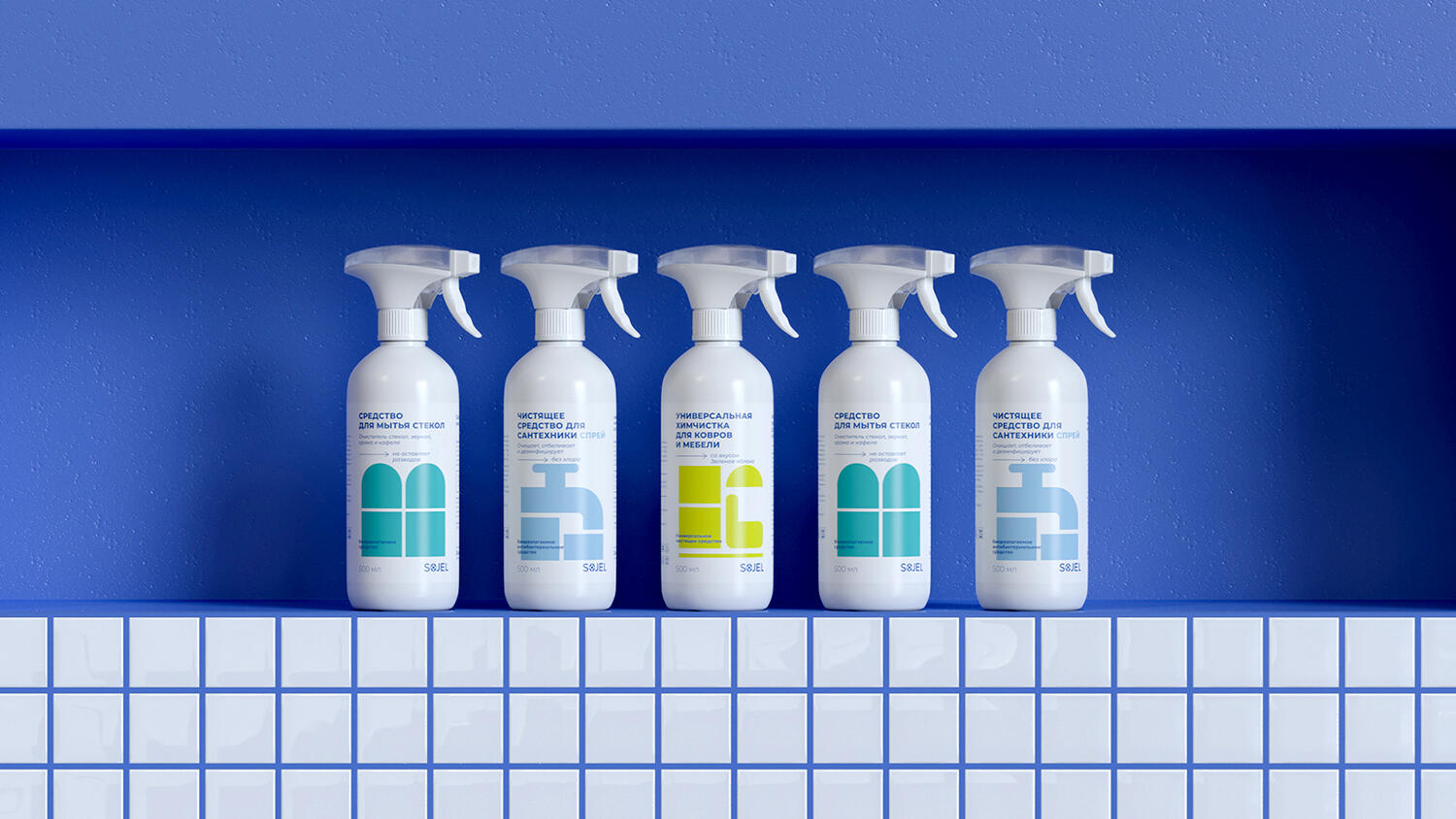
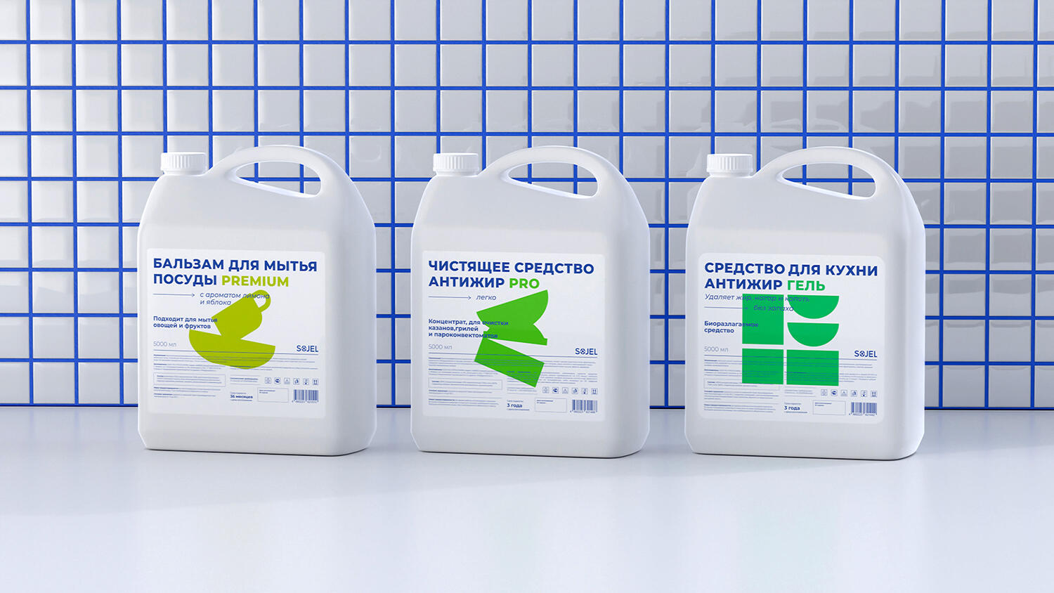
Sojel for the Home is a series of products for the care and cleaning of a variety of indoor surfaces. The brand uses no dyes or unnatural fragrances and cares about its customers.
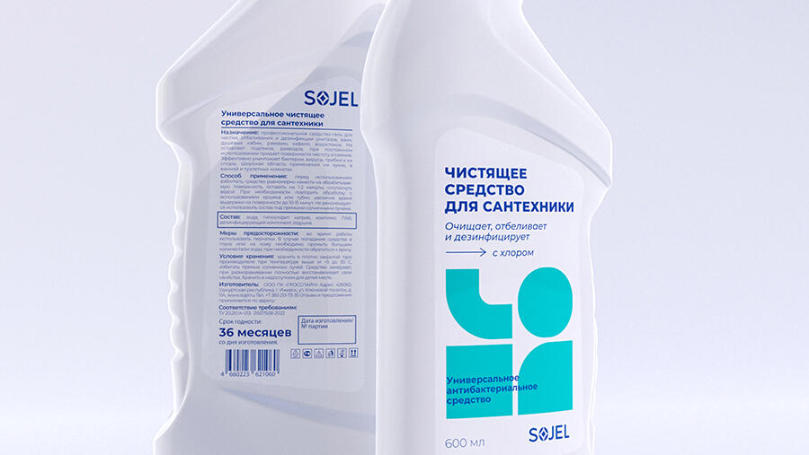
We developed new packaging for the brand – we suggested to style it with primitive graphic forms – reflecting the main essence and task of the product itself. The visuals are complemented by large typography – honestly informing the customer about the purpose of the product and noting its special properties.
The color scheme was chosen taking into account the peculiarities of the household chemicals market. A saturated blue was chosen as the underlying color for the brand and the typography on the packaging. Firstly, it allowed us to maintain the continuity of Sojel auto and Sojel for the home, and secondly, it created the necessary sense of cleanliness. In addition, it helped us to evoke a sense of uniformity in the line of packaging with a large number of SKUs.
For the graphic vector forms we chose brighter colors to attract the buyer’s attention and focus the attention on the essence of the picture. Our task was to create the effect of a quick dive into the essence of what this or that product is intended for, for this purpose we chose simple graphic forms illustrating the purpose of the product.