‘Together-ism’: The new brand DNA of Independence Brewing Company
Craft beers often talk only about the flavours they offer. But the consumer is going through something bigger in his life.
Today’s fragmented world has taken us away from essential social interactions and left us feeling rather alone and distanced from everyone. This ‘urban loneliness’ has been further intensified in the last two years of the pandemic.
The micro-brewery Brand attempts to revive the joy of meeting forgotten friends on an impromptu weekday night, making new friends on the weekend brunch plan or just chilling with your besties over a glass of chilled craft beer at home.
Anything is better Together, not individually. This is the camaraderie which is the driving force of the new independence brewing company. And it’s a happy social revolution that we intend to start. This value was engrained into the brand DNA as ‘togetherism’.
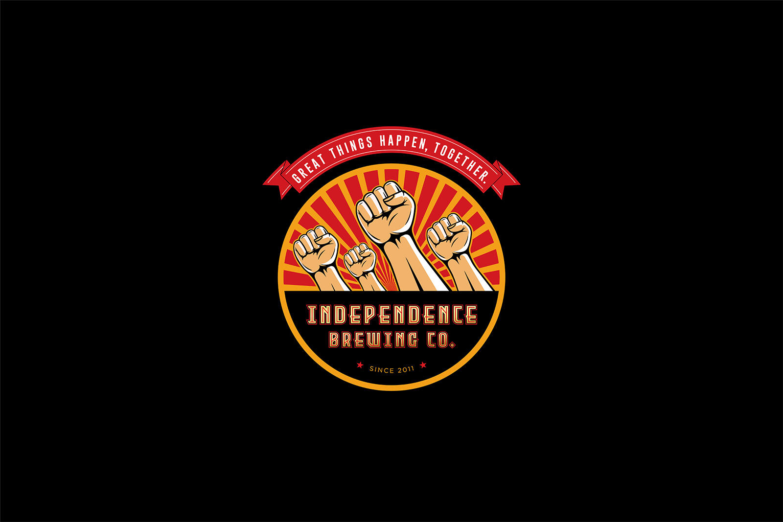
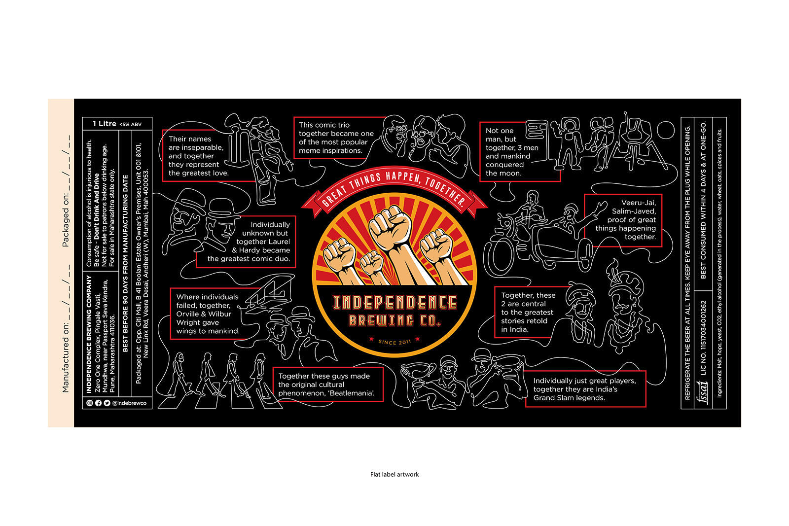
To propagate this ‘Togetherism’, a label that was completely distinct from the category was designed. Instead of generic flavours labels, ours depicted the true spirit of coming together. And what better way to depict it than several hands rising up in unison. These could be hands vibing at rock concerts, hands that are raising beer glasses or hands that are in unison in a friendship movement.
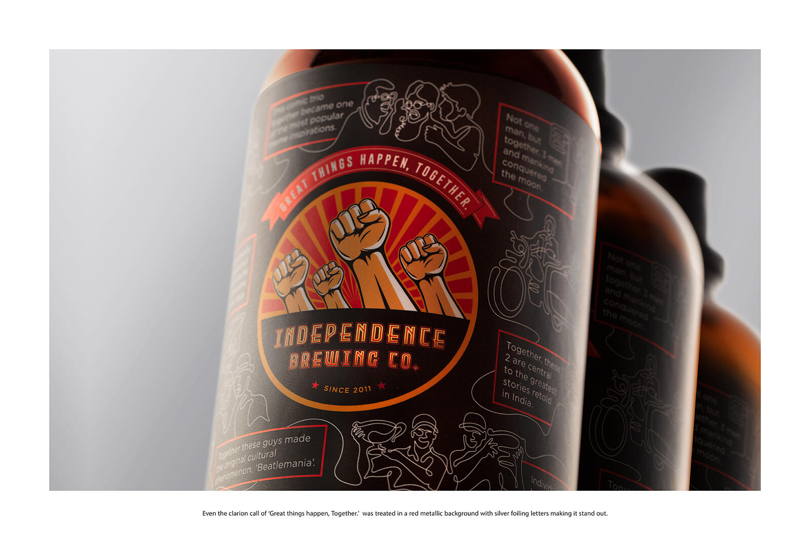
A likeable revolution is further strengthened by ‘the propaganda art style, which is both impactful and very clear in its intent. On a matte monochrome background the propaganda style hands raised together were rendered in warm beer colours that stood out in the centre. The strong rays behind give us optimism and energy, signalling good things to come. The font of our new logo is distinct as well. The warm colour schemes remind us of the warmth of relationships.
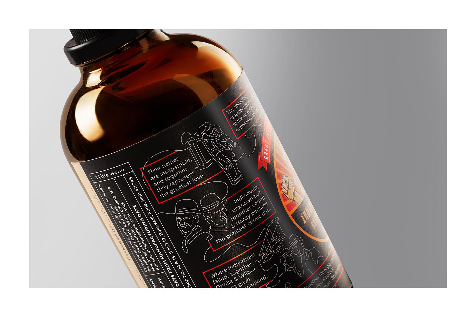
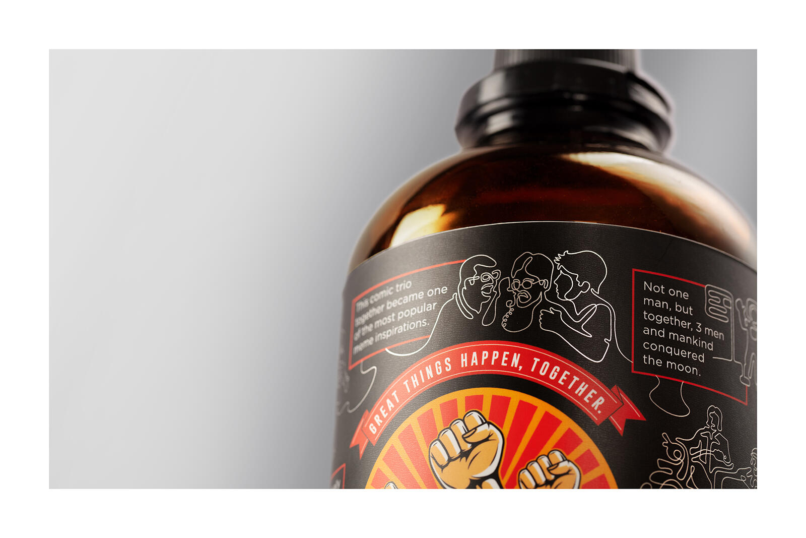
In an elegant matte black label, a single white unbroken line further depicted examples from around the world where great things have happened when people have come together. The wright brothers, Laurel and Hardy, etc. The illustration style which is a single unbroken line also demonstrates this united philosophy. The tagline was also rendered in red and silver to jump out as a clarion call for everybody. The art style imparted us with a distinct identity amongst other craft beers which are just trying to sell craft beer flavours.
Our brand intends to go well and beyond this product peddling, towards a greater social purpose. And the packaging identity always reminds us of the intended result: ‘Great things happen, together.’